Thursday, August 31, 2017

GESSO, MODELING PASTE, AND AQUAPASTO

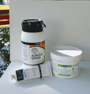
MEDIUM OF THE WEEK: Gesso, Water Color modeling paste , and Aquapasto


You can use these on watercolor paper (preferably 300 pound for the gesso) or hard board. This would also be fun with cradle board. (No framing necessary)

If doing a board, put three coats of gesso on first, drying completely between layers. If doing paper, you can just do one layer. You can have fun with the textures just with the gesso:

     *put some sand in it
     *lay potato bag over it
     *use a palette knife to create textures
     *drag a comb through it
     *use color shapers to poke shapes in it
     *press leaves into it
     *TINT it with tube color

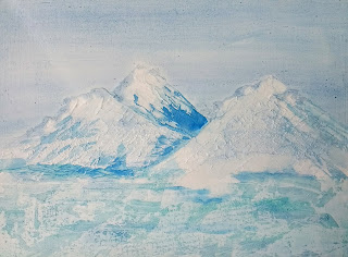
The watercolor modeling paste is lighter than the gesso, about the weight and consistency of beaten egg whites. You can buy it fine or coarse, depending on the texture you are after. You can put this directly on watercolor paper with or without gesso. It dries faster than the gesso, and doesn't seem to crack on a flexible surface. It seems to make peaks better than the gesso does, and you can use all the suggested texturing devices listed for gesso.

This picture is gesso on board, with water color modeling paste over it. (Not a work of art, but a good example of the texture you can create)

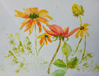
Aquapasto comes in a tube like toothpaste. It is a thick, clear gel. You can mix it with tube watercolors or apply it clear and paint over it. It creates an impasto look. Aquapasto looks glossy when dry, whereas the modeling paste leaves a duller look. It can be watered down and removed from the surface also.

In the picture below, I have aquapasto on the right yellow daisies and the centers of the flowers. The red flower is done just on smooth gesso. The petals on the daisy on the left are done over modeling paste. You probably can't see it, but the paint is duller than the centers and the daisies on the right. There is modeling paste on the bottom with leaves pressed into it. 


The advantages of gesso and modeling paste are also its DISadvantages. Paint doesn't slip and slide like Yupo paper does, so you have more control over hard lines. The paint is easily removed with a little water, making it easy to remove mistakes. However, it also makes it hard to glaze over with another color. You almost have to paint ala prima: "first time." If you are painting over an area, make certain that it is with a light touch so you don't disturb your first coat of paint.

Another advantage is that if you don't like something, you can gesso over it and start over.

Disadvantages of aquapasto is it leaves a sticky film. Yes, you can remove it, but it is also quite sticky until it dries. Then, if it is rewet, it is sticky again.  I would be concerned about it sticking to the glass in a frame if it became humid. I think it would have to be varnished over to prevent that.

GESSO DIRECTIONS:

Apply a coat of gesso onto your paper or board using a rough brush. While it is still wet,


use a roller to smooth it out, unless you are going to do a texture technique. You only need one coat on paper. When it is dry, you can smooth out unwanted bumps with some fine sand paper. Remove any dust thoroughly. Gesso should be dried and cured in 24 hours.

USING PERMANENT MASKING FLUID

MEDIUM OF THE WEEK is permanent masking fluid.


It is a wax instead of latex base. The bottom row of this photo was my experiment with it.
I used just one layer on the circle on the left; 2 layers on the next circle; 3 layers on the 3rd circle. The pink circle is mask mixed with some permanent magenta paint. On the end I painted a red square. When it was dry, I put the permanent masking fluid over it in the shape of an X. Then I painted blue over the whole thing.

What is different about this is that you have to go back over the dried painting with water on your brush to blot the extra paint off the masking fluid. (With removable mask, you just peel it all off.)

Using only one layer didn't seem to mask out as much as I'd like. 2 layers was plenty, as there was no change with adding a third layer.  I did like that it did a good job of preserving a color underneath it, as in the red X.

Disadvantages: It is hard to see the area you have masked until you paint over it. Also, you can't paint over the area once it is masked out, so it should be something you want to keep white. It leaves a slightly softer edge than removable masking.

Some people don't like the waxy shine it leaves. (It didn't bother me, though.) You can diminish the shine by going over it with a hair dryer.

SHOWING OFF STUDENT WORK

This post is just to show off some of the student work we've been doing lately. I'm so happy with some of the results. We've been working with negative painting, negative and positive, and masa paper. I'm sorry I didn't get photos of all the work. Some are not completely finished. These are from
the Mariemont class at The Barn.


Sunday, August 20, 2017

GUM ARABIC, GLYCERINE, & HONEY

Almost all watercolor paints contain gum arabic, glycerine, and ox gall; some use honey either in addition to or in place of gum arabic or glycerine.

GUM ARABIC: 

What is it? It is a gum from an acacia tree in Africa. It is non-toxic. We buy it in a sticky liquid form, amber colored, but it can also be found in crystal form.


What does it do? It is the binding agent in paint. It is what glues the pigment to the surface.  It can: extend the drying time of paint; give glow and transparency to paint; act as a temporary soft masking agent.

Note: QoR paints use a synthetic binder that is clear to replace the gum arabic.


How can I use it? 
      1.  To make your own paints. Mix it with dry pigment, ox gall, and glycerine.
      2.  To make gouache behave more like transparent watercolor: Add a drop or two to your gouache
    on the palette. It will reconstitute faster (normally you have to rewet gouache for 15minutes to be        usable) and be more transparent, with less matt finish.
      3.  As a mask: apply straight from the bottle onto paper with a brush. Dry completely. Wash over
    with watercolor. DO NOT MAKE MANY PASSES WITH THE BRUSH AND PAINT, as the gum
     arabic is water soluble. When paint is dry, gently remove from masked area with water and brush.
     Turner did this for scenes with moonlight.


Above is the experiment I set up for myself to see how well gum arabic can mask. I used removable
masking, permanent mask, gum arabic, and lifting preparation.


You can see from the top row, third circle from left, the gum arabic left a nice white shape with gentle edges that do not need to be softened.

       4. Add glow and transparency to your wc paints: You can add a few drops to a cup of clean water
     to the water you will use for wetting your paints. The more gum arabic added to the water the              more glow to the paints.
       5.  En plain aire, it can extend the drying time of your washes, and give you a little more time to
     work with blending the paint and prevent blossoms.

What are the cautions?
      *Using too strong a solution of gum arabic can result in a brittle surface and make the paint flake.
       *When using as a mask, if you brush over it too much, it will blend in with your wash instead of
        masking it.

GLYCERINE:

What is it?  It is a colorless, odorless, viscous liquid that is widely used in watercolors. Glycerin is soluble in water and is hygroscopic. The glycerin backbone is central to all lipids known as triglycerides. Glycerin is sweet-tasting and is non-toxic.
Glycerin is an humectant  (attracts moisture) and plasticizer ingredient in commercial watercolors today. It is used widely in candies and frostings, lotions and make-up.

What does it do?
  Glycerine is used in almost all watercolors today. It extends drying timeand helps the gum arabic redissolve in water. Its main purpose is to be a plasticizer and makes gum arabic more flexible and prevents it from turning brittle.

Winsor and Newton became top manufacturers of watercolors when in 1832 they began adding glycerine to their pan paints to help them reconstitute better.

How can I use it? 1. To reconstitute dried up paints or student grade paints. Put a drop or two on top of dried paints and let it sit covered.
 2. You can add it to your tube paints, especially student grade, to prevent them from cracking in the wells of the palette.
3. You can use it as an ingredient in creating your own paint from pigments or add to gouache.

What are the cautions? None

HONEY:

What is it? Ummm.....I think you know that one.

What does it do? Honey is a humectant, and it doesn't seem to degrade over the years. Jars of honey over 100 years old have been found still good. In watercolor paint, such as M. Graham, it is used to keep the paint moist and buttery in consistency when you spread it.

How can I use it?

Honey, like glycerine, can be used in small drops to reconstitute dried, cracking paints or mixed in with tube paints to improve the consistency and spread.

Cautions? 

Some of the sites I've read say that paints made with honey are more staining than their counterparts that are made without it. (same basic pigment, but different binders.)

NEW MASA PAPER PROJECT

Please look at June 2016 blog for Masa Paper Instructions.

Not all paintings look good in masa paper. Try  to choose something without a lot of tiny details,
since that is difficult in a paper that tends to bleed and doesn't keep precise edges. Buildings, many
flowers (poppies, irises, hydrangeas, etc.), baskets, anything with texture is usually good for masa.
Look at some examples on line for inspiration.

Tuesday, August 15, 2017

"Unrelenting"

Here is one of my latest paintings. It is on yupo, using ink, fluid acrylic, and alcohol inks.
Following is the poem that I wrote to go with it. It was originally for a show on addiction and recovery, which isn't going to happen this year, unfortunately.

The "model" is actually a very sweet kitty friend of my friend Jen.


UNRELENTING
By Christine D. Campbell
Even when I cannot see you
Your eyes upon me are unrelenting;
Never resting, always waiting
For my moment of weakness.
Then POUNCE!
You would have me
Between those threatening claws,
Taking pleasure in the taunting, As I squirm between your paws;
Taking measure of my pain,
Prelude to a life’s demise.

So too, must I watch for you,
My eyes vigilant and unrelenting.
Never resting, always watching
For my moment of strength.
Then NO!
You cannot have me!
With my own protective claws,
I’ll escape this desperate haunting, Steal the victory from your jaws
And keep what I have fought to gain:
Freedom of a life reclaimed.


Sunday, August 13, 2017

Water Lilies Negative and Positive


Here is the photo reference. It is my photo of some lilies in Lincoln State Park near Evansville, Indiana.

Here I simplified the photo, creating some areas of passage in the water
instead of having all those lily pads. I wanted to keep the dark reflections
and add some more flowers.


After painting the underpainting I drew on my sketch. Where I knew I wanted some pinks
and yellows for the flowers, I added those, but not in a controlled way.


Colors used: cerulean, hansa yellow, quin coral, permanent rose, deep green.

I started out with negative painting for the first three layers, until I was satisfied with my values. First, I painted around all the flowers, since those were focus points, and also the two pads closest to the front. I started with blue at the top, blending to a green in the center, going back to blue, and then adding pink to make it a little purple. The colors were different, but the VALUES were about the same.

For the next layer, I painted the water with blues and permanent rose to create the passage between the petals. The value got darker by 2 values. This time I painted around all the pads and stems and flowers.
I painted the wrinkles in the pads and the shadows that form between the pads.The shadows are really the negative space of the pads themselves.

I painted in the dark reflections at the bottom with cerulean mixed with a deep green. 
For the leaves, I added deeper green to the centers to create the feeling of a bowl. I separated the flower petals with darker mixes of the permanent rose and coral. 
Last, I lifted some areas of the stems and petals that got too dark. I still have to go in and lift some reflection out of the water in the foreground to further create the illusion of sunlight on water.

Ox Gall Medium

The medium I used on this week's test is Ox Gall. It is literally from cow gall bladder, but there are synthetic versions. It is commonly used in liquid version, but Lukas makes a pan version for under $4.
Most watercolor contains three things, besides the color: gum arabic, glycerin, and oxgall. The gum arabic and glycerin help it to bind to the paper, and the oxgall helps the paint move around.
Oxgall is considered a "wetting solution," which seems like an oxymoron to me, since it actually makes the paint dry faster. It seems its best use would be en plain aire under humid conditions, like Florida, where your paper just doesn't want to dry.

Directions call for you to use it straight to wet your paint instead of water. Here is a way to test what you can do with oxgall. First wet some wc paper and drop in plain color with nothing added but water. Watch how the paint moves around and blends. Do the same thing, only wet your paint with oxgall and drop it into wet paper. Notice how the paint spreads differently, like bursts of fireworks. The center of the drop pulls quickly away, drying rather quickly. (it loses its shine). If you set one color next to another, instead of blending like the first sample of paint, the paints tend to pull away from each other, not blending much. If you drop one color in the middle of another color burst, the colors tend to not blend much. They want to retain their own identity.

Friday, August 4, 2017

TESTING GRANULATING MEDIUM

I'm on a mission to try to understand the uses of the watercolor mediums I've seen in stores and in artist catalogs. So each week, I'll explore one new medium. dick blick has them on sale right now, so I figured it was a good time to explore.

The medium of the week this time is GRANULATION MEDIUM. Several companies make it, but the brand I tested is Winsor Newton. 

WHAT IS GRANULATION? It makes the appearance of having tiny GRAINS in the paint, small particles of sediment that separate and sink into the grain of the paper. You usually notice the sedimentary quality in paint with more water in it. TO TEST the colors in your palette for sediment or granulating properties, make a swatch of your colors. Make the swatch big enough to paint from dark to light. If it granulates, you will see tiny particles separating into the texture of the paper.

I made a list of some of the very granulating colors and the staining colors. You  might want a granulating color for creating great textures in things such as trees, wooden barns, a sandy beach. But you might NOT want a granulating (sedimentary) color for a child's face or a shiny metallic object.

SEDIMENTARY COLORS
Yellow Ochre, Raw Sienna, Burnt Umber
Lunar Earth, Burnt Sienna
Cadmium Red medium, Pink Color
Cadmium Red deep, Rose of Ultramarine
Cote d’Azur violet, Cobalt violet
Cobalt violet deep, Ultramarine violet
French Ultramarine, Cobalt Blue
Cerulean, Graphite Gray, Lunar Black
Manganese Blue, Cobalt Teal Blue
Cobalt Turquoise,
Cobalt Green Pale, Terre Verte, Viridian, Bohemian Green Earth
Raw Umber, Sepia, Undersea Green
Rich Green Gold
OTHER SEDIMENTARY COLORS
Earth colors
“genuines”
Oxides and ochres
Contain PBR7 (siennas and umbers), PB29 (FUM), PB 35 (Cerulean)

Some brands don’t granulate as much as others, especially those with honey. Also, student grade with a lot of fillers will granulate less.

*************  
Below is a sample of my experiment. I used French Ultramarine, which is already a sedimentary color, and Quinacridone Coral, which is very smooth. The first rectangle on the left is the color by itself on cold press paper. Rectangle #2 is with salt. Rectangle # 3 is spritzed with water. And #4 is sprayed with granulation medium. (you can add granulation medium directly to your paint instead of spraying it.) The non sedimentary paint granulated; the sedimentary paint granulated even more.


CAUTION: Keep any paints that you mix this medium with in a separate palette or container. If you don't, you will get it into your other paints. Also wash the brush really well before reusing for your normal painting. 

Directions for this medium call for using it full strength with your paints from the tube, diluting your paint with the medium instead of water. But I liked putting it in a small squirt bottle. I didn't have to worry about contaminating my other paints or my brushes. Just squirt onto wet or damp paint.

Granulation does not change the actual feel of the paper. Texture medium does, but I'll discuss that another week.

CONCLUSIONS: I liked using the granulation medium. The results were pretty noticeable. And using it in a spray was easy. I don't like how pricey it seems, but you don't use much, and it goes a long way. This is one of the more expensive mediums. Dick Blick's price this week/month was about $8.48 for 75 ml bottle, much better than the $12 I paid at Hobby Lobby AFTER my 40% coupon. 

How much will I use it? Probably not on portraits, except on beards or hair. But I'll use it on about half my paintings.

SOME MORE ABOUT NEGATIVE PAINTING


You can read about some more negative painting on the 6/3/16 and 5/26/16 blog posts. This one is similar, but different. In this one, each layer is drawn on one at a time to avoid confusion. Also, every negative space is painted the new value for each layer.

You can also read about negative painting in Linda Kemp's books: Painting Outside the Lines and others. I understand that she has a tutorial of the tree project on you tube, but I have not seen it.

STEP ONE:
Begin by creating a foundation. Some might consider it a background or underpainting.
Paint wet into wet an underpainting using three or four colors. (You will use only these colors for the entire project.) Use some of the texture techniques we've talked about: salt/spray water or granulating medium/wax paper/saran wrap/bubble wrap/spackling/etc. You are not trying to make it dark, but a pretty light value. Dry completely.

Note: Linda Kemp wets both sides of the paper and puts it on plexiglas to keep it moist while painting this foundation. You remove it from the plexiglas when you are ready for it to dry.

STEP 2:
After drying, sketch out your first layer of simple shapes, in this case a few trees for the foreground.
Here is a pattern if you don't feel comfortable without one.


Using the same colors you used for the underpainting, paint the SPACES BETWEEN the tree and limbs. Those are the NEGATIVE spaces. This part should be about two values darker than the first underpainting. When finished, you should see a lot of the textures showing up in your first trees.

Step THREE: Draw some more trees and some ground higher up above the first layer of ground. (This helps strengthen the illusion of distance: Things below your eye level rise from the bottom in the distance; things above your eye level appear to get lower from the top in the distance.) Use paint another value or two darker than the first time. Again, paint ONLY the NEGATIVE spaces between branches and trees,  NOT THE TREES THEMSELVES.  If you are doing monochrome, just use less water in your paint. With each successive layer, you should also neutralize your paints, to reinforce the effect of distance.

In this pattern of the second layer, the dots represent your first layer of trees. Notice the overlapping of the limbs.


This picture shows the original underpainting(using bubble wrap and pencil shavings for texture),
the first layer of paint, and the beginning of the second layer on the right side. The colors I used were quin coral, cerulean, hansa yellow.


Step 3: When the painting is dry, put in another layer of trees, making them smaller than the others, and making the branches wind behind the others. Again, using the same paints as before, use an even darker value to paint the last layer of paint.

Above is a finished tree project. (See how the ground rises with each successive layer)
Below is a picture of leaves using the same technique. These two are my paintings.


Below are examples of other artists' work using this particular method of negative painting.