Friday, August 30, 2019

MORE ON MASA

Going to try another masa paper, but I want to experiment. Usually, I wrinkle the paper, wet it, and put down a wash first before drawing my picture. This time I drew my picture first and went over it with permanent marker (in this case green and brown Sharpies). That way my pencil marks won't dissolve while I'm painting, and I can keep track of the picture better. 

This image is from an adult coloring book so I won't be able to show or sell it as original artwork. But it will work for demonstration purposes. Below you can see the brown marker on the bird, green on foliage. I did the marker BEFORE wrinkling, so it was easier to draw. 

If you do this, please test your marker for permanence if it is not a Sharpie. Some will smudge when wet.


I started with some greens and reds on the background. I haven't adhered it to a support yet because I want to get as much texture as I can before I glue it down and finish.


General directions for masa paper are on previous posts. See June of 2016 for one.

A Few Journal Entries from Wyoming

The journal I eventually chose to take with me on my trip was the little Handbook by Global Art. It was compact, and I was only taking a carryon on the plane. So it fit in my purse with the little Portable Painter. It turned out just fine, even tho it was only 90 lb weight and wasn't 100% cotton. But it was great for "sketches."

Thought I'd share a few things I did last week. Not great art, but I did keep my brushes wet....

Notes from the speakers at church. This is how I pay attention and remember what was said.


A vase from my mom's house.


Experimenting with how to mix color for the Russian olive trees I saw everywhere.


Doodles.


Russian olive on a wood bench


The chapel at Ucross Park.


A blue teal duck at the fish hatchery in Story. No pencil drawing, just paint.


Art opportunity in Sheridan, Wyoming


One great place an artist/history buff can't pass up in Sheridan is the Bradford Brinton in Bighorn. There are two parts, the original ranch and the Mars museum, which houses a great collection of Western art and native American artifacts. 
Leather bowl
Clay pot


View of mountains from cafe
 Another view from outdoor cafe

Ucross

Ucross is a retreat for artists, musicians, writers, poets, etc. They offer two to six weeks residencies to anyone wanting an opportunity to spend a block of time dedicated to artistic expression. Several prize winning artists have written novels here.
There are several art exhibits each year. This one was two
This is the chapel and park area


 The art exhibit area
 A hummingbird moth
 The exhibit of two native American women


 Explanation of one of the exhibits


Thursday, August 15, 2019

MORE ON PLANNING A PAINTING

I did a second color study, where the background was cool and the foreground elephant a warmer color. Wasn't as happy with that as the other one. So I think I'll stick with the first color choice.
Note: When doing a color study, be sure to note which colors you used. You THINK you'll remember, but......maybe not.


First color study


Second color study: cool background, warm fore


I also decided I wanted to do this elephant as a grisaille: painting the values first. But whether to do the grisailles in gray/black or burnt umber, I couldn't decide. So I made this little value study half gray and half black.


Then I glazed over it to see what the colors looked like over my grisailles.


So we have a split opinion: hubby likes the gray, and I like the brown, except that it "lifted" more than the gray when I washed over it with color.  Opinions?


Thursday, August 8, 2019

Using a journal for planning, Part 2


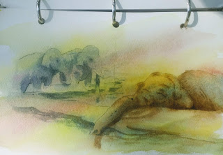
After looking at my value study from the previous blog, I realized that I didn't want the elephants on the left to be so prominant. So I made another sketch on a 5 x 7 drawing paper from my journal.


I did another value study on 5 x 7 Fabriano from my journal. This time I used burnt umber.
Where you see some white patches are the places that got too dark when I painted, so I painted gouache over to let me know I want a lighter value there.


Remeember, I made 3 simple sketches of my picture, with the help of my light box. Now I'm ready to experiment with the colors I think I might want to use.
My first idea was to make a warm sunset in the background and make the background elephants less distinct. With a warm background, I thought the elephants would show up better in a cool neutral. So I tested (you can see on the left of the picture that I tested and labeled right on the picture) these four together: Cobalt blue, quin coral Azo yellow, and quin gold. 


When doing this step, keep the shapes simple with no real detail. Try to keep it to fewer than 15 shapes, including the negative spaces as their own shapes. What you are trying to see is which colors work well together and create the colors you want. So keep the initial colors to 3 or 4. 

Make other color studies using a different set of basic colors. This is a good time to experiment. You might be surprised what colors work well together.

In addition to figuring out a color plan, you'll also discover other things you might want to change: moving a tree or a house over; adding clouds; lowering the horizon line; connecting shapes; etc. 

Below is the final sketch I made for the picture. This is on sketch paper. I didn't really need for it to be so detailed, but I was having too much fun shading and making wrinkles on the elephants.

When you are happy with your value study and color study, you can sketch out the final drawing on the size paper you want to use. I may use masa paper. I think the wrinkles will look good on it.


SOME HELPFUL VIDEOS

I'm still looking for a good video on color studies, but here are some others you might find helpful.

Below is an 11-minute youtube on thumbnail sketches you might like to watch. (Let me know if it doesn't work)

https://www.youtube.com/watch?v=UShPncjYYK0

Below is a link to Mind of Watercolor's 7 minute video on matching colors that you are trying to
make from your reference photos.

https://www.youtube.com/watch?v=-rdjyVnhbbA

Below is a 25 min video of Sterling Edwards doing a value study. 

https://www.jerrysartarama.com/free-art-instruction-videos/painting-a-value-study-watercolors-sterling-edwards?gclid=Cj0KCQjwkK_qBRD8ARIsAOteukAEXVltvEEkjo7V5KxjVv5oBYd4LJNjiF15vgWLQzszABD2TZ_sGLcaAowAEALw_wcB


Thursday, August 1, 2019


USING YOUR OWN JOURNAL

In the next few weeks, I want to use this journal to create, start to finish, all the processes that you go through to create a painting. It will help prevent mistakes later in the painting process. At first it seems to add to the time in creating, but in reality, it makes the painting process smoother, since much of the decision making has been done already.

So the first thing to do was find a picture I wanted to paint. Everyone had some great ideas, but mine is this funny little elephant we photographed at the Columbus Zoo six years ago.

First up was to create THUMBNAIL sketches on drawing paper. (This drawing paper will be handy for not just sketching, but for protecting other pages in the sketchbook). Thumbnails don't take long, but allow you to quickly see good patterns and placement of things in your picture. Easy to eliminate the unwanted or unnecessary. You should make at least 3 to give yourself options in composing.

GOOD QUESTION: Do I always do all these steps? Answer: No. I always try to do a value study and resist the temptation to dive in and just paint the colors I see. The one I skip most, and usually regret, is the first thumbnail sketch. It doesn't take much time, but it saves a lot in the end. And it gives you choices in composition that you may not have considered before.


Next is to make a small more detailed, but not VERY detailed sketch. I made mine on tracing paper. I am going to make at least 3 copies of this same sketch on watercolor paper from my journal.


Next up is to make a value study on the first piece of watercolor paper.
If you are painting the value study, use a color that can go from very pale to very dark. (I used dioxazine, but burnt umber, indigo, and paynes gray will do) Some people use wettable graphite.

Look at your value study and adjust it. Is your center of interest where you want it? Are the shapes
interesting? Is there a good path of light and dark? Is anything getting too much attention?


THIS IS WHERE I TELL YOU ABOUT NOTANIZER.

There are some technologies out there that simplify this process for you. One is called Notanizer. Notan is a Japanese term which means "light dark harmony." Artists use notan studies to explore different arrangements of light and dark elements in a painting, without having distraction of other elements like color, textur, and finer details.

You can download a simple notanizer for $1.99. You will probably consider it well-spent money. Mine has a symbol of yin/yang on it. You simply choose the photo from your phone and can convert it to a black and white photo, a 2-value notan, or a 4-value notan. A slide scale at the bottom of the screen lets you adjust each value. Then you can save it or print it.

When you print out your value study from the Notanizer, use a dark pen, a gray pen, and a white pen to adjust the values you want even further, eliminate unwanted shapes, or add highlights.

There are other wonderful tools out there that help construct a good composition. This ones cheap and easy. I like cheap and easy.

CREATING MY OWN JOURNAL

I like the idea of having several types of paper in my journal and being able to carry along a few extras, such as pencil, wc pencils, eraser, clips, etc. Here are the "ingredients" for my journal:

One 9 by 7 3-ring binder
1 sheet of Arches 140 cold press, cut into 10 6x9 pieces (it will make 18 5 x 7 or 15 6 x 7)
1 9x12 Arches 140 Hot press, cut into 2 6 x 9 pieces
1 sheet of tracing paper, cut to size
2 sheets of 18 x 24 drawing paper cut into smaller size
Any other pieces of paper I have on hand or want to try
    (Such as Yupo, Fabriano, Bee, etc.)

1 small clip
1 plastic pencil holder
elastic for closures
eraser/mechanical pencil/2 brushes

I just punched holes in the paper to match my binder.
In pencil, I marked the paper type in corner of paper.
I ended up with 20 sheets of 140 lb paper plus drawing paper, tracing paper, and room to put more.
The total cost was about $13.

What I like, besides paper choices, was that I can remove the paper and clip it to the outside of the binder and use it for a support. And I can make a smaller or larger one by using a different size binder and cutting paper differently.

Small binder

Open binder with plastic pencil holder with Micron pen, mechanical pencil, and Pentel ink brush.


Extra supplies: Sponge, eraser, pencil sharpener, clip, travel paint palette, wc pencils in plastic pencil holder, masking tape wrapped around orange strew, 2 brushes, waterbrush, and extra paints in round magnetic tin. 


The paint palette is Portable Painter (cost around $29 on Amazon). On the far lower right is a homemade palette made with 1/2 pans I bought on line that have magnetic bottoms. You can put these extra paints in a Sucrets or Altoids box, and the magnetic bottoms keep them from moving around. 
If you are making one of these, I have two cautions. One, be sure to dry your paint wells for a few days before you travel. I love M. Graham, but they do not dry as quickly as the others. They don't have to be solidly dry, but enough that paint won't drip around as it gets jostled in travel. The second caution is that sometimes the glue on the magnets isn't as permanent as I'd like. I had to reglue a few of them. Other than that, it's a great, inexpensive way to get extra paint in a very small space.

I've been playing with the Portable Painter to get familiar with it. It comes with an adorable portable brush with two sides to it. But I am used to flat brushes and a larger brush, so I will probably have to bring those. 

All of these supplies plus journal fit in a very small tote bag, which fits in the outer pocket of my carry on, and weighs about 2 1/2 pounds at most. It takes up a space about 10" by 8" by 3".  Far less than a kindergartener's back pack.

I still have some tweaking to do. Still need to ask myself, "What can I live without?"

WHY JOURNAL?

WHY USE A JOURNAL?

Artist use journals/sketchbooks for lots of reasons. Some fill them with memories of places and people. Some use them to record ideas for future paintings. Some may dedicate a journal for one special reason, such as doing the July Watercolor a Day challenge. Just plain doodling is a great way to unleash creativity. In the next blog session, I'll explain another good reason for a journal: documenting all the steps taken to create a larger painting, from thumbnail sketch, to value study, to color studies, and all the way to finished piece.

Since I am traveling soon, I have been very interested in how to pack my art supplies, and should I bring a journal with me? In the past, if flying, I have just brought watercolor paper, some watercolor pencils, and a small brush. They fit just great in my carry-on, not adding much weight or space. But I miss the feel of watercolor.

So I started investigating journal reviews. I got a few to try out. I hope having me do the homework helps you decide what you want in a sketchbook/journal.

I created a checklist (which doesn't translate well in a blog) which I'll summarize here. The things I look for may not be the same as what are important to you. What I look for are:

SIZE  OF JOURNAL/WEIGHT   
COST       
SPIRAL BOUND OR HARD BOUND? 
      Some prefer hard so that when open, it's like having a larger sheet of paper.
       Some, like me, prefer the spiral because it's so easy to flip over and not let the binding get in the         way of my hand (I'm left-handed)
PAPER TYPE (100% cotton, pulp, etc);
PAPER SIZE (140 lb, 90 lb) 
PAPER TEXTURE      
ARE BOTH SIDES SAME?    
DOES IT GLAZE WELL? 
DOES IT LIFT? 
DOES IT GIVE SMOOTH WASHES AND BLENDS?  
IS IT GOOD FOR PEN/INK?  
DOES IT WARP? 
DOES IT BLEED THROUGH TO THE OTHER SIDE? 
IS IT GOOD FOR DRAWING? 
PERKS: elastic to hold it shut; pockets in the back; pen holder; etc. 

SO HOW DID SOME SKETCHBOOK BRANDS HOLD UP?

Here are three that I tried out. Left to right, top to bottom are: 
Handbook Journal Company 5 1/4 by 8 1/4; Handmade sketchbook my daughter made me; Stillman & Birn 7 x 10 Beta Series for mixed media; Winsor Newton Watercolor Aqua 5 x 7. 


Here are my first attempts with each one, in the same order. The one my daughter made me is strictly for sketches and dry media only. The paper is good, but made for drawing and is about 70 pound weight. 


Next pages, the back of the other pictures. 


Except for the sketchbook, I tried each with several media and wet techniques: wet in wet, pen and ink, washes, lifting, glazing, Posca Pens, watercolor pencils, and pencil. 

The Handbook Journal : Cost about $12. 60 pages, about 95 lb. It was made with pulp, not cotton rag, and was bound and sewn. That is for people who prefer to be able to paint more of a scene in landscape mode. It did fair with washes and well with lifting. Glazing was poor to fair. Pen and ink was great because of the smooth finish, as were watercolor pencil and graphite pencil. Blending of color was poor though.
I liked the size of the Handbook Journal. It's very light and has an elastic closure. I would use it for pen, ink, pencil, watercolor pencil, and only very light watercolor. 

Stillman and Birn:  This journal was recommended by at least three traveling artists in Watercolor Artist Magazine, August 2018. So I tried. The paper was heavy weight, 140 lb, cold press, but it was pulp, not cotton. Size was 7 x 10, and cost was $19. It had 50 pages, and all together weighs about a pound. It is spiral bound--good for me--and was only fair with washes and glazing. It was great for lifting, pen and ink, watercolor pencil, and pencil. Both sides of the paper seem about the same, and are very smooth. (Not quite like hot press) There was very little warping after the paper dried. And I liked that nothing bled from one side of the paper to the other, not even the Posca Pens, which are a type of acrylic paint in the pens. And it took several erasures without destroying the paper. 

Winsor Newton WC Aqua: This was my favorite of all of them. It was 5 x 7, ost about $12, and only has 15 pages. But the paper is 100% cotton!! It is spiral bound, does well with washes, lifting, glazing, pen and ink, wc pencil, pencil, and blending. It's a little rough with pencil. There is no bleeding from one side of the paper to the other. And both back and front of each page are the same texture. You can use this with heavy applications of water and it will behave as well as your good paper will. I wish it came in a slightly larger size.

What would I like to try in the future? Two stand out in my mind: Kilimanjaro from Cheap Joe's and Khadi, which I believe is made in Singapore. Both are made from 100% cotton rag. The Kilimanjaro comes in several sizes and has 70 pound drawing paper between each piece of watercolor paper. That is great for two reasons. One is that it protects your painting from pencil or paint or other materials that might be on the page before it. Second, I really like the idea of having drawing paper and painting paper in the same sketchbook. 

Next up: How I put together my own personalized journal.