Thursday, May 30, 2024

Gouache and Watercolor Compare


Gouache and Watercolor

Gouache and Watercolor have the same binder, which is gum arabic in most cases. Gouache, however, is more opaque, and light can be painted over darks. 

First thing we did was do a side by side comparison of watercolor (on the left) and gouache on the right. We tested out wet into wet, blending, and lifting. Discovered that:
 Watercolor dries lighter, and requires more layers to darken.
Gouache lifts very easily, which makes it difficult to blend.
Gouache can be done wet into wet, but the paint doesn't move the same as watercolor. 


Here are a few practices. A peach on the left, first wet into wet, then wet on dry paper.
Then some practice with brush strokes. 


More practices. These were testing the opacity of gouache and the lifting techniques. 
Tried some blending with the flowers and portrait and sunset. Notice the intensity of some of the colors. People tend to equate gouache with a chalky-ness, and that is true of lighter values, which must be mixed with white to get lighter values. But straight from the tube, the colors are beautiful. 


Finally testing painting on a black surface. 


If you have white gouache only, you can make a variety of pastel looking gouache by combining your watercolor pigments with the white gouache. Many watercolor artists keep white gouache handy for recovering small whites or spattering snow. 


Below is a link to my original blog from June of 2022. In it you will find step by step instructions to paint a toucan with water color, then gouache. It also includes a chart that compares the two.

https://www.blogger.com/blog/post/edit/8812132386157895665/1559740055234291428

Tuesday, May 14, 2024

Michele Webber

Michele Webber (one "L", two "B's")


Michele Webber is what I would call a self-made artist. She is an example of a woman who has been told she "couldn't be an artist," but she did it anyway, all while being a single mom.

For over 20 years she has been illustrating and teaching. She discusses a wide variety of subjects, including marketing your work. Her YouTubes cover drawing, watercolor, and most media except for oils.

She lives in the Sulfolk area of the UK.

You can find out more information about Michele here:

https://www.michelewebber.com/about-me

One important reason I include her is that I can find an answer to so many questions on a variety of topics: color theory, drawing, media, etc. She has a series on watercolor pencils that is super helpful for someone wanting to learn how to use them.

Michele DID have a Patreon. She has switched to YouTube "membership" instead.  She also has online courses that you can purchase that give you lifetime access. She has Youtube "Membership Perks" for 2.99 pounds (about $3.50 in dollars) or 8.99 pounds (about $10 American). The 8.99 version is Color Academy, where she emphasizes color mixes and drawing. 

Here she explains why she left Patreon and went to Membership. 

https://www.youtube.com/watch?v=IdsTcvdOxhw

Here is a video on a simple watercolor pencil butterfly:

https://www.youtube.com/watch?v=6OFjO6uIAtI

Using watercolor pencils--flower

https://www.youtube.com/watch?v=DDBML3f5nNI&list=PL47l9lPVgZdCef0KkGi_Vpw-SS71RB8Vx

calla lily

https://www.youtube.com/watch?v=9C-1IUWh0As&list=PL47l9lPVgZdCef0KkGi_Vpw-SS71RB8Vx&index=4

my post on watercolor pencils from 2018. This has the practices we went over in class.

https://www.blogger.com/blog/post/edit/8812132386157895665/3535152390433130050


In class we did a baby sun conure in watercolor pencils. Here is the reference from Pixabay.


Tip #1 is to outline/draw your sketch in watercolor pencil rather than graphite. This is especially nice if you are working in light colors, like yellow.

Use a decent cold press paper as a general rule. The paper I used for this was not great paper, so the results were not as brilliant as I would normally get. Hot press paper can be used, but it can be a little tricky to avoid blossoms. Rough paper is hard on the pencils, but if you like the effect, it's OK. 


The next step is to color in GENTLY with the wc pencils. You don't want to score the paper by pressing too hard. Try to use more than one color as you go...two colors of yellow, for example, or two shades of orange. You can color just about all of the picture with pencil. 


The next step is to add the water. I gave out water brushes for everyone to try.
The trick for adding water is to work from white or lightest color into the darker color.
On the head, I wet the yellow, then worked into the orange, blending it as I went. 
Just as in regular watercolor, don't try to add water to an area that is next to a wet area. 
Wait for it to dry. 

To make the dark eye, I wet a dark blue pencil AT THE POINT (not on the wood) and colored it in. This makes a very dark mark that is more controlled. I often use this for tiny details in my regular watercolor paintings. 

I finished the bird before I added pencil on the background. (many people prefer to use a regular watercolor wash for backgrounds)


I wet the background. This is not very good paper, so it was a bit disappointing. For the tree limb, I colored in with two different browns and a gray. I wet the branch, then used pencil to indicate lines of bark. Then, while still wet, I shaved the pencil with a razor blade (exacto knife) to get a spattered effect. 


Thursday, May 9, 2024

Watercolor and colored pencil


Steve Mitchell is very experienced at just about all the media, but loves line and wash. Many of his spontaneous videos include line and watercolor.

In class we covered line and wash in general, but focused on three: pen and ink; graphite pencil; and colored pencil.

The colored pencil project included doing line in regular colored pencil. Colored pencil has a waxy base (some an "oil" base), and are slightly resistant. 

We did this colored pencil:

Reference: 

line drawing:

Added colored pencil:

Then I wet the paper with a large brush, and brushed in a wash of yellow and red.

I sprayed a little to let the color flow.

After it dried, I used some green in spots for negative painting.

I also darkened some centers that seemed a little washed out. (This was on rough paper, so I did have to go over a few things.)


Here is Steve Mitchell's YouTube about colored pencil and wash:

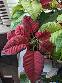
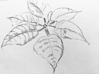
poinsettia line and wash

https://www.youtube.com/watch?v=iPZ5m8z2d_s


for examples of colored pencil OVER the wash:

https://www.youtube.com/watch?v=v-cjKb606vw


You can do line and wash with ink. I used this elephant reference to draw and ink in the wrinkles in this elephant. It is from Unsplash. On cold press paper.


I tried to use colors that I wouldn't use normally, this time quin gold and magenta. Just did a wash. Took about 30 seconds to do the color.


Used the same elephant reference. This time my line was graphite. I started with a normal #2B mechanical pencil. To darken and thicken lines I used a wood less graphite pencil set # 4 and #9 for the darkest.
This one is on hot press paper. I GLAZED over it with pthalo blue on the left and violet on the right. 
Background is quin gold and hansa yellow. 
The effect of the pencil is more subtle than ink, but I liked this a lot. 
Here is a YouTube of Steve doing a goose in graphite.


There are some interesting hints about doing line and wash.
#1 You don't want it to look like this is traced. (Even if you did trace it.) Vary your line. Make your edges interesting.
#2 You can leave some undrawn areas for "lost edges", which can be very effective in creating a feeling of distance.
#3 If using a pen, use different sizes. Also, be creative in your lines. A good guide is a book by Claudia Nice on pen and watercolor. 
#4 You can continue to do line, whether it is pen or colored pencil, even after you have done the paint.


Thursday, May 2, 2024

Mind of Watercolor


Steve Mitchell/Mind of Watercolor

The very first YouTuber I ever followed was Steve Mitchell. He is a complete nerd, even has a skull he's named. Steve Mitchell lives in South Carolina, and has been a professional illustrator and designer for over 30 years. His YouTube channel is mostly watercolor and some mixed water media. He often does spontaneous landscapes out of his imagination. Steve sometimes reviews products (papers, pens, pencils, brushes,etc.) He has a great teaching style, and you can learn all kinds of techniques and tips from him. If you enjoy pen and wash you will enjoy Steve Mitchell. 

He has 2 levels of Patreon: a $3 level and an $8 level. 

$3 level includes:

  • My heart-felt thanks. You'll become one of my Minder Patrons helping me continue to provide regular YouTube video content.

  • Access to the Patreon news feed

  • 24 hour early access to my latest YouTube episode

  • Priority attention given to comments, questions and requests (vs. YouTube, Instagram or even email).

  • Access to the Patreon Member's Posts where you can post artwork and comment on other Patron's posts.

  • Access to Patreon Private Messaging which also receives priority attention over any other form of contact for me.


Many YouTubers, such as Paul Clark and Louise DeMasi will include a sketch and reference if you are a Patron. However, Steve does not. He might give reference materials, but rarely a sketch to copy. 

One of his most recent YouTube's is about a glazing method called grisaille. 

Grisaille is a neutral underpainting to establish values, then glazing over with color. Here he shows how he is doing a twisted branch of a tree.

https://www.youtube.com/watch?v=sNNU0r_ZieI


I've done other blogs on this subject. See: 

a still life in grisaille:


Painting Elvis in grisaille:


In today's project, I started with a very simple still life of fruit and a cloth. 
Here is the reference (my own photo):

Using my Notanizer app, I changed it to see 4 values:


I will use this as a map to paint in my values. Here is where there is a difference between grisaille (that you intend to paint over) and a value study. Any part of this, even if it is darker, that will be pure color, I leave alone. Basically, I am painting in only the medium and darkest values that truly are not a pure color.

I did dab some masking fluid on the highlights with a sponge to get the effect of the skin of the fruit.

You can choose grays (Paynes gray, Janes Gray, neutral tint), browns (burnt sienna with burnt umber), blues, anything for underpainting the values. Some people like to underpaint the shadows in the complementary color. To show the difference, I underpainted one entirely with brown values and the other one with complementary values. (An orange's shadows painted in blue; yellow shadows in violet; green shadows in red; and bue shadows in burnt sienna)

The picture below shows how I've painted shadows and dark values in complementary colors. I have already colored over one of the oranges and the lime. (I still don't have my darkest values in some of the oranges yet)


This picture shows an under-painting that was all in burnt sienna/burnt umber values.
After that was dry, I just took pure color...orange, yellow, greens, and GLAZED over the fruit. I GLAZED over the cloth with cerulean and pthalo. 

Something to note: When glazing with color, apply the paint over the entire piece of fruit, shadows and all. Don't be stingy with the paint. If it is too watery, you may have to darken it later.


If you get the values in the underpainting correct, it practically paints itself.

You can also lift out hilights to give dimension to the oranges and lime.