Daily I see artists struggling with concepts that I either learned or WISH I'd learned early in my watercolor journey. In this three weeks, I hope I can help artists avoid some of the pitfalls so they can progress faster.
This first week is about supplies. You honestly don't need much to begin. But your choices can greatly affect your progress.
Basically you need:
*watercolor paint, six colors
*3 watercolor brushes (about an 8 round, 3/4 " flat, and liner brush)
*100% cotton 140 lb paper
Other than that, you need a palette for your paints; some paper towels or white tissue, water, spray bottle, masking tape, something to store and protect brushes, and a willingness to experiment and make mistakes.
PAINT:
There are HUNDREDS of paint colors and brands out there. Do you choose pans or tubes? Do they have to be professional grade?
I was spoiled by having an amazing teacher when I began. She had us use the right paper and paints right from the beginning. I have my preferences, but to begin USE WHAT YOU HAVE. Professional paints have purer pigments, fewer fillers, and they perform better. Watercolor paints have several attributes that other mediums don't have, besides the "hue" or color.
TRANSPARENCY: This is probably the most important, because it is the transparency that gives watercolor it's glow and beauty. Transparency is labeled transparent/semi-transparent/opaque. It is usually not on the label, but you can get charts from manufacturers that give that information.
SEDIMENTARY: This provides texture. Some paints are not able to be ground as finely as others, which makes some particles heavy, and they granulate. Some of these are burnt sienna, French ultramarine, any of the lunar paints, etc. Professional paints will designate this on a chart.
LIGHTFAST: This means the paint will not fade over time. Some paints (Alizarin, Opera) are famous for being "FUGITIVE", which means they fade quickly. Paints will indicate by Roman numerals I, II, III, or IV, with IV being the least light fast. You want paint that is I or II.
STAINING/LIFTING: Professional paints can be staining or not, and should indicate on the label. Staining paints quickly get into the fibers of the paper, and are hard to remove or "lift." Artists take advantage of this quality in several ways. If they want to glaze other colors over another, and want the under color to not mix or lift, they will use a stainer. If you are doing flowers or a face, and you know you will be lifting high lights, you would choose LIFTING colors. Common stainers are Pthalos and Carbazole.
PIGMENT COLOR: Pro paints will provide the pigment number. This helps in comparing brands, which don't always use the same name as another brand for the same color. For example, French Ultramarine is PB (pigment blue) 29; Imperial Purple is PB 29 plus PV 19 (pigment violet). Winsor Violet is P 23, which is the same as Lucas Dioxazine or Daniel Smith Carbazole.
SERIES NO. You will see a Series No. on many paints. That doesn't indicate quality of paint. Instead, paints are priced according to what it costs to produce. Series one will be the cheapest; series 5 will be the most expensive, because they are made with the most expensive pigments.
INFLUENCE or TINTING STRENGTH: This can be important to remember when mixing colors. Yellows have very little influence, so if you want a green, you will need more yellow than blue. You would start with the yellow and add bits of blue until the hue you want is achieved.
VEHICLE or binder: Most watercolor, except for QoR, use gum Arabic as the binder, or the vehicle which the pigment is ground into. It is also the same vehicle for gouache, which is an opaque watercolor.
BRANDS:
People have their favorites, and you can mix and match them. I pretty much stick with Daniel Smith, Winsor Newton, Lucas, Holbein, M. Graham (which has honey in it), Sennelier. There are some homemade companies cropping up that also do a good job, but they can be expensive.
Student Grade: Cotman by Winsor Newton makes a pretty good student grade of paint. If that is what you have, use it, but gradually add some of the better brands to your list. Student grade will have more filler, less pigment, and miss out on some of the other qualities of watercolor paint.
TUBES OR PANS
My preference is tubes for several reasons. I always have pure paint ready if I need it.(paint in the pan, especially yellow, gets polluted by other colors). It is easier to mix a dark color, rather than struggle to reconstitute a dry paint. I can put the paint where I want it in my palette. Plus I can easily share a color with someone.
Pans are handy and usually cheaper because they have more filler. Often your set places the colors close together, and they get mixed up and need to be cleaned out constantly.
WHAT COLORS DO I NEED?
Start with a "warm" and a "cool" of every primary. In the next week we will discuss the "split primary" color wheel, which will help understand color mixing. Cool colors lean toward blue, and warm ones lean toward orange, in general. Generally speaking, you can make nearly every color with 6 primaries:
WARMS
Reds that lean toward orange (I avoid cadmiums bc they can be toxic. They do now make cad "hues")
Blues that lean toward purple -- cobalt; French Ultramarine)
Yellows that have a tint of orange
COOLS
Reds that lean toward violet (pinks; magenta, permanent rose)
Blues that lean toward green (cerulean; pthalo)
Yellows that look very pure, like lemon
You can prob get away with one yellow if it is not too light and doesn't lean to orange
I NEVER use white or black, so you don't need it.
Many colors are considered "convenience" colors, because they are mixes that are used frequently. (such as sap green). Some you get because you need something either staining or lifting. Some are heavily sedimentary, and you want that look for landscapes. Some are neutrals, such as burnt sienna. Your palette will evolve as you become more experienced and learn what subjects appeal to you.
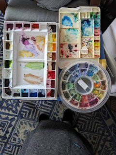
PALETTES
Here are a few I've used over the years.
The first I'd ever painted from (outside of a plastic dish) was the one on the left. The wells are large, and it has two large mixing sections. I still use one like this at home. It allows me to have the colors I need, and to use large or small brushes. An advantage not many consider is that colors don't get mixed up, contaminated, as much as in a palette with smaller wells. Also, the lid has two additional mixing sections.
The one on the top right is a small, about 9 inch, palette. The wells are pretty small. But it does have 5 sections for mixing. I often use this to lend to students.
The bottom is a stay-wet circular one I bought because I thought it would be nice to have all my colors in the color wheel. The wells are nice size. But it has no space for mixing paint. Bummer.
On the left is my most recent palette, a Mijello with 40 wells for paint. I thought I'd at last add some colors I didn't have space for, like some greens. But, alas, when I fold the lid over, any wet paint gets mixed in with paints on the bottom. So sad.
On the top right is one I use for kids and is OK for small items. The daisy shaped one on the bottom right is cute, but I only use it to store odd colors or tubes that I've had to pry open. The very bottom one is a flat tray, originally for acrylic paints, that I just use for mixing space.
I used this one for teaching and traveling for a long time. It has trays that pull out to give 3 large spaces for mixing. It cracked, and the hinge broke, which is a weakness with palettes by Mijello. After that I bought the larger one, above, and was disappointed. So, for traveling and teaching I am going back to this one.
I've arranged my paints, left to right, like the color wheel. It starts on the top left with cool yellow, then to warm yellow, then oranges, then warm reds, then cool reds, then purples, then cool blues, then greener blues, then neutrals. No greens. See those little cups in the middle? They are little containers I use to keep a green or two and any odd colors I want for a painting.
This one works while I'm teaching. But at home, especially for bigger paintings, I like my old big one. I also have a tiny palette for traveling in the car.
BRUSHES
There are many decent brands of brushes out there. I personally like Silver Black Velvet, but Princeton Neptune makes a reasonably priced brush that I like. Some people love the Escoda, but they are more costly. You will get a lot of tips from other students, so be open to that.
To begin with, you only need three. I like a round brush, about a size 8; a flat, about 3/4 inch; and a liner brush for fine details. That is all I had for years..... specialty brushes are cool, but not necessary. If you plan to paint larger, then larger brushes are needed.
Watercolor brushes are generally short handled and designed to suck up moisture and release it. Sable is wonderful, but I honestly like the synthetic or mixed just as well. I like my brushes to have a little snap to them, not to be "moppy."
Your brush should be able to come to a sharp point when wet, with no extra hairs sticking out. It should hold together when wet. As a rule, you should not use watercolor brushes for any other medium, except possibly gouache. (which uses the same vehicle).
You might consider getting two other inexpensive brushes: One is a "lifting" brush...one that is stiffer...to help lift out unwanted paint or to lighten an area. The other is a small brush used only for masking fluid, usually and old brush no longer good for watercolor.
In class I had a set from Emma LeFebvre from craftamo. You can watch a brush demo on craftamo.com/botanical
Cleaning brushes--super easy. Just rinse out with lukewarm water and soap. Bring to a sharp point, then air dry flat. When they are dry, put them in something (brush side up) to protect them.
PAPER
Just because a paper is called watercolor paper, doesn't mean it is any good. Even paper that is 100% cotton and acid free isn't always quality. My preference is Arches, Fabriano Artistico, or Kilimanjaro. For class it should be 140 pounds cold press.
Arches is great because it only makes ONE quality of paper--the good stuff. It will take punishment, any technique I need to use, will take masking fluid and tape and contac paper. It absorbs the paint beautifully, and has the right amount of sizing. I can glaze or lift. If you spend money on anything, spend it on paper.
There are some less expensive papers which I think are OK to practice on because they seem to absorb the paint and give a similar effect as good paper. They either don't lift, or don't take masking, but are OK for other techniques. There may be others but these are the ones I've tried.
FLUID, Bao Hong, Bee 100% cotton
WEIGHT is important. We usually use 140 pound because lighter weights will buckle. 300 pound paper is quite expensive, and requires additional water because it absorbs more.
SOME RULES TO REMEMBER
Over and over again, I hear that the key to mastering watercolor is learning to CONTROL THE WATER.
So most of what I am concentrating on will be how to control and manipulate the water and paint. It takes practice.
The first RULE we talked about was ONLY PAINT ON WET Or DRY PAPER. Ideal wet will be a shiny area, but NOT PUDDLEY. There is a time when the paper loses its shine, but is not "DRY." To tell if your paper is dry enough to paint on, touch the area with your finger tips; then touch some paper that has not been painted. They should be the same temperature. If the painted area feels cold to the touch, it is not DRY.
The second rule we talked about is Water flows from areas of more wetness (like your brush) to areas of less wetness. Paint will not flow to the dry paper unless you purposely put it there. If you wet an area then add paint the paint will be darkest where you first put it down with your brush, then gradually get lighter as it travels down the wet paper.
PRACTICES
First, introduce wet into wet technique, where you wet the paper first, apply paint, then learn to "charge" another color into it. See what happens to the paint in a 'puddley area" and on one that is just "shiny."
Practice controlling the water/paint ration by making lines that start out dark and gradually get lighter. To make it lighter, after each addition of paint, blot the brush on a towel to remove some paint, or add a little water to the brush.
Practice using your brush as a mop for when you have too much paint. Use the brush to mop up the excess paint/water for a more even spread of paint.
The first thing I asked people to do was to play with brushes. See what their brushes can do. Make marks, see how long a line they can make before running out of paint. Practice how much pressure to put on the brush. Try using light pressure, then harder pressure to use the belly of the brush, then light pressure. Use the marks to swatch out some colors.
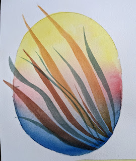
Then practice making "washes." Practice how much water to paint they need. See how to use the brush to pick up excess water and paint. Then make a graded wash in a shape, like below.
When the graded wash is dry, practice painting some long strokes over it, such as in the picture below. These strokes require you to start with the sharp point of the brush, gradually add more pressure as you pull the brush along, then lifting the brush back to the point to end the stroke.
(I'm being sneaky and introducing "glazing" in this one) Notice how the color of your stroke changes as it passes through each color on the graded wash.
(all of these grasses are made with the same brush, just using different pressure)
Here are some short videos that may help, and not be as boring as this:
Mind of Watercolor: Steve Mitchell discusses the importance of learning water control
Emma LeFebvre talks about supplies and exercises--27 minutes
Jackie Hernandez supplies--9 minutes
Kristin Van Leoven 5 things I wish I knew 16 min