Thursday, September 20, 2018

WATERCOLOR PENCILS TECHNIQUES


WATERCOLOR PENCIL TECHNIQUES


Today's lesson was about some water color techniques. Here are some web sites/youtubes
that can help refresh your memory:

Mr. Otter Studio 4 WC pencil techniques

 Bob Davies , How to Use Watercolor Pencils

Bob Davies mallard duck

Frugal Crafter – Daffodil

Julie Davis, Cheap Joe’s--a time lapse 

The name of the book I showed pictures from is Water-Soluble Colored Pencils by Gary Greene. (Northlight Books 1999)


Square 1: color some pencil on the top of the square. Wet it and create a graded wash. When that is dry, try lifting some of it with a stiff brush.

Square 2: Apply dry pencil on the top, and another on the bottom. Wet the colors and blend ink the center. When dry (you can use a blow dryer), GLAZE a third color over it to show that you can create a beautiful glaze.

Square 3: Practice dry strokes: cross hatching, small circles, stipling, etc.

Square 4:Wet the paper. Use sandpaper on a dry pencil to create texture on the square.

Square 5: Sandpaper some dry pencil on a wet square. Then, using a flat brush, drag the brush across the shavings to create an effect that looks like birch tree bark.

Square 6: With a damp round brush pull some color off a pencil. At the top, paint color with it.
Wet the bottom of the square, and pull color off a pencil. Paint wet into wet.

Square 7: With a damp FLAT brush, load color from one color on one side of the brush, and another color on the other side of  the brush. Paint a stroke, like a rainbow, on dry paper. Then try it on wet paper.

Square 8: Create a "Palette" of colors. Just apply dry pencil in a circle, over and over, until you have a thick layer of pencil on the paper. Use several colors. Wet a brush, dip into a color on the palette, and paint as you would regular paint. (In last square)

Square 9: Wet the paper. Draw directly onto the wet paper with pencil. It creates very dark color.

Square 10 and 11: Color a few areas of pencil. Spray with water and let it drip. 

Square 12: Paint in from your palette in square 8.


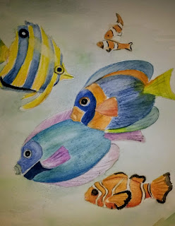
The above picture uses at least five different methods. (1) The background is wet, then color is pulled off a blue and green pencil and applied wet into wet. (2) The blue and purple fish is colored by coloring dry pencil onto dry paper. I have used several colors together before wetting to blend. (3) While the blue fish is wet, I SANDED to create some texture. (4) One the blue and orange fish, I wet the paper, then used two blue pencils to create squiggly lines across left to right. Then I wet over it again to blend a little. (5) I LIFTED hilights on the top of the yellow fish and orange clown fish. 


WHY WATERCOLOR PENCILS?
1.       They are easy to travel with.
2.       Easy to get smaller details.
3.       Can be used dry like colored pencil or
moistened to look like watercolor.
4.       Can make corrections to over-worked paper.
5.       They can be subtle or vibrant.
6.       Use with yupo paper when paint won’t stay
7.       Can draw with them first, then paint over.
8.       Can use in sketch book, and come back a month later to paint
9.       CONTROL over paint
10.   Less likely to accidentally spatter
11.   Paper usually gets less wet.
12.   Can be used in combination with water color, colored pencil,  or by itself
13.   Adjacent areas can be painted sooner bc they dry faster
14.   Very little mess, clean-up
15. Great with kids!


SOME TIPS
1.       Wet from white or light to the darkest to avoid losing whites
2.       Don’t over use the water.
3.       I try to use two or three colors together for more natural color.
4.       Use water color paper

WHAT BRANDS SHOULD I BUY?

You might watch Steve Mitchell's youtube on watercolor pencils. He favors 
       Faber-Castell's Albrecht Duhrer set. I generally use Derwents, often their Inktense line, which dries like ink instead of watercolor. There are several very good brands: Prisma, Caran d'Ache, Kohinoor, etal.  The differences lie in, first, the solubility of the pigment, and second, the intensity of the colors. 
Whatever you use, be sure to make COLOR SWATCHES of your set, because the dry color looks very different from the wet color. You can buy pencils individually or in sets. 

Wednesday, September 19, 2018

Portrait Repair

Here is an example of a painting that needed some help. I started this in watercolor and loved most of it.(first picture) But I'd started this not knowing that this surface would not lift. (It was Arches board). I had used miskit on the hair, and did not like the effect, and could not lift it off.
Someone suggested doing the hair with pastels, which I'd never tried before. So I did.
 (second picture)

I am pretty happy with the result now. My youngest grandson. 


Note pastel used on hair and some of the green shirt.


First Aid for Water Color


Some helpful tips to ‘save’ a painting.

The first 9 are taken from Birgit O’Connor’s article, “Watercolor SOS”, in Watercolor Artist, August 2018, page 20-24. This is just a summary, but see the article for more details.

1.       PROBLEM: Studio Lighting Issues. Birgit O’Connor suggests full-spectrum natural lighting is best, so you want to come as close to that as possible. Use compact florescent bulbs or LED bulbs. Basically, you need a clean WHITE light cclosest to daylight without being too blue, 5000K should be fine.
2.       PROBLEM: Messy, undefined edges. This is a mistake made by painting an area too soon, efore the adjacent areas has had time to dry completely. SOLUTION: walk away and let the painting dry completely. If you need to clean up a messy edge, dry it completely, and use a wet on dry technique to clean it up.
3.       PROBLEM: Trouble determining values. There is a saying: value does all the work, but color gets all the credit. The quickest way is to make a black and white photocopy. (I often take a photo on my cell phone and turn it into black and white.)Or do a small thumbnail sketch in pencil or single paint color, such as gray. The other way is to hold a sheet of RED PLASTIC OR ACETATE over a subject. The red color shows the ranges of values.
4.       PROBLEM: Unintentional blooms. These occur when parts of the painting dry more quickly than others.SOLUTION: allow the painting to dry completely. Then try to lift or soften edges with a melamine foam eraser. Or, while still damp, add more water and allow the puddle to move around the surface to spread the water more evenly.
5.       PROBLEM: hard rings of color. These occur when you apply and reapply too much water, lifting pigment and pushing to edges.             SOLUTION: Dry completely, then reapply color in layers.
6.       PROBLEM: Muddy colors. SOLUTIONS: * DON’T MIX TOO MANY COLORS AT A TIME. * Don’t overmix colors on palette. * Work with the most transparent colors.* Avoid mixing cadmiums, opaques, and earth colors. * Don’t overuse mixed complements. * Be aware that every color has a warm or cool bias. * Allow each layer of color to dry completely before applying the next.
7.       PROBLEM: COLOR MATCHING ISSUES: Each brand of paint may have different names for each color. But also, they may use a different formula for the same name. SOLUTION: learn to read a tube of color.
a.       Pigment code: Tells the pigment(s) name(s) used
b.       Transparency code: Transparent, semi-, or opaque
c.       Lightfastness rating: you want a I or II. It refers to the permanence or chemical stability of a color, especially whether it fades over time with light.
d.       Series number: This indicates PRICE. Series 1 is lowest priced.
8.       PROBLEM: STRAY BRUSH HAIR IN WET PAINT. SOLUTION: Don’t leave it and don’t try to remove it with a fingernail, which can dent your paper. Use a small stiff synthetic brush, like a #3 round, to gently lift it out.
9.       PROBLEM: THE ENTIRE PAINTING IS A MESS.  Birgit O’connor suggests removing all color by placing it under running water using a faucet or hose or submerging it in a tub. While the surface is still wet, use a large soft brush, or Mr. Clan Magic Eraser, to gently wipe surface. If you press too hard you can damage paper fibers.
AND THAT BRINGS US TO THE CHALLENGE: CAN THIS PAINTING BE SAVED?

Here are more ideas you can use when you run into problem #9. You are ready to throw this thing in the trash. But before you do, ask if there is something redeeming about the painting, other than the fact you have poured hours of work into it.

1.       CROP.
2.       SOAK OLD PAINT OFF
3.       WHITE OUT
4.       USE BLACK OR VERY DARK PAINTS TO TURN IT INTO ABSTRACT
5.       USE FLUID ACRYLIC OR GOUACHE TO RECLAIM YOUR WHITES
6.       USE COLLAGE
7.       COVER PARTS WITH RICE PAPERS
8.       USE YOUR COLORED PENCILS
9.       TRY GOING OVER PARTS WITH PASTELS
10.   COVER WITH MAT MEDIUM OR GESSO
11.   RUB WITH A SMOOTH STONE (for paper that has become rough from overuse)
12.   USE IT AS AN OPPORTUNITY TO TRY SOMETHING NEW
a.       Stenciling
b.       Stamping
c.       Gels and mediums
13.   TEXTURIZE
14.   CUT IT UP INTO BOOKMARKS

Thursday, August 16, 2018

PORTRAITS: EYES AGAIN

PORTRAITS: THE EYES

I just finished a great 5-day portrait class with Chris Stubbs, who is from Oregon. I wanted
to share just a few things she emphasized. I have another blog on eyes (see 2017 May 5). So look at
that for drawing tips.

In painting, Chris Stubbs does a few things differently than I did. First of all, she paints the skin tone right over the eye instead of leaving it white. That is because the eye is recessed quite a bit in the face, so is seldom ever seen as pure white. Also, she does quite dark glazing over the face, so in comparison, the eye looks natural without the pure white of the paper.

In doing the first glaze for the skin tone, Chris uses a combination of a red, a yellow, plus Janets Violet Rose, Permanant Green Lights (or Hookers) and some verditer blue as accents. She mixes her base skin tone (such as permanent rose plus raw sienna- Winsor Newton brand bc it is more yellow), brushes it on with a large wet brush, and adds one of the other colors in areas that will either be in shadow or will reflect another color.

In class I showed the difference between painting on Arches cold press (300) and hot press papers. The hot press seems smoother, but doesn't absorb paint in the same way as cold press: can leave hard edges and blossoms. So if using hot press, you can use a LIFTING PREPARATION before painting.
In this one, I used cold press Arches 300 lb on the top; Arches hot press 140 lb on the bottom

You can see that this first layer paints directly over the eyes. You can also see the addition of some blues, greens, and violets in some areas. 


Here I've painted a blue and brown eye for demo purposes. The procedure is very much the same as in my May 2017 blog: 
1. Paint and arc of blue under the top eyelid. Pink the inner eye around the tear duct. Allow to dry.
2. For a blue eye, paint a base of pale cobalt blue teal (I think Chris uses Arctic Blue); for brown, use quin gold as the base; and for green use cobalt blue teal and drop some quin gold in areas. Let that dry.
3. Darken the top of the iris again: verditer blue or cobalt for a blue eye; quin burnt orange mixed with French ultramarine for the brown eye. Pull that color down into the iris. Dry.
4. For all eyes: mix quin burnt orange and French ultramarine to make a dark color for the iris. (You can also use French and burnt umber or another dark combination). Paint the pupil. Then paint the ring around the iris. While it is still damp, use a small brush to soften the inner rim..pull into the iris just a bit. Then Soften the pupil just a bit. Dry.
5. Use a very small lifting brush to lift a highlight on the side of the light source, and a reflection opposite it. In this, my light source is to my left, so my hilight is on the left, reflection on the right.


So here is an unfinished painting I began in the workshop. Yes, I know the hair needs to be finished. 
And the paper I used was not as good as I thought it was (an Arches cold press BOARD, which does not lift.) This is one of my grandsons, Noah. 

So here are some of the tips I learned:

Use a large brush that carries a lot of water at the beginning.
Use paint combinations that are not staining.
Don't be afraid to experiment with color. (Who knew that if you use Quin Coral with green gold, you can get a decent skin tone?) 

Monday, June 11, 2018

Using Grays to Paint Clouds

PAINTING CLOUDS

Following are a few ways you can create cloud effects in your paintings. #1 will be if you have a lot of clouds, but also a lot of blue sky, and need to mask off the clouds.(USING NO MASKING FLUID) #2 will show what to do if you have a lot of sky and only a few clouds. And #3 will show mostly clouds with a few peeks of blue sky.

#1 Lots of sky/lots of big cloud formations.

If you want to mask off clouds so that you have some freedom to wash in lots of sky, here is one way. First, tear some tracing paper in the general size and shape of your cloud. Rip strips of masking tape and tape the tracing paper to the painting ripped side out. (This is to reduce the hard-edged look that masking things off often gets.) Leslie Macracken (who is BTW a man) suggests using a knife to cut the edges of the tape to the cloud shapes. I didn't care about the specific shapes enough to try that.


After I finishe taping, I still wanted to ensure soft edges, so I applied gum arabic (slightly thinned with water) to the edges of the tape and let it all dry.


I used a wash of cerulean and French ultramarine over the sky, painting dark at the top and getting lighter toward the horizon. There is a tiny bit of pink in the horizon too. I chose these colors for two reason. One is that they both lift nicely. Another is that I planned to use cerulean as part of my gray mixture. 
While the sky is still wet, I BLOTTED around the cloud edges. (I'm still trying to prevent any hard eddges that I might have to soften later.)


While everything was drying I washed in a warm wash for the ground, using quin gold and cerulean.


I removed all the tape. And I'm pretty happy with how soft-edged the clouds are.


Then I begin to shade or gray the clouds. Rules of perspective are for skies too. As clouds recede in the distance, they become smaller, less distinct, less detail. Often the tops of the clouds will be more white as the sun hits them, and the bottoms will have the shadow colors. For my base shadow color is mixed cerulean and quin burnt orange. When I wanted to cool it a bit, I added French; to warm it I adde alizarin crimson. 


The painting is about 3/4 complete. I've added detail to the clouds and warmed some in the foreground, and cooled some in the background. I added some trees to the horizon line using quin gold, french ultramarine, and alizarin. The pink in the sky is alizarin. I warmed large cloud at the top of the page with a little gold to tone down the white. 


WHEN YOU HAVE JUST A LITTLE BLUE PEEKING THROUGH

The top of this small sample shows a nice easy way to show little peeks of blue poking through the clouds. Wet the area you want with water. With a little GUM ARABIC in your water, pick up some blue paint and paint into the area you have wet...BUT NOT TO THE EDGE where it is dry. Paint up to the last 1/4 to 1/2 inch of the edge, and let the water and gum arabic carry the paint to the edge of the cloud. It will create a soft edge such as the top two sky areas.

At the bottom is the gray I used with a little gum arabic in the paint. You can see how the gum arabic makes it disperse differently especially on the right.


The top of this picture I put a horizontal line of gum arabic from the jar. Below that I painted some blue and let it wash into the gum arabic area.
On  the very bottom of the picture I just painted blue, and while wet, lifted the small cloud with paper towel and thirsty brush. You can also drip water and create a backrun for small, wispy clouds. 


Thursday, May 31, 2018

More than 50 Shades of Gray

EXPERIMENTING WITH GRAYS:

This is a really bad photo.

I found an article in Watercolor Artist magazine, April 2011, by Lauren McCracken about using grays. I don't find myself using many grays, but there are times when you want a lot of gray tones, and a variety of them: painting silver, large billowing storm clouds, chrome, ocean foam, glass and crystal, white flowers, ocean waves. Lauren gave some great suggestions on developing grays that you like.

So make a chart of grays you can make yourself. Divide a piece of watercolor paper into squares and separate them either with tape, miskit, or some other way. Mark the top of every other column with cool colors you want to try. I used cerulean, cobalt, veridian, and French ultramarine.

One the side mark it with reds/oranges that would be close complements of those colors. I used (from the top) Quin burnt Orange, Quin burnt scarlet, Burnt umber, Alizarin Crimson, and Burnt sienna. Use what you have! Try Prussian blue, Winsor Blue, or Indigo or indanthrone if you have them. Use coral or other reddish colors with greens. You can try purples with yellows too. Find the colors you like as grays. (Some will NOT be attractive grays).

In the left square put a dark mixture of the gray; in the one to the right put a very light,watered down version of that color. My chart is obviously not completed. It will probably extend to another piece of paper, because I have several combinations I'm eager to try.

Notice which grays are granular. You might not want that on a silky smooth flower, but you might love it on rocks or wood.

Lauren McCracken goes a step further and creates a separate palette of six favorite grays by mixing quantities of favorite combinations. (for example four parts of cerulean with one part Winsor Newton light red, with just enough water to allow it to mix thoroughly). That way she can start with the exact shade, then cool it with a blue or warm it with a red.

MORE STUDENT BRAG

Here are a few more student paintings finished today: