Tuesday, October 25, 2016

SEA TURTLE


TO PAINT THIS SEA TURTLE

I got the reference photo from UNSPLASH from the pixabay
web site, which offers public domain photos. If anybody has other
public domain references that they like, please let me know.


First, sketch the turtle on cold press paper and miskit out the
white lines on the shell an flippers. What you see in gray
is where I put miskit. In this example, I applied miskit with a color
shaper, made for pastels. You can also apply with a soapy brush. I have since
discovered that an inexpensive Polar Flo by Creative Mark works very well also.
Do not mask out the underbelly of the shell.


I wanted to play warm against cool colors. I wet the shell completely, and starting at the bottom
rim, I painted in with quinacridone gold, quin burnt orange (or any brown/orange like burnt sienna),
and magenta. As it dried, but had not lost its shine, I added pthalo blue around cracks in the shell where it would curve under a bit. You can salt a bit for texture, or spritz speckles in it as it dries.


While the top shell is drying, softly paint a warm neutral color for the spots on the 
underbelly. Avoid hard edges here. While that is drying, begin the head area. The colors I used
were: Pthalo blue, quin magenta, and some quin gold. I was aiming for a bright, multi-colored
cool for most of the head. Avoid painting the eye yet.


Finish all the flippers with the same colors you used in the head. You want strong color
on the leading edges of the flippers. (Miskit is still on everything.) Notice that I salted the shell
in the first step, and the colors are faded on the top shell.


Using the same colors as before, I glazed over the top shell until I was happy with
the amount of glow. For the underbelly, under the mouth, and underpart of the far
right flipper, I glazed over with cobalt teal blue. I used this instead of a watered down
pthalo (which is OK to use) because it doesn't get dark, and it lifts better than pthalo
if I want to make it softened later.


Remove all the miskit. Whoa! Bright white! Paint in the eye using dark blue
and purple, leaving a spot of white.


Decide on a few bright whites you want to keep, and glaze over the head,shell, and 
flippers with water, letting the paint move lightly over the whites to dull them down
a bit. Strenthen any darks you see under the shell (near the back flipper) etc.
You can paint thin light lines on the far right flipper, just faintly.


This is one way to create a watery look. In class we will investigate several ways.
I covered the entire turtle with contact paper (clear), and carefully cut around the
shape of the turtle with an exacto knife. Then I pulled away the background, leaving
the contact paper on the turtle. 
IF YOU DON'T WANT THE PAINT TO BLEED over the top shell, apply a thin line of miskit on
the paper above the shell.

I made puddles of several blues,( including cobalt, pthalo, and cobalt teal) on my palette, with a bit of
green gold. I wet the background (trying to be sure my contact paper was secure)and then laid in
washes of the blues. While it was still shiny, I wrinkled some plastic wrap and laid it on top of the wet paint. Then I watched it dry.
If you think it is drying too hard edged, remove the plastic and sprits a bit in places it is getting
too hard edged.

I MADE A MISTAKE ON THIS ONE.
Which is nothing unusual. I did not miskit the top, and some of the blue from the background seeped under the contact paper. It created a blue-ish backrun on the top of the shell, just where I wanted a
nice light glow. I just waited for the entire painting to dry, lifted a bit, dried it, and painted some quin gold over it. 

WATER COLOR CLASSES SOON!


(student work, sixth week)


(student work, first week)

    
SIAG IS NOW OFFERING WATERCOLOR CLASSES

Chris Campbell will be offering watercolor classes beginning Wednesday, November 2, 2016.

Dates: Nov. 2, Nov 9, Nov. 16, (off Thanksgiving week) Nov. 30, Dec. 7, and Dec. 14. (off for Christmas Holiday)

Location: SIAG Studio, 2nd and Main, Aurora, IN

Time: 1:00 – 3:00 p.m.
Studio Open: 12:30 – 3:30

Cost: $75 for six weeks or $15 per lesson. (Please add $5 supply cost for each lesson if you use instructor supplies.)

Focus: Creating texture, controlling paint and water, good composition, mixing color, experimenting with papers and brushes--using fun, flexible projects adaptable to any level of ability

This is open to beginners or intermediate painters, or anyone who wants to expand his knowledge of papers, paints, and textures.

For more information contact Chris Campbell, mamalovesart@gmail.com
Or call 812-221-1252 to register and receive supply list.

COME PAINT WITH US!


(Space limited)

Friday, September 9, 2016


THE OLD RED BARN

Copy the pattern onto cold press 140 pound watercolor paper.


One “rule” of landscapes is to work from your largest shapes to your smallest.

This is started with wetting the entire sky with a large 2” brush. While wet, I washed in the blue of the sky, mixing cobalt teal blue with cobalt. (you can try other combinations) Some of the wash went over the roofs of the barns, but that is fine. I lifted out some clouds with a thirsty brush. Then I dried the picture.


Step two was painting in some green for the grass area. It is very easy, if using wet-into-wet, for the grass area to start to look like one big green pond. So you need to have three things to prevent that: direction, variety of color, and texture.

I chose a wet-into-wet start, although I could just as easily have done dry brush. I wet the grass area, and dropped in raw sienna, French, pthalo, and new gamboge. I tried to direct the paint in a diagonal away from the barns to create some direction. As it began to dry, I spattered a little. While wet, you can scratch in some suggestions of grass or pull out some whites with the side of a credit card.

When painting a field, you have to remember that grass, like other things, follows the rules of perspective, aerial (atmospheric) perspective. The main things to remember are:
The more distant, the smaller things appear; color becomes more muted and cooler (bluer) in appearance; and details disappear. So grass in the foreground will have more detail and cleaner color.  HOWEVER, keep the “pretty” color near your center of interest, not going off the page.

The field, rather than be a flat plane of color, should be used to subtly move your eye through the picture, through shadows, color change, texture, etc.

When your grass is dry, you can dry brush, gliding the side of a large round brush across. You can dry spatter. You can also use a fan brush to pull wet paint up into blades of grass.

When the grass is dry, work on the barns. Light is coming from the left side, so that side of the barn has the purest color. It is painted with red mixed with burnt sienna. The side of the barn is the same, only deeper color and mixed with some French ultramarine. More ultramarine is added just under the eave of the roof to add some shadow.

The top of the rear barn is painted the same, except more muted in color because it is further distant. The bottom is raw sienna. (later muted with a thin glaze of blue) The smallest building is painted with a glaze of purple, darker in the shadows.Its roof is a dirty green, shadowed near the red barn with burnt sienna.

The roofs of the barns are a wash of cobalt with some pale cool red, muted with some raw sienna. While wet, you can scratch some lines in the roof to indicate the metal roof. Just don’t make stripes, just indicate some lines the parallel the roof edge. Be sure the angle is correct. The rear roof is done the same, leaving white where the sun causes a glare on the roof.


THAT IS AS FAR AS WE GOT THIS WEEK. HERE IS HOW WE WILL FINISH THE PICTURE:


The doors of the barns are done with dark mix of burnt sienna, red, and Pthalo blue. It is darker at the top of windows and doors because the light hits the lower areas but not the tops. Paint the windows with a dark mixture of Pthalo or French ultramarine with burnt sienna. You can indicate more barn texture if you wish.

Finish the clouds by lifting off additional color gently, then shading the bottoms with a violet mixed with whatever blue you used for the sky with some cool red. 

There are vents in the roof of the closest barn. Darken the left side and bottoms for shadow. Then
create a long shadow underneath the vents to the edge of the roof with a darker gray mixed from the
same roof colors.

The front barn sits on cement blocks. They are painted with a raw sienna on the outside and the shadowed side, underneath teh barn, is darker, burnt sienna with blue. In one part you can see grass
growing underneath the barn.

To finish up the grass, spatter some texture in the foreground. Spatter the road, if you made one.
Create some indications of grass, especially on the edge of the road.

Lightly with a fine brush paint in the lightning rods on the roofs. These should not be very dark, nor 
get too much attention, so blot them if they seem too dark.


Sunday, August 28, 2016

EXPERIMENTING WITH GREENS


EXPERIMENTING WITH GREENS

Why green? Because you can hardly paint anything without needing a good green, but it is SO easy to kill your painting with too much or too boring a green. 

Here is a way to discover the world of greens without making boring color swatches.

Start out with an abstract drawing as in my April 13 blog.
Use triangles, circles, squares, of all sizes overlapping them until they make an interesting drawing.

Instead of using primary colors, as in the April blog, use three blues and three yellows. Try phthalo, French ultramarine, cobalt, Cerulean, or manganese for blues; hansa, new gamboge, cadmium yellow, quinacridone gold, or even raw sienna for yellows. (as long as there is a variety of warms and cools of both colors)

STEP ONE

Wet one of the larger shapes and paint it wet into wet with pthalo.
While wet, drop (“charge”) one yellow into one corner, another yellow into another corner, and a third yellow into another area. Allow the center to remain blue.

Repeat this in two other shapes, using a different blue for each base.

You should be able to see what kind of greens each combination will make.

STEP TWO

Wet a shape with one of the yellows. Then drop each of the three blues into
the yellow to see the reactions.  Allow the center to remain yellow. Repeat for the other yellow shades.

You should now have six shapes colored in.

STEP THREE

Wet a shape. Drop a blue in one area, and yellow into another. Then add
either a red, orange, burnt sienna, or purple to see what happens to your green.

Experiment with other shapes.

STEP FOUR

Hopefully you have at least six shapes left. Leave at least three small shapes
to the end.

In at least three shapes, choose to make three or more different greens and mix them
On your palette instead of “charging” wet-into-wet.  This will give a very flat appearance
Compared to those done wet-into-wet, but it makes for a good comparison. Sometimes you want a flat effect.


STEP FIVE

Finish up your painting leaving some white spaces and using reds or oranges to fill
in some small spaces. This will accent your greens. Use these complimentary colors to make your design have some “pop.”

(I think my example looks like a cubistic monkey~!)


LAST STEP:

Top it off by glazing over areas with a stripe of red, orange, or violet. Notice how much it neutralizes the greens. 


Friday, August 19, 2016

Anonymous


This is the not-quite finished version of the painting I did for CASA's Addiction and Recovery show. I showed it also at the Regional Show, but I meant it for the CASA show. It is called Anonymous, not Faceless. It's about how addiction affects all of us, even if you don't think it does. Those who are trying to recover are part of N-A or AA; those of us who love them are part of Al-Anon or Nar-Anon, both of which encourage anonymity: the mask. The rainbow face represents those who are trying to fight stereotypes of drug users and become a more public face, making the community notice and become aware of what needs to be done to face the problem. The eyes, almost but not quite black, each have a spark in them to represent the hope for recovery. One mask has real eyes, representing regaining a real and meaningful
life again.

Hummingbirds

I have been wanting to paint hummingbirds for a long time. When we were in Florida, we saw these flowers at my brother's house (actually, all over Florida), so I figured I could combine the two. This is a yupo, a fluid acrylic background with watercolor. It was in our Regional Art Show August 20.
It's about 11 x 15.

Sunday, July 10, 2016

TWO ROSES DEMO

Here are the steps to completing the rose painting we started in class. 


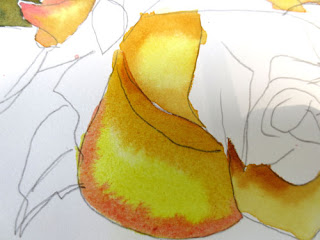
In the first picture we had already copied the picture. You can see where we applied cobalt on the red rose on areas that would face the sky. We applied some quinacridone gold on areas of the red rose that will be the warmest, the areas nearest the heart of the rose.


On the yellow rose, we wet each petal, one at a time, then painted some hansa yellow (or another cool yellow) in the center of the petal. Then we applied quin gold to the center, warmer part of the petal, and some red along the edge. The red is a thicker when it is painted in. Remember, the wetter the paint, the lighter it will be when it dries. 


While it is still wet, apply more red to the outer edge and more quin gold to the center. 


Use the above technique on each petal, one at a time, working around the rose so that you are never working next to a wet petal. I like to leave tiny bits of white on the edges of some petals. This just gives some sparkle to the painting.


In this picture, I have darkened some of the red areas and added more quin gold to the deeper or shadowed parts of the yellow flower. I am using Quin Gold because you can get a deeper value in the shadows than other yellows. Remember, you can't get a darker value than the color that comes straight out of the tube.

You can see in the red rose that I have begun to add reds to the petals. Where we had underpainted with gold, the colors look warmer, and where we underpainted with cobalt blue, the colors look cooler.


In the above picture I have finished washing reds over the entire rose. I've added some darks to separate the two roses even further on the very bottom red petal and on the very top. 


To paint the leaves, I wet the leaf and put a light wash of cobalt blue.


I then applied quin gold over the cobalt, adding in a dab of red on the most shadowed parts of the leaf and yellow on the tips that would get more sun.


Next I painted the rose bud, wetting it all over, then just applying red on the outside and letting it blend into the center, keeping the center fairly white. When it dried, I added a thicker blend of red to the center and shadows.


After I was sure I had all the paint where I wanted it, I began to gently lift in places I wanted to have highlights or be softened, especially where the petal might curve. 

I added a background because I could not get some pesky spots off the white paper. I just got a large area wet, washed in some cobalt, and added some watery reds. Then I created some "blossoms" by dropping water drops into paint that was almost but not quite dry.


Last picture! The background didn't hide those spots well enough, so I added two leaves under teh red rose. I blushed on some red in parts of the yellow rose. Then I discovered I'd completely left out one of the petals! (See if you can tell the difference!) So Ipainted that in too. Voila! Done at last!

Tuesday, July 5, 2016

SNOW SCENE


The purpose of this lesson was to experiment with a different paper - 300 lb arches cold press-- and to discover different ways to preserve whites.

We started with masking tape, and tore strips of it down the long sides to create tree trunks. We used smaller ones for branches. We also experimented with ironing on strips of white freezer paper (waxed on one side.)  Most of us discovered that the roughness of the 300 lb paper doesn't allow the freezer paper to stick as well.  (in the picture above I've done the same thing--you can see the blue tape--but I've started a fall scene. Just ignore the paint and see how we taped off trees and grass)

Then we used Contact Paper to cut out the shape of a little cabin in the background. Then we spattered some snow with miskit. All this before we even picked up a brush to paint!


Leaving on all the tape and miskit, we used a combination of ultramarine blue, burnt sienna, and a bit of red to wash in  a dark sky. The darker the sky the more the snow shows up. While the paint was wet, sprinkle a little salt into the whole area. After all that was dry, and salt was scraped off, we created a little bit of background bushes behind the trees and cabin using the same mixture, only adding a bit of green to it. We kept it very soft to imply distance.

After drying, we removed all the tape, contact paper, and miskit. Then we began to work on the trees.
This picture above shows about how far we got in the class.

To create tree bark, trying for an aspen type of tree with white bark, we used ultramarine blue and burnt sienna again. We applied about an inch or two of paint on one side of the tree (in my case, the left side) and scraped it with a cut up credit card to create the bark.


In the next class we just have a bit to finish up. We'll finish the trees. The barn/cabin will be painted with a little red toned down with the blue/burnt sienna combination. The siding will be created by scraping the credit card into the wet red paint. We will shade small mounds of snow and make the trees look like they are attached to the ground. And for the last step, we will spatter white guoache for a little more snow effect. 


Wednesday, June 15, 2016

Orchids and Strawberries

Two paintings recently finished and put in the June art show at Greendale Cabin.


Our art guild, Southeast Indiana Art Guild, hosted a special event today at the Greendale Cabin. Steve Harpster, a Cincinnati cartoonist, gave a great presentation to local kids. With Steve's unique style of teaching, he had kids from 4 to 14 drawing successfully and loving it. He starts with a letter or a number and teaches them step by step how to turn it into a cartoon. I was so pleased that we could bring him to our community.

Anyone interested in seeing videos of what he does or buying his books can view more at harptoons.com.


Saturday, June 4, 2016

Special Olympics 4 letter Words

The object of today's Special Olympics art program was to think of a 4-letter word that represents you and paint it in complimentary or opposite colors. Got this idea from a lesson Pat Hunger did in school when teaching about Indiana artist, Robert Indiana. I love what the kids came up with.

I have to say I absolutely love teaching this class, and can't wait to do it again, hopefully this fall if we can coordinate everything. And many thanks to Jodie Cole and Marlene Green for their help. They worked so well with these students!


Friday, June 3, 2016

NEGATIVE PAINTING FINISHED


Here is where I left off on the negative painting, with the background painted (in this case with blue tones to emphasize the warms in the leaves). Note that it does not have to be all one color, just so that the colors flow into each other.


Next I darken some areas behind the leaves to emphasize the ones I want to be important. (notice the rounder leaves on the left) To separate shapes, where one leaf or stem is on top of another, I paint beneath or behind the upper leaf, painting the shadow of it onto whatever is underneath it. Since my underpainting is dry, I can still use wet into wet: wet the area to be painted, brush color into that area, and use a clean damp brush to soften the color away.


Now I want to do some clean up with my lifting (scrubbing) brush. On narrow parts, like the stems, I can put masking tape on each side and drag my clean wet scrubber brush across the area to make it lighter. I have also softened other areas on the leaves that I think are too dark. (This is old paint, so it did not lift as well as newer paint.)


I needed the leaf on the far right top to become much less important, so I used a green grayed with orange in it to color that leaf. It's usually not a good idea to have the white running off the edge of your painting. I added some detail, like veins in some leaves. You can add as much detail in your painting as you need, but I liked this without much detail at all.