Sunday, April 29, 2018

SKIN TONES


FIRST, A BRAG OF THE FINISHED/ALMOST FINISHED PIECES FROM CLASSWORK:


PAINTING SKIN TONES

There are as many ways to create skin tones as there are people, I think. Every artist has his own methods of doing things. I'm just going to show a few ways that have worked for me. I did not invent any of these, and where I remember names, I will give credit to the artist or book that I have found useful. 

One of the simplest ways to achieve a skin tone is through glazing. (Glazing is merely applying color, letting it dry, and then applying more color over it, in thin layers.) Let the following picture illustrate,
using just three colors: new gamboge, permanent rose, and cobalt.


First I glazed over all the face with yellow, keeping it more watered down on lighter areas, darker in areas of shadow.  After that dried, I glazed over the RIGHT HALF with permanent rose. (I left the other half so you could see the first step.) After the permanent rose dried, I used cobalt in some of the shadow areas. You can glaze these colors over and over again without getting muddy. 

I don't usually do it this way, but I do glaze toward the end of the process. 

Here is what Chris Stubbs recommends for creating skin tones. On a quarter sheet of paper or larger, make a dozen squares. Choose the colors you want to try together and write them underneath. Then blend the two or three on the left together in different strengths, and on the right of the square add a blue/violet/or other neutralizing color to see how it shades the skin tone. 


Here is one way I experiment with color. I divide an oval in half and put four squares on the outside. I label one top square one of the red colors, one a yellow color. Underneath I put one color I can use to "warm up" the skin tone, and one I can use to neutralize, like a purple, blue, paynes gray, etc. 


NOTE: I did these samples WET ON WET on the paper, instead of blending the color on the palette.
That means wetting the paper with water before adding the paint. 

Skin tones for light skinned people fall into three categories: fair (with bluer tones), yellow toned, or olive. 

In the top left (dark tones) I used Quin burnt scarlet and raw sienna as the base. I used Cobalt violet and paynes gray to darken and cool down shadow areas. The top right is burnt umber and burnt sienna with carbazole and turquoise for cooling down and darkening the tones.

Bottom left base mix isrose madder and hansa yellow, with quin burnt orange to heat it up, and cobalt violet to cool it and shade. The bottom right is a base of quin coral and new gamboge with quin burnt scarlet and rose of ultramarine. 

These are only a few combinations to try. I want students to see what they can make using what they have, not to go out and buy the "perfect" color. Use a red and yellow for the base; experiment with blues, violets, and even greens for shadow.

USING A "VIEW FINDER" TO HELP DETERMINE CHANGES IN SKIN TONES

Using a photograph is usually going to distort actual color, but it is helpful in determining whether an area of skin is coolor or lighter, and also how much the value might change. To make one, just get a very white sheet of paper, poke a hole or two, and hold it over an area to determine actual color. You might be surprised at how blue or how green some can appear to be. The white isolates the color so you can see it clearly.

My husband came up with the idea of using a viewer made of your watercolor paper, then painting right onto it to try to imitate the skin color.


But this also illustrates a point. Color is relative to what you see next to it. In the portrait below, I accidentally made the child's forearm far too dark a red, especially compared to the pale of the rest of her skin. Instead of trying to lighten it up, I made the webbing of the chair next to her arm a very dark, bluish red. That created a strong enough difference that the arm looks natural. Had I used a green color in the chair, the skin would have looked disasterous. 

So in most cases, your skin tones do not have to be perfect.They are going to change anyway due to light changes, reflections of clothing, and other influences.  They just have to be believable. 


GREAT REFERENCES ON CREATING SKIN TONES

Steve Mitchell on Mind of Watercolor youtube did a great tutorial on blending colors. He uses different colors than I do, which is fine. Use what you have and see what you can create. 

The Watercolor Bible has a really nice suggestion for blending colors. They use a base of a red and yellow in a central oval; then that blend is combined with lemon yellow in one area, cad yellow in another, and cad red. On the bottom it combines the base with cobalt blue, paynes gray and viridian. (green)
I don't want to post a picture of it because it is copyrighted.


Jan Kunz has a great book called Painting Watercolor Portraits that Glow. She gives great information on color.

TRY THESE COLOR COMBINATIONS:

naples yellow or yellow ochre with cad red deep  (or another cool red, like alizarin)

sepia or raw umber with burnt umber and dioxozine violet

burnt umber and nickel azo yellow

permanent rose and hansa yellow (or lemon yellow)

Vandyke brown , quin gold

quin magenta and yellow oxide

THINGS TO AVOID WHEN DOING SKIN:

Some colors are very dull by themselves, and should have a brighter color added to them. Burnt umber, raw umber, yellow ochre, paynes gray, indigo are some of these. Also be careful of using sedimentary colors in a face, especially in women and children. 
.

Monday, April 23, 2018

Painting over the Miskit Background


THREE STEPS FOR FINISHING THIS PROJECT

The first is to SELECT A PATTERN with good negative shapes that will go with your design. Don't get too hung up on whether or not the white streaks match up with your design. DRAW THE DESIGN on tracing paper. This allows you to see the colors beneath the drawing and move the design around on the paper for the best composition. It allows you to see if you want to make changes in your design. Using tracing paper isn't necessary, but it is helpful.


When you are happy with your design DRAW or trace it with graphite paper onto the background. I often use a light box, but sometimes the background design keeps me from seeing it clearly. (You can barely see it on this picture below. I've changed my pattern to add pears instead of apples on the top of the basket, and I've removed small details from the reference.


STEP TWO: Paint in negative shapes. They don't have to be super dark right away, but dark enough to find your way through the picture. Painting in these negative shapes will help you "see" the picture better. In this student work she painted in the areas behind and between the grapes, and behind the right side of the basket. (I love those grapes...they look good enough to eat!)


STEP THREE: Painting the positive shapes. Now you can start to paint in the positives: giving the grapes color, along with the other fruits. I had a dark spot inside the pears that I lightened with water and a sponge before painting so that some of the yellow would show up. 
Don't get rid of all your lovely whites!

(picture isn't finished, but shows negative shapes done, and most of the positive forms ...fruit, basket, etc.....begun. 

None of these are finished, but I'm so pleased with some of the student work, I wanted to show it.And I love the diversity of the subject matter.


Monday, April 16, 2018

USING MISKIT AND OTHER MEANS OF SAVING WHITES


 Pictured are just a few ways of applying miskit: credit card brushes soaped to keep clean, palette knife, and silicone tips (on the end of the brush in front)

In watercolor, preserving the whites of the paper is important. You can always go back and remove whites, but rarely can you get that sparkle back if you lose it. So here are a few ways you can preserve some whites in your paper.

USING MISKIT:

Masking fluid has several names: Pebeo, miskit, friskit, etc. It is a latex liquid that preserves the whites of you paper and is removeable after it is dry.

The good part of masking fluid is that it leaves crisp, hard edges. And the bad part is it leaves crisp, hard edges when you don't want them. All is well... they can be softened.

Materials for using masking fluid are: masking fluid, soapy water (or liquid soap), and an old brush that you won't use for anything else ever.  Pour the miskit into a small container and shut the container. Wet the brush, apply some soap,dip it into the miskit, and brush it on. Using a fine brush for miskit is great for strands of hair, fur, and other fine work. The thicker the brush, the thicker you lines will be.

For larger areas miskit can be applied using a number of supplies: silicone shapers, palette knives, drafting pen, bamboo sticks, sponges, etc. The advantages of those others (not including sponges) is that you can let the miskit dry on the applicator and it will just peel off and not damage anything. The palette knife can also be used for fine lines as we did for the tree branches with paint.

Some miskit comes as a pen form. Daniel Smith makes it with tips. (I have a review on that from last fall) I liked it until the tips clogged. After that I was forced to apply it with a brush or other tool.

CONTAC PAPER:


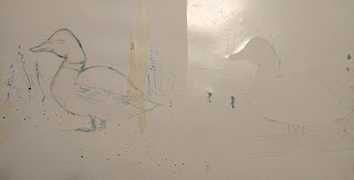
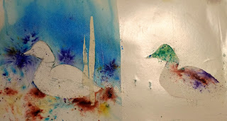
This pic is a little hard to see. It shows contact paper used to cover the duck on the left, so that I have freedom to work with the background. On the right the background is covered to allow freedom to work on the duck.

The one on the left also shows miskit applied to some grasses with a brush and palette knife. The feet are masked off using the silicone tip (shaper), and some dots of it are spattered in the foreground. I wanted to show masking tape also, on the right of the duck.

Reasons to use:
     1. You have a large area of white you want to preserve, like a sky (see duck on left)
     2. You have very precise edges of something you have painted that you want to protect.(see duck on the right)

There are two basic ways to use contac paper. The first is to trace the shape you want to preserve onto the contac paper and carefully cut it out with scissors. You can cut it to the exact edge if you don't mind a little bleeding of the paint. If you want very precise edges, cut a little larger than your shape. PRESS THE EDGES down with a flat object like a credit card. Then SEAL the edges with a line of masking fluid.

The second way to use contac paper is to cover your entire area with it. Then, with an exacto knife, cut around the shapes you want to preserve. Press the edges down with a credit card.  Again, if you don't want any bleeding of the paint, seal the edges with miskit. SEE THE TURTLE PAINTING from my blog on 10/25/16.


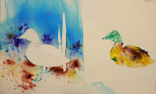
On the left, where only the duck was masked off, I was free to experiment with the background. In this case, I wanted to play with Brusho. On the right I was free to use Brusho on the duck without risking it getting into my background.


Contac paper and other masking removed.


PACKING TAPE:

You can use packing tape as you would contac paper. Sounds scary, but for smaller objects, it works well. The advantage of contac paper and packing tape is you can see your drawing/painting through it. This only works on 100% cotton paper. I've tried it on some others, and it can leave a residue on papers that are not cotton rag.

MASKING TAPE:

Masking tape can be use to seal off edges around a building or roof or any area you want to be straight. You might get a little bleeding, but it will be less if you press the edges well.

By ripping down the sides of the tape, you can make more ragged, uneven edges, like a tree trunk.  These will be softer edges in a way because they are torn, not cut.

You can also cut shapes either with scissors or exacto knife, just as you would contac paper. You just can't see through it.

BUTCHER PAPER:

Joye Moon uses butcher paper, that heavy white paper with wax on one side. You cut it to the shape you want and IRON it onto your paper. I think it bleeds too much and it peels off when wet. But maybe I am just doing it wrong.

WHITE OR CLEAR WAX CRAYON:

Some people use a white or clear wax, like Susan Schewe's product, to keep the whites, especially the sparkle on water. It is not removeable, however.

NON-REMOVABLE MISKIT

See my blog from last summer/fall on this product.

GUM ARABIC:

See my blog from last summer/fall on this product.It works well as a temporary mask for soft edges, like a moon. You apply it over the area you want to remain white, just using a brush, no soap needed. To remove it, just wet the area with a brush again and blot. I believe Turner and other early water colorists used it for moons, waves, and other areas they wanted preserved.

You can't put layer after layer of paint over this, though, as the constant brushing with water will loosen the gum arabic.

Thursday, April 12, 2018

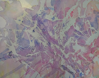
Drizzling Miskit for Background

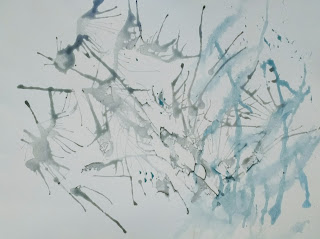
Today we prepared paper to do a Stephen Blackburn style painting. 

STEP ONE: DRIZZLING MISKIT ONTO THE PAPER

You can use cold press or hot press, at least 140 pound paper.


Pour a small amount of miskit into a container and begin to drizzle the miskit onto paper. It helps to hold the paper at a slight tilt to encourage the miskit to move. Use a straw to blow the wet miskit around. Slightly spritz with water to get the miskit to spread in tendrils. (You don't want to soak it, just create little paths for the miskit to travel in). You can also use a dropper or you can move it around gently with a palette knife. You can even spatter some miskit with a toothbrush if you choose.

Let this dry completely. DO NOT USE A HAIR DRYER ON THIS. Masking fluid is generally made of latex, and using a dryer, especially on high, can make it permanent and non-removeable 

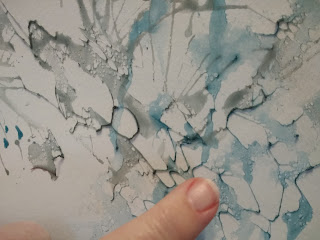
After it is dry, if you feel you have too much miskit, or you want to break up some globby areas (yes, "globby" is a technical term), use your finger or miskit remover (I think it's called a rubber cement eraser) to create some little holes and passages in the miskit. 


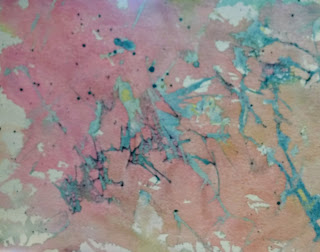
Mix three small cups (like baby jar size) of watered down paint: one yellow, one red, one blue. The ratio would be about 3-4 T. water to a small dot of paint. The paint should look a bit watered down, but not so watery that the color is too faded. 


Spritz the paper slightly, and, over a sink, start pouring the paints onto the miskited paper, one at a time. I usually start with yellow, swirl it around a little, then add red and let them mingle. You want some areas where the color is pure, some where they have blended. It's a good idea to dry the first two colors before adding the third so your paints don't make brown. Experiment. This is supposed to be FUN!

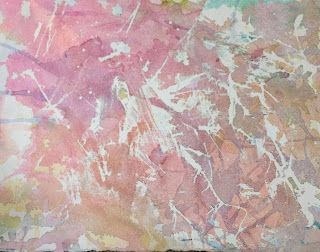
When the paint is completely dry, remove the miskit. Your color should be medium to light on the value scale. And you want lots of white left on the paper.


For some reason these two examples look darker than they really are. The top one is 300 lb cold press; the bottom one is 140 lb hot press.

To see a bit more about this, you can look at the link to Sandy Maudlin's blog on the right. Looke for a giraffe painting on 2/15/10 and a daffodil on 2/26/09.

Next step is to find a picture that you can paint over this background. Look for simple shapes if this is your first one, with interesting negative shapes you can paint. 


Wednesday, April 11, 2018

Finished Tree with Rocks


Finishing the tree and rocks.

To finish the trunk of the tree, I added some French ultramarine to shadow it and darken a few areas. I also added a little French into the water area. I sponge painted the yellow, then orange, then red in the trees, drying between each color, and then spattered and sprayed in areas. I sponged some dull green in some of the background areas to push them further into the background.I also dry brushed some of the green in the farther shore (Had to keep it a dull green so it didn't come forward)  I strengthened some of the rock shapes and washed some watered down coral over them to warm them up a little. Finally, I spattered the foreground. 


STUDENT WORK

Sometimes I am jealous because the students' work turns out better than mine!
Here are two. The top one is finished, done very loosely. Love it! The second one
also stayed quite loose and used hogs hair brush to get some texture in the lower bark.
(Thanks for letting me show off your work!)


Sunday, April 1, 2018

ROCKS & TREES TOGETHER


The reference for this picture came from this photo, from a free web site. 


I cropped and simplified the photo to come up with this sketch.


Continueing with the idea of doing a value study, I found my darkest darks first, marking those with pen. This time I went to some of my medium values and penciled those in. (This is not
a complete value study, just beginning.) I marked where there are darker values in the leaves and sky.


This picture shows the subject drawn onto my watercolor paper. Using a brown watercolor pencil, I put in my darkest darks. CAUTION: Do NOT put them in with a heavy hand. Even though these will be my darkest darks, I am mostly using this to help me find my way through the painting. 


I used watercolor pencil for several reasons. I wanted to offer an alternative to painting the darks. Some people are more comfortable and less threatened by the pencil.They can take their time with it.  I also like the texture the pencil gives to the trees and rocks.  

I also limited this to two colors, to take the focus away from "What color do I use?" and allow for more focus on finding good values and shapes. I chose burnt umber and either yellow ochre or raw sienna mixed with a little yellow. 

After painting (or penciling) in the darks on the tree and rocks, using a damp brush, loosen some of the paint (or pencil) from one side of the rock and soften it onto the shape behind it. This should leave one hard edge to define the shape of the rock, and a soft edge to help color the shape behind it. 

I ran a damp brush over the entire tree, which loosened some of the pencil and made a light wash on the trunk. Using raw sienna, I painted the smooth water of the creek. Then using a sponge, I sponge painted some of the foliage in yellow ochre. When that dried I sponged again in a slightly darker value, adding a bit of umber to the ochre. Since this is the light value, you don't have to be overly careful.


When dry, I used a brush with a medium value of ochre/umber mix to negative paint in the spaces between branches and leaves, leaving some hard edges to indicate the leaves.

The painting isn't completed yet. I will finish up the rocks, add some darker tones to the tree, and refine some areas. Will post it again when it is finished. 

Some people asked how to calm down some of the brown in their paintings. French ultramarine or cobalt blue will work well over them to create cooler or grayer colors for bark.