Using Color Cubes from Sarah Renae Clark
Color Cubes come in two boxes, each holding 250 heavy-weight cards.
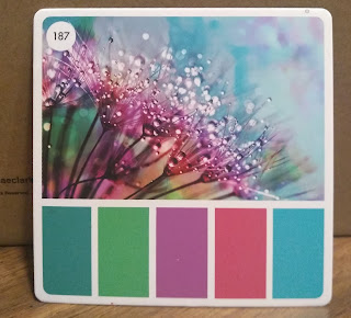
Each card has a photograph reference, with the main colors in it shown at the bottom.
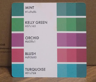
These photographs are copyright free, so you can try to copy the reference if you like. On the back of each card the colors are shown and listed with a generic name (usually from a colored pencil collection), with a digital number (called a hex code) for that color for those who do digital coloring. On the right the same color is shown with a 20% tint and a 20% shade. The colors go right to the edge of the card to make it easier to match. She names the colors with color pencil names.
The color catalog and color companion (which comes as part of the catalog) are digital apps that make it easier to use the color cubes. The catalog was actually developed before the cubes. I originally bought just the cards because I am not a "digital" girl, and I love just browsing through them. But I wanted some more flexibility, so I finally got the digital catalog to go with it. (OK, my husband got it for me, because he was sure I'd need it, and he was right.)
Using the catalog, you can search for a combination by color, by subject (birds, animals, buildings, etc.) or by theme (mood, holidays, etc.) I like picking a color that I'm dying to use, then search for color and it will give me the numbers of all the cards that have that color in it, giving a variety of color combinations.
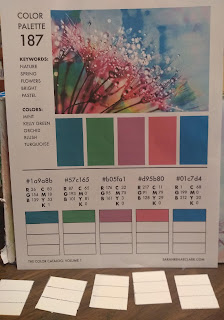
For class, I chose card #187. I went to the color catalog and printed out that card. The printout has information that is more useful if you are not a pencil artist.
The printout again shows the photo reference and the color combinations. But at the bottom the colors are printed out with 3 rectangles underneath each color. This is for you to match your colors to the color on the card. You can write down what paints you used to create those colors. Since watercolor doesn't work well on printer paper, I taped a strip of watercolor paper across this so I could try out what watercolors make those color combinations.
What interests me is the codes above each color. There are RGB (red/green/blue) codes and CYMK codes. THE CYMK stands for cyan-yellow-magenta-black, the colors in your color printer. I may not get a perfect match, but it gives me an idea of what and how much of each color is used to create that color. I try to begin with a color in my palette that most matches, then add cyan, magenta, or yellow to it to try to create a match. (I have to mention that a few years ago I purchased Lucas colors of cyan, magenta, and yellow for creating a color wheel, so they are very helpful in color matching)
For example, on card 187, the first color is a blue that they call mint. The CMYK numbers show a predominance of cyan (80), a smidge of magenta (18) and some yellow (53). Everyone has something different in their palette. One person found that Mayan blue was just about perfect. Someone else mixed turquoise and a bit of magenta.
The second color, Kelly green, shows no magenta or black. It uses cyan and yellow. You'll also notice that the more saturated and dark the color, the higher the number. In watercolor, this just translates as "less water, please." Some people found that their Hookers green was a good match even without changes.
So my final color choices from my palette, trying to match the colors on the card, were turquoise with a bit of magenta; cyan and magenta for the purplish red; Magenta with a bit of orange for the pink; and cerulean for the final blue. (some people have quin magenta, which is more purple)
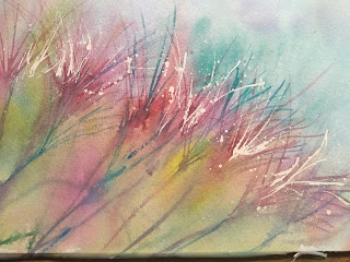
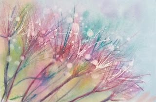
To do a loose version of this picture, I spattered Miskit in an arch across the paper, trying to get some larger drops for the water drops. I used a fine liner and Miskit to make some white flower strands.
When the Miskit was dry, I wet the paper and applied cerulean with a pit of turquoise in it, dropping some magenta into areas. I used the magenta and cyan for the area where the centers of the flowers were, then moving to the bottom left, added other colors for a fun colorful wash.
After all was dried, I used a fine brush dipped in the magenta to make flower clusters. I also used some purple and some blue to get a variety of colors in the flowers.
When I was happy with the flower clusters, I put in the stems. I thought they were too harsh, so I spritzed the stems to soften them a little. When I liked it, I dried it all and removed the masking fluid.
To finish I used a circle stencil to get some larger white droplets.
I used my watercolor pencils (magenta, purple, and blue) to make darker stems and a few more flowers. I like that I have some stems that seem to be in the background in addition to the sharper ones in the foreground.
Here are some youtubes to show some ways to use the color cubes.
Emma LeFabre 16 min.
https://www.youtube.com/watch?v=_qhlXULSm8c
Denise Love: she has a series of youtubes on this bc she has given herself the challenge of eventually using all 500 of the cards, and she doesn't really use the catalog, just the cards in the cubes.
Info on Color Cubes is on Sarahrenaeclark.com website.



No comments:
Post a Comment