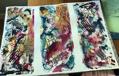
Denise Love began 2Lil'Owls Studio around 2012 and she is super involved in making textures. She'll use anything, and beware of falling in love with all the products she demos. I've taken one of her projects and reduced it to elements that a watercolorist would have on hand. Here is her project using Klimt inspired stencils and color cubes for color inspiration.
Color cubes was created by colored pencil artist, Sarah Renae Clark. There are two cubes filled with cards...similar to the recipe cards we used to get....500 cards in all. Each has a different color combination, and were meant to give you inspiration for new color combinations. Here is my blog on them:
I mention this because Denise Love is on a mission to use as many of those color combination cards as possible, and she mentions them in her video.
In this video, Denise is creating designs based on Gustav Klimt. She has some stencils with similar Klimt designs. She used different acrylic paints, but I tried the same type of project with watercolor and some other thing I just happen to have. (some of my own stencils)
This project involves 3 basic parts: creating a base; stenciling on some gold paint; and "making marks" that unify the piece.
The first step is to tape off a 9 x 12 piece of watercolor paper into 3 sections. Then paint, mostly dark colors. Use any texturing techniques you like: scraping with a credit card or comb, salting, masking, bubble wrap, etc. I even drew some lines and words with watercolor inktense pencils. Then dry it.
It might look a mess.
Choose some stencils that you think will go together. Tape the stencil down if needed. Stencil gold acrylic paint over the painted sections.
Each gold can look quite different. We chose between 2 different acrylics, gold gesso, and interference gold.
(NOTE on stenciling: I used what I cal a "spouncer." A round sponge on a stick. Found at Walmart or any craft store. You can also use a sponge. If it is dry, dampen it and get as much moisture out of it as you can. You just want it damp enough to pick up the paint. When you pick up the paint, bounce the sponge on a paper towel to get the excess off. Too much paint will bleed underneath the stencil and make it blurry. Also, bounce the sponge or spouncer...don't wipe it across the stencil. You might practice if you have never done stenciling before.)
When that is dry you can do mark making with black ink (Posca paint pens, sharpies, ink, or paint). I gave out some zentangle design ideas to get people started thinking. You can choose to make them very individual, or you can unify the 3 paintings by making marks that connect them. I don't know whether to call this "mindful" or "mindLESS". The purpose of the marks is to draw your eye through the piece and unify it through pattern. It looks like a totally different piece when you are finished.
You can also use white pen (like gel) or white ink to create your lines and marks. (In the one below, I used neurographic designs and a stencil with numbers, one with tree bark, and another random one)
Remove the tape for the BIG REVEAL.
This was so fun, I just had to show everyone's projects. Thanks to
those who sent them to me. I'll post others as they come in.
This is Allie's...not complete yet, but doing a mandala theme. She used Posca pen and Sharpie for the black. Also some colored Posca to bring out some colors that got lost.
Robin's first try. She used some floral stencils. I just love the colors.
She even put glitter pen on some of it.
Robin is working on this second one. She painted 3 different distinct stencils using gold interference. For her marks, she used two other stencils (using a Sharpie) to bring it all together in a unifying pattern. Almost done! Can't wait for the big reveal!
This is Barb B's. So pretty! Reminds me of an iron fence. The purple and turquoise work well with the gold. You can see some of the imprint of the dry wall tape in it.
Barb G. cut hers up into three pieces. The music theme ties it all together.
Carol's are super bold and didn't need much in the way of line and pattern.
There's a little jewel in the very center! The white screen look in the third one is drywall tape
laid down before any painting was done.
Frances used super bold watercolor paints from Plaza. They were on a little tablet, (sorry, don't know the name) and the intense darks worked so well with the gold. She also used a music theme.
Shirley took a totally abstract approach. Her original had more whites showing. I could look at this a long time. I love how you can get so many different interpretations of this project!
Jackie's had lots of whites and harder edges, and the gold wasn't doing it.
So she used a stencil and marker to bring it all together. Loving the movement of it.
Judy's had a more pastel background and gentle feel to it.
Vicki loves color. She started out with lots of orange and added some
bright red and purples. It looks great.
Thanks to all who sent me their work!


No comments:
Post a Comment