Saturday, June 4, 2016

Special Olympics 4 letter Words

The object of today's Special Olympics art program was to think of a 4-letter word that represents you and paint it in complimentary or opposite colors. Got this idea from a lesson Pat Hunger did in school when teaching about Indiana artist, Robert Indiana. I love what the kids came up with.

I have to say I absolutely love teaching this class, and can't wait to do it again, hopefully this fall if we can coordinate everything. And many thanks to Jodie Cole and Marlene Green for their help. They worked so well with these students!


Friday, June 3, 2016

NEGATIVE PAINTING FINISHED


Here is where I left off on the negative painting, with the background painted (in this case with blue tones to emphasize the warms in the leaves). Note that it does not have to be all one color, just so that the colors flow into each other.


Next I darken some areas behind the leaves to emphasize the ones I want to be important. (notice the rounder leaves on the left) To separate shapes, where one leaf or stem is on top of another, I paint beneath or behind the upper leaf, painting the shadow of it onto whatever is underneath it. Since my underpainting is dry, I can still use wet into wet: wet the area to be painted, brush color into that area, and use a clean damp brush to soften the color away.


Now I want to do some clean up with my lifting (scrubbing) brush. On narrow parts, like the stems, I can put masking tape on each side and drag my clean wet scrubber brush across the area to make it lighter. I have also softened other areas on the leaves that I think are too dark. (This is old paint, so it did not lift as well as newer paint.)


I needed the leaf on the far right top to become much less important, so I used a green grayed with orange in it to color that leaf. It's usually not a good idea to have the white running off the edge of your painting. I added some detail, like veins in some leaves. You can add as much detail in your painting as you need, but I liked this without much detail at all.

Thursday, June 2, 2016

FIRST OIL PAINTING IN 43 YEARS!

May 20th I took a delightful oil painting class from local oil painter, Cindy Crofoot. I had not painted in oils for over 43 years, and had never received any oil instruction at all. Here are the two (nearly finished) oil paintings I did in her workshop. I highly recommend Cindy as a teacher. Water color is my true love, but I'm not so scared of oils now.

(Debi...I told you there was a duck!)


SPECIAL OLYMPICS

At the art guild some of us have been giving classes for the Special Olympics athletes. Unfortunately, I only have pictures of two of our projects from April 30 and May 28. It's definitely been fun for me, and I think they have had a good time. We hope to do it again in the fall.

Here are some of the straw-blowing projects. They blew watercolor paint through straws and glued eyes onto them to create some crazy critters.


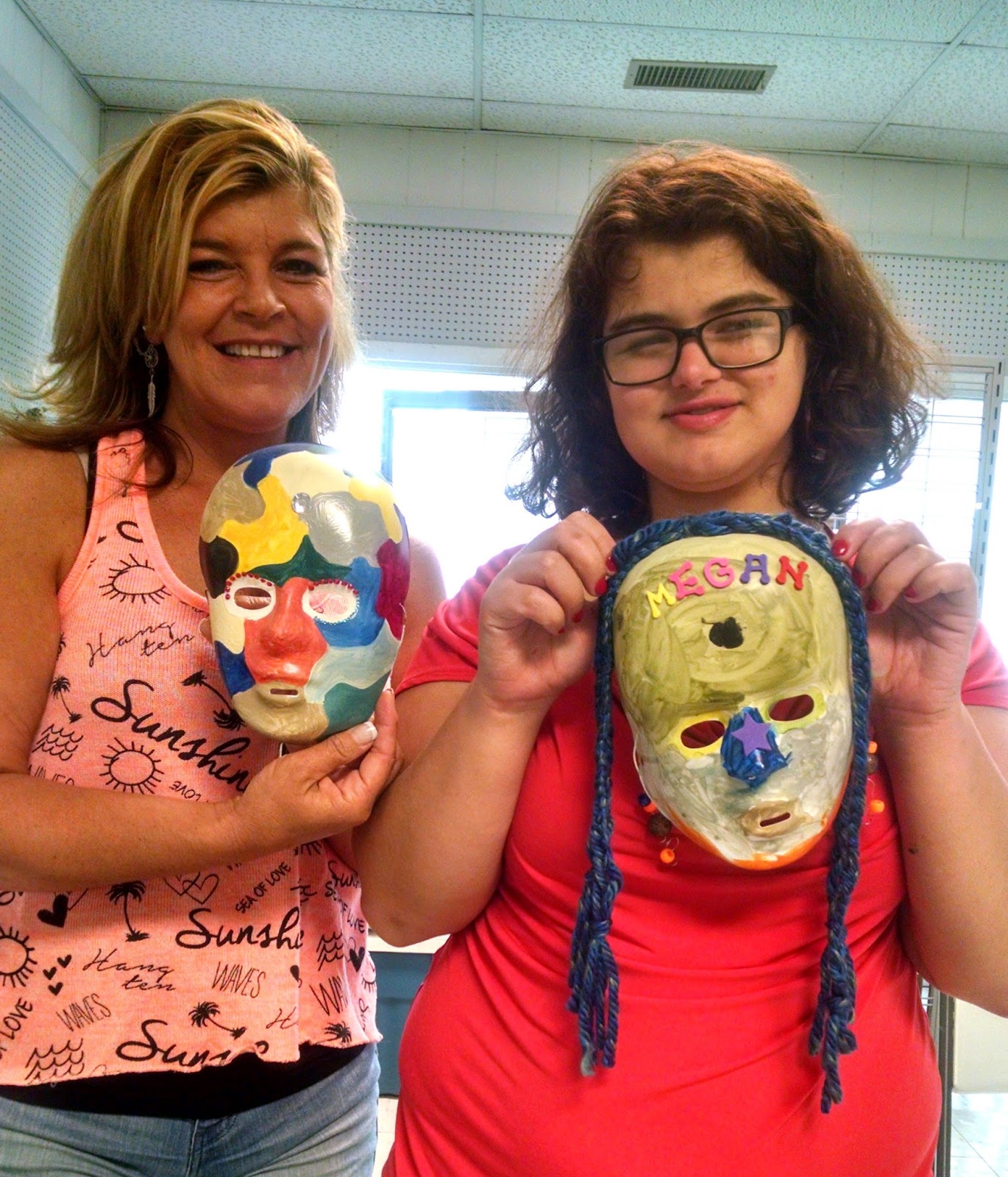
The theme of the four classes is "All About Me." Here they are painting masks to represent something about themselves and their personalities.These are from May 28.


MASA PAINTING - PREPARING THE PAPER

INSTRUCTIONS FOR USING & MOUNTING MASA PAPER


Masa paper is a type of machine-made Japanese art paper made from sulphite pulp. It is soft and white, has internal and surface sizing, and is archival. Masa can be used for a wide range of art techniques, including sumi painting, watercolor, and printmaking. One side is smoother and shinier than the other.

Masa paper is also very inexpensive, compared to the cost of regular watercolor paper. It does, however, need to be mounted on watercolor paper. So this is where your CHEAP watercolor paper comes in handy.

Using masa paper became popular when famous watercolor artist Cheng-Khee Chee (I always think
“Chunky Cheese”)  used it widely. You can find many examples of his art work on line or in his book.
Try Google-ing “masa paper” and you will find some beautiful artwork done by others as well. There
are even a few you-tubes out there on the subject.

Different teachers teach this painting technique several ways. We are going to do it the easiest way
I have found.

1.      FIRST, make a small X in a corner in pen on the SHINY side of the paper. You will not paint on this side.
2.      SECOND: This is the fun part. Wad the paper up and crinkle it until you have the effect you want. (this breaks the sizing in the paper, so when you paint on it you get a textured effect.)
3.      THIRD: dip the paper in clean water to soak it thoroughly.
4.      FOURTH: Spread the paper on some paper towels on your board.
5.      FIFTH: On the side without the X, make washes of clean color over your paper. Be sure to leave some white spots. You do not have to cover all the paper. You can plan a little bit here: put cool colors in shadow areas, warm colors where you want some warms. Don’t over-think this. Have fun with it. Your wash may look dark, but it will dry much lighter.

What masa looks like after step 5.


NOTE: Because the masa paper is so wet, it is fragile at this time, so be gentle with it or it will tear. If it does get a tear, don’t despair! When you glue it down, the tear will not show, but look like part of the crinkle texture. (Not you can see a tear in this picture at the top, but in the picture of it glued down, the tear is not noticeable.)

6.      SIXTH: Dry completely. You can set it over a fan to speed the drying, but the fan will leave
some of its own marks on the paper.

AT THIS POINT, YOU CAN DRAW ON YOUR PAPER AND CONTINUE TO CAREFULLY PAINT ON IT AND THEN MOUNT IT, OR YOU CAN MOUNT IT FIRST. PAINTING ON IT WITHOUT MOUNTING CREATES MORE INTERESTING EFFECTS, BUT THE PAPER BECOMES MORE FRAGILE. CHOOSE WHICH WAY YOU LIKE!

7.      MOUNT THE DRIED PAINTING on some cheap watercolor paper. Now is the time to use up some of that cheap stuff you bought before you knew better. (NOTE: You can also mount masa paper on canvas!)
a.      Make a mixture of 2 parts mat medium or white glue to 1 part water.
NOTE THIS IS MAT MEDIUM, not gloss. Gloss will not accept paint very well.
b.      Using a large old brush, spread the glue onto the watercolor paper, just slightly bigger than the masa paper.
c.      Place your painting over the glued paper and press down.
d.      Put some wax paper over the masa painting and using a brayer or other pressure, roll over all of it to seal to the wc paper. (The wax paper is there to keep from getting glue and wet paint all over your hands and materials….the glue tends to make the paint bleed a little bit.)
e.      Air dry until you no longer feel glue around the edges.
f.       Press the painting between two boards lined with butcher or wax paper and weigh down until completely dry.


8.      DRAW on your sketch using either a light box or graphite paper (Saral). I don’t sketch directly onto it because I don’t want erasures on the masa paper.


9.      PAINT using whatever method works for your painting.


In this painting, I've begun by washing over the red strawberries with two shades of reds, 
letting them run together, and being careful to leave the stems and leaves alone. When that dried, I painted the dark areas by negative painting the shadows behind the strawberries with a mix of red and adding some blue. At this point, they are just beginning to look rounded, and the paint is still transparent looking.

The leaves were washed over with yellow, dropping in a little blue to make the green color. Again, this was done keeping the paint trasparent looking, not thick. I darkened the shadows between the leaves with blue. I put a light wash of green over the stems and buds.  Then I added a slightly darker
green to the lines in the leaves, leaving one edge hard and softeneing the other edge with water.

This painting is not finished. More on it after next class.

Thursday, May 26, 2016

Negative Painting on Textured background

Instructions for
Negative Painting #1

Start with a background that you have used texture techniques on:
Salting, Saran wrap, straw blowing, or spattering. LEAVE WHITE,
Especially in the places you want to have as points of interest.


After it is dry, draw on your design. It should have INTERLOCKING
shapes. (This can be leaves, daisies, cone flowers, fish, or any other
repeating shape in different sizes)
The rule is to NOT HAVE ANY TWO NEGATIVE SHAPES
the same distance apart or the same size.

In the first picture you can see the interlocking leaves drawn over the textured paper. In the bottom right corner, you can see where I have begun to paint blue behind the leaves, in the negative space. I've carried that color to the other side of the leaf to avoid looking like a patchwork quilt.

Using a medium value paint, PAINT THE NEGATIVES, or the spaces
between your shapes. This should make all your positive shapes pop
out. You should be able to see whether you have a good design.You can always make them darker later.

When painting these negatives, remember to bring your color through
to other shapes so they don’t look like a patchwork quilt. You want the
illusion that all of that is behind your positive shapes.


When you are happy with the background, you can start on the positive
shapes. The positives are brought out by painting into the shape underneath them,
making that a negative space. (More on that next week)

In the second picture, you can see all the space behind the leaves has been painted in with a medium tone. You begin to see the leaf shapes.

NOTE ON COMPOSITION:

We also talked about the “Golden Mean” of composition. This is the ideal
place to put your center of interest, the natural places your eyes want to go
first. There are many ways of making something “pop” as a center of interest
You can use complementary colors; very light against very dark; harder edges
if most of your surrounding edges are soft; or  a spot of “surprise” color.


WaterColor Class: Textures 1

Instructions for
WC Textures #1

RULE #1:

Always paint on very dry or shiny wet paper. Nothing in between.
Check dryness by touching your finger to unpainted paper, then
touching the painted section. If the paint feels cool or damp to the touch,
it is not dry enough to paint on. If the painted section is still shiny, you
can still add more paint to it.

Divide your paper into four rectangles using masking tapes. The tape
is just there to keep paint of one practice from bleeding into another.

You only need three paints, one of each primary: yellow, blue, red.
Make puddles of each color. (When you put the paint on the paper, the
color will be a medium value, not puddle-y, not thick, but not too thin
and watery. You want it to stay transparent. ALWAYS TRY TO HAVE
YOUR PAINTS DILUTED AND READY so you are not at a critical
point and have to stop to mix paint.


In this picture you see the first section salted; second saran wrap; third straw blowing; fourth spattering. When the paint dried, I lifted a picture of a dog and a circle into the salted section.

Wet the first section with your brush. (You can use a spray bottle to
wet it, since we are using the whole section wet into wet.) Brush in
paints loosely, at least a medium tone. (too light will not show effects)
Apply kosher salt on half of the paint, PAINT MUST BE SHINY,
NOT PUDDLE-Y, and apply popcorn or table salt
to the other half. (To apply salt, take a small pinch, hold about 12”
from the painting, and gently sprinkle. Too much salt will be a pain
to remove.) LET THIS DRY ON ITS OWN. As time goes on, the
salt keeps reacting.

USES: snow, a kittens fur, beards, small white flowers in a field, sand.

On the second section, apply paint wet-into-wet as before. This time,
Crinkle saran wrap and lay it over the wet paint. Weigh it down. Let it
dry on its own.

USES: fast flowing water, reflections in glass, rock, leaves, flowers.

On the third section, make a quarter-sized puddle of paint. Blow it with a straw.
Make another puddle of a different color and blow it with a straw. See how
Many spidery webs you can make with this.

USES: wild grass, jelly fish, just for fun.


On the fourth section, make a wet clean stripe down the center. You
Will be spattering the entire section, but spatters will look different on the
Wet section. To spatter, load your brush (probably a round one) with paint,
Then smack it against your finger or another brush. Use several colors.
On one of the dry sections, lightly spray water to move the paint just a bit.
It will look softer, but not as soft as the wet area.

USES: distant flowers or foliage; rocks or gravel; speckles on an animal,
Rusty metal, old wood.


 After all was dry, we used a stiff lifting or scrubber brush to lighten an area.