Tuesday, April 23, 2019

Transition and Gradation

TRANSITION:

Is how you make the eye move through the picture, how you lead the viewer from point to point.
One of the ways you do that is through GRADATION, which is a gradual change either in shape, value, size, or color, line, direction,  the elements of composition. It is a step by step series of gradual changes and the opposite of contrast. It adds interest and movement to the painting.

Gradation in color is like a sunset or rainbow, where one color gradually blends into another.


Image result for gradation principle of art


Mr. Mahi
gradation of color


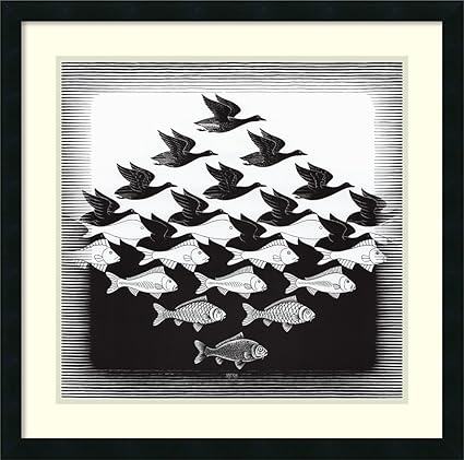
Gradation in shape is where the shape gradually changes. Think of M.C. Escher's tessellations.


Image result for m.c. escher art

M.C. Escher
gradation of shape, value,  and texture

Gradation in size is taking similar shapes and gradually changing the size to lead the eye in one direction or another.


Image result for gradation principle of art
gradation of size and value


In line, gradation is seen in perspective drawings. You can even have gradation in texture, in which the texture gradually changes in the picture. 


a brief explanation:


Thursday, April 11, 2019

PAINTING CHALLENGE - AGAIN


HERE IS THE CHALLENGE:

Find a photo reference you don't mind doing more than once.
Choose one of the ELEMENTS of art (line, shape, value, color, space, size, texture) to create your area of EMPHASIS (Sometimes called domination) in your painting. Choose one type of composition (such as cruciform,bridge, spiral, radial, S or Z shaped, cantilevered, horizontal, vertical, etc.) compose a painting with those two things in mind. 
For example: You might choose texture as to be dominant in your painting of a building and choose a vertical composition. 
You might choose a Z shape composition to paint a country path landscape and choose strong values as your element to emphasize. 

(good paintings have several design elements, but the one you choose should be dominant above the others.)

Then on the next week, choose a different element to emphasize and a different composition, USING THE SAME REFERENCE PHOTO. You can focus in on a part of the reference or change as little or as much as you choose. Be creative. 


Today I issued a challenge, one I took about eleven years ago. In fact, I'm going to refer you to the original blog I did. Look at Feb. 2008. There are six posts named Painting Challenge, Painting Challenge #1, etc. You can check those out to see my original reference of an alstromeria plant and five of my attempts. Then look at August of 2008 for #7. It seems I never posted #6, which you will see below. In this one I used a "checkerboard" composition (overall plan), and the design element I chose for this one was color again, using a blue/orange complementary color scheme. 


This was either four or five, can't remember. I wanted to try an S shaped composition. I think the focus was on repeated shapes, like the small white shapes to direct the eye into an S shape. 


Below is my 2nd challenge painting, only completed and matted. I was probably most happy with this one. If you look back at the blog you'll see that I chose a radial composition. 


In the original challenge, we only had two hours to paint each one, after the initial planning and drawing. Since I am not a quick painter, that was a bit challenging for me too, but it was helpful in deciding at an early stage whether or not I was going to like the painting. 

This might sound like work, but it is a great tool to help get away from just "copying" a photo reference and making it uniquely your own. It forces you to look at how strong your composition is, as well as to ask yourself the best way to present what you love about that picture. And I think it's fun. Hope you do too!


Thursday, April 4, 2019

Still Life Using Grisailles

STILL LIFE: COPPER POT

In grisaille, you can use burnt umber (BRUNaille), Green (VERDaille) or gray (GRISaille). It depends on the final outcome you want, whether a warm tone, cool tone, etc.

In this picture (from my photo), I used the burnt umber. Please see the notes on what paints and paper to use in the previous blog.

In grisaille, you do most of the work in monochrome, forming the values and molding the shapes as you would if you were shading a picture.

My reference photo taken 3/29/2019. First step was to turn it into a black and white so all I could see was value, not color.


First I sketched onto Arches cold press. It really holds the underpainting. You don't want a paint (or paper) that will lift for underpainting. I taped the BLACK AND WHITE version of my photo next to my painting as I work.

Mask off any highlights you want to preserve. 

 I constantly compare values as I go. A good way to do that is, if you are not using grays, take photos on your cell phone and change them to black and white (side by side, like this), and compare the two. 
You can also compare by taking two very white cards and poking a hole in each. Use it as a viewer, holding one over the area on the photo, and the other over your painting. Compare to see how close your values are. 


In the above photo, I could see that my values were not as strong on the copper pot as they should be to create the feeling of shine and roundness. So, in the photo below, I strengthened the darks. Then I worked on the two glass vases. When I got to the middle one (yellow with specks), I used a sponge to create small flecks on the glass. This part of the process took me about 2 hours...I'm a slow poke.

Also, you can see on the far left vase that I am terrible with straight lines. I had to go in with some masking tape to help me straighten up the right side of that vase. 


When I was satisfied with my values, I began glazing over the underpainting. I began with green and pthalo blue over the center of the copper pitcher. While that was drying I used quin gold to glaze over the yellow vase. The red vase is rose madder and perm red.  (You can see I still have miskit on the vases. I should have used more miskit on the pitcher) I feel like I lost some sparkle.


To finish up the pitcher, I used quin burnt orange, quin gold, and perm red. I used quin gold over most of it, avoiding the pure whites, then put burnt orange and perm red in the deeper tones. When dry, I removed all miskit, and made some small adjustments. Also added a bit more green tones in the center area of the copper. 


I like the overall look and feel of this. However, I have two regrets. One is that I did not mask off enough of the whites on the pitcher, and had to go back and lift. The other is that I would like to have the glass look more transparent than it does. Other than that, I like it. Not something to use with every painting, but definitely a tool in your tool kit.

For more information about painting grisaille, see these two youtube videos:

The Frugal Crafter: Step by step - about 1 hr


about 7 minutes explanation 
This is the one by Hajra Meeks. She has several good videos on grisaille, both with and without a color glaze. 

When I finish the gray tone painting, I'll post it and tell you what I did differently on my second attempt. 


Sunday, March 31, 2019

GRISAILLES

I have been wanting to do a grisailles with watercolor ever since I took an oil painting workshop where we made an underpainting with burnt umber and glazed over it with color. Loved the effect and wondered if it would work with watercolor. Turns out it can.

Grisailles is, basically, using a gray, like Paynes Gray or Neutral Tint, something fairly STAINING, to create an underpainting first, sculpting the forms and creating values before laying on any color. Then, you glaze over with color.


BEFORE STARTING, SELECT AN APPROPRIATE PAINT AND PAPER.

CHOOSING A PAINT:
Your underpainting needs to have three characteristics:
#1: transparency
#2: staining - a 4 on a scale of 0-4
#3: Large Value range (at least 62 out of 100)

Transparency speaks for itself: you don't want an opaque color that will dull the painting. Oddly, most of these dark colors are transparent or semi.

Staining:
You want a STAINING paint that will not move or dull your color. I can suggest several useful colors: Neutral Tint, Paynes Gray, Indigo mixed with a bit of orange, burnt umber, Vandyke Brown. If you don't have these, try Prussian Blue with a bit of strong orange or burnt sienna. NOT ALL BRANDS are created equal, so you will need to test your mix. Here's how:

     *Paint strips of several paints you think might work.Dry completely.
     *Try lifting with a stiff brush. Or soak the strips for a few minutes and see which ones lift or smudge.

Here below are the colors I tried: Paynes Gray (Senelier); Neutral Tine (Daniel Smith); Shadow Violet (Daniel Smith); Sodalite Genuine (D. Smith); Burnt Umber (Holbein); Ivory Black (DaVinci); and Lunar Black (d. Smith) I could have also tried Sepia and other blacks. I included some that granulate in case I decided to do a piece with lots of texture.


This is the same chart as above with each one swiped through with a lifting brush, as seen on the top of each color. From this I could see that some of my faves lifted too easily to be used in a grisaille. I picked some random colors to paint over to see how each would look glazed with colors.

Verdict: I will probably stick with Neutral Tint or Paynes Gray...maybe Burnt Umber if it is a warmer painting. If I want some texture, probably some Lunar Black. Love Sodalite, but it lifted far more than I expected. 

In the picture below, note that on the side I have included the pigment codes for the colors. I also showed different colors glazed over the grays and browns. 


Value Range:  This is how many values from light to dark on the value scale your colors will go. For example, they might rate a yellow as a 10; a red about a 40 or 50; a blue about a 60. The scale goes from 0 to 100. You need your dark to be able to go from very light to very dark, so it would be 60 or above. 

Some grays are warmer, some cooler. This will be guided by a personal preference and the overall tone of the painting. 

Lindsay Weirich, The Frugal Crafter, has an excellent youtube video on a simple grisaille using QoR Neutral Tint. 

CHOOSING PAPER:

You will be fine if you usually use something like Arches hot or cold press. Both of these have about the right amount of sizing. You do not want a paper that is overly sized and lifts and resists glazing techniques. (like Strathmore and some Canson) Some watercolor boards work well also. Please test the color on the paper you wish to use to be sure that the underpainting color (the gray) will not lift and smudge. 

OTHER OPTIONS IN GRISAILLE:

Your underpainting can be done with an Inktense colored pencil, (by Derwent) which will not lift after you wet it the first time. There are also graphite pencils that are made to be wet. Some people use India ink for a very dramatic effect. 

If you use a brown underpainting, it is called BRUNAILLES.
A green underpainting is VERDAILLES.
Gray is GRISAILLES. 

MIDTONES are when you make your own gray from the colors in your painting, as we did with the lilies and the white roses. These are often chosen because there is more unity in your painting. They are usually not as staining as other options, which can be a good thing, depending on your desired outcome. 


Friday, March 29, 2019

TWO APPROACHES TO PAINTING LEAVES

There's more than one way to paint leaves. Here are just two.

BOTANICAL APPROACH

This rose was painted on Arches hot press 140 pound paper, treated with lifting preparation to make it easier to lift color when necessary.


Begin by making two mixes of greens using colors you've already used in the flower itself. Here are the colors I've used this time clockwise from top left: Hansa yellow light (use a lemon or pale yellow); French ultramarine blue; rose madder (use a red you've used in the flower); and cerulean blue. (you can use pthalo, but it doesn't lift; or any blue with green bias)


On the left I've made a puddle of bright green with yellow and cerulean.
On the right I've taken some of the bright green and added French ultramarine and a touch of red to create a dark green color. Keep them side by side as you work on the leaves, having a bit of each color nearby to add to the basic mixes. 


If you look at the top flower picture, you can see the steps going clockwise. The first leaf on the left is step one and two. The next one is step three and four. And the top leaf is step five and six. I suggest as you paint you have actual leaves in front of you instead of a photo reference. It really helps.

WORKING ON HALF OF EACH LEAF AT A TIME PREVENTS YOU FROM WORKING ON ONE WHEN IT IS TOO WET. By the time you are done with half of all four leaves, they are dry enough to work on the other half. 

Step one: Wet the leaf and stem with clear water. Apply a watery layer of dark blue, leaving highlights unpainted or wipes out with clean brush. 
Step two: While that is still wet, use the tip of a fine brush to apply dark green mix to create the serated tips of the leaf. Dry.
Step three: Use the bright green mix to carefully paint betwen the raised veins and the center of the leaf, leaving fine lines and avoiding highlights.
Step four: Use alizarin crimson, burnt orange, or other red to go over some of the leaf tips, and carefully blend it into the rest of the leaf. Also add some red into the stem areas.


Step five: using a fine tipped brush, paint some of the dark veins that come from the heavy veins using the darker green mix with extra French ultramarine in it. Dry completely.

Step six: When that is dry, use the bright green mix to cover all the leaf, including some of the veins. That helps to blend the blue veins into the leaf and to unify the entire leaf. Lift out highlights if you have lost them.

What I like about this method: I can take my time and just putz with each leaf if I want. I like that leaf color is consistent throughout the painting, and I don't have to worry that the colors look like they don't belong together.


NEGATIVE PAINTING APPROACH

This rose is painted on Arches cold press 140 pound paper.

Here is a looser approach to the leaves, and one I am more likely to use in my own style of painting.

You will need a red, blue, and yellow that you've already used in the flower petals. Then get out the pthalo blue because that is one strong color. My object was to make the muted grays in the flower stand out by making a background of brilliant colors.

Before painting MAKE THREE puddles of water in small cups: phthalo blue, a red, and a yellow. Your choice. You might want to work over a sink, paper towels, or "doggie diaper" to absorb excess paint and water that drips off.

Step one: WORKING ON 1/3 TO 1/2 OF THE PAINTING AT A TIME, carefully wet the paper around the roses and right over the leaves themselves. I used a 3/4 inch flat as it holds a lot of water, yet makes crisp edges.(I don't work on all the background at one time...too difficult to keep a wet edge and prevent unwanted hard edges)

Step two: tilt the paper away from the roses and apply pthalo blue (or your favorite blue). I always apply the color right up next to the dry edge (in this case, the rose petals) where it will be darker, and let the color run out onto the background. As it runs, use a dropper to drop in yellows, especially where the leaves will be, and some reds. Backruns (blossoms) are welcome here, as are other interesting things that can happen. As the paint is drying, you can spritz lightly for more texture.


WHEN DRY mix a dark blue/blue green and begin "finding" your leaves using negative painting. This means you paint around the leaf shape and soften the paint into the rest of the background. You can continue to "find" leaves and stems as much as you like. You can see that I have done two on the right, and you can see the ones on the left are not touched yet.


What I like about this method:

A: The background is bright, interesting, and energetic in stark contrast to the roses.
B: I have a lot of freedom to use the textures that occur to invent a completely different background if I want to.

Friday, March 22, 2019

White Roses


MIXING GREENS

I prefer to mix my own greens to provide continuity in a painting. I am including some youtube sites that might be helpful to you. Steve Mitchell's Mind of Watercolor can always be counted on to provide some good tips. 


But a lot of people prefer to use prepared greens, and that's OK as long as you don't overdo it. One suggestion is to pick a basic green (like Hookers, sap, rich green gold, etc) then pick one blue and one yellow to change the temperature and darkness of the green; and one red to neutralize it when needed. EX: If I choose Hookers green as my base, I might choose French ultramarine to cool it off; Azo yellow to get more yellow greens; and alizarin to neutralize it, especially the shadowed areas. 

You can check what you can do with what is in your palette before making big changes. To see more on that, see this youtube with Susan Crouch:


And if you want to learn what your own paints will do, this one shows how to make a chart
that shows different mixtures. I particularly like how she does it. (In Liquid Color)


MORE ON PAINTING WHITES

I used this photo from Paintmyphoto as a reference. The photographer was Inkflo (Angie).


I changed it to a black and white. This helps me to see values and shadows more clearly.


Since the roses are a creamy white, I wet the flower, and dropped quin coral into the centers. Then I put a pale glaze of raw sienna, just to cut the whiteness of the paper and tone it a bit. If the paper is already a creamy color, you don't have to tone it.


After the initial wash is dry, begin separating the petals wet into wet. Alternate petals so that you reduce the risk of painting into a wet area.  Prepare a puddle of a slightly neutralized blue for the shadow areas. Have a bit of coral, pink, or green on hand to add to it. 

Wet the petal completely to a shiny-but-not-puddly stage.  Apply the color into the deepest shadow area, and allow it to spread onto the petal, leaving some of the white to show. While wet, you can drop in a bit of another color. EX: If I started with a blue toned mix, I can drop in a little pink or green. 
At this point I am trying to work from my black and white reference so that I am more influenced by the shape and values of the shadows instead of trying to copy color at the same time. 


Nearly done with the shadows on my roses. 


There are three differences between doing whites this way and the way we did it with the arum lily. First, in this process, I do make a grayed color (or neutralized color), but it is not GRAY. The color is clean and apparent from the very beginning. then other color is dropped into it while wet.  I will glaze later, but over this purer color rather than the gray.

The second difference will be obvious in the next blog.In the first we didn't paint a background to bring out the whites. This one will have a background that will bring out the whites. 

The third difference will be that we are going to do some negative painting in the background and leaves. So tune in next time....

PS: For those who are worried that their colors might not match exactly, remember: a reference is YOUR GUIDE, NOT YOUR GOD. Make it the way you want it to be.

Finishing the Arum


In the last blog I talked about using grays as midtones, and then glazing over the grays with color to create a white flower. Here are my final changes on the lily.

I continued to glaze the greens on the stem, using the same color blend, but adding French ultramarine into the darker areas. I went around the tips of the white petal with a pale green made from the cerulean/azo mix. I strenghthened the shadow in the deepest part of the lily around the stamen. (still don't know if it's a stamen or pistol) I made a few veins in the flower. And finally, I cleaned up edges by lifting paint, and then lifted some of the ridges in the flower.

Notice that this is the same pattern, but the one on the left seems to cup inward, and the one on the right seems to make an outward curve on the top right. That's only because of the direction I lifted out the paint on the first wash in the shadows.