Friday, April 30, 2021

TRANSFERING A DRAWING ONTO YUPO POUR

 HOW TO TRANSFER AN IMAGE

One idea is to use a lightbox. This will work if your yupo is not too thick and the paint is not too dark. Sometimes, actualy often, the paint is too confusing to really tranfer the image that way.

Idea two is to use colored SARAL, which is a transfer paper. The gray graphite paper is often used on white paper, However, gray sometimes does not show up well on your paint. So you can choose a colored transfer paper instead. You lay your paper down first. Tape your image at the top where you want it to go on your paper. Slide the SARAL in between, dark side touching your painting. Use a ballpoint pen, (i like to use red) to trace over your drawing. Check now and then to be sure it is transferring to your painting.

(Can't tell you how many times I've put it upside down)


Idea three is to draw it with WATERCOLOR PENCILS. Even if you are using a lightbox, you can use watercolor pencil. There are several advantages to this. The first is that you can "erase" it with water on your brush. NEVER USE AN ERASER ON YUPO. It will leave a spot that is "greasy" and doesn't accept paint. Another advantage is that watercolor pencils show up well and can make it easier later to darken small spots that just don't want to take paint. You can use whatever color can be seen easily or will blend with colors you want to put there.

You can use a pencil to sketch. Just remember not to erase, and pencil marks may show later.

Friday, April 2, 2021

POURING A BACKGROUND ON YUPO

HERE'S A PROCESS THAT WILL BRING OUT THE KINDERGARTENER IN YOU!

SUPPLIES


ABOVE: YOUR SUPPLIES are (clockwise starting with paint)
1. FLUID acrylics (don't use other types)
2. sponges
3. tape
4. absorbant towels or, as I show here, puppy training pads
(to absorb paint drips)
5. brush used for acrylics (don't use your good watercolor brushes)
6. toothbrush
7. spray bottle
8. disposable cups or jars for stirring, pouring paint
9. YUPO paper (white in background)

START: Pour a nickel sized amount of paint into a cup or jar. Use a separate cup for each color you want to use. Add a small amount of water to thin it to a pouring consistency. 

If you want to preserve large amounts of white (to keep from having to remove it with alcohol), you can tape it off, as I have at the top. If you want a speckled effect, use a toothbrush to create some fine specks, using the diluted paint.  Dab up any that look too thick or large. For the third effect, use a sponge dipped in diluted paint and dab lightly. 
You don't need to do any or all of these. These are options.
Caution: If your paint is too thick, it will not be transparent. If it is too thin, you will have a hard tme getting to the medium value you are looking for, and it will take longer to dry.

These effects should be dry enough in 15 minutes, or you can use a blow dryer on low at this point.


ABOVE: This pic shows just 4 ways of starting a pour. Top to bottom: tape off area you want white, spatter with a toothbrush, sponge lightly, and leave blank and let the paint do its job. Let this layer dry before pouring.


BELOW:

I began this pour with magenta, cobalt blue, and some yellow.

First: Use a stiff board beneath your work. On top of it lay an old towel, paper towels, or, as I like to use, a puppy training pad, to absorb drips of paint. There will be drips. There will be mess. You will love it.
Have a spray bottle of water handy. Tip the board slightly, and begin to pour one color. Move it around, spray it if necessary to get the paint to move. Then pour in another color. Move it around to get the paints to mingle in the direction you like. When you are ready add a third color in places. You can pull up and blot with sponge or paper towel; spatter in another color; wipe off places you don't like. As long as the paint remains wet you can work with it.

Your object is to get an OVERALL blend with few hard edges that is MEDIUM value. Not too light or too dark. If an area is not blending well, spray it with water a little or spatter in some other color to break it up and make it move.


BELOW: This is how my first pour turned out. You can see the tape on the left; spatter in the middle; sponging next to that; and on the far right, only the paint pour.


My second attempt: tape on left, then spatter, then sponging, then plain.


Close-ups of spatter after I've poured.


Close-ups of sponging after I poured.


NOTES ON PLANNING A PAINTING

1. Don't try to overplan. Begin your process using more paper than you think you will use.
This gives you options. If part of it turns out more interesting than another part, you can use that instead of where you might have otherwise chosen. You have to be flexible.

2. You can plan some. For example, if you know you want one area to be sky, you can pour that area first. You can either let it dry after you like it, and then pour the ground area, or, if you feel confident, pour the ground area at the same time and add textures to that area only.

3. You can start with color that you want in the background and center of interest.

4. This truly is "Watching paint dry." You want to watch that backruns don't get into your painting from paint puddling or collecting on the edges and running back into your painting. 

5. When you use tape, you will get runs of paint underneath it, which you will probably enjoy and keep, but can wipe off with alcohol later if you don't like it.

NEXT WEEK: transfering your drawing and wiping off white with alcohol.


Sunday, March 21, 2021

EASTER BUNNY


In class I started by showing the skeleton of a rabbit, discussing how it is different or same as other animals, and comparing it to the human body. Notice these things about a rabbit's body:

1. The eye sockets are huge and nearly at the top of the head. The upper part of the socket protrudes.

2. The nose bone on the skull is quite long.

3. The forelegs bones are similar to our arms, and they travel on their feet, unlike dogs and cats, who travel on their toes.

4. Hind feet are quite long. Notice how they support the body at rest, and the curve of the springy hind legs.

5. the spine is curved in one direction, unlike the human spine and that of horses and some other animals. 


This week I'm working on this cute little guy, just in time for Easter. I am emphasizing ways to make an animal look furry and alive.

Below is the sketch, taken from a photo I found on Unsplash.


Below is shown the first two or three steps. First, wet the entire body, but not the face or ears yet. I used raw sienna, burnt sienna, and French ultramarine blue, but you can use the colors you like. 

I wet the entire body. When I want the illusion of soft furry edges, I WET to the edge, but I don't paint to the edge, but let the paint travel and create a softer edge. I laid down an overall color of raw sienna, with burnt sienna in some darker areas and French ultramarine in shadow areas. While it was still shiny wet (not puddly, just shiny) I added some kosher salt and some popcorn salt. I let that dry on its own so the salt can react. 

While waiting for the body to dry, I painted pink inside the ears and around the outside lilning of the eye.  I also put in the pink in the nose. After the pink is painted and dried, I painted the iris blue. This part of the eye is very round and leaves very little white visible. Then I darkened the pupil, also very round, and more visible at the top of the eye than at the bottom. This part should dry rather quickly.

Then I painted the face and outer ears with the same colors as the body, this time salting only with popcorn salt.

TIP: If your paint dries before you can salt it, drop water droplets onto paint that has lost its shine. That will give tiny blossoms similar to salting. Also, don't throw gobs of salt on this. You don't want it to be like sandpaper.


Close up of eye and start of ears below.

Begin to make the effect of fur around the face. To do this, put a little darker paint underneath the chin,
then, with a small pointed brush, pull some of the dark into the dry face to make it look like fur.
This is done under the chin, on the side of the face, and in the right ear.

Gradually add some darks to the ears in areas where you see dark. There is also a ridge above the eye and below the ear that is dark. This is where the skull around the eye protrudes.


Back to the bunny body. Wash over the body with some water on a large brush. This serves to even out
some of those salt marks and make them look more like natural fur. Start to paint the dark shadows you see underneath the rabbit, around his hind leg, and on his back. Play with the color until it is what you want. 

Will finish this next week.


Monday, March 8, 2021

yupo example

 Last post I referred to previous posts for examples and instructions on using fluid acrylics on yupo with watercolors. I am just posting a step by step example. This is sort of the kindergarten version of the process, extremely simplified to its basics.

1. Beginning with your background of poured fluid acrylics, draw on your pattern. This background should be of a medium value overall. You can draw it on with pencil or colored watercolor pencils. Also, If you use Saral or another graphite transfer paper, you might consider a colored transfer paper to trace your picture/pattern. It may show up better on your color than gray.

2. Using a brush or tool dipped in 91% alcohol, rub off anything that will be white or very pale in value. In the picture below, you can see that I have rubbed off all the whites in the flowers. Now I have 2 values, white and a medium value.

Pattern with some of the whites removed.

TOOLS TO RUB OFF THE WHITES: bamboo sticks or skewers for thin lines and small detail; bristle brushes, small, like those used as scrub brushes; cotton swabs; tissue; cotton balls, and more. Do NOT use your good watercolor brushes in the alcohol.

Pattern with all of the whites removed. Note that the alcohol can also remove some of the pencil lines.

Begin to add your darker values, as in the leaves. You do this with watercolor, slightly diluted from the tube instead of dried paint on your palette. You CAN use watercolor pencil for finer detail. Some enjoy inking with pen. Some like to use more fluid acrylic on spots that just won't take color any more. The advantage of using watercolor is that you can wash it off with a damp brush and blot it if you don't like it.

Then you can add in some pale color, such as the pink on the far right lily.


Friday, March 5, 2021

ANOTHER YUPO PROJECT

 PLEASE REVIEW THESE BLOGS ON THIS YUPO PROCESS:

5-22-2018 

5-31-2018

Those will give a more detailed account of pouring fluid acrylic paint onto yupo and then wiping off the whites with alcohol. 

I handed everyone a small square of yupo that had fluid acrylic poured over it and dried. They could choose to do a butterfly, flower, or their own pattern.

After drawing on the pattern remove all whites.

Then paint in the darkest darks. You can adjust colors. YOu can also use colored watercolor pencils for fine areas.

A finished yupo should have a sealer over it to protect it from moisture.


THE BOAT ON MASA PAPER

MASA PAPER is an inexpensive, machine made, Japanese "rice" paper that is interesting to work with. You can see my other blogs on masa paper projects for more information, but basically it is a thin, soft, acid free paper made of sulphite pulp. It is often used in printing processes.  

I always begin by making a small X in one corner with pen on the wrong (smooth) side, so that, after getting it wet, I'll be able to tell which is the right side.

CHOOSE: You can either draw your pattern on before you wrinkle the paper or afterward. The advantage of the first is that it is easier to draw on smooth paper. The advantage of the second is that you can look at the underpainting and decide where to put parts of your drawing. You can also choose to use MICRON or ULTRAFINE SHARPIE to outline your pattern if you like the pen and wash style.

Then I wad up the paper into a ball, just as if you were going to wad up trash. Then I soak it a bit in water, just long enough to get the entire thing wet.

I put the wet paper on an absorbant surface, like a puppy training pad or paper towels, and appy a soft underpainting. My object is to have an interesting color flow no edges, not too dark. It always dries lighter because of the large amount of water in the paint. 

I like having no lines on the paper to tell me where to put color when I first start out. I really like the unexpected colors that can happen if you don't over plan. You can leave whites where you really need them. 

You can't use masking fluid, but you can do a small amount of lifting. You want to use a very soft brush on this to avoid "pilling," which occurs when you over-brush the paper.

On the painting below, I chose to ink the image first, then do an underpainting. Dry the underpainting. 

Then I brushed in blues, reds, and browns as I saw them in the reference photo. Expect some "bleeding" from one area to the other.
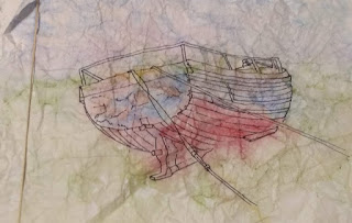
I used cobalt blue on the blue areas, alizarin on the reds, new gamboge with some brown in it for the yellows. On the first layer, as I did the blues, I dropped some burnt sienna in areas to give it a more aged look. 

For the second pass of color, I added some purple and burnt umber to the bottom of the boat and in aeas that were in deep shadow. I darkened the blue on the back of the boat. Added some burnt umber drybrushed on the wood around the rim. With French ultramarine, I added a dark shadow under the ropes, and deepened the dark inside the boat on the far right.


The ground is painted in with gold ochre and green apatite genuine, with a little blue toward the sky. There is dark shadow beneath the boat and to the left to keep it from appearing to float or hover over the field.

The railing is painted just as the previous picture, by wetting the rail, an inch or two at a time, and dotting with French ultramarine on the bottom, then dotting over the blue with burnt sienna (or quin
 burnt orange) to make it appear rusted. 
I painted a few houses and farm buildings on the horizon line, along wth some small trees. I need to keep those less distinct to keep them in the background. 

For the sheep, I lifted out round ovals where I wanted sheep to be, then dried it. I put black tranglular shapes for the head and ears, some little black legs.  I had to use some white gouache in a few spots.

MOUNTING 

Masa paper needs to be mounted either on another sheet of watercolor paper (this is where your cheap stuff comes in handy) or white board. Apply glue to the paper you are mounting to. (I use an acid free bookbinding glue called Yes Paste, but Aleenes or other good glues will do.)  Make sure you don't miss spots---use a broad palette knife or credit card to spread it. Situate the painting on top of it carefully. Put a piece of wax paper over it so you don't accidentally smudge paint or glue. Then gently rub the masa painting down. I like to begin in the middle and work myself to the edges to be sure there are no air pockets. I also use a breyer to rub it all flat.

I then turn it upside down on a flat board, put weights on it, and let it dry naturally so that it will be completely flat.

You can still work on it after it is mounted and DRY.

MORE BLOGS INFO ON MASA PAPER: JUNE 2016
MAR 12, 2020
MAR 18, 2020
SEP 13, 2019


Thursday, February 4, 2021

Elvis in Grisaille

 PAINTING ELVIS AS A VALUE STUDY

I used a color that can go from very light to very dark in value, so I used burnt sienna, burnt umber, and neutral tint for darkest areas.

I have another more detailed blog on painting values in portraits. See Oct 13 and 29, 2019 blogs on grisaille, a portrait of my grandaughter Iris.  

Miskit only small areas that you want to be white, like the white dot in the eyes. 

Use burnt sienna (or the color you've chosen) and wet the entire face--including the eyes--and apply a pale wash over the entire face and hair. 

Dry. Gradually build up darker areas, constantly refering to the black and white reference.

For eyebrows, Wet the area. Drop in color at the bottom, and don't paint all the way to the top, allowing it to fade softly. Pay attention to the way the hair is growing. Use a tiny brush to paint in tiny hairs. OR use a watercolor pencil (brown) sharpened and gently draw in some hairs.


Below, I have shown how this can be colorized. If you use a color underneath that is more staining, you can easily paint other color over it. This painting below was done exactly as above. When dry, I covered the face with a flesh tone. Then I added magenta on the right cheek. I repainted the line down the nose with coral, and added some dark blue to the hair, picked out white dot in the eyes. 

In class, someone asked if the right side should have a dark background to pull the back of the head into the distance. That was exactly right, so I painted it dark to show how much it pulls that part of the head into the background. 


Here is the black and white version of the reference, found on the internet, so I can't use this for show.


Color version of Elvis.