Thursday, May 27, 2021

SIMPLIFIED WAX BATIK

 This is an extremely simplified example of how to do a wax batik on rice paper.


SUPPLIES: rice paper (kinwashi or unryu thai, about 25 gsm) (10 gsm us too thin)

                    a small electric skillet or crock pot to heat wax at consistent temp.

                    paraffin (Gulf Wax)

                    a set of brushes that you don't care about, because they will never be used for anything else

                    butcher paper (or foil)

                    water colors and large watercolor brush

STEP ONE: THE "MAP"

                 This is the planning part, and takes some time and careful thought. Draw a small version of your picture. Find your different values. You can use a program such as Notanizer or photoshop to help you decide on the values from a photograph. Assign each value a color. On the "map" below, you will see that white is for white....the first thing that will be waxed off. I used yellow as my second value, and the second thing to wax off. (this does NOT mean I will paint it yellow: it's just that everything in yellow will be waxed next before painting another value) Orange is my third value, and the third thing to be waxed. Green is the last value to be waxed off.

As I said, this is VERY simplified, so I only used 5 values. You will need to decide for yourself how many values you will need. In more complex pictures, it is easy to lose track of what you should be waxing/painting, and a map will help you through it.


DRAW or trace your picture onto the rice paper. You will want to draw dark, as the wet process tends to lose the pencil marks. 

Set your drawing on the waxy side of butcher paper (shiny side of foil). This will protect surfaces from the hot wax and will allow you to pull the painting away from the butcher paper when done waxing.


MELT your wax at a safe temperature. (190 degrees is about right) I set my mini-skillet for a little before the half-way mark. It needs to be hot enough to melt the wax to a clear liquid, but not so hot as to cause smoking. You can start a fire that way, and it's not a pretty sight.


Using a brush set aside for wax (I like a 3/4" flat) dip the brush into the melted wax and apply it to everything you want to stay white. Use smaller brushes for smaller spaces. Feel free to spatter wax or drip it. 
I've learned 3  things about applying the wax. First, you just can't control it completely. Second, if you set the waxed brush down close to but not ON the line, you can get more accurate. The very hot wax that first comes off flows more, and after a second becomes a little more controllable. 

Try different tools for applying wax. Besides brushes, you can use the wooden tip of a brush or skewer that has been clipped. There are also tools called "tjanting" that are like little scoops that hold the hot wax. They make electric ones that keep the wax hot, but cost about $50. I know Blicks carries the wooden ones.  Experiment.

Third thing I learned (the hard way) is to make sure the wax goes through to the back of the paper. If it doesn't, you can get paint bleeding into the back of the paper, which will show through. If this occurs, just rewax those areas on your next layer.

FLIP your butcher paper to the dull side and put that under the picture to PAINT your first value. This will help absorb the paint that comes through the thin rice paper. You can control the color to some degree, but the beauty of this process is letting all the colors run together. You are looking more for a uniform first value than specific color.
Below is my first wax with the first wash.

You will be surprised at how LIGHT the paint will dry on this first layer.


DRY the painting, then apply wax to the first layer of paint to create a new value. Here you can see I've waxed over areas my map had in yellow, then applied another layer of color and value on. Trying to get darker with each value change.
(You can also see some "bleeding" where the wax was not thick enough, so paint bled on the underside)
This should be fixed as soon as it is noticed. After a wax layer, look at both sides in the light, and feel for wax on both sides.


Dry each layer completely before doing the next wax layer.

Below I've waxed out everything marked orange in the map, and painted more values into the unwaxed areas, namely the bonnet and creases in the skirt. I'd also left thin lines around the arm and purse to create a bit of an outlined look. 


This process is repeated until you have all the values you want in your painting.

Next week: 

Finishing the last layer of wax; crackling effect; removing the wax; mounting on paper.


Thursday, May 20, 2021

Finished Pic of Peppers and shadows

Here is the finished picture of the shadows complete with the painted peppers. If Peter Piper painted peppers, how many painted peppers would Peter Piper paint?


Thursday, May 13, 2021

CAST SHADOWS

 CAST SHADOWS AND FORM SHADOWS

FORM SHADOWS are the ones on the object itself. They help define the shape/form of the object, making it look more 3-dimensional. I'll discuss those in another blog..

CAST SHADOWS  are the shadow that light casts from one object or surface to another. There are several good reasons to pay close attention to the shadows in your painting. Here are a few.

1. Cast shadows set an object on a surface, so it doesn't look like it is "floating." Like a tree on the ground or a bowl on a table.

2. Use them to create more interest in shape and color in your painting. Think of a bicycle wheel with interesting cast shadows.

3. Use them to create mood, time of day, or a feeling of place.

4. Cast shadows can separate the objects  and give them a more realistic appearance. Think of a white daisy. Each petal is white, so how can you see where they separate? It's because some of the petals cast a small shadow on the ones below them, creating a darker area that separates the petals.
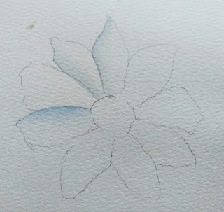
5. Cast shadows can connect objects that are seemingly separate. 
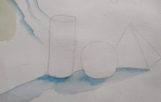

Here are some general rules about cast shadows.

Use the picture below for 1-5

1. Shadow touches the object when set on a surface, like a tree in the ground, bowl on a table.

2. Objects can cast a shadow on surfaces it does not touch: a cloud casting a shadow on the ground; shadow of a flower on a leaf. In the picture below, some of the orange pepper casts a shadow on the lower left of the green one.

3. Shadow is darkest where the two surfaces meet, then gets lighter and softer edged the further it gets from the object casting the shadow.

4. Shadow is "cooler than the color it is cast on. (note the general grayish tone)

5. Shadow is basically a distorted shape of the object.


Use the picture below for 6-9

6. Shadow often gets some color of the object refelcted in it, especially if the surface is shiny white.
Note the orange reflected into the shadow beneath the orange pepper.
7. Some of the color of the pepper on the left is reflected in the green pepper.
8. Length of the shadow depends on the angle of the light. Note in the photo above how much longer the shadows are than the picture below. The one above was taken about 6:00 p.m. in the sun. The one below was taken indoors with light above it.
At noon, shadow is very short; at 9 a.m. and 3 p.m. shadow is about the same size as the object. evening and early morning sun cast very long shadows .
9. Likewise, the DIRECTION of shadow depends on the position of the light.


10. Indoor light generally casts a softer shadow than direct sun. 

11. Shadows of transparent objects will have some paler places where light shines through.

12. Cast shadows generally follow the contour of the object it is cast upon. If a tree shadow goes over a rocky path, it will take on bumps; it will follow the lay of the land, like the slant of a hill. In this picture, the light is on the right. The tree shadow is interrupted, but continues up the side of the building, then onto the roof at the angle of the roof.


WAYS TO CREATE SHADOWS

The first, most common way, is to paint the surface first, in this case, a blue table. Then, using a darker, grayer version of the same hue, paint in the shadow. I like to paint wet into wet; wetting the shadow area with water, then dropping in the paint where I want it to be darkest, then allowing it to spread and lighten as it moves away from the block.

The second, common way is to paint the shadow FIRST. In this one I used cerulean with a bit of burnt sienna in it to gray a little. After the shadow was dry, I GLAZED ovr the table with cerulean (blue). 
Still darkening the area just beneath the box.


To paint the shadow of these, I first mixed a gray from French ultramarine and burnt sienna. This is a very common combination that you can turn brown with the addition of more burnt sienna, or cooler with more blue.

I wet the shadow, then dropped in the gray mix at the base of the peppers, and spread the color gently from there. I wanted it to be softer and more muted by the time it reached the end of the shadow. 
While wet, I dropped some orange into the shadow of the orange pepper; a little dark green into the shadow of the green one. 


Below are some photos of the same peppers on a blue surface so you can see how the color affects the shadow. 
.  
On the one below, note that beneath the right side of the orange pepper, the shadow is quite light right by the base of the pepper. This is because it is receiving some reflected light from a surface outside the picture area.


In the one below note the orange reflection in the green pepper. Also note how purple the reflection under the orange one looks. This is due to the visual blend of red in the orange and blue of the surface.


How can you tell how dark to make your shadow? Use your camera to temporarily turn your picture to black and white, as the one below. You may find it's not as dark as you think.

 Blue surface
White surface


ONE FINAL TIP:

Some artists, to avoid confusion, draw a little tiny sun on the outer part of their picture (or on the tape) to remind them of where the light source is coming from. It's important to be consistent in the shadow direction and relative length. 


Thursday, May 6, 2021

STUDENT WORK

I am always inspired by student ideas, the individual solutions to problems. Most of these are not completely finished, but you can see how each person interpreted the same idea. I love them!


I think it's interesting that many of these compositions can be viewed either vertically or horizontally, depending on how you want to frame it.


Friday, April 30, 2021

Dogwoods, Karlyn Holman style


DOGWOODS are flowering everywhere! Walking down to Sandy Maudlin's studio last week, I saw a sea of dogwood blossoms, just begging to be painted.

I wanted to try something different for the background, and decided to use a composition method explained by Karlyn Holman in her book Watercolor Fun and Free. This one is called 3 white corners. Here are some examples of her work. (Taken from Watercolor: the Spirit of Spontaneity.)


In the cherries above, she used 3 corners dark, and left the inside white.


The main idea is to leave three corners of the painting white, being sure to make the composition flow into these white areas, just not painting the background. 

FIRST PAINT THE MAIN FOREGROUND

Use a large enough piece of paper. You want to be able to have a free hand with textures and paint. Give yourself space to make changes later. 

For the branches, I used moonglow, burnt sienna, and a touch of magenta and leaf color.
Working 2 or 3 inches at a time, I painted on the moonglow on the bottom, added some burnt sienna in the top areas, then dropped in green where it connects to the leaves. If it was close to a flower, I dropped in some magenta. If it dried too light, I darkened the bottoms of the stems.  (If you don't have moonglow, use a gray made from ultramarine and burnt sienna)


Do do the flowers, dampen the petal first. Apply magenta where it will be darkest, at the tips of the flower. Add a warmer pink (I used coral) in some darker areas. Let the paint flow from tip to center. As the petal gets closer to the center, leave it white. If the paint flows into the white, pull it up with a thirsty brush. When it is nearly dry, you can add some of the fine lines that curve around the petal with a very fine brush. 
 
For the centers, make small yellow dots, then while wet, dot with ochre. When dry, add some greens.
For some shadows, use cobalt blue, very lightly, in shadowed areas. 

Your painting may be something like this. 


So next week we'll begin designing the three corners. 
1. You want each corner to be different in length and width, and the entire inside should connect.
2. In each white space, some of the design should peak through.
3. Try to design it so that it will emphasize your center of interest.

Then you will tape off the areas to remain white. After taping, you will either mask off the design that you've painted, or you will use contact paper to preserve the design. 
You will choose the texture you want for your background.Then you can use other methods to enhance it: stamping, lifting, collage, etc.

Here are two examples of small cards I painted using this method.I taped off the areas I wanted to stay white, and I used masking fluid over the flowers and stems. The texture is made using cheese cloth, since gauze isn't as easily available in the type I want.


TRANSFERING A DRAWING ONTO YUPO POUR

 HOW TO TRANSFER AN IMAGE

One idea is to use a lightbox. This will work if your yupo is not too thick and the paint is not too dark. Sometimes, actualy often, the paint is too confusing to really tranfer the image that way.

Idea two is to use colored SARAL, which is a transfer paper. The gray graphite paper is often used on white paper, However, gray sometimes does not show up well on your paint. So you can choose a colored transfer paper instead. You lay your paper down first. Tape your image at the top where you want it to go on your paper. Slide the SARAL in between, dark side touching your painting. Use a ballpoint pen, (i like to use red) to trace over your drawing. Check now and then to be sure it is transferring to your painting.

(Can't tell you how many times I've put it upside down)


Idea three is to draw it with WATERCOLOR PENCILS. Even if you are using a lightbox, you can use watercolor pencil. There are several advantages to this. The first is that you can "erase" it with water on your brush. NEVER USE AN ERASER ON YUPO. It will leave a spot that is "greasy" and doesn't accept paint. Another advantage is that watercolor pencils show up well and can make it easier later to darken small spots that just don't want to take paint. You can use whatever color can be seen easily or will blend with colors you want to put there.

You can use a pencil to sketch. Just remember not to erase, and pencil marks may show later.

Friday, April 2, 2021

POURING A BACKGROUND ON YUPO

HERE'S A PROCESS THAT WILL BRING OUT THE KINDERGARTENER IN YOU!

SUPPLIES


ABOVE: YOUR SUPPLIES are (clockwise starting with paint)
1. FLUID acrylics (don't use other types)
2. sponges
3. tape
4. absorbant towels or, as I show here, puppy training pads
(to absorb paint drips)
5. brush used for acrylics (don't use your good watercolor brushes)
6. toothbrush
7. spray bottle
8. disposable cups or jars for stirring, pouring paint
9. YUPO paper (white in background)

START: Pour a nickel sized amount of paint into a cup or jar. Use a separate cup for each color you want to use. Add a small amount of water to thin it to a pouring consistency. 

If you want to preserve large amounts of white (to keep from having to remove it with alcohol), you can tape it off, as I have at the top. If you want a speckled effect, use a toothbrush to create some fine specks, using the diluted paint.  Dab up any that look too thick or large. For the third effect, use a sponge dipped in diluted paint and dab lightly. 
You don't need to do any or all of these. These are options.
Caution: If your paint is too thick, it will not be transparent. If it is too thin, you will have a hard tme getting to the medium value you are looking for, and it will take longer to dry.

These effects should be dry enough in 15 minutes, or you can use a blow dryer on low at this point.


ABOVE: This pic shows just 4 ways of starting a pour. Top to bottom: tape off area you want white, spatter with a toothbrush, sponge lightly, and leave blank and let the paint do its job. Let this layer dry before pouring.


BELOW:

I began this pour with magenta, cobalt blue, and some yellow.

First: Use a stiff board beneath your work. On top of it lay an old towel, paper towels, or, as I like to use, a puppy training pad, to absorb drips of paint. There will be drips. There will be mess. You will love it.
Have a spray bottle of water handy. Tip the board slightly, and begin to pour one color. Move it around, spray it if necessary to get the paint to move. Then pour in another color. Move it around to get the paints to mingle in the direction you like. When you are ready add a third color in places. You can pull up and blot with sponge or paper towel; spatter in another color; wipe off places you don't like. As long as the paint remains wet you can work with it.

Your object is to get an OVERALL blend with few hard edges that is MEDIUM value. Not too light or too dark. If an area is not blending well, spray it with water a little or spatter in some other color to break it up and make it move.


BELOW: This is how my first pour turned out. You can see the tape on the left; spatter in the middle; sponging next to that; and on the far right, only the paint pour.


My second attempt: tape on left, then spatter, then sponging, then plain.


Close-ups of spatter after I've poured.


Close-ups of sponging after I poured.


NOTES ON PLANNING A PAINTING

1. Don't try to overplan. Begin your process using more paper than you think you will use.
This gives you options. If part of it turns out more interesting than another part, you can use that instead of where you might have otherwise chosen. You have to be flexible.

2. You can plan some. For example, if you know you want one area to be sky, you can pour that area first. You can either let it dry after you like it, and then pour the ground area, or, if you feel confident, pour the ground area at the same time and add textures to that area only.

3. You can start with color that you want in the background and center of interest.

4. This truly is "Watching paint dry." You want to watch that backruns don't get into your painting from paint puddling or collecting on the edges and running back into your painting. 

5. When you use tape, you will get runs of paint underneath it, which you will probably enjoy and keep, but can wipe off with alcohol later if you don't like it.

NEXT WEEK: transfering your drawing and wiping off white with alcohol.