Monday, April 25, 2022

Ready-made (or convenience) Greens

Wow! We discussed all kinds of things today.


First item of business was to create a background for next week's lesson. We got the paper wet on both sides and put it on a board or piece of plexiglas. No need for tape.....it stays on its own if wet enough.

Then we mixed 3 colors of choice and let them run together, turning the board at angles to keep the paint flowing. We're looking for all SOFT edges and a nice blend of colors....no hard edges and no splotchy looking spots in the background. Just a soft, light to medium value of colors. While wet, use a tissue to blot out some white spots where your center of interest might be.

Leave this to dry overnight. 


NEXT ON THE LIST: seeing what your convenience greens can do for you.

Point one: I have probably 15 different tubes of green, which I rarely ever use. I have them mostly because they were recommended for one workshop or another. 

But a common thing for painters to do is use too many different greens in your painting, and end up with colors that seem to clash. They lack color harmony. So here is one thing you can do.

Start with a small square in the center of a scrap piece of paper. Fill it in with one of your convenience greens, like sap. To the left add hansa yellow (or a light lemony yellow). To the right add a blue, such as ultramarine. Directly below add a red, like alizarin. Directly above add a warm yellow, such as quin gold. On the bottom left corner the green is added to orange. On the bottom right violet is added. Top left is burnt umber and top right is neutral tint (or paynes gray). 

Below is a grid I started with chromium green oxide.


chromium green oxide plus hansa yellow


chromium green oxide with all the other colors added in respective boxes


A sheet with five different greens, using the same colors in the same places.
Top left is pthalo green blue shade; top middle is permanent green.
Bottom left is sap; middle is serpentine; right is hookers green.  


Just by looking at each grouping, you can see that some of those colors do not look good with colors outside that group. But you can create so many shades of green with just one, and they all work together in harmony. 

So if you really want to use a convenience green, use other colors with it to create other tones of green for shade or to make a green look like it's in the light. 


Part 3 was to make realistic looking leaves. Your painting might look great, but then, instead of taking as much time on the leaves as you did with other parts of the picture, it looks odd....almost as if you used two different styles. Even with "loose" paintings, you want it to be believable, not just slapped on randomly.

So here are a few tips on leaf making.

5-minute video on leaves with veins

 https://www.youtube.com/watch?v=8W8k8fyZVtk

Angela Fehr shows 13-minutes of 3 types leaves

https://www.youtube.com/watch?v=tyJHmdrzpl8


I do mine a bit differently. Especially rose leaves and stems, which nearly always have reds in them.


I usually start with painting the leaf with a yellow (Hansa light) or yellow green.(Hansa + sap) If there is red in the veins or tips, I paint those in either before or after a basic glaze of yellow/green.
Rose leaves: on left, underpainted with red tips and center vein (use very small brush);
middle leaf underpainted yellow/green; right leaf underpainted with yellow.


After that is dry, I negative paint around the veins with a darker green. (a medium shade, just darker than that yellow green). Here I used sap green, since we're discussing convenience greens. 


Adding reds to the tips of middle and right leaves after the second glaze.


Adding blue (pthalo) to the sap to darken. Also adding reds and blue to the stem.
I look for bumps and shadows, and paint those in a bit darker. 


When all is dry, I glaze over the leaf either with cerulean or just with water to take some of the hardness out of the lines. Some hilight might need to be lifted.


Glazing over the entire leaf to soften edges and blending the veins into the leaves.


Sunday, April 17, 2022

More work on lamb and ewe

 The next step to working on the wool is to create some soft textural lines in the wool. The lines will do two things: add to the feeling of the softness of the wool; and show the contours of the sheep. When adding these lines, avoid making them the same distance apart or the same length. Also, some parts will be darker than others, showing deeper separations in the wool.


With that disclaimer, let's get started.


You can and should work this in small, manageable areas. If you have lost your lines, lightly draw in some lines to indicate the separations in the wool. Lines along the sides will be more vertical; then round a bit at the top and bottom.

Mix up some paint using the raw sienna and burnt umber, basically the color you used before to form the color of the sheep. This should be a fairly creamy mixture. Experiment on scrap paper. Have some french ultramarine handy to create darker areas.

Wet an area about 2-3 square inches. Dip a small pointed brush into the mixture and gently TAP paint along the line you want. The paint should spread out slightly, creating a fuzzy look that is still a line.

If it is too uncontrolled, either let the paper dry a bit or use less water in your paint mix. 

If it is too dark, play with the mixture until it is the value you want. 

Make some of your lines shorter, especially near the top; make some converge or appear to converge; near the head, make short curly lines. In some areas, drop in blue or darker color in some places. These will look like shadows made by longer deeper wool areas.

If color looks too dark when dry, wait until completely dry and wash over with clean water....or just loosen the paint with a clean brush in places. If too light, you can go over it again after it dries.


The FACE AREA & LEGS

This may sound weird, but wash over the entire face, ear, and top of the lamb with pink. I used magenta, but any red can be watered down enough to pink and used. While that is drying, I moved to the leg area.
Use your brown mixture and some of the blue. I am creating a HARDER edge between the legs and wool of the body. I wet the top of the leg first in a wiggly motion to indicate the wool. I added the brown mix and dropped in some blue to create the dark at the top of the leg, which is shadow from the body.
I pulled down the color with my brush, then added blue wet on wet to the knee area. (sheep knees look a little dirty at all times). I did this to all the legs, paying attention to which sides of the leg is darker and more in shadow and which parts are catching light from the right.


I used the blue and the brown to make a gray mix. I wet the face again (over the pink) and painted the gray mixture onto the face. I layed down the darkest on the edges where the wool and ear meet the face, and let it spread over the rest of the face, except the eye. I left the muzzle white.

For the baby, I glazed over the pink with raw sienna and aussie gold (you can use burnt sienna) and mingled them on the paper. The color only goes down to the top of the baby's legs.


I used blue with a bit of umber to make shadows on the left sides of the legs, the tail, and the rear leg that is completely in shadow 

To complete the face of the ewe, I added a little gray over the ear, but much lighter than the face.I tried to leave a rim of white on the ear. I painted the eye in with a golden brown (umber with a little yellow), then let it dry. I used a black fine tip marker to go around the eye and also to make the horitzontal slit of the pupil. (If it had been bigger, I would have used paint....but my hands shake a bit, and pen works when it is to small for me to control.)
I painted in the nostril and the mouth. I tried to leave as much pink in those areas and the ear as I could. 

The color of this baby is its skin...there's no wool yet. So you can see its ribs. After I got the color I wanted for the lamb, I used a little cobalt to shadow the belly and the face hiding behind his mom. I used a tiny lifting brush to lift out some hi-lights in the ribs. 


Finishing grass and background.

You have choices in finishing. The original photo reference has them against some very dead grasses and straws, so that the background was nearly the same color as the sheep.  I wanted it to look more like spring. So I used a combination of greens to create grass that looks trampled The shadowing beneath the sheep keeps them anchored to the ground. Plus the edges between hooves and grass are blurred and obscured, which also keeps them anchored.

If you're wondering where the 2nd lamb in the original painting went, well.....
I decided it took away from the story. I couldn't exactly erase it. I tried to lift some. No matter what I did, that extra lamb showed up. Since these sheep live on a farm with an old stone fence, I decided that might help the painting a bit. So that's where the lamb went....behind the fence.

Did I use any whites? Well, I did use a bit of gouache on parts of the stonework and on a hi-lited spot on the lamb's foreleg. I also used a bit on the ewe's face under the eye. 

Here are some nearly finished ones from class:


Thursday, April 7, 2022

Water consistency/Lost and hard edges

PAINT CONSISTENCY

One of the main things a water color artist needs to tackle is how much water to add to the paint.
In the picture below, you can see 4 different paint to water ratios. The first (some people call this mustard consistency) is about 90/10 paint to water. The paint doesn't move around on the palette and is very dark.
Second is about a 50/50 ratio. There is enough water to make the paint easy to move around, still dark, but more transparent. Some refer to this as "cream" consistency. The third is about 25/75 paint to water. YOu can call it "coffee" or soy with wasabi. Color is lighter, the puddle of color moves around easily. The last, about 10/90 paint to water. Some refer to this as "tea", another artist calls it "soy sauce." This last is often used as a light first layer or wash.


Here are some bad habits to avoid.

1. Mix up enough paint ahead of time to cover all you want to cover. That way you can avoid having to make more at an inconvenient time. And you won't have to worry about not mixing the exact same color.

2. Don't keep dipping your brush in the water to rinse it if you are using the same color. Each time you rinse your brush, you are adding more water to your mixture, making it hard to make darker layers. Instead, mix enough of the consistency you want, and when you run out of paint, just dip your brush into the puddle of paint. When you want to change color, rinse your brush, dab the water out of it, then dip it into the new paint.

LOST/HARD/SOFT EDGES

You'll want to practice this a little before starting the sheep painting.

A HARD edge is a very precise edge formed on dry paper. It is painted with a wet brush on or against a dry area of the paper. 

A SOFT edge looks fuzzy, indistinct, like a cloud, fur, cotton. It is formed by wetting the paper first, then painting into the wet area. Wet means it is shiny, not sopping, no puddles of water. You can experiment with different consistencies of paint into the wet area. Below on the left you see lines made by a thin brush onto wet paper. You have some control. On the right is a "puddle" of water, and shows that
the paint is far less controllable. 


Below is a practice to learn how to do the sheep with LOST and SOFT edges. Lost edges occur when you create a place where the edge seems to vanish into the background. It is just no painted. YOu can
see the edge here that is mostly soft, then disappears, then continues on the right.
To practice making a soft edge and lost edge for the sheep, wet the area above and below the line for the sheep back. I turned it upside down to work, then applied the paint along the edge of the back and LET IT FLOW DOWNWARD, away from the edge of the sheep. If it begins to run too much into the wool, just take a thirsty brush and pull up the paint while wet.
You can work in small sections, as long as it is wet. Practice skipping a part to create a lost edge. 


These pictures came from my friend and farmer neighbor. Her lambing season just finished, and these babies were newborns. 

When you feel you are ready, make a soft edge on the painting. Wet not only the edge, but into the wool also. Turn the painting upside down, apply the paint along the edge of the back, and allow the
paint to flow AWAY from the sheep. Do this on edges you want to keep soft.


When you have done the entire background, dry the painting. Then wet the sheep where it will look woolly. Mix raw sienna and burnt umber for the wool color. Starting at the bottom of the sheep, where it will be darkest, apply the paint and let it run into the upper part of the sheep, trying to keep the top of the back white. You can add some blue to some dark areas at the belly and legs while wet.

Gently add a pinch of salt grains onto the sheep wool. 


This is where we ended this week. Next week we'll work on the wool coat as in the picture below.


Here are some good very recent youtubes on these topics. Worth watching.

Louise DeMasi on water consistency and fixing mistakes 

https://www.youtube.com/watch?v=RsZh4wKTKGQ

Louise DeMasi sheep partial tutorial/lost and hard edges

https://www.youtube.com/watch?v=s32PTPeXJsg

Friday, March 11, 2022

You are invited:

 Here is an invitation to our guild's annual spring art show. Each artist is allowed to put in 6 items, but they have to be new, never shown here. Hope to see you there! (PS...if the times don't work out for you, call me and I'll arrange a time to meet you there!)


Chri


ALSO: Spring class begins the first Thursday in April, April 7. It will go for 8 weeks.


Playing with textures

 One way to do a background is to do that first and incorporate it into the painting. Here are a

few ways to accomplish this:

1. Plan several textures. On this example I spattered miskit, laid down joint tape; used saran wrap and wax paper; and dropped coins on the wet paper, and salted the wet paint.

After it dried, I sketched some still life on it and began to paint. I could also do some negative painting. Haven't decided on how to finish it yet, but at this point you can see many of the textures in the background.


The point of this exercise is to let yourself experiment with textures. In the one below, I showed how you could, if you wanted, do some planned painting using textures: used contac paper for the tree shape; miskited out some distant tree trunks; used cheese cloth for distant brush; joint tape; stretched saran wrap to create water in a stream, and wax paper cut circles to create some rock texture in the forground. This could be turned into a loose landscape without too much effort.


Another way to do a background first is to spatter miskit, blow it with a straw, or otherwise spread some miskit on the paper. If I get globby shapes I don't like, I rub it when it is dry to get shapes I like better, or get rid of shape I don't like. After the miskit is dry, create a light wash over it. Remove the miskit. Then place your sketch over the background. It could be anything: flowers, a ballet dancer, faces, buildings, anything you like.


Wednesday, March 9, 2022

Student work using grisaille


Here's a bit of show and tell of student work using grisailles method in one way or another.

Barb did this picture using burnt sienna for the underpainting and following
one of the methods for creating a black background.


Jackie used color for underpaintings, and then created a misty background 
that works well with the hands.


Sylvia had done this painting in sepia and pen in the past, and is
experimenting with glazing color over it.


Shirley used brown Brusho for the underpainting and
the shadows. Looks better than the photo.


Dorothy underpainted, then wanted to warm up the skin..
Working on those curls was a challenge!


Here I took the beginnings of a demo on underpainting and just
made up the rest. I underpainted with Brusho, then used several flesh tone
glazes, keeping warmer colors on the left and cooler on the right. I wanted to play with the hair, 
so added greens and oranges; lifting out some highlights; and finishing with what looks like pastels, but isn't. It is a product called Intense Blocks....like Inktense colored pencils but in sticks the size of pastel sticks. 
You can use them wet or dry...wet to create washes of color; dry to give a pastel look.

I added the necklace to bring the eye around instead of stopping at the hair on the left.


Inktense Blocks


Saturday, February 26, 2022

More about Grisailles

 Pronounced gris-i' (long I at the end), it is from the French gris, meaning gray. If you use brown as an underpainting, it is brunailles; green is verdailles, etc. But generally underpainting in one color is considered grisailles.

Originally this was an oil painting technique. You underpaint all the values either in gray, umber, sepia, or even India ink (not a shiny ink, but one that will absorb into the paper and allow the watercolor to absorb into paper),  then you paint over it with thin glazes of color until you get what you want. It's almost like magic. Doing this in watercolor takes a little thought, but worth the effort. You have to use color that will not bleed or lift when you paint a glaze over it. (We call these colors "staining.") 


My reference from unsplash by Garreth-Paul.


Done in notanizer with 6 values.


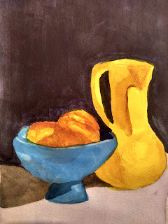
I used burnt umber in the grisailles below. Sometimes if I need to get darker, such as in the shadows, I will add some neutral tint to the umber. (you'll see that in the shadows below the vases and bowl)

When I paint an underpainting, I build up the values gradually, so that they sink into the paper. If I put too dark a layer on at one time, it is more likely to move or lift when I try to glaze over it. In the painting below I used burnt umber for the shading. ANY COLOR THAT WILL BE PURE AND SUNLIT should not be underpainted, regardless of the value, especially your yellows.


I was also experimenting with making a very dark background, so you will see the background color in black, not burnt umber. Normally, that's not my approach, but I was killing two birds with one stone. 
colors I used in this black are carbazole violet, cascade green, and quin burnt orange. Plus whatever mud was on the palette. 

Here is a good youtube on painting very dark backgrounds: with Susan Monroe. This is the method I used to create this dark black background.


Another suggestion from Anne Abgott


both are pretty short, like 7-9 minutes

I dried this completely, and was ready for the glazing process.

I used isoindoline yellow over the pot and part of the peaches; coral over the peaches; and pthalo blue over the bowl. I dried the first layer, and added more color. I found I had not shade the bottom of the yellow vase as much as I wanted, so just used some burnt umber over it. I also deepened some shadows under the blue bowl. I lifted a few hi-lites in the peaches.

VERY IMPORTANT when glazing color: Try to use a large brush and use a light touch so that you do not disturb the underpainting any more than necessary. Use a mixture that is not thin tea strength, more a coffee or cream thickness. You can go over any places that need more when it is dry.


The purpose of this process is thinking about one element at a time, first, value; second, color.

The Frugal Crafter, Lindsay Weirich, did a youtube on grisailles about 3 years ago. It's helpful to actually watch someone doing it. About 1 hour 20 minutes. She also has links to pattern to follow along. 
 Link below:


In her video she used QoR neutral tint, which is more staining than the Daniel Smith.

Some people wanted to try doing a portrait in grisaille. It is the same process. You just have to be more particular about your underpainting color. 

I did a blog on a portrait, using Elvis as a model. See Feb. 4 of 2021. There is also a portrait of my granddaughter, Iris, on the Oct 13 and 31 of 2019 blogs. (Oct 13 is monochrome; the 31st is colorized after a grisailles underpainting.)