Friday, February 3, 2023

Making a Bokeh Painting - Bird Part 1

SECRETS TO CREATING A BOKEH EFFECT 


Bokeh is a photography term used to describe a soft, out-of-focus background. There are often round circles of sunlight in it.

I've tried several different techniques for creating bokeh in watercolor, and have been mostly successful. After watching a Karen Rice method of doing it, I decided to add that to my repertoire, with a few changes.

The two main things I learned were: 

    A. Use only lifting colors (I'll list some of them below)

    B. Apply background colors in circles, wet into wet.  

Step One: Wet the background (shiny, not puddly), and start applying color in circular shapes.


Keep adding colors, also in circular shapes. These are lifting not staining colors. For this exercise, I used veridian, cerulean blue, Hansa Yellow, and Quinacridone gold. 


As it dries, after it has lost its shine but before completely dry, spritz a few drops of water over the paint. 
This is not squirting it to soak it, but sprinkling a few drops on to create small soft effects. (See the little snowy drops?) You can just make drops from the tip of a brush instead. 


Next use a template or stencil with different sizes of circles. You can buy one or you can
use a piece of yupo (or other thin plastic sheet) and punch circles in it. Lay the stencil over
the dried painting where you want a circle. Use a soft sponge (or even a Mr. Clean sponge) to gently lift circles. Blot the area with a paper towel or tissue. Overlap some circles. Don't overdo it. 
Below you'll see some circle stencils (courtesy of Dollar Tree) next to a piece of white yupo and a hole punch. 


Below you'll see bokeh done in different colors, and listing some possible lifting colors you can use. (The ones I used are highlighted)

For Blue:  Cobalt, teal, cerulean, cobalt violet, ultramarine turquoise
For red/orange: Quin. coral, burnt umber, magenta, quin gold, hansa yellow, quin burnt scarlet
(I did use magenta, which is slightly staining, but mixed with all lifting colors, it's OK)
For yellow/orange: Quin gold, hansa yellow, burnt sienna, burnt umber, quin burnt orange, Transparent pyrol orange
For green: Hansa yellow, veridian, hookers green, cobalt blue, cerulean blue, quin gold


Starting to paint the bird


I got this photo reference from Paint My Photo by Chrissy M.(It is a red bellied nuthatch)


Sketch the bird and tree trunk onto 100% cotton paper. Put small bits of masking on the dot on the eye, the beak, and a few tiny feathers on the wings. (Karen Rice uses a paperclip to make the small liles of masking) Use an old sponge to mask on bits of rough bark up and down the tree trunk. (When the masking tried, I roughed it up by rubbing my finger through it.)

Choose the color scheme you want for the background, and wet the background, avoiding the bird. Do one side of background (beside the tree trunk) at a time, so your paper doesn't dry before you are ready.
Apply the paint as described above. 

DRY the background.

In class I went ahead and demonstrated the bokeh, Using circle stencils in several sizes to lift the bokeh. Overlap some of them. Make some more white and distinct than others to increase the feeling of depth. But I'd prefer doing it after painting the bird and trunk.

TRUNK
Remember, there are patches of miskit on the trunk, roughed up a bit. Don't allow it to be in "chunks," as it needs to look rough for the bark.
I used a mixture of quin gold and ultramarine to create the mossy green. I wet the trunk, then painted in the greens on the left hand side, using the point of a credit card (or other sharp object, like bamboo pen) to pull out strands of green to look like moss. While it was wet, I then painted burnt umber and burnt sienna, allowing it to blend into some of the green. 
 Before it dried, I used the point of a credit card to create some ridges of bark, indenting the paper in ragged lines.
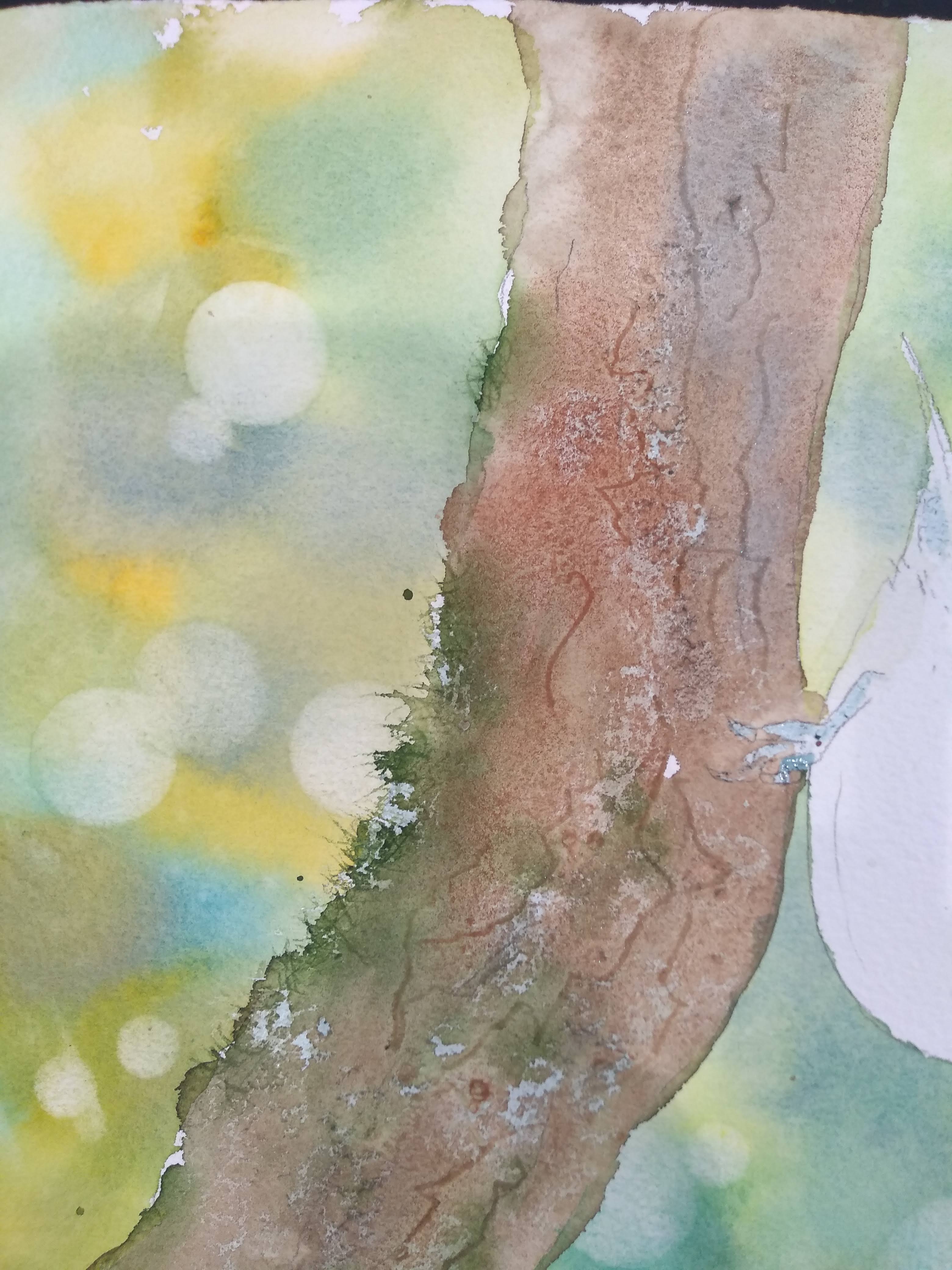
Dry the trunk.
Remove the masking fluid.


There will be some hard edges, which I want, but I don't want the white. Using gray (paynes or neutral tint) or burnt umber, lightly wash over the entire trunk. Drop in darks (greens and browns) to enhance the feeling of bark. 

I went a little further to enhance the feeling of bark, but you don't have to. I painted in some dark, small lines to indicate the bark. I also added some more greens where I thought they got lost. 

Two other things you can do are: scrape areas of the bark with a craft knife blade; and use some pastel in areas to make it look like bark.


THE BIRD

I still have masking fluid on the bird. I used cobalt grayed down with a little burnt sienna for the top of the bird.
I made an underpainting of gray on the belly of the bird, rounding it with some shading. 


After it dried, I glazed over with some orange. I painted the black over the beak and the eye with neutral tint mixed with ultramarine blue. I waited until it was dry to paint the foot. (cobalt blue grayed with burnt sienna)
To finish, I painted in some thin dark feathers and the seed in his mouth. I also deepened the blue on his shoulder and near the beak to round the head a little bit more. 


Before I added the bokeh by lifting circles, I made sure the colors surrounding the bird were the value I wanted. I wanted them a little darker around the belly so that the belly would show up better. It could be a little lighter over the head and back because that area of the bird is darker. If I need to darken an area of the background, I have to do it before I start adding circles.


Friday, January 27, 2023

Loose Floral finishing touches

 Here is what the floral looked like just after removing masking.


The first thing I did was to remove that green leaf on the left that bothered me. I used Bleed Proof White to cover it up. After it dries, you can paint over Bleed Proof White, which is why I used that instead of gouache. I had tried removing it by lifting it, but it must have been a staining paint, because it didn't remove at all. 
The next thing I did was figure out where I want to add darks and hard edges. I put a piece of clear plexiglas over the painting and used markers on the plexiglas to indicate changes I want to make. Below you see just the plexiglas after I put dry erase marker on it.


Below you can see the plexiglas over the original painting with the changes I wan to make.


In class I handed out tracing paper for people to put over their paintings. They made the changes on the tracing paper, then penciled in on the painting the changes they like. Below you can see the painting after I made some of the changes. 
I added some green to separate some roses. I added a few strokes into the rose petals. I used credit card and squeegie to make stems, and did some final touches with a small brush.


If doing the foxglove, add stems and some darks before removing the masking. Using a small brush, lightly shade the white ones, using some pale blue. You can strengthen the color in the colored ones.
They don't have to look outlined, but you do want them to be hard edged on at least one side.


You can sponge or spatter some whites (gouache or white acrylic) if you want to.

Next week I'll show how to use pastels to make corrections/changes. 


BRAG TIME

Tho none of these is completely finished, I want to show the diversity of styles:

This uses skinny tape to mask off straight edges, and sponges cut into leaf shapes for leaves. Contact paper on flowers and miskit on the white table. 


This one uses some spattered miskit, miskit in some petals, and contact paper over some areas that had been painted pink. She used credit card on leaves and vase.


This one used sponged on miskit, credit card on the vase and stems, and some sponged on paint on the flowers. Also daisies were miskit. 


This one is a large sheet of 300 pound paper with a torn arch at the top. She sponged on some miskit, then sponged on some paint. Used credit card on stems and vase, and some spattering at the end. 


Thursday, January 19, 2023

Starting a loose painting without paint brush

 DESIGNING the painting

You can look at a reference photo. I am making this one up as I go, but it's helpful to have a reference. I used a sponge dipped in miskit to mask out a pattern of flowers, as I said in the previous blog. You can use contact paper to mask out petals and other hard edged flowers, leaves.

To make a symmetric vase, cut a piece of drawing paper the length of the vase. Fold it in half lengthwise. Draw half of the vase, using the fold as the center line. Cut it out just like we used to cut out paper dolls and hearts when we were kids. Open it out and you have a symmetrical vase. Just trace that onto your paper.


First step was to add yellows and reds using a sponge dipped in watercolor. I used hansa yellow, transparent pyrrol orange, and quin magenta. Before it dried I sprayed it to make some of the paint run. 

You can tip your painting in the direction you want to make the paint run. 


The vase area: I wiped some yellow and orange on the vase after spraying it. I just let the paint run even below the vase. Using the small cut credit card, I put in some edges to the vase, trying not to outline the entire thing with the same color. I use a cut up credit card (small) and run it through some green paint, and drag it through the damp paper to create some stems in the water. Also drug it through some of the flowers above the vase. 


Here is what it looks like before removing masking fluid.


Here is how I cut up a credit card. The two small narrow ones for applying paint and making lines; a triangular one with sharp points for scoring and one with rounded edges for scratching whites, as for trees.


Below is the rubber from a squeegie. It's more flexible than a credit card, so you can make the curves around leaves, petals, and other hard edges.


Using a small edge of credit card to create some edges.


Using the credit card to put color around the edge of a leaf.


After removing masking fluid, you can see where I've put a tulip shaped contact paper to preserve a hard edged white.


After removing the masking fluid. 


I was showing how to make a leaf with squeegie rubber, but I don't like how it turned out or where I put it. So this will have to be changed somehow. 


If you want to watch Karen Rice demo a similar floral  with no paintbrush, I've included the link here: 


Thursday, January 12, 2023

Ways to apply Miskit (Masking Fluid)

 The next project involves using masking fluid to create textures and effects, so I wanted to show different ways to apply it. Once you get started finding creative ways to apply miskit, you just keep thinking of more.

Masking fluid comes in lots of brands, but you don't want to get "permanent" miskit that cannot be removed. I like to use Pebeo because the gray coloring lets me see where I have put it on the painting, but others prefer white so that it more clearly shows the white. 

You only put miskit on DRY paper, and you let it dry completely before painting over it. And the painting should be dried completely before you try to remove miskit.

Pour a little of the miskit into a small disposable lid or cup, only what you think you will use at one time. Put the lid back onto the jar so air doesn't get in and dry it up.  Don't try to put leftovers back into the bottle.

Here are some examples of ways to use it to create textures and save your whites.


Left to right, here are some of the tools I used: White masking fluid and Pebeo; a sponge cut to shape, a yellow pot scraper and green scraper; stamp; straw, bamboo pen, thin brush, graphing pen, color shaper, toothbrush. In front are a piece of corrugated cardboard and a cut credit card.


Pictured below: 
#1 is green scraper
#2 yellow pot scraper
#3 star shaped stamp
#4 star drawn with shaper (silicon)
#5 Sponge cut in triangle, used as stamp
#6 Contact paper cut in a shape
#7 Drafting pen
#8 credit card
#9 torn sponge (cellulose, not natural)
#10 toothbrush spatter
#11 Corrugated cardboard
#12 dip pen
#13 spatter from brush
#14 rubber squeegie-- to cover larger flat area
#15 Stencil letters


Here are a few more. The tenth one shows miskit that has been dried and then rubbed
through with fingers to rough it up. The 8th one (with stamping) shows a circle made
by a milk bottle lid and two small circles made using the "bullets" from a Nerf gun.


So look at the textures you've made, and imagine what you could use it for. Fine lines on the whiskers of a cat? A bushy beard? Spider webs? Snowflakes? Wording on a sign? Gravel or sand? Windows? siding on a barn? Smoke from a chimney? Fence posts?

To remove miskit, use a RUBBER CEMENT ERASER. Hobby Lobby sells them for about $2.50. Lacking one of those, you can use your finger, or just wrap masking tape around two fingers, sticky side out, and remove it with the tape. Make sure your paper is completely dry before removing it.

TIPS ON APPLYING MISKIT WITH A BRUSH

Most of the methods I've shown use a tool that can be wiped clean after the miskit dries or just pitched, like a sponge or scraper. A brush is different. NEVER use a good brush. You can wet the brush and apply a little bar soap before dipping it into the miskit. Some people just wet the brush often. Wash well with soap and water afterward. You will not be able to use this brush for watercolor afterword. Miskit will clump up on the brush if you're not careful. If it does, soak it in Goof-Off to clean it.

In the project we are going to start, we are mostly going to use sponging, scrapers, contact paper, and some stamps.

The project will be a loose floral painted mostly without brushwork. I got the idea from Karen Rice, who has a website and some youtubes, which I will attach to the next blog, giving full credit where it is due.

Your assignment is to find a floral reference (or take a pic of one) that appeals to you. Make some small sketches, concentrating on the white/light shapes that lead the eye through the picture in an interesting way.  You will be drawing just those basic shapes on your paper and applying masking fluid to the whites.

In the picture below I've applied miskit with a yellow scouring pad in different sizes and shapes,
twisting it a little to get small rose shapes. (I've darkened the shapes so they are easier for you to see)
In a way, I'm partially "composing" the painting with miskit, which I can add or erase if I don't like it. You can see that I didn't do a lot of drawing. 

Here is a small checklist:

Does it form an interesting pattern?
Do I have a variety of shapes and sizes?
Does it look balanced?
Does it fit the space? (In other words, are you filling the space without crowding)


Please don't begin painting yet. You can do a preliminary sketch if you like and put on some miskit, but that's all. 


Friday, November 18, 2022

Finishing the Cardinals

 I wasn't happy with the flatness on the upper chest of the female. My paint had dried before salt could react on it. So I put another layer of paint on it and used some popcorn salt, and it reacted just fine the second time.


To separate the feathers, use a gray, and with a small brush, outline the feathers, then use water to soften them on the bottom edge. (I made this gray from ultramarine and burnt sienna). 


The eyes: the eyes have a lighter rim around them. If you look very closely, you have the outer rim, a medium brown, then dark black, then white highlight. But since it's so small, I skipped the medium brown, did a black center, then, when dry, added a tiny highlight with gouache or white ink. 

(Hint: you can add these tiny details with black watercolor pencil dipped in water. Sometimes my hands shake too much for tiny details with a brush, and I resort to watercolor pencil for control)


For the red cardinal, add at least another layer of reds, but don't try to go too dark too fast. You are building up layers, so be patient. Use your transparent pyrrol orange to warm up areas that are too cool; use alizarin to cool off areas that might be too warm. Aim for some roundness in the belly area.

On both birds, think of them as being two round balls, a small for the head and a large for the breast area. Think about shading them as you would a ball, only a soft fuzzy one. They will read much better, instead of looking flat. 

Separate the wings in the same manner as the female, only use darker gray or even blue or purple to separate the wing feathers. Pay attention to the roundness and softness of the shoulder, the short feathers next, then the longer flight feathers. Separate the tail feathers. 

Lift any areas that need to be lighter or come forward. 

For the black mask, I wet the area and wet just beyond where I want the black to go. You can make a black or use a tube black or paynes gray. Apply the paint around the beak first, making a nice hard line against the beak. Then gently spread the black to the outer part of the mask, and let the water move the paint into the wet areas. It should create a softer edge where the black and red feathers meet. 

(see the above picture)

For the berries, treat groups as one shape. Underpaint them with coral or transparent pyrrol orange. When they dry, separate shapes with alizarin crimson. For deeper shadows, add some purple to your alizarin. The contrast of the dark and light red shapes will make the berries look more transparent. 

For the leaves, underpaint all with a layer of yellow or green gold. When that dries, use a blue to paint areas that will show bends in the leaves. (shadowed) When that dries, use a darker green to paint over the entire leaf, leaving the very thin middle line of the leaf. (It will show yellow at this point) When dry, use clean water to blush over the leaf, including the line. This will make the middle of the leaf blend in better. If you want to lift some highlights, wait until it is completely dry, and lift a few highlights.


The stem is a color called rose of ultramarine, but you can make it by adding magenta to your purple. Wet the stem, then add the color at the bottom, letting the color rise to the top of the stem. When it dries, make sure the bottom is darker than the top to make it appear round. Also, make the leaves look attached to the stem. You can just wet the bottom of the leaf and drag some of the color into the stem where it attaches. 


If you want to make the female bird's breast feel fuzzier, you can try using small strokes of white pastel pencil or white General's pencil. You can also try stroking some white pastel over areas to emphasize the soft feel. But these things should be done AFTER all the other painting is done.


For blogs about negative painting the leaves, a lesson from a few weeks ago, see below:


beginning the leaf painting

Finishing leaves, June 2016


some youtubes explaining negative painting


Saturday, November 12, 2022

Cardinal Christmas Card

 Background or no background?

This is the first try for painting cardinals. I was asked why I didn't give it a background. Do all paintings need one? I think it's personal preference and what you want to do with the painting. I want this one to be a simple Christmas card, so didn't put in a background. But....


I originally considered putting in some loose background color. To see if it was something I would like, I did the painting on yupo, adding some light green and red in the background. I also wanted to see if I wanted to move add some berries and change a few things. Yupo was a good, fast way to experiment without ruining a picture at the beginning.

Yupo version:


I decided I liked the drippy background, so put it onto the cold press paper. I just sprayed a little, 
dripped some color on, and moved the paper up and down to move the drips in the direction I wanted. I then began with the female. I did use a tiny bit of masking fluid on the tail and dot on the eye. On the original, I didn't use any miskit.
Colors I used: raw sienna (or quin gold), burnt sienna, ultramarine blue, and transparent pyrrol orange. (can use yellow and coral instead.)

I wet the face, crest, and breast of the bird. Wet in wet, I put raw sienna over the head and top of the breast, adding some burnt sienna in the darker part of the head. Sprinkled salt...popcorn salt preferably...onto the top of the breast. Made a gray from the blue and orange, and used that on the lower part  and sides of the breast/belly, very lightly, to create some roundness.

I used transparent pyrrol orange to the tail and wing feathers. (These will get grayer later in the process)
 The beaks are made from yellow and quin coral or transparent pyrrol orange. When they dried, coral was used to separate the top and bottom beaks, and a highlight was lifted from the upper beak. 


This painting is about building up layers. Don't try to get the colors perfect the first layer. It looks better if you can build them up.
Here I added some burnt sienna and orange to the crest and head. When it was dry, I painted the black mask, and then added a little more burnt sienna around the edges to keep the edges soft.

The eyes need to have a small circle around the darkest black of the eye. It isn't white white, but it needs to be lighter than the black of the eye. 


I wanted to get in a base for the red cardinal. He especially needs to be built up in layers, and I want to have time next week to do him right. Colors are cobalt blue (but you can use ultramarine), pyrrol red (or any red or orange red), and alizarin crimson. I wet the body, and used blue on shadow areas: underneath the breast, under the wing, part of the tail, the crest, some on the upper wing. Then I used the warm red on the breast and face and crest, and alizarin on the tail, letting the colors run together. 

Do not try to avoid the black areas. You can easily paint over any color with black. 

On the female bird, I used a little gray (made from blue and orange) on the tail feathers and upper wing. 


Here are the reference photos I used:


photo by Megan Zopf
PMP

Evereau Ozdemir PMP


Goran Hocoel-- PMP


I also want to point out that your birds will look more realistic if you pay just a bit of attention to the wing feathers.  The wings on the cardinals are very much like the bird on the bottom right. The upper shoulder (scapular)  feathers are small and soft, and not individually distinct.  Then there is a layer of small but detailed feathers. Then come the secondary, longer feathers. And last are the long primary flight feathers. The actual back of the bird has tiny feathers that are covered up by the folded wing feathers. 


Hopefully you can see some of these distinctions in the painting below. 


Next week: finishing the details on the birds and the holly.