Sunday, July 10, 2016

TWO ROSES DEMO

Here are the steps to completing the rose painting we started in class. 


In the first picture we had already copied the picture. You can see where we applied cobalt on the red rose on areas that would face the sky. We applied some quinacridone gold on areas of the red rose that will be the warmest, the areas nearest the heart of the rose.


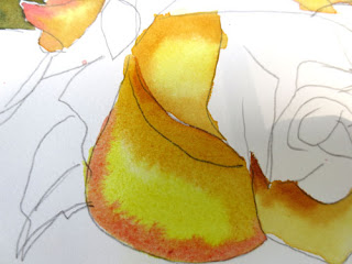
On the yellow rose, we wet each petal, one at a time, then painted some hansa yellow (or another cool yellow) in the center of the petal. Then we applied quin gold to the center, warmer part of the petal, and some red along the edge. The red is a thicker when it is painted in. Remember, the wetter the paint, the lighter it will be when it dries. 


While it is still wet, apply more red to the outer edge and more quin gold to the center. 


Use the above technique on each petal, one at a time, working around the rose so that you are never working next to a wet petal. I like to leave tiny bits of white on the edges of some petals. This just gives some sparkle to the painting.


In this picture, I have darkened some of the red areas and added more quin gold to the deeper or shadowed parts of the yellow flower. I am using Quin Gold because you can get a deeper value in the shadows than other yellows. Remember, you can't get a darker value than the color that comes straight out of the tube.

You can see in the red rose that I have begun to add reds to the petals. Where we had underpainted with gold, the colors look warmer, and where we underpainted with cobalt blue, the colors look cooler.


In the above picture I have finished washing reds over the entire rose. I've added some darks to separate the two roses even further on the very bottom red petal and on the very top. 


To paint the leaves, I wet the leaf and put a light wash of cobalt blue.


I then applied quin gold over the cobalt, adding in a dab of red on the most shadowed parts of the leaf and yellow on the tips that would get more sun.


Next I painted the rose bud, wetting it all over, then just applying red on the outside and letting it blend into the center, keeping the center fairly white. When it dried, I added a thicker blend of red to the center and shadows.


After I was sure I had all the paint where I wanted it, I began to gently lift in places I wanted to have highlights or be softened, especially where the petal might curve. 

I added a background because I could not get some pesky spots off the white paper. I just got a large area wet, washed in some cobalt, and added some watery reds. Then I created some "blossoms" by dropping water drops into paint that was almost but not quite dry.


Last picture! The background didn't hide those spots well enough, so I added two leaves under teh red rose. I blushed on some red in parts of the yellow rose. Then I discovered I'd completely left out one of the petals! (See if you can tell the difference!) So Ipainted that in too. Voila! Done at last!

Tuesday, July 5, 2016

SNOW SCENE


The purpose of this lesson was to experiment with a different paper - 300 lb arches cold press-- and to discover different ways to preserve whites.

We started with masking tape, and tore strips of it down the long sides to create tree trunks. We used smaller ones for branches. We also experimented with ironing on strips of white freezer paper (waxed on one side.)  Most of us discovered that the roughness of the 300 lb paper doesn't allow the freezer paper to stick as well.  (in the picture above I've done the same thing--you can see the blue tape--but I've started a fall scene. Just ignore the paint and see how we taped off trees and grass)

Then we used Contact Paper to cut out the shape of a little cabin in the background. Then we spattered some snow with miskit. All this before we even picked up a brush to paint!


Leaving on all the tape and miskit, we used a combination of ultramarine blue, burnt sienna, and a bit of red to wash in  a dark sky. The darker the sky the more the snow shows up. While the paint was wet, sprinkle a little salt into the whole area. After all that was dry, and salt was scraped off, we created a little bit of background bushes behind the trees and cabin using the same mixture, only adding a bit of green to it. We kept it very soft to imply distance.

After drying, we removed all the tape, contact paper, and miskit. Then we began to work on the trees.
This picture above shows about how far we got in the class.

To create tree bark, trying for an aspen type of tree with white bark, we used ultramarine blue and burnt sienna again. We applied about an inch or two of paint on one side of the tree (in my case, the left side) and scraped it with a cut up credit card to create the bark.


In the next class we just have a bit to finish up. We'll finish the trees. The barn/cabin will be painted with a little red toned down with the blue/burnt sienna combination. The siding will be created by scraping the credit card into the wet red paint. We will shade small mounds of snow and make the trees look like they are attached to the ground. And for the last step, we will spatter white guoache for a little more snow effect. 


Wednesday, June 15, 2016

Orchids and Strawberries

Two paintings recently finished and put in the June art show at Greendale Cabin.


Our art guild, Southeast Indiana Art Guild, hosted a special event today at the Greendale Cabin. Steve Harpster, a Cincinnati cartoonist, gave a great presentation to local kids. With Steve's unique style of teaching, he had kids from 4 to 14 drawing successfully and loving it. He starts with a letter or a number and teaches them step by step how to turn it into a cartoon. I was so pleased that we could bring him to our community.

Anyone interested in seeing videos of what he does or buying his books can view more at harptoons.com.


Saturday, June 4, 2016

Special Olympics 4 letter Words

The object of today's Special Olympics art program was to think of a 4-letter word that represents you and paint it in complimentary or opposite colors. Got this idea from a lesson Pat Hunger did in school when teaching about Indiana artist, Robert Indiana. I love what the kids came up with.

I have to say I absolutely love teaching this class, and can't wait to do it again, hopefully this fall if we can coordinate everything. And many thanks to Jodie Cole and Marlene Green for their help. They worked so well with these students!


Friday, June 3, 2016

NEGATIVE PAINTING FINISHED


Here is where I left off on the negative painting, with the background painted (in this case with blue tones to emphasize the warms in the leaves). Note that it does not have to be all one color, just so that the colors flow into each other.


Next I darken some areas behind the leaves to emphasize the ones I want to be important. (notice the rounder leaves on the left) To separate shapes, where one leaf or stem is on top of another, I paint beneath or behind the upper leaf, painting the shadow of it onto whatever is underneath it. Since my underpainting is dry, I can still use wet into wet: wet the area to be painted, brush color into that area, and use a clean damp brush to soften the color away.


Now I want to do some clean up with my lifting (scrubbing) brush. On narrow parts, like the stems, I can put masking tape on each side and drag my clean wet scrubber brush across the area to make it lighter. I have also softened other areas on the leaves that I think are too dark. (This is old paint, so it did not lift as well as newer paint.)


I needed the leaf on the far right top to become much less important, so I used a green grayed with orange in it to color that leaf. It's usually not a good idea to have the white running off the edge of your painting. I added some detail, like veins in some leaves. You can add as much detail in your painting as you need, but I liked this without much detail at all.

Thursday, June 2, 2016

FIRST OIL PAINTING IN 43 YEARS!

May 20th I took a delightful oil painting class from local oil painter, Cindy Crofoot. I had not painted in oils for over 43 years, and had never received any oil instruction at all. Here are the two (nearly finished) oil paintings I did in her workshop. I highly recommend Cindy as a teacher. Water color is my true love, but I'm not so scared of oils now.

(Debi...I told you there was a duck!)