Thursday, October 28, 2021

Fall Scene with trees

 I have a post to describe this process. You can look at August 13, 2020. I did it while we were in COVID mode, and I was doing Zoom classes. So check out that post for this fun wet in wet project.


The July 5 of 2016 post will show some student work doing a winter scene using this process. Also March 23 of 2018. 

Below are a few from that lesson in July 5, 2016.


Ideas to finish the Owl

Here is what the owl looked like when I finished the last bit of work. I was happy with it, but I wanted more softness around the beak and eyes. 


The first thing I did was lift and soften paint around the eyes with a lifting brush. I lifted some of the white across the right (to me) side of the nose and eye to indicate the bone line in that area.
Then I put a light wash of the blue and purple colors in that large white area above the beak and salted it with POPCORN salt, which gives a very soft effect. 


I added a dark ridge of feathers along the left side. I darkened under the eye to the right of the page, still using the 3 colors I started with. (purple, turquoise, and quin burnt scarlet)

I began to add some black and dark browns to the feathers on the forehead and other places I felt needed it. I began to strengthen the color around the white feathers on the eye left on the page.

I also began to paint some darks beneath his chest feathers. 


left eye detail


head feathers detail


My background was white, but I wanted to demonstrate how to make corrections, especially in the shape of the figure, with a dark background. So I mixed a black. I wet a few inches at a time, being careful around the outside shape. I painted in black a few inches at a time, and with a detail brush, pulled the dark paint into the sides of the owl to create whiskery feathers. I worked around the shape a little at a time. 


When everything was dry, I used a tattoo needle - you can use a craft knife/razor blade -- to scratch in feathers along the eye. 


I ran a wet brush across the body to soften some of the feathers. Then I added some darks. Also note that I added tiny brush strokes around this left eye to darken the feathers there. I used white pastel to reclaim some of my white feathers.


Here they are side by side. 

Below, you can see how I used black pastel to get really dark around the background. I also used a little white pastel to bring out some
white feathers in the body, and some black to some of the feather tips.


Below I did the owl (what, again?) only this time on gesso. I applied a coat of gesso to paper, then for texture, I crinkled some plastic wrap, set it on the wet gesso, then pulled it up again and let the gesso dry.
I wanted the eyes smooth, so where it was rough, I lightly sanded the gesso in the eyes. I haven't done anything beyond the basics, but I love how the color reacts on the gesso. And I like how easy it is to wipe away whites, even with staining colors. This was a process very similar to the zebra found in my September post.


Saturday, October 23, 2021

ANDY WARHOL PORTRAITS

 I did a fun project on Andy Warhol with 16 kids aged 9 - 14 for our library. I'll post some of the results. Below I'm describing the process.

Take a headshot photo. Use photoshop, Notanizer, or other photo editing software to reduce it to three values. 


Look over your picture and decide if you want to add more details or take some out.

Trace the lines between the values on a piece of cardstock. (colored or white) Go over them with a sharpie, if you wish.

Make each value a different color (so you should use 3 colors). They should be bright, vivid colors.

This can also be done by cutting each value out of a different color of cardstock. Any small details (small lines, eyes, etc.) can be done in marker. You can also use paint or pencil or pastels. 


Thursday, October 21, 2021

OWLS, EYES, AND MAKING BLACK


I found this image on Unsplash by Ahmed Badawy. The eyes are so piercing, I had to try it.


First I had everyone do some "practice" eyes to get the hang of this. They seem to be the most dramatic part of this painting.  The colors I used were a medium yellow, (I used New Gamboge with a little hansa in it to cool it off), quin gold, and a bit of quin burnt scarlet, but burnt sienna will work.

I used a size 8 round with a nice tip. Wet the eye all over--except for the tiny highlight--and cover it with yellow. I wasn't being too careful because I knew I was going to outline it all in black. I want it to stay shiny, but not puddly, so had to soak up that puddle at the bottom.


With the quin gold, I gently dotted around the outside of the eye to let it bleed into the yellow.
When doing this, if you will load your brush, and then tap it onto a paper towel to remove excess moisture, you will have more control over this step. The paint on your brush should be
dryer than the paint on the paper. 


Using the tip of the brush, start at the top of the eye and tap in some quin gold in a partial circle around the center of the eye. Make another partial circle beneath that. If you want more depth, and the eye is still damp, tap in burnt sienna or quin burnt scarlet around the edges.


Dry the eye completely before trying to add the black. Paint in the pupil with black, hard
edged all around, and leaving the tiny white highlight. 
Then, a little at a time, begin painting the black around the eyeball. You want a hard edge around the eyeball, but you want it to soften it a little where the eye touches the feathers.
So, with a small brush, tap the outer edge with some water to create a softer edge, keeping the black by the eyeball hard.

(More on how to make black later)


Here you can see the finished eye. If you want to lift a little light into the yellow later, wait until the eye is completely dry. 


MAKING BLACK 

There are many ways to make an effective black, and advantages to making your own black. 
One is that it is not as "flat" looking as a tube black. Another is that you can make it from a limited palette. And another is that, when you soften edges, you get a variety of color. If you look at the eye above, see the greenish blue hue of the areas where I softened the edges.

Below is a chart of possibilities for making blacks. This is where using tube colors is an advantage. You can squeeze your darkest colors straight from the tube instead of trying to rewet enough color from a palette to get it dark enough. 

If you want a dark color, you need to use two (at least 2) colors with dark values. Others not shown on here are indigo and burnt umber; purple and burnt umber with some blue. 
Usually you want a warm (like a deep brown) and a dark cool.


FINISHING THE OWL

Paint in the beak leaving the highlight along the middle. As I painted the dark, while it was wet, I used a tiny brush to paint in some feathers along the beak, painting from the beak into the feathers, 


FOR THE BODY: Choose 3 colors that appeal to you. Get creative. I tried to use two cools and a warm that was close to complement of one of the colors to neutralize areas. For example, the one below used jadite (a deep green), Ultramarine blue, and for the complement, lunar earth...which also gave me tons of sediment. (You could use 2 warms and 1 cool complement also)


This one used purple, ultramarine, and quin burnt scarlet for the complement. 
Starting with the head, I sprayed lightly, leaving droplets of water on the paper. I used a fairly large round brush (or mop) and dropped in my colors, avoiding the white areas around the eyes and beak. While wet, I sprinkled in some kosher (pretzel) salt, which gives that feathery look on the head.

When I was happy with that, I did the same on the body of the owl, leaving small patches of white. Where paint dried before I could put on salt, I spattered clean water to try to get some backruns and texture. 


This is as far I we got in class. Next week I will show a few ideas on finishing the owl, although I kind of like it as is. 


Thursday, October 14, 2021

EASY FALL PUMPKINS

 IT IS FALL AGAIN!

My favorite time of the year. I love the colors, the smells, the crispness in the air. It's so fun to paint when nature is calling you to paint her.

I have a few new students today, so I am using these simple forms to show some of the basics of watercolor....things you need to master to move on to other things. Like the ten commandments, they form the basis for any painting attempt.

Colors used: new gamboge (warm yellow); Quin coral (or other warm red...one that leans toward orange); burnt sienna; pthalo blue or a green.


First, just draw 3 pumpkins, any shape or size. I want 3 to show 3 different ways to approach watercolor painting. 

Method #1: Wet into wet, allowing paint to mix on the paper.

First "wake up" your paints by spraying them with water. Decide on the colors you want and make puddles of them so they are readily available to you. 

Wet the entire pumpkin. Think about where you would like to leave some whites. Drop or brush in yellow first (not necessarily painting the entire thing yellow). Then add your coral or red into places it will be darker, and allow the two colors to mingle on the paper. You can "encourage" the paint to go in the direction you want it to. Spatter a little color if you want to while it is wet.

Things to observe/remember about wet in wet:
1. The paint will dry lighter
2. You want it shiny wet, but not puddly.
3. Give your paints the freedom to go where they want. 


Method #2: wet on dry paper

With this method, you mix your color on the palette and apply it to dry paper. 
Work every other section so you aren't painting into any wet spots.
I am left handed, so I work right to left to avoid dragging my arm through wet paint.
(Or sometimes I'll work upside down to avoid that problem)
Start at the part of a section that is darkest (the "seams"), and bring the color down along that line. These are a bit crescent shaped, so try not to make it a thin line, but a crescent shape, following the shape of the section. Quickly rinse your brush, and wet the edge where you stopped, and drag the wet brush along the edge of the shape to soften and lighten. Your are trying to create a HARD edge along the seam, but a SOFT edge as you move the paint away from the edge. 

Paint every other section. 


When it is dry, paint the other sections. You can deepen the color of the orange by adding burnt sienna (or quin burnt orange or quin burnt scarlet)

Then, after the wet-in-wet one is dry, go  back to the pumpkin where you did wet on wet, and create the sections in a similar manner. This time you only need to paint the seam area dark, wet the line before it becomes a hard edge, and soften it into your shape.


The third method is to create some fun texture using salt or dropping color into damp paint.
I did this twice, both which you see below. 
I did two things at once: I created the shadow of the top pumpkin while getting some texture on this one. 

Carefully wet the entire pumpkin, taking special care around the bottom shape of the pumpkin above it. 
Drop yellow into the shape, then drop blues (I used pthalo, but turquoise or other blues will work)
I want yellow to show, but, since I know I'm using salt on it, I know that yellow doesn't show salt effects as well as some other colors, so I drop a lot of green. I carefully go around the bottom of that top pumpkin with blue to create a shadow and to define the shape.

When my yellow/green mix is still shiny, but NOT puddly, I drop in pretzel salt. Pretzel salt will create those large soft blooms; table salt will create smaller blooms; and popcorn salt, will create very fine, more subtle, soft edges. 

Always dry completely before the next step. Allow the salt to react until it is what you want, and then you can blow dry. Blow drying will stop the reaction.


Same thing, only using table salt.


Here is what it looks like almost finished. I've used greens to define the sections instead of oranges. 
Go back under each pumpkin and strengthen the shadows and give the bottoms more definition. It's amazing what a little shadow will do for the realism!


Here, just for fun, I created a few warts for my pumpkin.

This is done with negative painting. Define a few warts with soft pencil lines.
Darken underneath the wart so that is has a hard line next to the wart, then soften it away on the pumpkin surface. Dark and hard edged near the wart; softened away into the pumpkin.


Finish your picture with a stem, leaves, spatters, or however you want it to be. 
Have fun with it. No one is going to come from the pumpkin police and tell you that it's wrong!!!

So here's a review of the 10 Commandments of Watercolor:

1. DO leave white. That is the sparkle of your paper.
2. DO only paint if the paper is shiny wet or bone dry.
3. DO plan your colors and get them wet and prepared before you paint.
4. Use good quality supplies ESPECIALLY 100% cotton paper
5. Use the right brush for the right job. (you wouldn't scrub your tub with a toothbrush or a baby bottle with a toilet brush)

6. DON'T use too much or too little water
7. DON'T outline objects or use long lines of the same color
8. DO NOT focus on details first
9. DON'T depend only on color to produce a good painting.
10. DO NOT COMPARE yourself to anyone else. "Don't let a comparing spirit rob you of your creative spirit.

HAVE FUN!!


Thursday, September 23, 2021

A Few Loose Painting Tips/Wisteria

What is "loose" painting? I brought several books by different painters I consider having a loose style: Charles Reid, Zoltan Szabo, and Jean Haines. All have totally different styles, but they have one thing in common: their paintings are simplified down to the most important elements. They may have some details in them, but not a lot. They suggest objects through color, shape, value, and lost and found edges. 

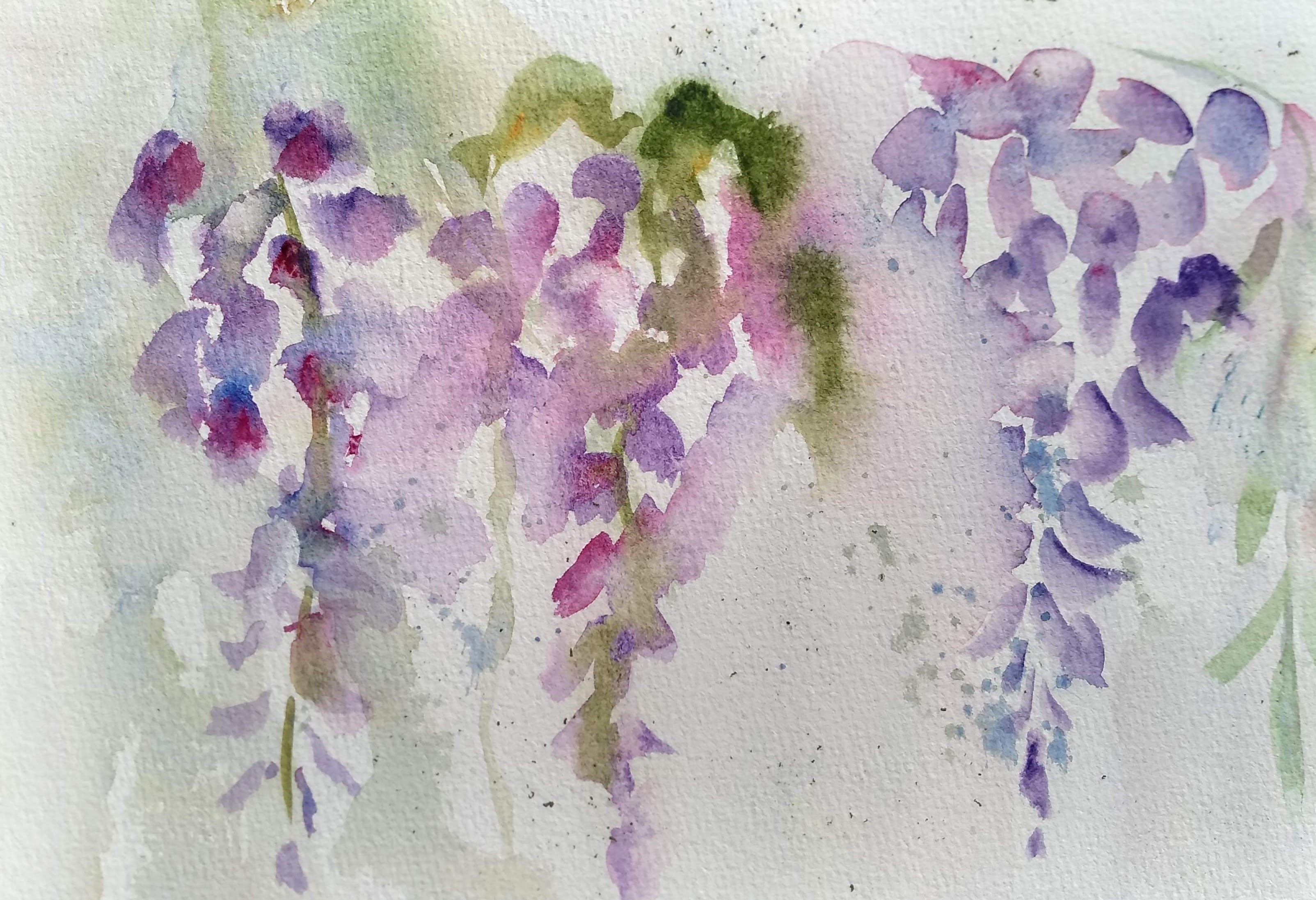
Below is a painting of wisteria that I tried in Jean Haines Online Workshop. There are suggested forms and some detail.   


A few simple suggestions that I've seen from painters who prefer a loose style:
1. Use Big brush/Small paper
This is to teach yourself to simplify your picture.
2. Hold brushes near the end, not up close to the bristles. Try to use your arms muscles, not just your hand and finger muscles to paint.
3. Simplify/simplify/simplify
4. Leave whites. White paper is oxygen to a watercolorist. (Jean Haines says so)
5. Try holding the brush in a Chinese style, not in a handwriting grip.
6. Learn a few simple brush strokes and practice them. 
7. Learn to "connect" shapes in a way that creates a more interesting painting.

Practice brush strokes

Using the biggest round  brush you feel comfortable with, practice making brush strokes. Standing up gives you more freedom of movement in your arm. Hold the tip vertically to create thin lines....to the side to create wider lines. Touch the tip to the paper, then push down on the belly of the brush to make it wider, then lift up again. Make lots of free strokes using your whole arm.
Lay down some strokes, and while wet, add a different color. Put clean watrer next to a stroke, and bleed some of the color into the water. (I will try to find a video that explains some of these strokes)

(Cafe Water Color - highly recommend)

(strokes used in flowers)


When you feel you are warmed up, decide on which colors you want to use. I did a "dancing ladies" exercise, which is Jean Haines' method of seeing how colors react to each other. Dot color from the tube at the top. Wet a stream of water beneath the dot, then encourage the paint into the water. Mix colors from other dots into it to see what combinations you can make. 

I decided on Ultramarine violet, Janet's violet Rose, Quin Gold, and Ultramarine Blue (to make green and to accent the violets) After you decide, you can USE THESE AS YOUR PALETTE. 


Use a photo or wisteria buds for reference. This is your reference, you are not trying to copy it petal for petal. You just need to study it to get a general idea of how it grows, what makes it look unique.

I am left-handed, so I started on the right side of the page. There are 3 different methods shown for painting a loose wisteria. 
On the far right, the first method is on dry paper. I made some marks to indicate petal shapes, trying to vary their shapes, always keeping in mind that I am aiming for a long triangular shape with larger petals on the top and thinner, airier ones toward the bottom. I looked for opportunities to "connect" these petals, either by overlapping them or letting one bleed into another. While wet, I tried to add blues or magenta to lesson the flat look. I also took clean water to create "lost edges," see the left side of the wisteria.

In the middle is the 2nd method. I dropped "reservoirs" of water here and there, and applied paint to the dry areas and let them touch the wet areas. Remember, you don't want a polka dot effect. You want to vary the size and shape of the spaces between petals and create connections. One this one I used my green (created from ultramarine blue and quin gold) and let it bleed into some of the violets.

On the right is the 3rd pethod. I lightly sprayed, created little droplets of water. (the paper is not solidly wet, just has some droplets on it) The class gave me the challenge of painting it right handed (I am a lefty) and holding it like a Chinese brush near the tip. I still made general shapes, added color wet into wet, and found opportunities to connect shapes while maintaining whites. 


When it was dry, we discussed 3 things you can do to make adjustments.

1. If you got too heavy-handed with color and want to get some whites back, try to lift some shapes gently. (I used a Monarch brush--firm but not harsh and stiff). You can also soften some of your edges this way.

2. You can use negative painting to carve out some shapes.

3. You can use guouache (white) to get some whites back where lifting doesn't work.

You can also spatter. On this one, I used watercolor pencil shavings, misted them with a spray bottle, and let them dry. 


Thursday, September 16, 2021

FINISHING THE BIRTH FLOWERS

 LETTERING

There are several ways to add lettering to the project. Of course, you can carefully letter each word by hand. Some people chose to write names as the bottom part of the stems vertically; some chose to write horizontally across the bottom. Some chose to add a family name, some did not. It is all personal preference.

Method 1: masking off lettering and using Brush-O. (or other spattering method)

Brush-O is a fairly modern product that can be purchased on Amazon.com. About $28 for a 6-color set.

It is a fine crystal that ignites into brilliant colors when sprayed with water. There are several youtubes on painting with the product, and I have a blog explaining it in more detail. (A fun suggestion for someone who doesn't know what to get you for Christmas) You tap on a small amount of crystal color, then spray. Or wet the paper first and then tap on crystals. You will see that effect on the bottoms of some of the following paintings.

For lettering, first mask off the letters either with miskit or stickers you can buy at Dollar Tree. I used stencils to draw the 2nd line and miskit over that. COVER ANY THING YOU DON"T WANT to add Brusho to. Then apply a bit of brush-o and mist lightly with a spray bottle until you get the effect you want. 

Below you'll see where I have lined up stickers on the first row, miskit letters on the second row, and used miskit on a dip pen to free-hand letters.

T

Below you can see where I have used brush-o over the tops of these letters. When they dried, I removed the stickers and miskit.
At the bottom of the page, I'd demonstrated two other options: spattering with a toothbrush and regular spattering; and shaving a watercolor pencil and spraying to create spattering effects. 


Method #2 for lettering: Just use your computer to choose a font for your letters. Type out the words you want, make them the size you wish, print out, and then trace them onto your project. This came from Kerry, who is great at finding solutions to problems.

STUDENT SHOWCASE

Cathy's 1st piece after Brush-O (hasn't inked letters yet)


Cathy's first piece without Brush-o


Cathy's 2nd piece


Mine, not finished, using stickers to make letters


Dorothy's: liked the simplicity without Brush-O.


Dolores: Used watercolor pencil shavings at bottom.


Dolores: gave it a background color instead 


Kerry's 1st: Notice the lettering: words were typed on the computer first, enlarged to desired size, and then traced onto the project.


Kerry's 2nd project


Barb (below) chose a vertical format, and no brush-o or other embellishments.
The adorable bees were originally a yellow drip that wouldn't lift off, so they
became bees, adding a whimsical touch.


Brush-O youtubes:


Once you get on youtube, you'll find lots of projects and ideas!