Friday, March 11, 2022

You are invited:

 Here is an invitation to our guild's annual spring art show. Each artist is allowed to put in 6 items, but they have to be new, never shown here. Hope to see you there! (PS...if the times don't work out for you, call me and I'll arrange a time to meet you there!)


Chri


ALSO: Spring class begins the first Thursday in April, April 7. It will go for 8 weeks.


Playing with textures

 One way to do a background is to do that first and incorporate it into the painting. Here are a

few ways to accomplish this:

1. Plan several textures. On this example I spattered miskit, laid down joint tape; used saran wrap and wax paper; and dropped coins on the wet paper, and salted the wet paint.

After it dried, I sketched some still life on it and began to paint. I could also do some negative painting. Haven't decided on how to finish it yet, but at this point you can see many of the textures in the background.


The point of this exercise is to let yourself experiment with textures. In the one below, I showed how you could, if you wanted, do some planned painting using textures: used contac paper for the tree shape; miskited out some distant tree trunks; used cheese cloth for distant brush; joint tape; stretched saran wrap to create water in a stream, and wax paper cut circles to create some rock texture in the forground. This could be turned into a loose landscape without too much effort.


Another way to do a background first is to spatter miskit, blow it with a straw, or otherwise spread some miskit on the paper. If I get globby shapes I don't like, I rub it when it is dry to get shapes I like better, or get rid of shape I don't like. After the miskit is dry, create a light wash over it. Remove the miskit. Then place your sketch over the background. It could be anything: flowers, a ballet dancer, faces, buildings, anything you like.


Wednesday, March 9, 2022

Student work using grisaille


Here's a bit of show and tell of student work using grisailles method in one way or another.

Barb did this picture using burnt sienna for the underpainting and following
one of the methods for creating a black background.


Jackie used color for underpaintings, and then created a misty background 
that works well with the hands.


Sylvia had done this painting in sepia and pen in the past, and is
experimenting with glazing color over it.


Shirley used brown Brusho for the underpainting and
the shadows. Looks better than the photo.


Dorothy underpainted, then wanted to warm up the skin..
Working on those curls was a challenge!


Here I took the beginnings of a demo on underpainting and just
made up the rest. I underpainted with Brusho, then used several flesh tone
glazes, keeping warmer colors on the left and cooler on the right. I wanted to play with the hair, 
so added greens and oranges; lifting out some highlights; and finishing with what looks like pastels, but isn't. It is a product called Intense Blocks....like Inktense colored pencils but in sticks the size of pastel sticks. 
You can use them wet or dry...wet to create washes of color; dry to give a pastel look.

I added the necklace to bring the eye around instead of stopping at the hair on the left.


Inktense Blocks


Saturday, February 26, 2022

More about Grisailles

 Pronounced gris-i' (long I at the end), it is from the French gris, meaning gray. If you use brown as an underpainting, it is brunailles; green is verdailles, etc. But generally underpainting in one color is considered grisailles.

Originally this was an oil painting technique. You underpaint all the values either in gray, umber, sepia, or even India ink (not a shiny ink, but one that will absorb into the paper and allow the watercolor to absorb into paper),  then you paint over it with thin glazes of color until you get what you want. It's almost like magic. Doing this in watercolor takes a little thought, but worth the effort. You have to use color that will not bleed or lift when you paint a glaze over it. (We call these colors "staining.") 


My reference from unsplash by Garreth-Paul.


Done in notanizer with 6 values.


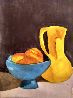
I used burnt umber in the grisailles below. Sometimes if I need to get darker, such as in the shadows, I will add some neutral tint to the umber. (you'll see that in the shadows below the vases and bowl)

When I paint an underpainting, I build up the values gradually, so that they sink into the paper. If I put too dark a layer on at one time, it is more likely to move or lift when I try to glaze over it. In the painting below I used burnt umber for the shading. ANY COLOR THAT WILL BE PURE AND SUNLIT should not be underpainted, regardless of the value, especially your yellows.


I was also experimenting with making a very dark background, so you will see the background color in black, not burnt umber. Normally, that's not my approach, but I was killing two birds with one stone. 
colors I used in this black are carbazole violet, cascade green, and quin burnt orange. Plus whatever mud was on the palette. 

Here is a good youtube on painting very dark backgrounds: with Susan Monroe. This is the method I used to create this dark black background.


Another suggestion from Anne Abgott


both are pretty short, like 7-9 minutes

I dried this completely, and was ready for the glazing process.

I used isoindoline yellow over the pot and part of the peaches; coral over the peaches; and pthalo blue over the bowl. I dried the first layer, and added more color. I found I had not shade the bottom of the yellow vase as much as I wanted, so just used some burnt umber over it. I also deepened some shadows under the blue bowl. I lifted a few hi-lites in the peaches.

VERY IMPORTANT when glazing color: Try to use a large brush and use a light touch so that you do not disturb the underpainting any more than necessary. Use a mixture that is not thin tea strength, more a coffee or cream thickness. You can go over any places that need more when it is dry.


The purpose of this process is thinking about one element at a time, first, value; second, color.

The Frugal Crafter, Lindsay Weirich, did a youtube on grisailles about 3 years ago. It's helpful to actually watch someone doing it. About 1 hour 20 minutes. She also has links to pattern to follow along. 
 Link below:


In her video she used QoR neutral tint, which is more staining than the Daniel Smith.

Some people wanted to try doing a portrait in grisaille. It is the same process. You just have to be more particular about your underpainting color. 

I did a blog on a portrait, using Elvis as a model. See Feb. 4 of 2021. There is also a portrait of my granddaughter, Iris, on the Oct 13 and 31 of 2019 blogs. (Oct 13 is monochrome; the 31st is colorized after a grisailles underpainting.)


Wednesday, February 16, 2022

Practicing for Grisailles

 Here are some practices you can do to prepare to do a grisailles. 

Draw some shapes that have volume on your watercolor paper. You can just trace circles from a jar lid to make it easy.

Choose some colors that are staining and can go from very light to very dark. Neutral tint will also work well. You want a color that doesn't move if you glaze over it.

Shade each shape using a different color. I used neutral tint, burnt umber, Day's gray, Dioxizine violet, sepia, and pthalo green in the sample below.


Here I used cobalt, pyrol red, phthalo blue, and BrushO (just for fun) light brown.


When they are completely dry, choose one color to glaze over each one. (You want to just touch the color on lightly, not pressing or scrubbing with the brush, trying not to move the color underneath. )This is the control of the experiment. If you know you want to paint something blue, paint blue over each one. If you want to paint yellow, put yellow over each one. This is for you to see how a color would react if underpainted with another color.

So, I know that I want to paint a portrait. So I used my general portrait mix (raw sienna, coral, and magenta) over each shape. I'm interested in it making a natural looking skin tone.


You can see that cobalt granulates even when glazed over. I was surprised that I like the BrushO one. But I will probably use burnt umber or sepia for this painting. Although the green looks interesting.

Anyway, experiment and see what you like best, whether doing a portrait or a still life or a scene.

Tuesday, February 1, 2022

The difference between thumbnails, value study, and color study

 Why use a thumbnail? A value study? A color study? 

Here is a photo of a picture taken from Unsplash (see previous post for credits):
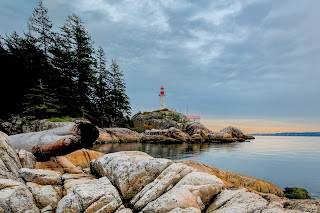


Here it is changed to a black and white.
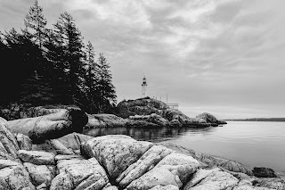

Here are some questions to consider before I paint this:

1. What do I love most about this picture? Is it about the lighthouse? Or something else? 

2. What do I find distracting or uncomfortable? (like that big dark spot on the log on the left?)

3. What details are important to keep? (if I want it to be a specific recognizable place, especially)

4. Is there anything that makes it feel off-balance? 

5. Do I want to keep the mood created by cloudy skies, or change it?

6. What shapes can I combine and connect to give the painting continuity?


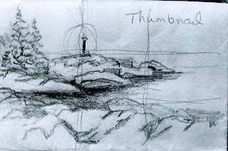
Here are three thumbnails done of the photo to explore possible compositions. 

A thumbnail is generally a very small (like 4 x 6 or smaller), usually pencil, sketch. It lets you quickly compose different possibilities for framing your subject. It doesn't take more than 5 minutes to do, and can be done several times to compare possibilities. 

This first sketch, about 2 1/2 inches by 4 inches, shows the composition as it is in the photo. I've drawn a line through the centers to show that the lighthouse, which I want to be a center of interest, is smack dab in the center. I also included the log on the foreground on the left, which I don't want in my final picture.

It also shows me that maybe I don't want all that heavy dark in the trees. 
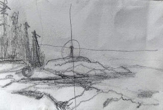

For this second thumbnail, I moved the lighthouse to the left and up a little bit to make it more important.(aiming for a good center of interest) This also raised the horizon line to above center. I lowered the trees a bit also and put more space in them. 

I removed the foreground log I didn't care for. I like this composition better. I just need to make certain that I don't make my middle ground, foreground, and background equal in size.


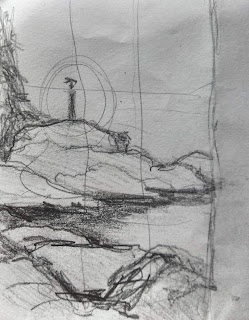
Just for funzies, I tried a thumbnail on a vertical. Again I divided it into thirds. When I do this, I can drop in my center of interest and draw around it. If I did paint this, I would not put in the trees as they appear in the photo. It throws off the balance of the picture.
Now for the value study.

This is only 5 x 7, a very loose sketch with the most important shapes in. Using just one color that can go from very dark to very light (paynes gray/burnt umber/sepia/dark blue/ etc) I loosely painted in my values. It lets me know immediately where I might need to make changes in the darks and lights.
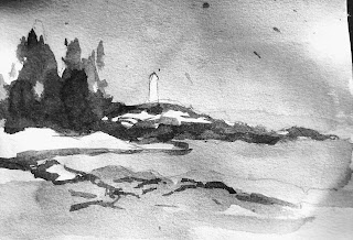


So, can you use your black and white copy as a value study? Ummmm, sure. But keep a white and black marker handy. There may be details you want to eliminate; values you want to make darker or lighter; an important detail to add in or move to another place. A shape to adjust.

Color study. (also a 5 x 7)

I wanted to play with color that would create the same mood as I get when I see this photograph. Maybe I want to recreate the colors exactly. But maybe I want to be more playful and see what I can get with other color combinations. I try to pick just three color that I think will work well together, not get too complicated. It may take more than one color study to decide what you like. If nothing else, you'll discover what NOT to use.
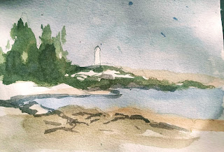

None of these steps should take very long. Mostly because you are only dealing with your basic shapes.

The point of these steps is to eliminate as many painting mistakes as possible before you commit to the final painting. 

1. Thumbnails: to quickly discover a composition that you like

2. Value study: to quickly see where your lights and darks should go.

3. Color study: to quickly decide on basic colors for your composition.

These are like the ABC's of starting a painting. In reading, you don't always consciously think about each letter as you become more proficient at reading. And you may not consciously do each step as you paint. But you can save yourself a lot of grief if you at least consider each step before committing paint to paper.


Thursday, January 20, 2022

More about composition...making value studies...perspective

 The value of a value study

In class each person brought a reference photo of their own. We discussed how to create a value study...again combining smaller shapes into larger shapes...and again painting wet, and changing color, not necessarily value, in the first washes of the value study.

A value study allows you to make decisions about your painting on a small scale before painting the final product. You can eliminate distractions; add a shadow; move an object; change the focus. This is all on a small scale. 

Can you use your black and white photo as your value study? Sometimes, yes. You can begin with the b/w photo and use a marker to add or eliminate details and to darken or lighten areas. You can use the marker to make connections between shapes. 

You can also use apps to help you do some of these things. I like to use Notanizer, which costs $3 to download to your phone. It allows you to change a photo to a black and white, to only 2 values, 3 values, up to 7 values. It lets you adjust each value also. This is a great way to help you see large shapes.

Eric Yi Lin recommends Snapseed. It has a lot of features and does more than just adjust values. It takes a little playing with, but I can see its uses.

Below is a youtube by Eric that he made after attending a workshop by Andy Evanson. He discusses Snapseed. He also does a good job of demonstrating the importance of a value study. (I have seen him do one on almost every painting demo) Eric has several others just on value studies.

https://www.youtube.com/watch?v=kIvHjb8QXio

Doing outdoor scenes almost always involves knowing a bit about perspective. Here are a few I've found.

Youtubes on Perspective

This is by Eric Lin...he discusses doing perspective on buildings, keeping it simple, not mathematical

https://www.youtube.com/watch?v=QBrMVl6ZbJQ


Perspective from Liron Yanconsky

Perspective Drawing For Painters - Tips Tricks and Techniques - YouTube


Perspective from MIchele Weber

How to Draw in Perspective for Beginners - YouTube