Thursday, September 5, 2024

A little about watercolor on canvas


"Maddie by the Sea" on Arches


"Maddie by the Sea" on watercolor canvas


There are times when you want the look of canvas, and it can be done in watercolor. There are 4 popular options:

1. Fredrix watercolor canvas, stretched

2. Fredrix watercolor canvas, on board

3. Watercolor canvas in pads

4. Regular canvas covered with 2-3 layers of Ground


I am covering their advantages/disadvantage one by one. (Prices are Dick Blick)

1. Pre-purchased watercolor canvas, stretched.

One 9 x 12 is $19.60 

Advantage: It is ready to paint on, no waiting for product to dry.

You can buy a cheaper Masters Touch brand at Hobby Lobby.

2. Watercolor canvas board.

Advantage: Ready to paint on, no waiting for product to dry.

One 9 x 12 is $ 8.65


3. Canvas pads

10 sheets of 9 x 12 is $14.10.

You can NOT just paint on one of these sheets until it is securely mounted on board or other hard surface. It will just curl and be impossible to work with.

I use YES paste to glue it to a strong surface, such as heavy mat board or the leftover board from a block of paper. You can also use extra heavy matte Gel. Regular glue will not be strong enough. I have also used a strong spray adhesive that works very well, for about $5 a can. Purchased at Wal-Mart in craft department.Disadvantage: You have to wait for this to dry for a few hours before painting.

Advantage: Cost and only a short wait before painting

By the time you purchase the glue (about $20 for a jar that will do about 15) you have about $35 to make 10 9x12's, or $3.50 each. Plus whatever you spend for the board to mount it on.

You can also purchase this canvas on rolls, which you can stretch or mount yourself. A roll of 58" by 3 yards is $82.60. But I really don't think I would use all that in my lifetime.

4. Making your own canvas board with canvas board and ground.

   Cost of 10 9x12 regular canvas:   $15

    Cost of enough ground to cover the canvas 3 times: $18 (ground is available from Daniel Smith, QoR, Schmincke, and others. Holbein calls theirs watercolor texture paste. Schmincke calls theirs primer.)

    Total cost for 10: $33. $3.30 a piece. 

Advantage: cost; can create textures;  ready availability of regular canvas

Disadvantage: you have to wait 48-72 hours before painting on this surface. It is also more time-consuming than the others.


Transferring the sketch to canvas

You can't use your trusty light box to transfer the picture onto canvas because it is too opaque. You can use Saral, which is is a graphite paper that you put between the drawing and the canvas, then trace it. Or you can also just draw it, if you are confident. Try not to erase.
This is a rougher surface than paper, and erasures may end up smudged. If you need to erase, use a Mr. Clean magic eraser, dampened. 

Painting Process on Canvas

The process of painting on canvas can be a lot different than paper. It is hard to glaze one color over another because the paint tends to lift easier. It isn't as out of control as yupo, but you do have to be careful to paint it the value you want first. 
Learning to blend on it is harder at first. You can still do wet on wet or wet on dry. You can still use certain techniques, such as Saran wrap and some textures. Painting tiny details is hampered by the texture.
The advantage is that the paint lifts easily without making the surface look worn. Paint looks very vibrant and clean. No mounting or matting needed. Just pop into frame.

Finishing the Painting

I like to frame the canvases without mat or glass. To do that, I have to use a finishing product, such as Kamar varnish (a non-yellowing archival varnish made for watercolor).

Each type of canvas will have it's own degree of texture. Some are smoother than others.

Here are some excellent video references for watercolor canvas:


Mind of Watercolor explains watercolor canvas--about 15 min

https://www.youtube.com/watch?v=0UZ_lABXDAw


Liz Chaderton gives best tips

https://www.youtube.com/watch?v=uf1yuYyTfSs

don't expect canvas to act like paper

prepare with watercolor ground

plan--there's no way to hide, no place to cut

paint flat

don't use your best brushes on canvas

don't use too much pencil when sketching--hard to get rid of

use a magic eraser instead (wet)

be direct and get what you want the first time

don't be afraid of the water

use a spray bottle to move the paint

don't fiddle

do use textures if you want (salt, etc)

do control the water

do let it dry

stand up to paint

do be patient - takes longer than paper to dry

lift out mistakes easily

use small brush with controlled amt of water to glaze

seal and protect

varnish or Dorlands wax


30 tips from Liz Chaderton (20 min)

https://www.youtube.com/watch?v=xLAMi9mNf1U


How to prepare a canvas (6 minutes)

https://www.youtube.com/watch?v=j7yYyIrTESA&t=0s


Friday, August 30, 2024

Elephant on Masa Paper

I love working on masa paper. It is inexpensive (about $2 a sheet of 20x30) and it practically paints itself. 
I love how you can get beautiful blends and textures almost effortlessly. 


In this more realistic version of the elephant, I used masa paper. After marking an X on the BACK side (shiny side) of the paper, I wrinkled it and soaked it  for a few seconds. I then spread the paper on an absorbant surface (I use doggie pads) and applied washes of color. This dries much lighter than it seems when you first put it on because both the paper and color contain a lot of moisture.


I traced my sketch using a lightbox. If you are drawing with permanent ink, as this version is, you can actually draw the picture on BEFORE you wrinkle it and paint the wash. If drawing with pencil, be sure it is dark enough for you to see well.


I worked on the sides of the elephant first. I want to be sure the face and trunk stand out from the rest of the body, so I be sure to use darks around those areas. The paints I used for this are burnt sienna, magenta, some transparent Pyrrol Orange, and French ultramarine. 


I emphasized the warms for the face and trunk so they would stand out a little more.

I always try to paint as much as possible BEFORE gluing the masa paper to another surface. I usually choose to glue it to a cheaper water color paper that is acid free. Occasionally I paste to a prepared gallery board.

When I've painted as much as I think I can, I paste it to another white surface. It has to be completely dried. Then I can work on details, because gluing it down makes the paper smoother to work on.

What glue do I use?

In the past, I have used YES paste to glue this down because I was told it is archival. And very strong. I still like it, but it is expensive and not as archival as I was told. If you don't want to spend $ on a good glue, you CAN use modge podge, Aleene's glue, or matte Medium. I used heavy gel medium because it is archival and is good to glue down even heavier paper. If all you have is Elmer's glue, try to NOT use the "school glue." What happens is it can separate the masa paper from the support if it gets wet. So if all I have is that, I try not to paint on it any more. Using bits of ink is fine.

If you want more info on this process, here are some of my other blogs on masa paper:


Friday, August 23, 2024

Painting on Yupo


Beginning Yupo


 This next painting will be done once on yupo and once on masa paper.

Yupo is made from polypropylene. It is very white and non porous, and has many uses. Before being discovered for the fine art market, it had many commercial uses, such as signs, wrist bracelets for hospitals, etc. It is fun to use with fluid acrylics, alcohol inks, Brush-O, and even printing. You can paint on both sides. Because yupo is nonporous, the paint sits on the top of the surface instead of sinking into the paper. It makes the colors appear more vibrant. It also takes some time to dry.

There are many techniques for painting yupo in watercolor. In this demo we'll use it for positive shapes and also removing paint to create shapes, using only a few basic techniques.

Before using a sheet of yupo, it is recommended that you clean it thoroughly either with warm soap and water or with wiping it down with alchohol. This removes grease and any marks from your hands when handling it. If the oils are not removed you will have a hard time getting the paint to adhere to the surface.

When tracing or drawing your picture, you can use a water color pencil. Regular pencil will not erase well, but if you don't mind the pencil showing, you can use pencil. If you want a pen and wash effect, you could also draw with a permanent marker.


Some   videos with painting tips for yupo:

Sunflower: a good 25 min video for just learning. I don't agree with some of the things she says (like using an eraser to lighten pencil marks), but overall a fun demo to try. 

https://www.youtube.com/watch?v=hWNiybDBlOo

Mary Schumaker - 1 1/2 hours  But so worth watching! She shows dozens of ways to create textures with yupo. The first half is showing how to make textures. The second half is a demo. A little overwhelming at first, but super interesting if you want to pursue it. 

https://www.youtube.com/watch?v=59Oxl8XjCSE

This is my reference photo. It is an AI created photo from Unsplash.


I did two paintings of this elephant. The first is drawn with watercolor pencils, which dissolve as you apply paint and water, then direct painted, elephant first, then background. The second is drawn with permanent marker, like Sharpie, then paint the background first, then the elephant. 

I used French ultramarine blue, purple, and magenta to paint in the elephant ears first. I was not trying to do any details yet. I added darks where I saw darker values, especially around the face. Then I did the body. I let that dry, then painted in the face with lighter values. Looks pretty messy. I dried it all, then painted in some ochre in the background. I left mine lose looking, but you can use a sponge roller to smooth it out.

When all was dry, I used a small damp brush to lift or remove paint from the wrinkles in the trunk and ears. Then I used the small brush dipped in dark color to emphasize the lines in the wrinkles. You can also use a watercolor pencil for these fine details. 

Tip for drying: the more it air dries, the more effects will happen. You can use a hair dryer to speed up the process, but you may lose some textural happenings.

I used a credit card dipped in paint to create grasses. I used a dark watercolor pencil for the dark eyes.

Below left is the process of removing paint; on the left is after I added darks for creases in skin.


In the one drawn in ink, I did the background first. I used several blues with some ochre painted all over, then used the sponge roller to smooth it out. I used a damp paper towel to remove some of the paint from the elephant. With yupo you cannot glaze one color over another....the paint will either mix with the new color or just lift off. 

When the background was dry, I started painting the elephant, using burnt sienna, French ultramarine and some ochre. I tried to paint in the darker areas, but I know I will use water to

 lift out highlights, so I didn't have to be overly careful. 


When that was dry, I lifted out the wrinkles in ears and trunk with a small brush dipped in water. Then used watercolor pencil and a fine brush and dark paint to darken the creases. I put in the eye. Haven't done any ground yet.

Lifting out whites: 


Painting in darks:


Friday, August 16, 2024

Paper compare...hot press vs cold press


Comparing hot press and cold press papers


 Steve Mitchell does a concise summary of the differences of hot press, cold press, and rough papers.

https://www.youtube.com/watch?v=D_AnLl0PMlo

Hot press is rolled between hot drums, so it is very smooth. Think of pressing clothes with an iron to remove wrinkles. Cold press is formed with cold drums. Rough is pressed between drums wrapped in felt to give it rougher texture. 

Even among top professional papers that are cotton, there are differences in texture or weave, softness, and sizing. Sizing is a product  (usually a gelatin) added to the pulp to allow the paint to sit on top of the paper and not be completely absorbed by the paper. It is what gives you control over the paint. Internal sizing is added to the pulp before it is pressed; external is added afterward. Too much sizing makes lifting easy, but makes glazing difficult. 

Paper also comes in a variety of weights. The most used are 140 pound and 300 pound. Paper weight refers to the weight of a ream of paper, which is 500 sheets of paper cut to a standard sizeIt can be measured in either pounds (lb) or grams per square meter (gsm). In the United States, paper weight is usually measured in pounds, while outside of the US, it's usually measured in gsm.

 Be careful when buying...you may mistake 140 lbs for 300 because 140 pounds is 

the same as 300 gsm

You can also purchase 90 pound paper, which is about like card stock. It does buckle 

but it can fit through most printers.


The work horse is usually 100 per cent cotton cold press because it allows you to use a variety of techniques. (masking fluid, taping, scoring, etc.) 


To compare, I painted the cold press on the left exactly the same as the hot on the right. (Same size, colors, etc.) 


First I painted a wash of pale colors to create the background. From this I was able to compare the drying time of the papers and how well the colors blend. You can see that wash behind this painting. Do this to both hot and cold press to compare.


Observe: Drying time of papers.

Hot press dried more quickly, sometimes before I could get the paint on. I had to add more water initially and work a bit faster to get an even wash.  You might notice little flecks until the paint dries, and then it leaves a smooth surface.

Blending

Even though the paper is wet, the hot press does not  blend or bleed into other colors as much.

Then I painted some teardrop shaped buds, only the centers. While waiting for them to dry I painted in some stems and played with leaves. (I used a flat brush for the stems and experimented with a dagger brush on the leaves) When dry, I GLAZED over the buds on each side to see how well each glazed.

Below is the tear drop centers of flower:


When center is dry, the sides are glazed over them. (Glazing is simply one color
painted over another after the first is dry)


Here are the glazed flowers with some leaves and stems added in background


Observe Glazing...does one type of paper seem better than another?

you should notice that the petals appear transparent on both types of paper. 

Stems and leaves

Use the chisel tip of a flat brush to create stems. Practice using round brushes to make different types of leaves. I even used my dagger brush for long ones. Make them overlap stems for a transparent effect.

How well does it lift?

Choose some places to try lifting with a medium soft brush. Which is easier, hot or cold? 

Try some fine lines with a small brush . (see on petals)

Try some pen and ink. The pen should glide over hot press, but get a little resistance from cold press.


Another test you might try is painting with granulating paints. Do you get more granulation with hot press or cold press? Below is French ultramarine and burnt sienna, both granulating colors, on hot.


Try this: wet a square on each, hot and cold press. Then paint a form inside each wet square.
On the cold press, the paint spreads a lot. On the hot press, it keeps its shape, but has soft edges.
This picture shows what it looks like on hot press.


Hot press is often used in flowers because the petals appear so smooth, and you can get tiny details. Some think the colors are more vibrant since they stay on the surface instead of being absorbed.

Here is a video that shows 5 tips for painting successfully on hot press.

Rachel's Studio tips on painting on hot press

https://www.youtube.com/watch?v=1At1F2pBXKg

GLAZING TIPS:

Sometimes, in order to unify a painting, it helps to glaze over an object with a color. My three favorites are:

Cobalt blue--for pushing something into the distance

Nickel azo yellow

Transparent Pyrrol Orange - for unifying reds 


Thursday, June 20, 2024

Fracturing the PIcture Plane

 Kathy George does a technique she calls "fracturing the picture plane." To explain, imagine that you have dropped a piece of glass or mirror onto a picture and broken it. The pieces will look a bit distorted along the fractures. 

Another way to think of it is to picture yourself standing in front of a store window. You can see objects clearly through the glass. You also see things in front of the glass, but more in focus. But there is another dimension: the reflection of what is behind you is also seen in the glass, distorting your view of the objects inside. 

I have simplified the process a little to understand it better. To begin to understand it, draw a simple picture, about 5 x 5. Then grid it to look like a relaxed tic tac toe board.


Take one piece of the grid at a time. Color the first part of the grid. Then, where it changes along the "fracture" line, color that section of the grid-- Only CHANGE something about that new section. You can change COLOR, or VALUE or DETAIL/TEXTURE. Do this with each section so that each one looks distinct from the others. It will be easier if you take one row at a time.

I did this sample in colored pencil to get a quick idea of the process.  I didn't want to wait for paint to dry before working on the next section. It took about 20 minutes, start to finish.

0n the one below, I began with the top left, coloring the apple section orange and the background blue. Next I went to the mid top section, changing the apple to red, coloring the straw green, and the inside of the glass orange and brown. On the right top side, I did the background light blue with pattern of dots (changing the DETAIL), colored the liquid in the glass brown and orange (CHANGING COLOR), and kept the straw green.

Then I started on the middle section, mostly changing colors. On the bottom section I changed pattern, which is a change in detail. The only places where I changed VALUE was in the straw (darker green in the id section) and in the apple dark pink and light pink.


The Big Project

Now I'm ready to start the main project.

You can choose to gesso the paper ahead of time or just paint on watercolor paper. You have to do this in advance, bc the gesso must dry completely. 
If you choose to paint on gesso, apply it to water color paper...even the not-so-good stuff.  You can brush it on and impress textures into it. On mine, I pressed corrugated cardboard and drug a comb through parts. On others I impressed a stencil or bubble wrap. Also, you can leave part without gesso. In those parts, the paint will absorb differently and automatically create texture.

Paint will react differently on the gessoed parts, sort of a slip and slide. But at least it is easy to lift if you don't like the color or make a mistake. You will use less water in your watercolor paint. Another thing you will notice is that the gessoed paper does not warp or buckle.

After gesso has dried, draw your sketch onto it. My light box will work on gessoed paper. 
Then I created a grid on it. In class we used a clear plastic cover over it, making the grid on the cover with dry erase marker. When you are happy with it, make the same grid in pencil (or water color pencil) onto the gessoed sketch. I can make additional "fractures" as I go along and decide it is needed.
On this one, I used the drawing in the practice, but added a little kokechi doll.


Pattern


Fractured painting


This one I used the pattern from a previous drawing.


Here are some examples from Kathy George's class.


On the one below, the foreground isn't fractured at all....only the background. Note additional fractures that were created after the original grid.


reference

sketch 


final picture. Notice the repetition of the horizontal stripes creates a kind of unity. This one also created  additional fractures after the original grid was mapped out. 


just used a few shapes (light bulbs) repeated 


see how some shapes (like the left bottle on bottom, the flower foreground, and the creamer) are not fractured at every division. This pushes them to the foreground. 


There is a mural in Lawrenceburg near me that shows a version of this idea.
Notice how sometimes the artist chooses to change a color and sometimes he chooses to leave an object the same color, even into a fractured area. 


Any watercolor on GESSO will have to be set with a clear coat of acrylic spray or varnish to protect it from moisture. Until you do, you can make as many changes in the paint as you wish.


Friday, June 14, 2024

More about 3-value portraits

 3-Value Portraits....Class work

I explained 3-value portraits in the last blog post. Today we continued this project. Once you begin to understand it, it's a good idea to do it again. So today I am just posting the student work, some still a work in progress.

                                                        John Wayne


Totally captures his personality


not finished with the third value, but it's beginning to look like her already

Taylor Swift's guitar is going to get some shiny rhinestones on it


Somebody's sweet little puppy


for some reason the hair in this one came out a different color...it's really purple.


Thursday, June 6, 2024

Portraits a la Andy Warhol


 3-value portraits


Seems everyone is scared to try a portrait. So many variables to juggle all at once: what colors for skin tones? How do I make hair? Eyes? Realistic shadows? The list goes on and on.

I wanted to take the scary out of portraits by only worrying about values and allowing the use of any color scheme.

To do this, I had everyone take a photo in strong sunlight. (This will help in identifying the values.) Crop the photo to a head shot. 

Then, using Notanizer or other photo altering app, turn the photo into a 3-value picture, adjusting it so that it captures the look of that person.

It is important to make those adjustments to your picture. Notanizer gives you a good start, but it's not perfect. You need to decide what you can eliminate and what you want to add so that the picture looks like the person. I like to see how little detail I need to make it captures the person. (On this one, I had to recover part of his face covered up by what he's holding.

 Print it out to the size you want to paint. I also print the black and white version (with all values) as a reference.

Copy or trace this 3-value picture onto watercolor paper. (if you are doing it in gouache, you can use a less expensive grade of paper)

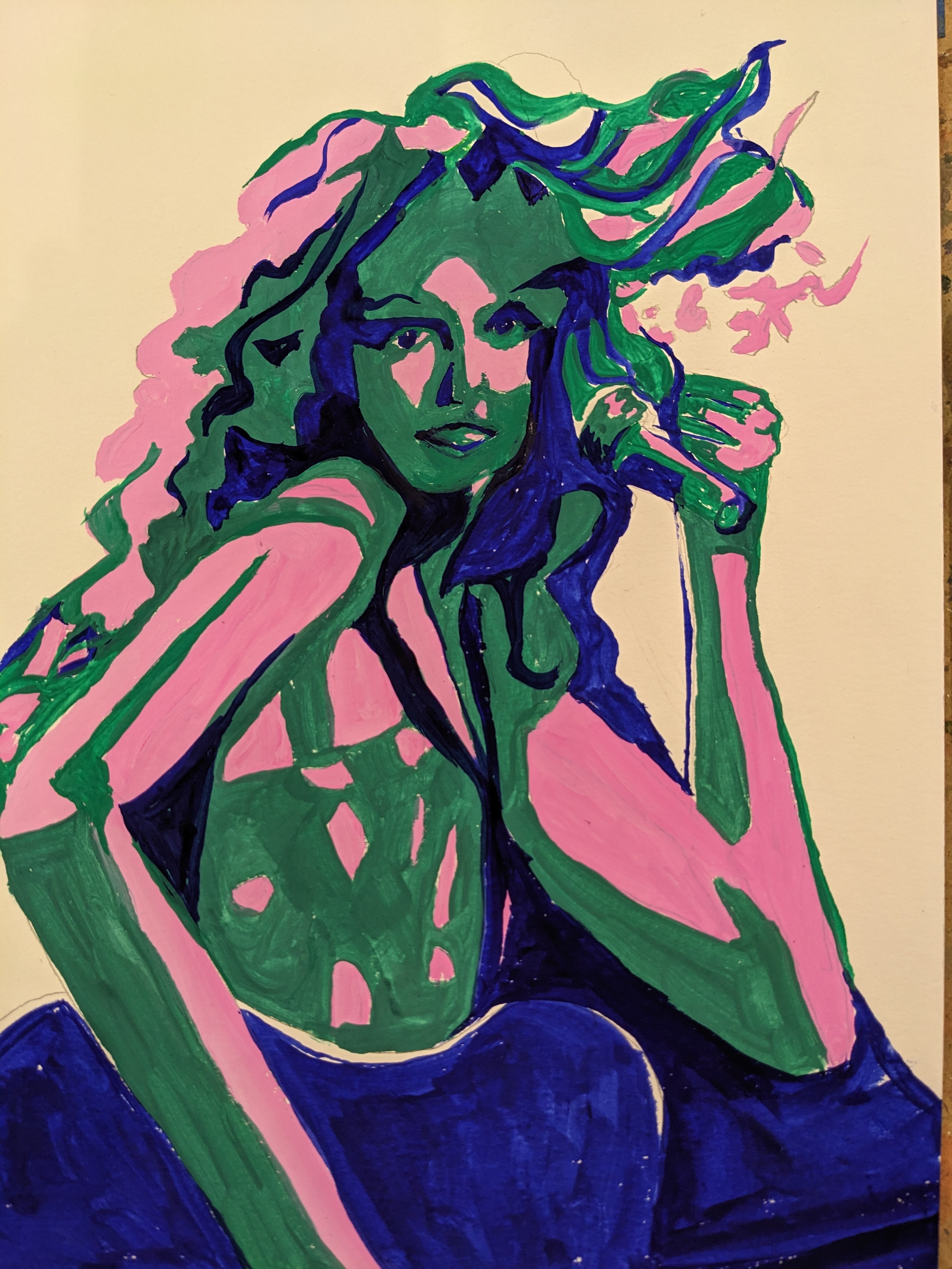
Decide on your three colors. You will need one to represent the lightest value; one to represent the medium value; and one for the very darkest value. I usually like yellows or light greens for the lightest value, but you can also use a pale pastel of any other color. The medium value can be any color (except yellow), as long as you keep it a medium value. And the darkest values can be blue, violet, black, brown, or a darkened red. There are a lot of combinations you can make.

I start by sketching on paper. I mostly use the value picture, but I look at the black and white also for any nuances I might have missed.

When I'm happy with the sketch, I paint my lightest values in the color I've chosen. (in this case, pale green)

When that is dry, I paint my medium value in. (in this one, it is orange)

When that is dry, I paint in my darkest values. (blues) Sometimes I adjust things as I go along.

You can paint in a background if you like. You can also add blacks or whites to emphasize areas, such as a white in the eye.

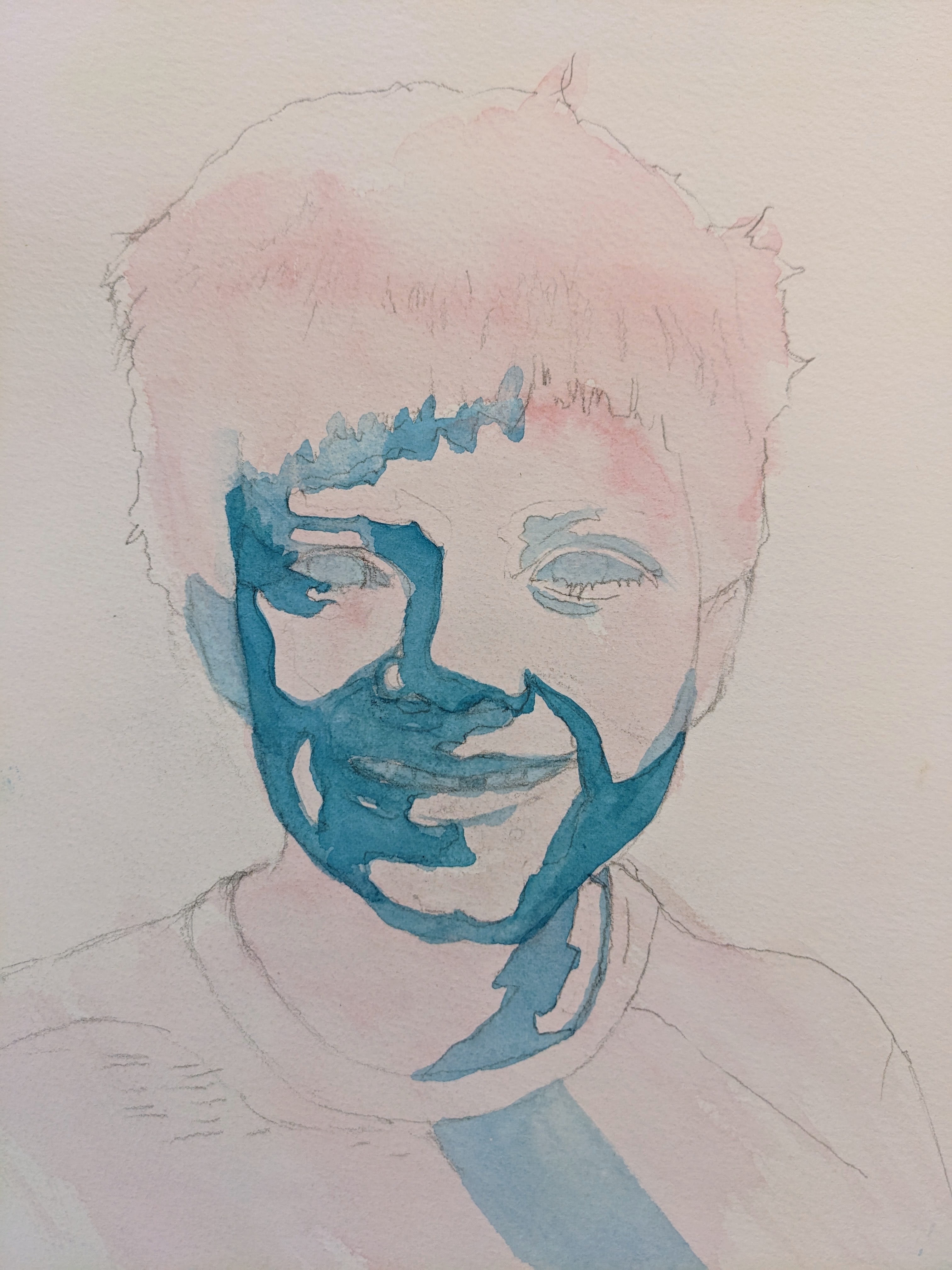
If you are using watercolor (I used gouache on the one above), I like to paint my lightest values over everything. (see the pink in the one below) I do this to make it easier to paint some areas, such as the band of light in the hair.

Then I will paint in the medium tone value (blue) in just the medium areas. I have not begun to paint in the darks yet. 


For help in using the NOTANIZER app, here is a very short YouTube:


This is the only time I recommend an app, but it is SO useful, and I mention it a lot, both in composing a picture and in critiquing my own work.