The area between, around, below your shapes is SPACE. Sometimes we think of it as the NEGATIVE of the shape.
SO, the question is: Does the artist see MORE shape than other people, or LESS? Or does the artist just know how to SIMPLIFY and DIRECT THE EYE with shape?
Sometimes you are stuck with shapes that are not themselves very interesting by themselves. Here are a few ways to make your shapes a little more interesting and unified.
Think of your picture as a good story. Would you give away the ending at the very beginning? No, you want the mystery to unfold and keep you interested. So you can do the same thing with the shapes in your picture. The human brain WANTS to have to work to enjoy the picture. You make it work when you DON'T spell out every little detail.
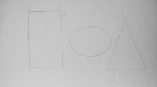
Take three basic shapes.

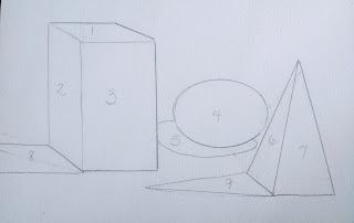
Give them some dimension, then a shadow, and now you have 9 individual shapes.
I've spelled it all out for you. Kind of boring.

Below I've taken the 3 basic shapes and shown 3 ways to make them more interesting. From left to right are: wet into wet charging color; gradual transition of color (shading); and texture on the triangle. Much better than flat color.
So in the one below, I've MERGED the shadow shapes, so that instead of 9 shapes, I have only 7. MERGING SHAPES is a great way to simplify and make shapes more interesting. PLUS, bonus points for making the human brain do some of the work.
In this one, I've taken MERGING a step further, merging the shadow of the egg shape with the triangle shadow. Now I have only 6 shapes. (The shadow on the left of the rectangular prism plus the side of it; the yellow top of the prism; the front of the prism; the egg shape; its shadow merged with the shadow of the pyramid; the front of the pyramid)
Below are a few more ways to add interest to your shapes.
Top left: make the NEGATIVE space around your shape interesting.
Bottom left: Have a variety of EDGES:
Edges can be SHARP, FIRM, SOFT, OR LOST. In the shaded oval, you see all of these. Sharp (razor sharp between object and background) and hard (firm--definite) lines give definite edge to a shape. Soft edges (think a kitten's fur) indicate form and gradual change. And lost edges blend into the surrounding space. You can see a white lost edge at the right tip of the oval and in the dark undershadow where you can't see where the egg ends and the shadow begins. (also causing a MERGED shape)
On the right you can see how overlapping another shape over the rectangle (the tree and the bush) can make the shape appear more interesting...or at least less boring. And I've used repeated shapes in the walk up to the house, making them go from large to small, to guide the eye toward the front of the house.
EVALUATING THE SHAPES IN MY OWN PAINTING
When self-critiquing (is that a real word?) here are some questions to ask yourself about your shapes:
1. Are there opportunities to connect (merge) shapes and simplify?
2. Are my negative shapes interesting?
3. Do the shapes direct to the focal point....or are they drawing the eye away toward the edges?
4. Is there interest within some of the shapes?
5. Is there variation?
6. Is there balance in my shapes?
7. Do they feel unified, or does it feel random?
8. Do I have a boring shape too close to the edge of the picture?
Here are some short little youtubes. I was happy to see Stan Prokopenko making a 12-minute video on the subject. Have to say, he's my favorite drawing instructor.
And these to 10-minute videos are pretty good too!


No comments:
Post a Comment