PEN & WASH TOOLS:
There are lots of options for a pen and wash. So what I'm recommending isn't always what others use.
PAPER
Here is your chance to use that crummy paper you accidentally bought. It doesn't have to be cotton because you are not going to be doing a lot of glazing or lifting. Many people prefer a smoother paper for pen and wash because it is easier on the pen. I still like regular watercolor paper because I like the added texture. You can use pretty much whatever works for you, as long as it will hold up with watercolor paint after inking. Hot press is often chosen for it's smoothness. You can also use a lighter weight - 90 or 80 pound - if you don't intend to use very wet washes. This is a good chance to use Strathmore Aquarius II, which is part synthetic and only 80 pounds.
PENS
I use Micron that go from very fine (.005) to a 1 and a brush like pen. I also use an ultra fine Sharpie, which equates to a 05 or 08 on a micron. There are other brands out there, LOTS of them. You just want a PERMANENT INK pen. Some people love using the old fashined dip pens because of the variety of marks you can make with just one nib.
If by chance you don't know if it's permanent ink, test it on a small corner. Make some marks, then wash over them with water. It shouldn't fuzz out, but should remain sharp.
Some people like using browns, grays, and other colors.
WATERCOLOR
Anything, any colors, you choose. Some people also use watered down inks for their washes.
MAKING MARKS
I made this little practice chart. Pen and wash isn't just outlining in ink. It's using the ink to help tell the story of shadow and light, texture, and form.
You do this by varying your pen strokes. You vary the thickness of your line. You also vary the type of line. The chart lets you practice some of these types. The first on the left is stipling, which is just dots. The closer the dots, the darker the shading. HATCHING is basically parallel lines, which can be short or longer. The closer together the hatching, the darker the shading. CONTOUR simply follows the contours of the object. It is often used in wood grain. On here you can see how, instead of making the round object look spherical, the countours make it looked pinched in. Below that is SCRIBBLING, which is exactly what it says. Often used for curly hair, leafy areas, etc.CROSS HATCHING is next, but I've curved the lines to give it more shape. The last is CRISS CROSSING which looks a lot like hairs or feathers that cross each other randomly, instead of the more geometric looking cross hatching.

Below is my photo reference. This is an old shed in the back of my house. And I do mean old.
Rusty nails left trails of rust on the boards long before we moved here in 1983.

Below is the pattern I drew. I left out the background trees because trees are intimidating for beginners. Those with more confidence can add them in. I also didn't draw in every board on the side either. If this had been a new structure, I probably would have used more care in drawing in the boards to make the lines straighter. But seriously, these boards are not perfect in any way.

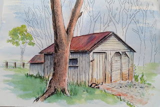
Below you see what I decided to ink. I put in the background trees. I used cross hatching on some of the shadows underneath the eaves of the roof. I used sketchy vertical lines on the boards and a few to indicate peeling paint. The window is shaded with cross hatching at the top. I used a little stippling for the pebbles in front of the shed doors. For the grass and foliage I used some criss crossing. The leaves on the little tree on the far left behind the shed are lightly scribbled.
For the tree, I used a form of scribbling, but it's shaped like the bark. I also showed some cross hatching on some of the branches.

READY FOR THE WASH
The first thing I did was paint a little burnt sienna over some of the boards, especially at the bottom, where the rusty hinges and nails would have left rust stains, and some dirt might get kicked up. I ran some on the brick walk and put some rust on the roof.
Then I mixed French ultramarine blue with a bit of burnt sienna, just to gray it a bit, and painted over the side of the shed, including the window. I used the same mix on the pebbles in front of the door. Then I mixed a darker mix of burnt orange and blue and went over the roof again.

The tree is a great example of how good inking can make it seem like the picture paints itself. I wet the tree, put burnt umber on the left shadow side and some burnt sienna on the right lighted side, and let them bleed together. I took a paper towel and blotted up some light spots on the right while it was still wet. Tree done in less than 2 minutes.

I used yellow and cerulean blue for the greens. I did a wet wash of a yellowish green over some of the grass, then added a green with more blue in it for the darks. Same for the background tree.
NOTE: If your green is too unnaturally green, tone it down with a little bit of red.

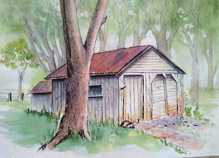
Totally debated whether to finish the background. I want to pay someone to paint my backgrounds, they can be so painful. But I started with a wash of blue, right over the trees and sky, leaving some whites.
While the blue was still damp, I dropped in some yellows and greens, careful to leave as much
white as possible.

Finally I painted in the background trees lightly with burnt umber mixed with a little purple. I wanted the trees cooler so they would recede into the background. I even washed some purple over the leaves so they wouldn't come forward and compete with the shed and tree in the foreground. Your result will be different, depending on what colors you use. This is really where you can set the mood with bright colors to indicate a sunny day or muted colors to show a cloudy or misty day.
No comments:
Post a Comment