Thursday, January 28, 2021

FINISHING BOAT, SHEEP, BACKGROUND

REVIEW OF THE SHADOWS BENEATH THE BOAT

Here are some tips for making those shadows look real:

1. Shadows will follow the lay of the land. This is a very horizontal "meadow" of some sort, so the shadows will tend to appear horizontal. (even tho they are generally followng the shape of the boat, they lie on a flat plane)
2. The sun is coming from the right side of the picture, so the shadows will tend to be underneath and to the left. The darkest shadow is both underneath the right side of the boat AND following through to the left of the propeller.
3. The shadow of the boat and the shadow on the grass appear to merge together in spot. This is important in making the boat feel "anchored" (excuse pun) to the ground, not floating above it. To do this, I darkened both the boat and grass with purple, melding one area into the other. 

BOTTOM OF THE BOAT
There is a triangular shaped propeller mount and another shape on the bottom right of the boat. These are dark and rusty, but not as dark as the rest of the bottom. I made a rust by dabbing with burnt sienna and then with French ultramarine, keeping it darkest next to the boat. 

TIE LINES
 I glazed over the two yellow lines on the right with yellow ochre or raw sienna. On the wider tie, I made a gray shadow above and below where the rope appears to twist. I painted a shadow on the grass beneath the ropes. 


BACKGROUND

If you want to put in a tree line or distant buildings, remember there are 3 things to do to appear distant: Less detail; grayer; softer edges. For houses I painted in some roof tops then quickly dabbed them with tissue to keep them from being hard edged. I painted in some green tree line, also quickly dabbing them to keep them faded.

THE SHEEP

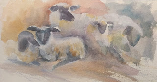
The foreground sheep are my addition. I wanted to give a sense of size and place to the boat.  I also thought it gave a sense of curiosity..."What are you doing in our pasture?"

I used a stiff brush ("scrub brush") to lift some white space in the approximate size and shape of a sheep body. This does not mean you scrub...let the water do most of the work before you gently lift off green paint.  I used some of my neighbor's photos of her sheep as reference. 

I lifted out little shapes in the distance, larger shapes close to the boat.  I had to dry it before I could paint in a little triangle face and some black legs and ears.  If I wanted it whiter than that, I could put a little gouache on the wool or simply darken the grass around it.  The farther away the sheep, the lighter the faces. 

Below are some of my practices.


FINISHING TOUCHES

I needed to make the peeling paint look more real. First I washed over the sections left white from masking with water to calm down the white. When dry, I took a #2 brush and dabbed some dark paint where the peeling paint would cast a shadow. 

For more texture, you could scrape the paint with the flat edge of a razor blade/craft knife.


Thursday, January 21, 2021

PAINTING BACKGROUND AND BOAT PART 2


You'll see I've spattered some miskit in addition to the other main sections I've masked. After masking off the parts you see in gray, check to be sure you don't have miskit on places you don't want. Now, before applying paint, is the time to remove unwanted miskit by gently rubbing it with your finger or a rubber cement eraser.The masking fluid allows you to make broad washes without having to carefully avoid small places. 

SKY

 I usually use cerulean for a sky, but you can use any blue: cobalt or French ultramarine are fine.
Make a puddle on your palette of the blue you choose. Then wet the top portion of the paper down to about an inch below the horizon line. Avoid the boat itself. Then with a large brush, beginning at the top, make a broad wash of blue. I kept it light on mine. 

GRASSY AREA

Mix a puddle of green on your palette and a puddle of raw sienna or ochre. Starting at the bottom of the paper (I usually work upside down at this point), wet the grass area and apply a wash of green, dropping in sienna here and there. I overlap the horizon line. I like to watch the paint dry, and as it loses its sheen, spatter blues and greens and sienna into the grash to give it texture. 


Dry the washes completely.

BEGIN THE BOAT

Keep the masking fluid on the painting for now.

I've only used a few colors on the boat. I used alizarin crimson, french ultramarine, raw sienna, burnt umber, and burnt sienna.
Starting with the blue, I've put a wash on the blue part of the boat, dropping in burnt sienna in places where I want it to look peeling and aging. I also have burnt sienna in the shadow underneath the top of the boat.

After the blue is dry, I washed in some red on the bottom. While wet I added some dark blue in the shadow areas. Before the paint dries you can add texture by sprinkling on table salt or by spattering water on the almost-dry paint (not shiny).

To paint the edge of wood along the top, paint in with raw sienna on the right side, burnt sienna on the left.(where it is darker.) Drop in darker paint in short rough brush strokes where the wood is very broken and decayed.

When the boat is dry, you will likely have to add layers to get the colors and volume that you want.


This last photo looks like the boat is floating on air. You have to anchor it to the ground with shadow.

I used a dark green (green apatite genuine) to create the shadow beneath the boat and added some purple to the green to darken it before I removed the masking fluid. I allowed the purple and the green to mix in places where the shadow seems to blend into the boat, and continued with purple to darken the red shadows.

RAILING

I used French ultramarne and burnt sienna on the railing. Basically I wet the railing, a few inches at a time, with a #2 brush, and dotted the shadow part with ultramarine and dropped in burnt sienna. This creates a rust effect.

I mixed french ultramarine with a little burnt sienna to create a dark color for the lines on the planks of the boat.


NEXT WEEK: fnishing up the details.


COLOR MIXING NOTES:

if you don't have burnt umber, mix alizarin crimson with a green until you get a dark brown color. Any two opposite colors (red/green; orange/blue; violet/yellow) will create a brown and/or gray, depending on the strength of the mixture.


Thursday, January 14, 2021

WATCH THESE BEGINNER BLOGS

 Here are some blogs that will give beginners  a few helpful suggestions to avoid mistakes.

I hope you'll take some time to watch them. I especially like the one by makoccino. I have been painting for 22 years, and some of these suggestions (like use 2 containers of water) took me a long time to find. 


6 minute video on beginner supplies

https://www.youtube.com/watch?v=NkhQsTpkWrs


Witty Gritty – 5 tips  19 minutes

https://www.youtube.com/watch?v=VGEbd4rLQiU


makoccino – 10 tips – nine minutes

https://www.youtube.com/watch?v=o8UdEtnolS8


BEGINNING THE BOAT


Next week we start to put into practice some of the things we talked about last week. It looks a little complicated, but you can do this. I chose it for its simplicity of shape; using masking fluid; creating a wash; and texture practice. 

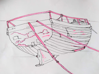
You have a sketch of this boat. I found this photo on paint my photo by a photographer named Lydon. First job is to carefully sketch this on your paper. You can use a light box or sunny window to trace it. Or you can use a graphite paper. Use a normal pencil, but don't draw with pressure. Pressure will score the surface of the paper.

If you use graphite paper (also called Saral), tape your picture on the paper. Then use a colored ball point pen and trace over the drawing. (A colored pen will help you see whether you have transfered all the lines) 

TIP: When the drawing is complete, roll an eraser over it to remove loose graphite. In this painting, the paint will be pretty dark. But if this were a pale flower or skin, you would want your lines to be pale. Once you have put paint over pencil, you cannot erase it. 

STEP 2:

In class we practiced using masking fluid. I'll just review:

    *Use a dedicated small brush, cheapie. You'll never be able to use it for anything else.

    *Wet and soap the bristles.

    *Pour a little masking fluid into a small lid (like a milk bottle lid)

    *Dip your brush into the fluid and paint it onto DRY paper

    *Dry completely

    *You will probably have to resoap the brush now and then.

Use masking fluid on the parts of this picture I've marked in pink.

STEP 3:  

I gave each person a small version of the sketch. Use pencil to shade your small picture. I want you to really see the values in your painting. Turning your color picture to black and white can really help see values. 

STEP 4:

Get to know this picture. Compare the sketch to the reference. Be sure you understand what each part is. Feel free to make corrections, simplify, and modify the drawing.

PAPER COMPARISONS

 COMPARING PAPERS:


The focus on the next six weeks is going to be comparing surfaces and papers for watercolors.

Today I wanted to emphasize why I ask for quality watercolor paper. We compared three brands you can get at any hobby store inexpensively: Canson XL; Grumbacher; and Strathmore 300, with Arches or another paper 100% cotton. The first three are not cotton, but wood pulp or celulose. 

When I'm teaching a class, I want students to have the best experience possible, and that starts with decent paper. Think about learning and instrument, such as a piano. You don't need to have the most expensive piano to learn...but it does have to be in tune. Trying to learn on poor paper is like trying to learn music on a poorly tuned instrument.

I want the paper they use to do it all. So here are my judging criteria:

1. Is it 100% cotton and acid free?

2. Does it accept washes without streaking?

3. When I use wet-on-wet technique (wetting paper first, then adding paint), does the color spread evenly and is the color vibrant?

4. What about lifting? (lifting is using a firm brush with clean water to lift out or wipe away (erase or soften) the paint.  I want it to lift some, but not too easily. If it lifts too easily, then glazng could be an issue.

5. Does it glaze evenly? (adding layers of color over dry layers)

6. Does it accept tape without tearing? Does it accept masking fluid without tearing when I take it off? This will affect what techniques I use to preserve the whites of the paper.

7. Does it stay relatively flat while I'm painting? (not curling too easily)

8. Can I paint on both sides of the paper? 

One of the reasons I ask people to get Arches 140 lb cold press is because Arches doesn't make an inferior or "student grade" paper. You won't go to the store, ask for Arches, and be confused by different grades of paper, some of lesser quality, all with the same brand. But in the last few months Arches has been hard to get or quite expensive. So I've been using Kilimanjaro (Cheap Joe's brand), Baohong (a Chinese paper in a block), or Fabriano Artistico. 

There are other good brands, and I hope to explore some of those later on. European artists frequently use Saunders Waterford because that is more widely available overseas.

PRACTIVE FOR TODAY

I gave each person a sample of Canson XL, Strathmore 300, and Grumbacher. We tried the same techniques on those papers, then did the same on a piece of good paper to compare.
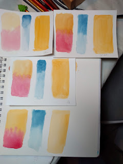

  Top to bottom, the papers are Canson XL,Strathmore 300, Grumbacher, and Kilimanjaro on the bottom. One the left of each is a wet into wet wash of yellow and red. The colors on the cheaper papers are less vibrant and splotchier. The center blue line of color is Mayan Blue, fading the color with water each time. The large patch of yellow on the right will be used to see how well each one glazes. 

  You can see how I've glazed the yellow strip with blue, red, green, and yellow to see how well each one performs. The three top ones are a bit blotchy with only one glaze. Future glazes will be worse.


Another test, on the right, is how well does it take tape and masking fluid. You apply both on dry paper; dry the fluid completely; wash paint over it. The paint must be absolutely dry before removing tape or masking fluid. If you use a hair dryer, be sure to dry on COOL so you don't glue the tape or fluid to the paper.


LIFTING: Try using a firm brush to lift paint off. Dip the brush in clean water and drag it through the paint. On less expensive papers, the paint might lift completely off. Nice, if you want to lift completely; not so nice if you plan to put more color over it.

SO LET'S PLAY

Try making a multicolor wash as discussed in class. (Use a larger brush to wet the paper and then to apply the paint) I started with blue, added a magenta (pinkish red) then a purple. When you are blending one color into another it is called a variegated. Try to make as few streaks as possible. 

(three basic types of washes: flat--all one shade of one color; graded--all one color going from dark to light---variegated, blending one color into the next). 


Let the wash dry completely. Drag lines of color, like grasses or weeds, over the wash. Use different colors than you used for the wash. Can you see how the color underneath pops through the grasses on top? That's glazing. 


This is done the same way, only my wash is done on a diagonal. It sort of looks like a tropical palm in a sunset. 


PLAY #2

Using clean water, make a rainbow shape over the paper. Then drop bits of color all over. Drop some next to each other (blue and violet; or yellow and red) to blend. Then drop some greens and blues for foliage.

With a flat brush dipped in burnt sienna make three horizontal stripes one beneath another on dry paper. The "tooth" of the paper creates a dry brush effect. 
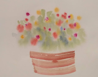

You can finish this however you like. Below is one done in the same style:


I just added details and spattered.