Friday, March 22, 2024

ERIC YI LIN


Eric Yi Lin- Cafe Watercolor

Eric was born in Taiwan, and moved to the United States when he was 14. He lives in the Seattle area with his wife and three sons.  He attended art school, and worked in art fields before deciding to dedicating his time to Watercolor and his own art.

He has an online art school program that takes you from basic drawing skills to painting skills. He has a very loose style, which he demonstrates on YouTube . I love his gentle, conversational style. His focus is more on composition and making a successful painting. YouTube's do not include drawings...you watch him do the drawing...or references. If you subscribe to his Patreon page, you can get the references and final picture that you can download. The cheapest Patreon is $5. His higher ones include more personal attention, such as help with your painting.


Here are some examples of his style.


    Here is one of his beautiful portraits of his wife. He can do landscapes, animals, flowers, anything. His main focus seems to be landscapes. 


Eric's mentor is Andy Evanson, (pronounced with a long e) a well-respected workshop artist. You will find that he emphasizes the importance of three basic things: value studies, connecting shapes, and simplifying into large shapes.

In order to give you a feel for his teaching process, I've chosen this photograph I took coming home from work one day, a barn about 5 miles from my house.


I put it on my Notanizer app to bring it down to 2 values, white and dark. I evaluated what I wanted to keep, what I wanted to treat as light or dark. Then I made a sketch, leaving out details. I also decided to take out the wire and the pole on the right. 


Next step is to make a puddle of gray paint. (You can use Paynes gray, neutral tint, or any dark brown or blue. The color just needs to be able to be a dark value as well as a medium value when you add water.)

I looked at my notanizer and painted everything that is not light or white a medium value. I tried to connect as many shapes as possible. I'm looking to see if my big shapes look interesting and connected. (I am using a rough paper, but that's not necessary)

Next I decided on what my darkest shapes will be. I made a darker mixture of my medium gray for this. Now I can really see whether or not I like this composition. If you don't see an interesting composition at this point, you should consider changing something about the picture.


Now to transfer this process to color. 

I picked three colors (just for simplification), a medium green, ultramarine, and burnt sienna. I wanted a medium value of all these colors. (We found that if you put a red plastic over the  3 puddles, they all looked the same value)

I'm going to start with the sky. Mixing a small amount of sienna to make the sky less blue, I wet the sky area (even the trees) and added the blue, lifting out the clouds. Then I started loosely adding some green to the trees, some gray into the barn areas (gray made from blue and sienna), and let them bleed together when they met. Then back to greens for the grasses and trees on the right. I didn't paint the sidewalk, stonework, or roofs. 

I let all that dry, then did my darks. I made darker versions of the previous colors: a darker, bluer green; a darker brown/gray version for the barns, keeping the burnt sienna ready to drop in to give the barn more interest. I paid more attention than I did with the value study, doing some dry brushing with the dark green in the trees. When adding the darks to the wood, I used a small brush (or credit card) to drag some lines down to indicate boards in the wood.

When I had the darks in, I added some light sienna to the stonework  and the sidewalk. It doesn't show where I added some shadow at the bottom left of the sidewalk to keep it from drawing the eye off the page. Also added some dark lines in some of the barn wood. And spattered some of the trees and bushes in the foreground.

I was pretty happy with my first try at this process.


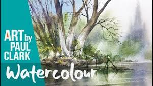
Here Eric shows this process. Talking about simplifying by connections.

https://www.youtube.com/watch?v=9i3hIIKTgCI


value study lessons learned from Andy Evanson

https://www.youtube.com/watch?v=QBrMVl6ZbJQ&t=364s


As promised, Eric's YouTube on the 30/70 rule.

https://www.youtube.com/watch?v=EJaR0NXzR50

Thursday, March 14, 2024

Paul Clark: Trees

 More about Paul Clark, and his tree methods.


In his videos, you'll see Paul Clark using the end of a paint brush to make smaller branches and to scratch texture into a trunk.  There are a few things about this technique that you need to know before you try it.

1. Sharpening the end of a paint brush. OK, I didn't want to ruin a brush doing this, so I tried it on some of my older wooden handle brushes. You have to sharpen it and then sand the end down to round it a bit. Must be wood. It doesn't work as well with smaller brush handles -- you need about a size 12 for it to work well.

Also, I practiced a LOT trying to make this work for me. I also tried other items: a palette knife, a credit card, a stick, etc. In the end I found that the point of my silicone shapers  (https://www.hobbylobby.com/Art-Supplies/Brushes/Silicone-Shaper-Paint-Brushes---Size-6/p/81072215 ) works the best for me. One student had Winsor Newton brushes that came to a nice point on the handles, and that worked well also. If you watch Karen Rice she uses a sharpened stick. 

2. The paint you lay down on the trunk must be very wet in order to use your device to make small branches. He doesn't stress this, but he continues to add paint to the trunk in small puddles in order to draw the paint out. If your paint dries out too soon, you won't be able to use a stick or something to pull the paint out. 

The link in the previous blog has one exercise on a tree with a background.

Here he tells several methods for simplified trees. 

https://www.youtube.com/watch?v=ygV5PuvzjE4


The middle of this video has a cool African tree in a sunset.

https://www.youtube.com/watch?v=q5bR1PeS9d8


This is another by Paul Clark. This one contains the abstract credit card method we did in class. It also has some details from a more complex tree, including lifting to bring some branches forward. He also demos a palm tree and fir trees. 

https://www.youtube.com/watch?v=xMVEuCfSVbs


There are many very good tree tutorials. Karen Rice has a very good one. https://www.youtube.com/watch?v=7UIo6FnX9KE  Here is a very loose video from Eric Yi Lin. He is even more loose than Paul Clark. 

https://www.youtube.com/watch?v=4j3CSYZZMbQ&t=1249s


Thursday, March 7, 2024

YouTubers: Paul Clark

 Paul Clark


Paul Clark is a professional artist and published author who has been teaching watercolour painting and drawing techniques to adult learners for over 25 years. He has taught art to adults at Bexhill and Claverham Community College, as well as running his own successful art school in Eastbourne. He lives in the UK, as you will catch on from his accent. 
Paul's ethos on teaching, is that students learn better when working in a happy and relaxed atmosphere.

He does still life, etc., but the main focus seems to be on landscapes. He has individual tutorials on YouTube on different subjects. Some are for a full tutorial, some of focusing on how to do a tree, rock, water, etc. Those are very helpful.

When he does a full tutorial from a sketch, he posts the sketch on his website: 

Most of the YouTube's are shortened versions of a full tutorial, but he does hit the most important parts.

Here are examples of some of his tutorials:


Class today was taken from the following video:

Three 20 minute demos techniques for landscape


We did some clouds. I've never done clouds with this method, so it was fun for me. We also did the one on the reflections in the water, quick and fun. I liked two things about that: one, it was basically two or three colors, so you could focus on learning the technique instead of waffling about color; and two, he showed a dry brush technique using the side of a round brush, which I've not used before. Makes interesting edges for trees. 

We didn't get to work on the tree, but we will next week. 

Paul Clark wrote the following book, and his work is found in several other books, which are compilations from various artists.


Paul Clark's book for beginners


Friday, March 1, 2024

Louise DeMasi


LOUISE DE MASI


Today we painted a goldfish, Louise style. 

Louise is a delightful Australian with excellent teaching skills. She has tutorials on Skillshare, Youtube, and Patreon. Many of the youtube lessons are on Patreon, but the youtube one is usually condensed and does not include important features, such as: full scale drawing, reference material, and progress photos. There are also many tutorials on patreon that are not on other venues. (patreon is $6 a month)(My favorite thing she does is the progress photos, which most other artists do not provide)

Louise has an index of her lessons that indicate whether they are for beginners, intermediate, or experienced. They are divided up into florals, 


birds, 


and animals.


You will find that she often uses a limited palette of just 3 or 4 colors, especially her more recent ones. Each of her lessons stresses some technique: wet on wet, blending, color mixing, texture, lost edges, etc. I enjoy her painting style, which is realistic, but very clean and inviting. If you want to learn how to create using wet on wet, she's your gal.

Most of her tutorials are more than an hour; some more complex ones are broken into two parts. She keeps an easy pace. Her style is learning by doing...in other words, the intent is to emphasize a specific technique, but she does it by applying it to a specific subject, in this case, a fish. 

She also discusses supplies that she discovers, brushes, paper, etc. I like that she also lets you know if you can show or sell the artwork you do from her tutorials, places to find good references, and so on. 

Also, watch to the end for the out-takes. 

https://www.youtube.com/watch?v=UAXHnemT0Og


I painted this goldfish, using her techniques for the most part. I changed to a reference photo that I found on Facebook's Reference Photos for Artists. I reversed the image to make it easier to follow. (It's very hard to paint an image facing the opposite direction.)

                                                  Reference photo in reverse


Reference in black and white


Sketch


The big eyed fish didn't appeal to me.

She used 3-4 basic colors: lemon yellow, warm red, French ultramarine and Burnt Sienna to make grays.
I later added some cerulean.

I began this the same as in the video: wet on wet in the body of the fish, leaving the tail and fins dry at first. IF YOU WANT TO DO THE black spots, make a thick black of burnt sienna and French Ultramarine (or cheat and just use paynes gray). When the paint on the body of the fish has lost its shine, drop in some dark spots. They should spread out a little and make soft edges. 

As the paint loses its shine, you can drop in clean water to make some small backruns on the fish.

TAIL AND FINS

This part gives some practice with making a line on dry paper, then quickly softening one side of the line. This is tricky, because paint dries much fast when it's on dry paper. 

Make a thin, watery gray from French Ultramarine and burnt sienna. Make a few lines on the fins, then soften one side. She shows this in the video. In addition, I used some soft light gray SHAPES where the fins appear to be shadowed. Don't try to do every spine on the fins. Let these dry.

I used cerulean to wash over some of these fins. I used bright orange (made from the red and yellow) in the areas indicated on the reference. I added some yellow to the dorsal fin. I also added some magenta to the side fin.

LOOK FOR OPPORTUNITIES to create lost edges. Lost edges are areas where the background and the object seem to disappear into each other. 

LIFTING

Louise has an "eradicator brush" which she loves to lift fine lines. Lifting is using clean water on a stiffer brush to soften the paint. You'll see her do that in the video. Until someone sweet buys me one of those, I will continue to use my stiff cheap brushes and my monarch brushes. For fine lines, I tape of the area and lift. 

I lifted between some of the fin spines, especially the top fin. I also used lifting on parts of the fins I wanted to have a softer edge. Softening the edge makes it recede into the background, and helps to lose that "outlined" effect.


THE EYE

For the eye area, carefully wet the area around the orange part of the eye, leaving the eye itself dry. All you are trying to do is make that orange part of the eye pop out. So keep the circle dry. Then put your red paint around the eye and help it disperse into the body of the fish. 
Blacken the center of the eye. When dry, use a white pen for the thin line around the black. 


FISH BODY

In my reference, the fish looks like it's got a bit of a belly. To make it seem more round, I added red orange behind that rounded area, and also darkened under the belly and side fin. If that area is already dark,
just lift the edge of the belly with water and a soft brush.


BACKGROUND

Louise's background is very simple, which I like. But I wanted a darker background. I just wet areas with a large brush, being careful around the fish, and dropped in ultramarine and cerulean blues, alternating to be sure the paint didn't look static and boring. As it lost its shine, I spattered water droplets to get backruns. 

So, in short, this tutorial showed four important ideas to master:

1. wet into wet
2. creating purposeful backruns
3. wet onto dry, then softening one edge
4. lifting
5. Losing or softening edges 

My version of the goldfish.