Tuesday, October 24, 2023

color version using value study as a guide


Colorizing a value study

This will be fairly short and not as explanatory as I'd like, as I haven't felt well lately.

To go to the next level after value study, I now have to consider colors. What colors do I want to add to create the feeling I am after?

I know that yellows have the lightest values; reds can get up to medium values; and blues and purples can get very dark. Browns also. So the main thing I have to decide is the colors I want in the clothing, because everything is else is a warm, dusty color except for the skin.

I did the sky first. I wet it, though you don't have to, to get a very light color of blue. (I used cerulean). I wanted to leave some clouds for extra contrast of the women. 

 I did the road and the background color using a combination of magenta and burnt umber. (you can also use magenta and green, its complement). ON THE ROAD, I was careful to paint in the direction of the hill. This adds to the uphill feeling. Also I was careful to leave the top of the road white, and the bottom a bit darker. Now I have all my first values in.

I chose 3 or 4 colors to do my first values on the women. I chose quin burnt orange, a yellow, and a blue.
Starting at the very top  of the basket on her head, I painted each woman wet into wet as all one shape. 
For example, on the woman on the far left, I painted some pale blue into the basket, moved to quin burnt orange on the skin, some yellow on the shirt, moving to some blue on the skirt, and orange on the legs, and some blues and oranges in the shadows. These were all connected, not painted as individual shapes. This is just a light value underpainting.  (Sorry I don't have a picture of that stage) I then dried the painting.


The picture above shows the next stage, where I have begun to define some of the details. Before I put details in the clothing, I put in the folds with a #4 brush. I was careful to keep in mind that the sun is on the right, so the darkest shadows would be on the left side of the bodies.

The skin is a combination of quin burnt orange and burnt umber. I put in the general skin tones, then made a darker brown for the shadows. Even tho the painting isn't very large, you still need to use value changes in the legs and arms so they don't look flat. 

We'll be finishing this next week. The main thing for this week is to get your lightest values in: the sky, road, background. And then get at least a light base on your figures and shadow, as if they are one shape. If colors run together, that's just fine; in fact, it's perfect.

Sunday, October 15, 2023

The Value of a Value Study


There are so many reasons to do a value study before a final color painting.

1. It's an easy and gradual process
2. You are getting used to the painting process--brush strokes against the type of paper you are using, etc. -- (instead of penciling in)
3. You are getting familiar with the subject
4. You can make your composition changes ahead of time, making many of your decisions before you add color.
5. If you choose a looser style, you understand which details can be left out, and which shapes are most important.
6. You can practice techniques you are less familiar with.
7. You are only worried about one thing at a time: value. You paint with one color only.
7. It's fun.

I am using a photo reference by Jack Ninno, Jr. found on unsplash.


You can use your Notanizer to find values, or print it in black and white.
I experimented a little with the composition, and decided I wanted a portrait layout, and I cropped off the left side to put the focus on the 3 women. 


The first one I did using only Payne's Gray. I wanted to see how it would look with warmer tones, so I used burnt umber in this demo. You can choose any color you want, as long as it can cover a wide range of values. I don't usually choose black, although I might add black as a final value. Another reason for using burnt umber is that I like to be able to lift, and Payne's Gray is hard to lift. (if you made your color from burnt sienna and French ultramarine, it would be gray or brown, but you can lift it more than Payne's Gray.)

Below you can see my "palette." It's a tiny Altoids box that hold 5 half-pans. One is burnt umber. I used the lid to mix my paint with water. For the very pale first layer, I made a light, watery version, and tested it on scrap paper to be sure it was pale enough.


Starting at the top, I wet the sky area. I saturated my round brush with watery burnt umber, and painted in what will be blue sky, leaving the clouds the white of the paper.


Then,using the same pale consistency, I painted everything that will not be white of the paper. This is so easy, because you just paint from one object to another, connecting them all, not worrying about any details. So I started with the basket and painted straight down the body of each woman, then into the shadows.  I want the top of the road to be much lighter than the very bottom, so avoided painting that. You can see some small whites I left. (no masking) I am also adding some directional strokes at the bottom to indicate the direction of the hill. This is not in the original photograph, but I think it will add to the feeling I want to express--the uphill struggle of their daily lives.


This dries pretty quickly, so it's usually ready for the next layer of value. I just added more burnt umber to my puddle, and tested it next to the first value to be sure it was the right shade.

Then I painted this next value over everything except what I want to leave white or light. (I left the sky, some of the road, parts of the clothing, highlights on the baskets, etc.) I darkened some of the bottom road, using strokes that indicate the direction of the hill. (be careful to follow the general rules of perspective here so your road is believable.)


I added some more burnt umber to my puddle, and tested it next to the other two values on a scrap of paper to be sure there was enough value change. Then I painted everything that I wanted darker, and left everything that was white, pale, or the last value. You can see their skin, folds in clothing, and legs are getting more definition. I now have 4 values: white, pale, medium pale, and medium dark. There are still 2 more values to go, but it is already shaping up.


Here is the scrap of paper I used to determine how dark to make each value.


Deepen the values on some areas....this further separates details, like the shadow under legs, clothing folds, etc.


To get the values deep enough for the final one, I added a dark green, which made
a nice warm black/brown. I added a few details on the skirts, deepened the shadows, 


Because I used a liftable color, I lifted a little on the skirt on the right; I spattered some on the road. If you want something lighter, add a little white gouache. 


I said before that you can use these to help with composition. I did this 3 times, changing the elevation each time. 


Friday, October 6, 2023

About Color Cubes

 Using Color Cubes from Sarah Renae Clark


Color Cubes is all about color inspiration: using color combinations that you have never thought to use before. It's like using a box to think "outside of the box."

Color Cubes come in two boxes, each holding 250 heavy-weight cards.

Each card has a photograph reference, with the main colors in it shown at the bottom.


These photographs are copyright free, so you can try to copy the reference if you like. On the back of each card the colors are shown and listed with a generic name (usually from a colored pencil collection), with a digital number (called a hex code) for that color for those who do digital coloring. On the right the same color is shown with a 20% tint and a 20% shade. The colors go right to the edge of the card to make it easier to match. She names the colors with color pencil names.

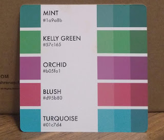
The color catalog and color companion (which comes as part of the catalog) are digital apps that make it easier to use the color cubes. The catalog was actually developed before the cubes. I originally bought just the cards because I am not a "digital" girl, and I love just browsing through them. But I wanted some more flexibility, so I finally got the digital catalog to go with it. (OK, my husband got it for me, because he was sure I'd need it, and he was right.)

Using the catalog, you can search for a combination by color, by subject (birds, animals, buildings, etc.) or by theme (mood, holidays, etc.) I like picking a color that I'm dying to use, then search for color and it will give me the numbers of all the cards that have that color in it, giving a variety of color combinations.

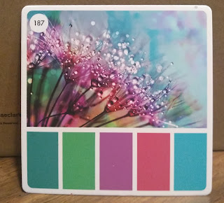
For class, I chose card #187. I went to the color catalog and printed out that card. The printout has information that is more useful if you are not a pencil artist.


The printout again shows the photo reference and the color combinations. But at the bottom the colors are printed out with 3 rectangles underneath each color. This is for you to match your colors to the color on the card. You can write down what paints you used to create those colors. Since watercolor doesn't work well on printer paper, I taped a strip of watercolor paper across this so I could try out what watercolors make those color combinations.

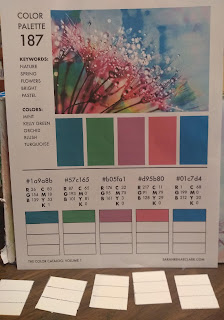
What interests me is the codes above each color. There are RGB (red/green/blue) codes and CYMK codes. THE CYMK stands for cyan-yellow-magenta-black, the colors in your color printer. I may not get a perfect match, but it gives me an idea of what and how much of each color is used to create that color. I try to begin with a color in my palette that most matches, then add cyan, magenta, or yellow to it to try to create a match. (I have to mention that a few years ago I purchased Lucas colors of cyan, magenta, and yellow for creating a color wheel, so they are very helpful in color matching)


For example, on card 187, the first color is a blue that they call mint. The CMYK numbers show a predominance of cyan (80), a smidge of magenta (18) and some yellow (53).  Everyone has something different in their palette. One person found that Mayan blue was just about perfect. Someone else mixed turquoise and a bit of magenta. 

The second color, Kelly green, shows no magenta or black. It uses cyan and yellow. You'll also notice that the more saturated and dark the color, the higher the number. In watercolor, this just translates as "less water, please." Some people found that their Hookers green was a good match even without changes.

So my final color choices from my palette, trying to match the colors on the card, were turquoise with a bit of magenta; cyan and magenta for the purplish red; Magenta with a bit of orange for the pink; and cerulean for the final blue. (some people have quin magenta, which is more purple)


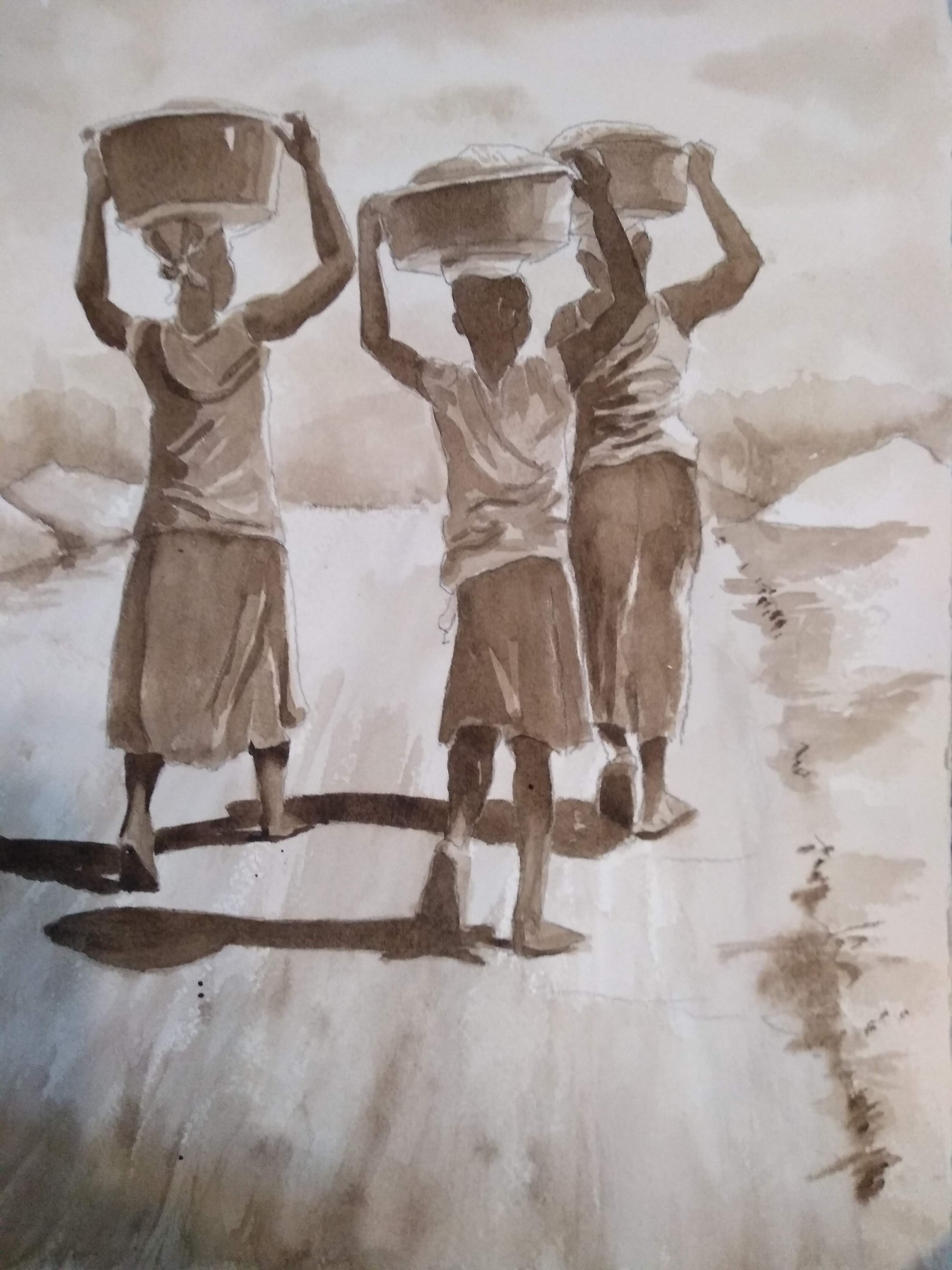
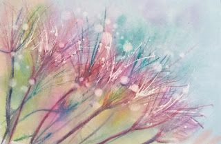
To do a loose version of this picture, I spattered Miskit in an arch across the paper, trying to get some larger drops for the water drops. I used a fine liner and Miskit to make some white flower strands. 

When the Miskit was dry, I wet the paper and applied cerulean with a pit of turquoise in it, dropping some magenta into areas. I used the magenta and cyan for the area where the centers of the flowers were, then moving to the bottom left, added other colors for a fun colorful wash.

After all was dried, I used a fine brush dipped in the magenta to make flower clusters. I also used some purple and some blue to get a variety of colors in the flowers.

When I was happy with the flower clusters, I put in the stems. I thought they were too harsh, so I spritzed the stems to soften them a little. When I liked it, I dried it all and removed the masking fluid. 

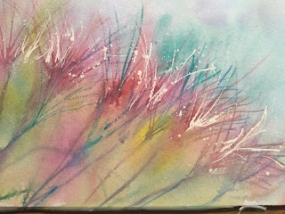
To finish I used a circle stencil to get some larger white droplets. 

I used my watercolor pencils (magenta, purple, and blue) to make darker stems and a few more flowers. I like that I have some stems that seem to be in the background in addition to the sharper ones in the foreground.


Here are some youtubes to show some ways to use the color cubes.

Emma LeFabre 16 min. 

https://www.youtube.com/watch?v=_qhlXULSm8c

Denise Love: she has a series of youtubes on this bc she has given herself the challenge of eventually using all 500 of the cards, and she doesn't really use the catalog, just the cards in the cubes.


Info on Color Cubes is on Sarahrenaeclark.com website.