Thursday, May 28, 2020

VASE FOR VIOLETS

Here is another suggestion for painting a vase from Jean Haines.

Place a piece of card or scrap watercolor paper over the edge of the vase. (Card is on the right, covering vase). Stroke your paint for background over the edge, adding othere color if you want.
Carefully remove the card.


The edge of the vase appears, painted "negatively."

I think that has a lot of applications, especially for architectural pieces: doors, fences, walls of buildings, windows, etc. 

A

For the inside of the vase I just washed pale color with lost edges.

PRACTICE THIS

MERGING BACKGROUND AND FOREGROUND

I'm back to discussing looser paintings and looking at the work of Jean Haines.

In the last blog I discussed getting to know your subject. And I try to follow my own advice. In the first tries of painting the violets, I did studies of the flower and felt like I was really ready to paint them. BUT I didn't like my leaves. Somehow they looked blobby. And I realized that, while I studied the flower petals, I did not give enough attention to studying the leaves and how they grew. So I began a study of those, and was much happier with the results.

 My leaf reference

leaf study


The following exercise puts into practice the things I learned from the violets: allowing colors to merge to create connections; paying attention to lost edges and hard edges. This time I used an idea suggested by Jean Haines to create a background first, and allow parts of it to merge into the foreground. It was also important NOT TO OUTLINE the object of interest, but to allow parts of it to have soft shapes that merge into the background. 

First I drew three circles in an arch. This is done on a small sheet of 6 x 8 cold press. I did not try to draw petals, just circles.  Using two blues (pthalo and cerulean) I began to paint the background around the circles. YOU CHOOSE WHAT COLORS YOU LOVE. Use it as a chance to experiment with color.
To create petals I just "cut into" the circle shapes to indicate where the petal would be. I did not try to outline all of the flower. I painted some areas dark, some lighter, some not at all.
PLAY with the background: DRIP colors, salt, use plastic wrap, tilt the paper, spatter, whatever sounds fun at the time.


Remember brushing clean water over part of a violet to allow the color to bleed into the background?
This time, before the background is completely dry, take clean water over an edge where a petal meets the background, and let light color bleed into the flower petal. This creates a pale shadow on the petal and begins to create the flower.

**I know I always preach not to paint unless the paper is completely wet or completely dry. This is an exception to the rule. The paint will be dry enough to sink into the paper, lost its shine, but still not completely settled so that you can pull some off to create a soft edge.

You can see this on the top right petal of the top flower. Look at the flowers for edges that seem to merge into the background.

For the centers, choose a color that contrasts with background.


Below I just played with pinks.


Thursday, May 21, 2020

Loose Painting Philosophies

I've been checking out artists who paint much looser styles than I do, specifically: Jean Haines, Eric Yi Lin, and Liron Yankonsky, some suggested by students.  I've come up with a few things they have in common, even though their styles are quite different.

First, they all suggest you need to KNOW YOUR SUBJECT before trying to paint it, either with sketches, small studies, etc.

2nd, they all agree that FAST is not necessarily good for LOOSE. Sometimes you need to take your time with an area, especially if it is going to be a focal point of the painting.

3rd, they all discuss CONNECTIONS in a painting.

4th, PRACTICE and having PATIENCE with yourself.

I really like the following youtube from Eric Yi Lin: The Real Secret of Loose Painting: Visual Language (28 min). He mentions 3 steps for better loose painting: Observe, Analyze, and Process and Interpret.

https://www.youtube.com/watch?v=NWSXVUs-B1o

Below is a 7 minute Liron Yanconsky with tips to paint loose.


For a 4-minute introduction to Jean Haines, see this youtube. Jean does not have full-length youtubes, but uses shorts to advertise her many books and videos on sale. In this one she talks about brush strokes. It will give you an idea of her current style. (She used to be a botanical painter, but developed a looser style after studying in China)


So, on with the start of this painting, ideas taken from Jean Haines book Atmospheric Flowers in Watercolor. Below is my first attempt at loose floral. I am not going to put on here any of Jean Haines' book or paintings. You can look those up online, and I don't want to infringe on her copyrights. These are my comments on some of her instructions, with some of my own results.


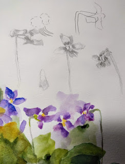
The NUMBER ONE THING that I've been trying to stress, first with the bird paintings and now with this one, is to KNOW YOUR SUBJECT. When flower painting, it's good to have a real flower in front of you as reference. I learned from trying this that violets are not as simple as you might think.
Below you'll see one violet that I picked from my yard, drawn from four different angles. I drew them, trying to get to know the flower, and it was enlightening how much I did NOT know.
Then I practiced painting them from different angles. 
The adantage to doing this is I didn't end up with a lot of generic flower shapes that looked cookie cutter shaped.

Jean Haines suggests getting scraps of paper and doing some practices before you begin a final painting. Just small scraps. I've numbered some of her suggestions to illustrate some of my own practice. These are just painted free hand, not drawn first.

#1 is painting a violet shape just onto dry paper.
#2 is wetting the paper in flower shape first, then dropping in color and letting them blend on the paper. (I used violet and quin violet)
#3 is a little tricky. You take a flower you've painted, but is not quite dry. You wet a petal with clean water and drag some of the color over the paper to create shadow-like shapes. It gives the illusion of shadow or perhaps obscured petals.
#4 Wetting the paper (not in flower shape, just circular), allowing the paper to absorb the water a bit, then painting in petals for a very loose effect with soft edges. (This was my own suggestions, not one from Jean Haines.)
#5 Paint a green color for leaf, and while a flower petal is still slightly damp, draw the leaf color into the purple of the flower. (you can also see some of lthat on #4)

This 5th step creates what she calls CONNECTION. Every loose painter that I admire uses this principle in one way or another. It keeps your painting from looking like a lot of unconnected (even if beautifully rendered) objects. 


Below is on of my practices with connecting leaves and flower petals. 


The youtube by Eric Li Yin is wonderful at explaining the importance of creating connections.
You create connection in several ways, but in this case, practice allowing your colors to run together in places. 


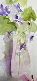
In this painting, I mostly created a flower grouping using the five practice techniques. For the stems, I painted flowy stems of light green and dropped bits of violet or quin magenta into them, varying the color a bit and creating more interest. 

For the side of the vase, I just applied wet purple and dropped in some green on the left side. 
Before it dried completely, I pulled some of the color into the vase (as I did with the violets). I decided it needed a little droopy flower and added that and the half flower on the right side.

My comments: I really enjoyed practicing doing these. Since I got flowers for Mothers' Day, it was a good time to practice other flowers also. It was really a matter of re-remembering some of the things I already knew and applying them in a different way. 


Monday, May 18, 2020

LOOSER VERSION OF JOEY

Here is how I finished this version of our cockatiel.
I started out with a loose background and drew the picture onto it after it was painted.
(See previous blog)


 First I held the picture at a diagonal and wet the heat and neck, adding yellow for the head. I waited for it to dry just a bit and added the orange cheek color, as in the first bird. After it dried, I wet the wing and tail. Still at a diagonal, I dropped blues and violets into the tail and wing colors. I was not trying to particularly stay in the lines at this point.


 Next step was to darken the yellow on the head and work on the branch while the rest was drying. I used burnt sienna and purple on the branch (same purple as used in the wing and tail.) I basically used the same technique as the branch before, just not being as careful about details.
The beak and feet are a raw sienna.

I filled in the eye with dark blue and put a bit of miskit on the crest so I could do the background more easily. I tipped the paper at a diagonal again, only the opposite direction, so the paint would flow top left to bottom right. I used cerulean and green apatite genuine. I wet the paper in sections, starting with the middle of the body. I wet the paper a good half inch or more than I planned to apply paint to keep edges soft. I applied the blue, letting it drip and move by itself because of the diagonal of the paper (it is also at a bit of a tilt so the paint moves more). I dropped in green apatite genuine here and there.

You will see a hint of branch-like shapes, very pale. Those are created by waiting until the paper has lost its sheen, and dragging a damp liner brush through the painted area.

When I was done with the midsection, I did the head area, then the lower area, being sure to leave areas of white.

When it dried, I used clean pthalo blue to emphasize sections under the chin and under the belly. Try to avoid 'OUTLINING" the bird.


Now I start to "find" the feathers. I used violet and ultramarine blue instead of grays. Using a small brush for these wing and tail feathers, wet the underside of a feather, then line it with purple and drop in bits of blue here and there. This is to avoid having a long, boring line of just one color. I underline the feather, and then soften it away with my brush on one side, leaving the other side a hard edge.

Above, I removed the miskit from the crest after all was dry. 


I may do just a little more on the upper wing feathers, but it is mostly done. 


Wednesday, May 13, 2020

FIINISHING JOEY

PAINTING THE BRANCH

There is a branch that I'd painted behind Joey's wings that actually was part of the large branch. But, as I looked at the painting, I realized it looked odd, so I painted a non-existent twig off the main branch to make it look more connected. 

To Paint the branch, I wet the entire thing, and, while wet, dropped in my gray mix and some burnt sienna. Be certain to leave some white in the branch, especially where the light would hit. Before it dried, I used a fine brush to add darker gray, with some purple, to the edges of the branch. The paint should lightly bleed into the branch, but not spread out as much as it did when you were dropping in the gray. If it appears too heavy, you can drop water into the area to create blooms on the branch.


BEGINNING A LOOSER VERSION

I started with a soft edged background of teal blue and undersea green. I tipped the paper at an angle and let the paint run together. I tried to be sure to leave soft whites here and there. 

When dry, I put the sketch of the bird over the background.

Tilting the paper again, I wet the top of the bird and loosely painted hansa yellow over the face and crest, not being overly careful to stay in lines...just trying to keep my colors clean, letting them drip in place.
I used cerulean blue and cobalt violet over the wings and tail in a wet into wet manner. The picture is still tipped at an angle on the board and turned to be diagonal. I also put in a bright orange cheek area before it got dry. 


More later.


Thursday, May 7, 2020

STRATHMORE AQUARIUS II PAPER

I just want to put in a word for what is probably the only Strathmore Watercolor Paper I like.
(They make other great papers, but, except for their highest grade of 500, well...I like other wc papers much better)

This paper is called Strathmore Aquarius II. It is 80 lb paper, and it is NOT 100% cotton. It is part synthetic. It is acid-free and considered cold press.

As far as I know, it is sold in sheets and tablets. (both Blicks and Cheap Joes carry it. I think Plaza does too) It has a smoother surface which makes it great for pen and wash. Some mixed media artists apply gesso to it and paint that way.

Its claim to fame is that it doesn't buckle or warp like other papers, especially the 90 and 80 lb weights. It can be used for print making, inks, card making, (stamping) and other media. 

One thing I like about it is that I can easily run it through my printer. It accepts black ink and color ink equally well. And then, if I choose, I can paint on a line drawing that I've printed on the paper.

This paper is lovely. Not perfect, but I like it, and have used it occasionally for about ten years. It DOES NOT LIKE miskit or contac paper. But it does take glazes and it does lift nicely.

JOEY: MY HUSBAND'S COCKATIEL

STARTING A BIRD PAINTING

After today's Zoom sessions, I just want to answer a few questions before I begin this tutorial.


Q 1: What is a good method for painting leaves?

For those struggling with painting leaves, here is a good tutorial by Louise DeMasi.

https://youtu.be/W0VqApUdDw8

Q 2: How do I share my pictures on Zoom?


Here is the reference photo: 


The sketch: 


Value/color study:


In some of our conversations, I've suggested making your line drawing and copying it several times, small sized, to do several value studies. In this case, I made several copies, made a value study, but also added the yellows where I wanted them to be. Joey is gray and yellow, so adding the color to value study wasn't much of a stretch.
To make the value study, I used a GENERALS SKETCH & WASH pencil, which can be sketched on then wet to create light to dark values. It makes the value sketch go quickly.

First step in the painting is to apply a yellow wash (I used Hansa Yellow), dark to the head, crest, and neck of the bird, making it very pale over the breast, tail, shoulder, and wings.

*I wanted a very pale yellow under painting over almost the entire bird. I will later "glaze" grays over the yellows. This is how Joey looks. He seems white and gray, but at closer inspection, you see undertones of yellow. I can't exactly "mix" gray and yellow to get the effect. I can only get it by glazing.)


Before this could dry, I added orange to the cheek to create a soft feather look. This is accomplished wet in wet, but the trick is to have the paint/moisture on your brush less than the moisture on the paper. I don't want a backrun, but I want the paint to spread out over the cheek area. 

(You apply the paint to the center of the circle and watch as it moves out. You can use a brush to encourage it in the shape you want, or a clean thirsty brush to prevent it from going farther than you want. A "thirsty" brush is one that has been in water, but has most of the water pulled out by either squeezing or drying on  a sponge or paper towel. It is not completely dry)

DRY COMPLETELY.
PUT A TINY DOT OF MISKIT IN THE CENTER OF THE EYE, AND THIN WISPS OF MISKIT OVER THE CREST.


The shoulder of the bird has small soft feathers. To create this effect, I mixed a gray with French ultramarine blue and a bit of burnt sienna, and added a bit of violet.
I wet the entire wing and shoulder BUT I only applied the gray paint to the top of the shoulder and let it go only to the top of the wing. (this is so I would get a soft edge over the wing)
NOW WATCH PAINT DRY. When the gray has almost lost its shine, or just barely lost it, use a small brush to drip tiny bits of water to create tiny "blossoms" that look like feathers. If it gets too light, use the gray paint to create the blossoms. 

For the beak and claws, create a flesh tone of raw sienna and pink or magenta. I painted in the eye with a "black" made from purple and burnt umber. I left a white ring around the eye. The nose is a gray. Make a dark round spot for the nostril.

I began putting a light gray wash over the body, leaving some of the flight feathers white and yellow. 

The feet have a glaze of the flesh tones. When they dried I put tiny dots of burnt sienna, and darkened underneath the feet for shadow.


I began the  process of separating the feathers. The way I usually do this is to apply the paint to the side of the hard edge, clean the brush, and with just water on the brush, soften the gray into the body. (the brush is not drippy wet, just damp enough to move the paint) 

On the tail and lower wings where the feathers overlap and are close together, I skipped every other feather as I worked, so I wouldn't accidentally paint into a wet shape. 

I used a damp lifting brush to lift away any areas I needed to be softer or whiter. (Such as those very white feathers.)


Since I have miskit on the crest, I could work a wet background in around the head. I wet the area around the head, dropped in cerulean blue and then  dropped in quin violet. 

Then I wet the section near the tail, again dropping in cerulean and some green and tiny bits of the violet. Same for the sections surrounding the stem. As the green dried, I dropped bits of water from a small brush to create blossoms.
Still haven't done the branch. And I will probably break up the green by his back wing. 


I am repainting the bird using a loose background first. This one was created using new gamboge, cerulean, and quin violet. I may choose a different background, but I will do the background first, leaving sections of white, or a "path" of white. I created some purposeful blossoms to break up some areas I thought needed some attention.