Thursday, August 26, 2021

Zebras and Gesso


SUBTRACTIVE PAINTING

Subtractive painting methods allow you to put color on your paper, even randomly, then remove the areas you want to be lighter or white. It's like sculpting, in a way. A sculptor just removes the parts he doesn't want. 

Start by covering your entire paper with ordinary white gesso.

Why gesso? Gesso has a slippery feel with watercolor, but not quite as slick as yupo. You will be able to remove the paint easily back to white. But you can still darken the paint. You won't be able to do a lot of glazing, because it will move the first layer easily. But you can glaze much more than with yupo's surface. Plus, you can create interesting textures that the paint will pick up.

With gesso you are not limited to watercolor paper. You can put gesso on wood, mat board, poorer quality watercolor paper, etc. 

You can smooth the gesso, put swirls and other marks in it for texture, add things like sand, impress leaves or stamps, whatever you wish to create textures. On one of mine, I put crinkled saran wrap over the top of wet gesso (just as we do with creating watercolor textures), then removed the saran wrap while the gesso is wet.

Dry the gesso completely. Maybe for a day, especially in this humid August weather.

The next step is to cover the entire page with washes of paint. You can choose what you like, but I tried to paint cool to warm, starting with blue on the left, adding magenta in the middle, then quinacridone gold on the right. (In this picture it's on its side).  Then I turn on its side and spray to make the paints mix together.

You can go as dark as you wish in this step. 


Draw your picture over the dried paint.


Using a lifting brush (stiff brush), remove the paint from the white areas. This should not be very difficult, as the gesso usually releases the paint easily. You will see little "ghost" colors where it doesn't lift completely, but these just add interest to the painting.


You may be happy with how dark your stripes are, but I was not. So I made adjustments. I wanted my stripes to go from blue to violet to red to orange to gold, So I strengthened them with colors, using the same colors I used in the original pour. I also painted the nose with Ultramarine blue and some violet. It picked up the yellow beneath it in places, making a more interesting color. I painted the eye in dark.


Here is the finished painting. 


Painting this was just pure fun for me, but I hoped to teach a few points at the same time.

1. Painting on a different surface to provide texture
2. "subtractive" painting.....removing paint to bring out the darker values
3. Using 3-4 colors to create harmony
4. Blending color on the paper for transitions in color. 
5. What it means to "lift" color

Below is a different painting done using CLEAR gesso. Clear gesso has a sandier texture, such as what you see in the gold background. It is much different than the white gesso, and doesn't remove paint well.


STUDENT WORK

It's always fun to see how each person takes the same concept and does something unique.
Most of these are not completely finished, but you get a feeling for the different directions each one takes.

Jackie had a darker base wash. The red was quite staining and hard to remove completely. She chose to do the stripes in various blues, which helped unify it all.


Tracy, below, did a diagonal wash of light blue violet to magenta. After removing the whites, she worked left to right with cool to warm, ending in a dark blue for the nose and eye.


Barb's wash had some neutral greens and blues for background. She sandwiched warm colored stripes in the middle with cool darks on far left and right.


Kerri Had a very warm, golden background, and used deep browns for the darks, and some reds and golds for interest. 


Sylvia has a more muted background, and the dark blue and blue green stripes bring it all out. She's added some gold stripes on the left to balance out the gold background on the right.


Betty had a green/yellow/gold background to start. She concentrated on making each stripe
vary in color, making for a very colorful, textured look.

Cathy's zebra started with a very pale wash. She did some undertones with metallic paints.
Then she varied the color of each stripe, letting one color bleed into the next. 


Dorothy's pale background allowed her stripes to go noticeably from cool to warm and back to cool in the mouth area. 


I am missing a picture, and I know I photographed it. It was a good example of how you can create a background you don't like and change it. So Sorry! Don't know what happened.


Thursday, August 19, 2021

FOREGROUND GRASSES

 Last week I posted the beginnings of a landscape with lots of grass. We didn't get to finish, and I wanted to concentrate on different methods of painting grass. 

I had included links to 2 different youtubes, and I hope you were able to watch them. This week I'm going over them (some of them) and explaining my favorites.

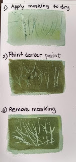
#1  Here is a way to create lighter grass. Paint light green or yellow and let it dry. Then apply masking fluid in grass shapes. Let the masking dry completely. Then paint darker green over that, and let it dry. Lastly, remove the masking fluid and you will see the lighter grass blades show through.


NEW TIP : I saw someone using an old-fashioned dip pen to apply thin lines of masking, and I thought it was genius! So I've been playing with my dip pen and loving it. Masking fluid removes easily after it dries. Plus, I've discovered that I can dip it into watercolor and use it to sign my name or make tiny thin marks. Love it! (from Amazon with 2 pens and 6 nibs: $10)


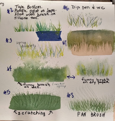
#2. Well, I'm going to pat myself on the back for the next method, because I've never seen anyone use it except me. I'm not a genius, but I really like this method for several reasons. The first is that I am not constantly reloading my brush; second, I get several colors of grass at once; third, the grass feels very anchored to the ground.
This is the top left method. You tape a piece of masking tape below your grass line. Drop puddles of green and yellow colors directly onto the tape, not the paper. Then drag a thin brush or silicone tool through the wet paints in flicks, bottom to top. As your brush goes through the paint on the tape, it picks up several colors at once. You can see in the picture I've removed 1/2 the tape so you can see the result.


(Jackie reminded me that you can also blow through the puddles with a straw and make some very interesting grasses that way. Sometimes we forget what we know!)


3.) Second left method: Spritz a few droplets of water onto white paper. Use a rigger brush to drag paint through the droplets. You will still get grass whisps, but as the paint goes through the droplets, it creates effects.

4.) Third down on the left: Cut up an OLD brush, even a bristle brush, into hacked uneven chunks so that some bristles are longer than others, and there are separations. You can either drag it through wet color (as on the left) or dry brush, as on the right. There are actually brushes made for that, and they are named in one of the videos I sent.


 5.) Fourth on the bottom left is scratching or etching into the paper. This is done while your paint is wet. Apply wet paint and use the sharp tip of your brush to scratch grass shapes into it. The etched part will begin to pool with paint, making it darker. If you use a credit card's rounded edge or a palette knife, you can make shapes that leave white by scraping into the paint.

6. On the top right is using watercolor in a dip pen. Just fill the pen with watercolor paint and away I go. The results are very fine lines. (TIP: this can be done on cold press, but works better on hot press because of the smoothness of the texture) These pictures are on cold press.

7.) Pictured here is "negative painting."  This is done over a first wash of yellow or light green. With darker color, you paint around the blades of grass from the top down. This can be done several ways.
A. You can spread a wash of darker color over the top and use a funny brush or rigger to drag it down into the lighter color. B. Use a rigger brush to paint around the tops of the blades and smooth the paint into the area above it. (If you turn it upside down, it will look like the dark grass is on the bottom.)

8.) Bottom right is using a fan brush. Many people like this, but I think it looks a little TOO even.

You will probably use more than one method in your painting. In this painting, I have an underpainting of light green. I used a little masking fluid after that dried, and colored over it with darker paint. Third, I used a bristle brush to define lines. The final touch was spattering with some yellow gouache after covering areas I didn't want spattered with paper towels. 


Thursday, August 12, 2021

USING TUBE GREENS

 Last week we did a lesson on mixing greens. We did color combinations wet on wet. So here's a challenge for you, if you haven't done this already.

Using the same color combinations as before, mix the colors on the palette instead of wet on wet.

Make a puddle of the yellow and a puddle of the blue. Paint a column of yellow on the left and the pure blue on the right. Add a tiny bit of the blue until you notice a color change. Then paint a column of that to the right of the yellow. Use the same puddle, add a little more blue, then paint a column next to the one before. Do this several times until you have gone through as many color changes as you can. (I did 6-7)

This gives a very clear idea of what color variations you can make with each yellow/blue combination. Put next to last week's chart, you can decide whether to mix a color on the palette or on the paper.


Tube greens can be a mix of colors or single color pigments. The top color swatch shows mixed greens on the top row and the pigment color. The bottom row shows two single color pigments, serpentine genuine and green apatite genuine, emerald green, deep sap, and green gold, another single pigment color.

The bottom chart is more single color pigments. Knowing pigments in a mix, such as sap green, can tell you how to mix that color from others in your palette. Example, Sap green is a mix of PG7 (pthalocyanine green) plus PY100 (Isoindoline yellow). Undersea green is a mix of PB29 (French ultramarine) and PO49 (quin gold). A chart of colors can be found on the Daniel Smith web site shown below. Also, if you look on Dick Blick or other art site and look for that color, then go into details, it should tell you about that paint, its pigment composition, whether it stains or lifts, how light fast it is, and whether it granulates. (I will email the chart)


Knowing the composition of a color can tell you whether or not a blue or yellow or other color would go well for color harmony.


THE VALUE OF PG & (pthalo green blue shade)

Below shows a few combinations of pthalo green : by itself, with hansa yellow, with red,
with french ultramarine, and with purple. Many tube paints have a PG7 base. But beware, it is a very staining color (all pthalos stain), and a powerful influencer. A little dab 'l do ya.

(Staining means that color grabs onto the fibers of the paper and don't want to let go. They are hard to lift with clear water and stiff brush)


A QU

ICK WAY TO SEE HOW COLORS REACT TOGETHER is what Jean Haynes (a loose watercolorist from Wales) calls "dancing ladies." Put dots of tube colors at the top of the page, and label each one. Put a 1/2 trails of water underneath the color, and then gently wet the color so it flows down the water. YOu will be able to see the color from dark to light. Try adding a yellow or blue to see what color green it makes.
A bonus of this method is that you can use the dot of paint at the top to paint with.


Below: Using line direction to indicate large field.


STARTING A PAINTING WITH GRASSES

Below are two small "thumbnails" that I used just to try out which colors I wanted to use in my painting. They are only about 3 inches high. It's a good idea to do this...takes about 5 minutes...and saves a lot of grief over using a color that doesn't work well.


SHOWING DEPTH

This is a picture that shows depth through the following ways:

Muted colors in the background (
Soft edges in furthest objects
less detail in background
keeping warmest colors in the area of attention


I took this from a photo I found on Unsplash: photographer Pat Whelan.


We started by drawing a line about 2/3 down the page for a horizon line Working wet on wet, starting with a dulled down cobalt or cerulean blue, paint a wash from the top of the page to the bottom. Work the blue down to the horizon line, then add some yellow over the area where the dark trees will be. Then paint yellow green, then yellow, then yellow green-green on the bottom of the page.

In the picture below you can see the underwash done before this next step.  Dry the wash completely.If you want a figure or barn in the picture, tape off the area to keep from painting it.

For the distant hills, Wet the area from the top of the hills to the bottom of the tree line. With some dulled down blue, paint in the hills. Add the paint about 1/2 inch below the tops of the hill, and allow the paint to move up to create a soft edged effect. 

For the tree line, drop dark greens into the wet area. Vary the height and width Try to leave some gaps so the lighter undercolor shows through. While wet, drop in French ultramarine blue, a dark green, or purple to deepen the shadows.  Notice how painting wet leaves the top of the tree looking distant and soft edged.

MIDDLE AND BACKGROUND GRASS

Background grass will have very little texture. You can add some tiny dots in the distance or some horizontal lines in the midground to suggest grass. You want to either add lines wet in wet or soften after putting them on dry paper. lines will be further apart as you get closer to foregorund. (perspective)


Here is the finished version of this painting with a figure painted in. Next time we'll work on different methods of painting grasses. 


for a sneak peak at some videos on painting grass, see the following:


Thursday, August 5, 2021

CONQUERING THE BIG GREEN MONSTER

 What is it about GREEN that strikes fear into the hearts of the most noble watercolorist? Orange...no problem. You want purple? Easy peasy. But green?

I was driving on the interstate and realized how green those highway signs are. They showed up so well even against a background of trees and bushes. And it clicked. That green doesn't exist in the natural world, at least not around here. It's so in-your-face green that it is out of place and shows up anywhere.

It also occurred to me that I've seen paintings of landscapes using that kind of green and feeling very uncomfortable. Not that I personally would do that.....

In landscapes and florals, you want your greens to look natural and to harmonize...look "right" together. Some greens will be used to show sunlight, others for shade; some for distance, some for foreground. Maybe I've been guilty of using one green for a bush, then shading it with a different green, but it somehow didn't look like the shade was part of the bush, more like a hole in the bush.

A good place to start is by training yourself to see things how they are, not how your kindergarten brain wants to see it. 

So this blog is about three parts:

1. mixing your own greens

2. being able to duplicate a green in a picture, scene, or item using knowledge learned from creating a chart of greens

3. Using your greens to make a simple picture of your own using just 3 colors.

LEARN WHAT GREENS YOU CAN MAKE ON YOUR OWN

This method is painting "wet on wet," which means you wet the paper first, drop in one color, then drop in another, then allow them to blend together...maybe with a few encouraging swipes of the brush.

Create a grid on a piece of paper, at least 9 x 12, using masking tape to separate the columns.

I like to have at least 10 rectangles, and I like them to be large enough to really see the effect of the colors mingling wet on wet.

Choose some blues and yellows. Wet a space. Apply one of the yellows on one side (I chose left) and a blue for the right. Allow them to mingle together until they make several shades of green. LABEL each time you do this. Choose different blue and yellow for each rectangle. For example, on the one below, the first space is French Ultramarine and Hansa Yellow. The one right of that is French ultramarine and Nickle Azo Yellow (a more orange yellow) 

second row: Pthalo blue and hansa yellow; french ultramarine and quinacridone gold

3rd row:Indigo and hansa yellow; pthalo and quin gold

4th row: cerulean and hansa; cerulean and quin gold

5th row: A bit of a surprise: paynes gray and hansa; neutral tint and hansa. They make a lovely olive color... who knew? But Paynes gray is made out of blue and black, so adding yellow to it makes sense to make a green. Neutral tint is made from lamp black, pthalo blue, and quin violet, so adding some yellow should make a green of sorts. 


The important thing is to experiment with the colors you have and see what you can do with them. You don't need a huge selection....just need to know what you can do with what you have.

Next step is to choose a green and try to neutralize it (that means lower the intensity or gray it down) with red; then try orange; then try purple. You should come up with some interesting greens that are much more natural looking. 

If you prefer mixing color on the palette, try that also. You will see the color will be flatter and not as variegated and won't have the granulation you see doing wet on wet. 


TRY TO DUPLICATE THE COLOR YOU SEE

Using the references below (or your own reference, pictures cut from a magazine) identify as many green shades as possible. Then try to duplicate that color. You can, as we did in class, use leaves or grass cut from your yard to try to duplicate the color. Try to paint the color of the back of a leaf, which is usually grayer. Use your chart to compare and get as close to the color as possible, then either add red or violet to tone it down or darken. You may need to thicken or water down your paint to get closer to the color you want. 


Let's use that second picture. To try to duplicate that yellow green, you might observe that hansa (or a lemon) yellow and cerulean make a beautiful spring green that you can add a little extra yellow to. That should bring you close to that color. The shaded underside would have to have some blue added to create that darker green.
For the foliage on the left, you might begin with a French ultramarine (not such a spring color) and yellow, then add a violet to make it much duller, more olive in color. 
Try several choices to duplicate some of the greens. Record your results.

leaves from my yard


Look at the color wheel:
 

The yellow that leans to green (such as hansa and lemon) and the blue that leans to green (such as pthalo, cerulean) will make your pretty pretty spring green.  The further your color is from those colors, the more neutralized your green will be. Think: red is the opposite (compliment) or green, so the closer my color is to red, the more neutral my green will be when I add it. (Many browns and grays are made adding red to green). So an oranger yellow, such as ochre, raw sienna, or new gamboge, mixed with a "redder" blue, such as French ultramarine or cobalt or indanthrone, produce a less "spring" green , one that is more natural looking. 

A PRACTICE PAINTING

In class we used a simple cactus sketch to practice the wet in wet technique, using one blue of choice and two yellows of choice (one cool, like hansa, and one warm, like quin gold). We also used a cut up credit card for this. You can do the opposite, using two blues with one yellow.


Wet one of the cactus areas. Drop in yellow on the light side, then drop in the blue in the shaded part, and let the two colors mingle. Help them along if needed by brushing the yellow into the blue. I always put my loaded brush down on the part I want darkest first, and let the paint move out into the middle. 


While that is drying, move to another leaf of the cactus, trying the blue with the other yellow. 
Make sure you don't paint an area adjacent to wet paint , or it will backrun and smear. You can at any time dry with a blowdryer. 


Before the paint dries, use the point of the cut credit card to scrape out little cactus thorns in the damp paint. (Paint will be shiny but not puddly) Once dry it won't scratch. 


I wanted some little pink surprises, so I added pale magenta to some areas, let it dry, and then continued to paint as before, glazing over part of the pinks.


I continued until all leaves were painted, alternating the yellows I used. 


I darkened shadow areas with French ultramarine. Then I glazed over all with hansa yellow to brighten it a bit. When it was completely dry, I used a white gel pen to add a few more needles to the cactus. I didn't want to overdo the prickly needles, just give a hint.


A useful you tube from Michele Weber :