Thursday, September 23, 2021

A Few Loose Painting Tips/Wisteria

What is "loose" painting? I brought several books by different painters I consider having a loose style: Charles Reid, Zoltan Szabo, and Jean Haines. All have totally different styles, but they have one thing in common: their paintings are simplified down to the most important elements. They may have some details in them, but not a lot. They suggest objects through color, shape, value, and lost and found edges. 

Below is a painting of wisteria that I tried in Jean Haines Online Workshop. There are suggested forms and some detail.   


A few simple suggestions that I've seen from painters who prefer a loose style:
1. Use Big brush/Small paper
This is to teach yourself to simplify your picture.
2. Hold brushes near the end, not up close to the bristles. Try to use your arms muscles, not just your hand and finger muscles to paint.
3. Simplify/simplify/simplify
4. Leave whites. White paper is oxygen to a watercolorist. (Jean Haines says so)
5. Try holding the brush in a Chinese style, not in a handwriting grip.
6. Learn a few simple brush strokes and practice them. 
7. Learn to "connect" shapes in a way that creates a more interesting painting.

Practice brush strokes

Using the biggest round  brush you feel comfortable with, practice making brush strokes. Standing up gives you more freedom of movement in your arm. Hold the tip vertically to create thin lines....to the side to create wider lines. Touch the tip to the paper, then push down on the belly of the brush to make it wider, then lift up again. Make lots of free strokes using your whole arm.
Lay down some strokes, and while wet, add a different color. Put clean watrer next to a stroke, and bleed some of the color into the water. (I will try to find a video that explains some of these strokes)

(Cafe Water Color - highly recommend)

(strokes used in flowers)


When you feel you are warmed up, decide on which colors you want to use. I did a "dancing ladies" exercise, which is Jean Haines' method of seeing how colors react to each other. Dot color from the tube at the top. Wet a stream of water beneath the dot, then encourage the paint into the water. Mix colors from other dots into it to see what combinations you can make. 

I decided on Ultramarine violet, Janet's violet Rose, Quin Gold, and Ultramarine Blue (to make green and to accent the violets) After you decide, you can USE THESE AS YOUR PALETTE. 


Use a photo or wisteria buds for reference. This is your reference, you are not trying to copy it petal for petal. You just need to study it to get a general idea of how it grows, what makes it look unique.

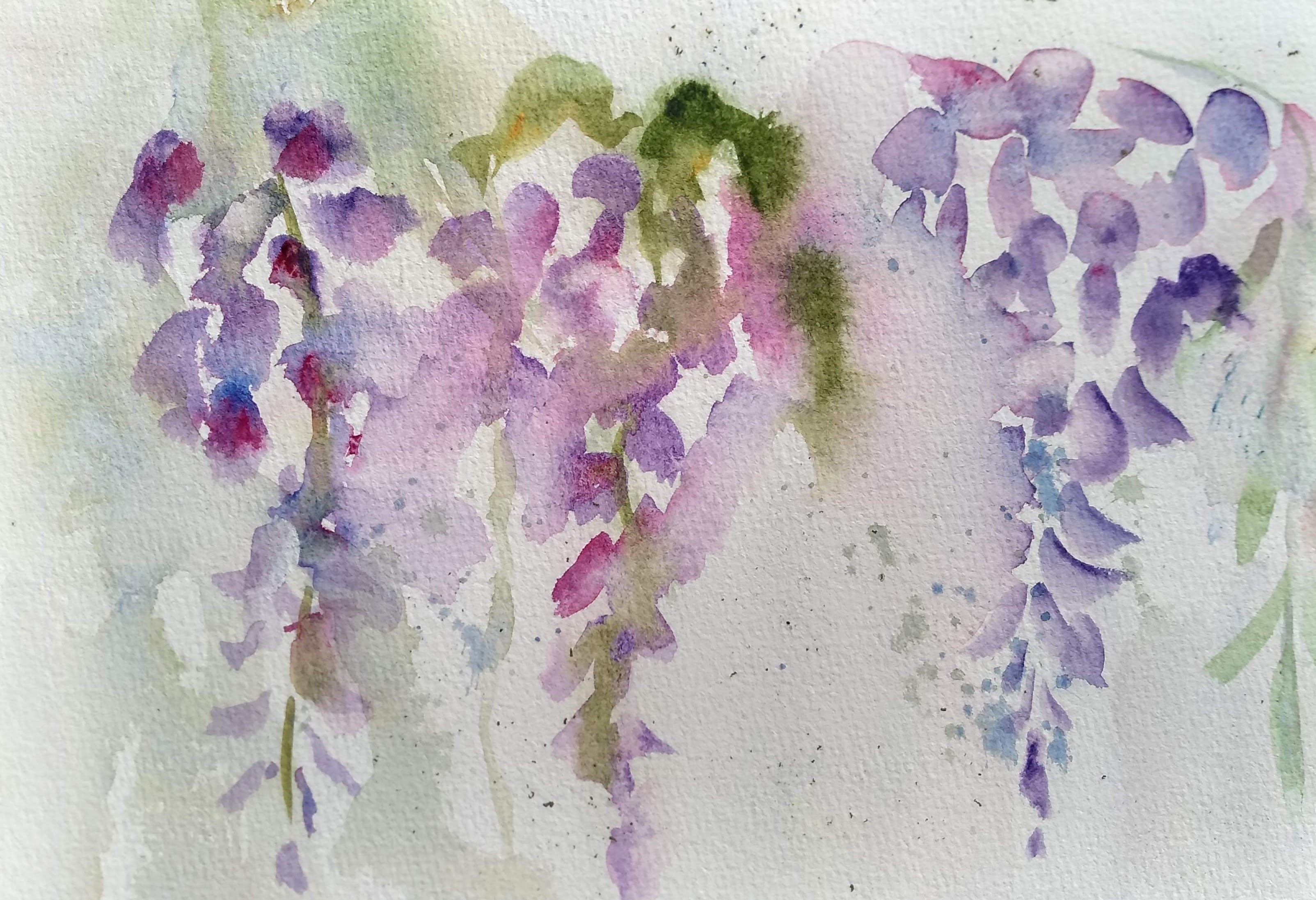
I am left-handed, so I started on the right side of the page. There are 3 different methods shown for painting a loose wisteria. 
On the far right, the first method is on dry paper. I made some marks to indicate petal shapes, trying to vary their shapes, always keeping in mind that I am aiming for a long triangular shape with larger petals on the top and thinner, airier ones toward the bottom. I looked for opportunities to "connect" these petals, either by overlapping them or letting one bleed into another. While wet, I tried to add blues or magenta to lesson the flat look. I also took clean water to create "lost edges," see the left side of the wisteria.

In the middle is the 2nd method. I dropped "reservoirs" of water here and there, and applied paint to the dry areas and let them touch the wet areas. Remember, you don't want a polka dot effect. You want to vary the size and shape of the spaces between petals and create connections. One this one I used my green (created from ultramarine blue and quin gold) and let it bleed into some of the violets.

On the right is the 3rd pethod. I lightly sprayed, created little droplets of water. (the paper is not solidly wet, just has some droplets on it) The class gave me the challenge of painting it right handed (I am a lefty) and holding it like a Chinese brush near the tip. I still made general shapes, added color wet into wet, and found opportunities to connect shapes while maintaining whites. 


When it was dry, we discussed 3 things you can do to make adjustments.

1. If you got too heavy-handed with color and want to get some whites back, try to lift some shapes gently. (I used a Monarch brush--firm but not harsh and stiff). You can also soften some of your edges this way.

2. You can use negative painting to carve out some shapes.

3. You can use guouache (white) to get some whites back where lifting doesn't work.

You can also spatter. On this one, I used watercolor pencil shavings, misted them with a spray bottle, and let them dry. 


Thursday, September 16, 2021

FINISHING THE BIRTH FLOWERS

 LETTERING

There are several ways to add lettering to the project. Of course, you can carefully letter each word by hand. Some people chose to write names as the bottom part of the stems vertically; some chose to write horizontally across the bottom. Some chose to add a family name, some did not. It is all personal preference.

Method 1: masking off lettering and using Brush-O. (or other spattering method)

Brush-O is a fairly modern product that can be purchased on Amazon.com. About $28 for a 6-color set.

It is a fine crystal that ignites into brilliant colors when sprayed with water. There are several youtubes on painting with the product, and I have a blog explaining it in more detail. (A fun suggestion for someone who doesn't know what to get you for Christmas) You tap on a small amount of crystal color, then spray. Or wet the paper first and then tap on crystals. You will see that effect on the bottoms of some of the following paintings.

For lettering, first mask off the letters either with miskit or stickers you can buy at Dollar Tree. I used stencils to draw the 2nd line and miskit over that. COVER ANY THING YOU DON"T WANT to add Brusho to. Then apply a bit of brush-o and mist lightly with a spray bottle until you get the effect you want. 

Below you'll see where I have lined up stickers on the first row, miskit letters on the second row, and used miskit on a dip pen to free-hand letters.

T

Below you can see where I have used brush-o over the tops of these letters. When they dried, I removed the stickers and miskit.
At the bottom of the page, I'd demonstrated two other options: spattering with a toothbrush and regular spattering; and shaving a watercolor pencil and spraying to create spattering effects. 


Method #2 for lettering: Just use your computer to choose a font for your letters. Type out the words you want, make them the size you wish, print out, and then trace them onto your project. This came from Kerry, who is great at finding solutions to problems.

STUDENT SHOWCASE

Cathy's 1st piece after Brush-O (hasn't inked letters yet)


Cathy's first piece without Brush-o


Cathy's 2nd piece


Mine, not finished, using stickers to make letters


Dorothy's: liked the simplicity without Brush-O.


Dolores: Used watercolor pencil shavings at bottom.


Dolores: gave it a background color instead 


Kerry's 1st: Notice the lettering: words were typed on the computer first, enlarged to desired size, and then traced onto the project.


Kerry's 2nd project


Barb (below) chose a vertical format, and no brush-o or other embellishments.
The adorable bees were originally a yellow drip that wouldn't lift off, so they
became bees, adding a whimsical touch.


Brush-O youtubes:


Once you get on youtube, you'll find lots of projects and ideas!


Thursday, September 9, 2021

TRYING OUT HOT PRESS PAPER WITH PEN & INK


A FAMILY OF BIRTHDAY FLOWERS


This lesson covers these basics of watercolor:

1. Painting on HOT PRESS paper
2. Using dryer techniques
3. Using pen and ink
4.Using your knowledge of color to create different greens
5. Using Brush-O/spattering/or shavings from WC pencils

One of my students wanted to paint her family's birthday flowers. She got the idea from pinterest, and I really liked the way it turned out. But I didn't want to copy someone else's drawings, so I drew my own birthday flowers and arranged them in different ways for each family.

Here are the birthday flowers. (I have no idea who came up with this)

January: carnation or snowdrop
February: Iris or violet
March: Jonquil or daffodil
April: Sweet pea or daisy
May: Hawthorne or Lily of the Valley
June: Rose or Honeysuckle
July: Water Lily or Larkspur
August: Gladiolus or Poppy
September: Aster or Morning Glory
October: Cosmos or marigold
November: Chrysanthemum or Peony
December: Holly or Narcissus

My first step was to draw each flower about 5 1/2-6 inches long and 2 1/2 inches or less wide.
I cut each into a seven by 2 1/2 inch rectangle so that I could place them on my paper where I wanted them. I taped the drawings to the paper and used a lightbox to trace onto my watercolor paper.

Below you'll see one of my daughter's family: An August husband (poppy); Katy (June, rose)
and their twins, also June. I did two things to differ the roses. The first was to change color. The second was to flip the drawing on one of them.

I left room at the bottom to later write in each name. 


ABOUT HOT PRESS

Some people love it, some hate it. It is what botanical painters use because of the tiny detail you can get with the smooth paper. I wouldn't use it for years because it just felt so foreign. Like anything else, it has its advantages and its drawbacks.
To the good, It has a different feel when painting. Like the brush wants to glide across the paper. It's quite smooth and easy on the ink pen nibs. The paint doesn't seem to sink into the fibers as much, so the paint doesn't lose as much of its vibrancy as it dries. You can do all of the techniques that you can with cold press.

One of the disadvantages, as you will discover, is that it is difficult to lift the first layer from the paper. If you rely a lot on lifting, this is a pain. It can be fixed a bit if you cover the paper with a lifting preparation before you paint on it. Another disadvantage is that it dries differently, sometimes a little too fast for me. This can make for a lot of unwanted blossoms. 

*****

To teach this, I made a bookmark out of each flower, cut 7" by 2 3/8 inches. This will fit perfectly into a 7 x 2 1/2 inch bookmark sleeve.

By cutting them apart, I was able to demonstrate how to paint each type of flower. 
Below is the beginning of a daffodil. The difficulty of painting a yellow flower is that it seems to limit your value changes, since yellow doesn't have very deep values. I used 3 yellows on this: hansa (like cadmium yellow light), new gamboge (oranger yellow) and quin gold. You can create this darker yellow by adding bits of burnt sienna to your warm yellow. 

White flowers can be hard, but even white flowers have shades and shadows. Here I painted it very lightly with violet and some light greens. Because this is going to be inked, I'm not too worried. But if this were a true botanical, I would have to paint in some background to make the whites show up more.

  
Violets and sweet peas are painted very similarly. On the violets I used a pale base of purple, then dropped in French ultramarine blue while it was still wet. I wanted the colors to mingle but not completely mix. 
When dry, I painted in the bright yellow dots in the centers. The sweet peas are also done a bit wetter, using cobalt blue as the base, then dropping in a different blue or pink or purple. Leave whites.
The rest of the work will be done with the pen. 

   
Poppies, irises, and carnations can be done in a similar way. Wet the flower, drop in colors (for a poppy, a warm yellow, some orange and some red), and while wet, cover it was a small bit of wrinkled plastic wrap. Put a weight over it and allow the flower to dry. You can see the wrinkled effect it produces on this poppy. 


Daisies and other white flowers still need to have color in them. I usually look for the shadows beneath the petals and paint them a greyed down purple or blue. The center is new gamboge (warm yellow) with a burnt sienna popped in along the base of the center to make it pop out a bit.
Poppy leaves are a gray-green, created by adding a bit of purple to the green.


I purposely drew broad leaves behind the lily of the valley to make the whites show up. Even the white bells have some pale blue and green shadows in them. These are spring greens with a lot of yellow in them. 


For the holly leaves, paint an initial wash of medium green and let it dry. Use a darker, bluer green for the next step. Paint half of the leaf up to the middle line with the darker coat. On the other half of the leaf, leave a very fine dry line down the middle as  you paint the rest. When it is dry, lift a little bit where you want to see the leaf curl. 
For the berries, paint an undercoat of orange or warm red, leaving tiny dot of white on each for highlight. When dry, use a darker red, like alizarin on the outsides, shading it like a tiny ball. Where the berries touch and there might be shadow between them, make the red even darker.


I really like painting a half-closed rose bud. I paint the whole flower with a base color, in this case new gamboge. Before it dries, take a small brush and dot in bits of red along the edges and let it blend in with the yellow. The leaves on roses are like the holly leaves only not as dark, and some of the serrated tips have a bit of red in them. As does the stem. 


When I was done painting, I used ink where I wanted to. I used two different sizes of microns, but you can use dip pen or extra fine sharpie. I just like varying the width of the lines. 

Next week we'll cover finishing this project, using some brush-o, and designing some lettering.

Thursday, September 2, 2021

SUNRISE/SUNSET


Painting sunsets can be a lot of fun. There are three main things to keep in mind:

1. Have a "buffer" or barrier between colors that could mix and make a muddy color.
2. Allow your colors to blend gradually, so that you don't end up with "stripes" of color, instead of a gradual mix from one to another. 
3, Know which colors are going to make the blends you want.

If you have a particular picture in mind, decide which colors are the most important. For example, if you have a lot of gorgeous purples, make certain the blue and the pink/red used make a good purple. Remember the split primary palette? Cool blues (like cobalt and French ultramarine) with cooler (pinker) reds make beautiful purples. If you use a warmer (oranger) red or a greener blue, you will NOT get a good purple.  So do some color swatches to make sure you will like the colors on the final piece.

On the left side I used cobalt blue, then magenta, then new gamboge, back to magenta.
In the right is cerulean (a greener blue), primary red, new gamboge, then primary red again.
Just trying out colors.
Note ON MAGENTA: My magenta is a very pink color, like the primary magenta used in a printer; but I noticed that some brands Magenta is almost purple. If your magenta looks purple, use something that looks pinker to you...quin rose, rose madder, permanent rose, something like that. Just so long as it doesn't lean to orange.


Most of the time, sunsets are done largely wet into wet. So for this first practice, wet a piece of paper, shiny but not puddley.
*Remember, your colors will fade as they dry. If you want vibrant color, the paint will be a thicker mixture when you apply it. (Not out of the tube thick, just not watered down as much). Your paper water + your paint has water = watered down paint.

I like to use a 3/4" flat brush for sunsets. After wetting the paper, I put a strip of yellow where my sun will be. Leaving a thin strip of white at the bottom and top, I paint in a magenta color above and below the yellow. I rinse my flat brush, squeeze water out, and use the flat brush  to blend the yellow and magenta into an orange. (I still have yellow, then the orange blend, then magenta) 

The paper is still damp, so I start from the top and add my blue, (cobalt or ultramarine) letting it blend into the magenta to make purples. 


5 WAYS TO CREATE CLOUDS

1. While paint is wet, use a paper tissue to blot out some whites..
2. While paint is wet, use a "thirsty" brush to pull out some cloud shapes.
3. Using a small brush, dot some dark color (I used purple mixed from magenta and blue)
to create some distant clouds. For larger ones, paint it on in small spirals. The sky should be damp, but not shiny.
4. After the paint has lost its shine, but is still not dry, drop clean water onto areas to create blossoms.
5. After the paint is dry, scrub out some whites. You can also gently wipe over some unwanted large blossom shapes. You can gently "scrub" out a sun. 

USING GUM ARABIC

Gum arabic is a crystal substance that is ground and added to water to create the binder for your watercolor paints. (except for the QoR brand, which uses a recently developed chemical binder). The binder is added to pigment to create all the beautiful colors for watercolor. It holds the paint together, helps it diffuse in a water solution, and glues it to your paper. So it is perfectly safe to use with your watercolor brushes.


Take a small amount of gum arabic and paint it over your horizon in a circle for the sun. If you want to use it to make some clouds or waves in the water, you can do that also. DRY it completely. (you can use a hair dryer.)
You are essentially using the gum arabic as a resist. I use this on moons and suns that I want to have a soft glow around the edges instead of a hard edge that miskits leave. 

Because gum arabic is completely water soluble, I can't use heavy amounts of water over it. So I paint the sunset a little dryer. Instead of wetting the entire paper, I just wet the top where I'll be putting my blues and purples. I'll start with blue, work in some magenta to create purples, then close to where my sun is, I'll paint over with yellow and create some oranges, leaving some yellows. I try not to swipe over the gum arabic more than once or twice. Then I can continue to the bottom, changing over to magenta again. 

When the paper is completely dry, I can use water and a soft brush to gently swipe over the gum arabic and blot it with a paper towel. In the picture below you can see what a soft white area it leaves. You can use this on moons also.


In the previous pictures you are using the MAGENTA or Permanent Rose or other pinkish color as a BUFFER or barrier between the blue, purple and yellow. If blue touches the yellow, it will go green. If purple touches the yellow, it can make gray or brown. So you need a buffer color in between, and in the first two pictures, that was red or magenta.

In the next exercise, you'll use WHITE as a buffer between colors.

This is done in two stages: wet on wet; then dry completely; then wet on dry.

Again, wet the entire paper, shiny but not puddley.
For this one I am using new gamboge (a warm yellow), transparent pyrrol orange, and permanent red. (any warm red will do) I am also using blue to show how not to mix orange and blue.

Work diagonally this time for a more dynamic sky. With the blue, paint across the top left corner in an angle. Leave some white, then paint a thin strip of blue at the same diagonal. Then do another strip of blue and leave white. If the blue starts to move too much into the white cloud, use your thirsty brush to wipe it off. 
Then add some red to the bottom below the last cloud, then orange, then yellow, then orange again. 
When you are happy with it, dry it completely. 

When the picture is dry, gently wet the clouds, working one at a time. Into the cloud you can introduce some orange, just very pale in some, darker in the ones closer to the horizon. Keep the edges as soft as possible. 

When it is completely dry, you can go back and add in dark clouds, like the second picture below.
In the first one, I made a row of fence posts in perspective. Note the shadow is quite long, indicating a late time of day.


I'll do more to this one later. I just decided to make a horizon of dark trees. 


Now turn your sunset into a landscape. Add palm trees, waves in the water, fishing boat, mountains, whatever your heart desires. It will mostly be in sillhouette, so you just paint right over everything you've painted so far. Good way to cover up a part you don't really like. 

I turned my purple and yellow sunset into palm trees, using purple and turquoise against the sunset.


One last bit about using a flat brush. They are wonderful for spreading water across the page quickly. And they work very well blending two colors together in horizontal strokes, both wet in wet and wet in dry.
If you see that you are getting "stripes" instead of blends, use your flat brush to blend the color together in long horizontal strokes. If the paint is very wet, use a thirsty brush. If the paint is dryer, dampen the brush a little to encourage blending.