EXPERIMENTING WITH GRAYS:
This is a really bad photo.
I found an article in Watercolor Artist magazine, April 2011, by Lauren McCracken about using grays. I don't find myself using many grays, but there are times when you want a lot of gray tones, and a variety of them: painting silver, large billowing storm clouds, chrome, ocean foam, glass and crystal, white flowers, ocean waves. Lauren gave some great suggestions on developing grays that you like.
So make a chart of grays you can make yourself. Divide a piece of watercolor paper into squares and separate them either with tape, miskit, or some other way. Mark the top of every other column with cool colors you want to try. I used cerulean, cobalt, veridian, and French ultramarine.
One the side mark it with reds/oranges that would be close complements of those colors. I used (from the top) Quin burnt Orange, Quin burnt scarlet, Burnt umber, Alizarin Crimson, and Burnt sienna. Use what you have! Try Prussian blue, Winsor Blue, or Indigo or indanthrone if you have them. Use coral or other reddish colors with greens. You can try purples with yellows too. Find the colors you like as grays. (Some will NOT be attractive grays).
In the left square put a dark mixture of the gray; in the one to the right put a very light,watered down version of that color. My chart is obviously not completed. It will probably extend to another piece of paper, because I have several combinations I'm eager to try.
Notice which grays are granular. You might not want that on a silky smooth flower, but you might love it on rocks or wood.
Lauren McCracken goes a step further and creates a separate palette of six favorite grays by mixing quantities of favorite combinations. (for example four parts of cerulean with one part Winsor Newton light red, with just enough water to allow it to mix thoroughly). That way she can start with the exact shade, then cool it with a blue or warm it with a red.
Thursday, May 31, 2018
FINISHING THE YUPO PROJECT
The next step for finishing this yupo painting is to do a value study of your intended sketch. You want to bring it down to three values, lights and whites, medium tones, and darks. You can do a lot of this on your computer, but some you will have to adjust by hand to get the values where you want them to be. Here is the fig tree photo after adjusting the contrast in Elements. I like to have it in or near black and white. Then you can just conentrate on the values instead of trying to copy color.
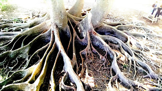
Sketch your picture onto the dried fluid acrylic pour. You may need colored saral (graphite paper) or colored watercolor pencil in order for it to show up. On the tree roots I used white; on the Buddha I used blue.
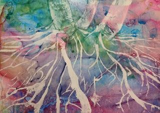
Now get ready to remove your whites and light values with alcohol. You can use several tools for removing the fluid acrylic: cotton swabs, stiff brushes, bamboo stick for thin lines, toothpick, etc. Here is the fig tree picture with whites and lights removed.
Begin to fill in the darkest darks with watercolor. The paper will be slick and resist, so you have to use more saturated paints. If you can't get the effect you want, you can use fluid acrylic or watercolor pencils. You just won't be able to remove the acrylic as easily if you don't like it. Here you can see that I've begun to darken the roots on the left.
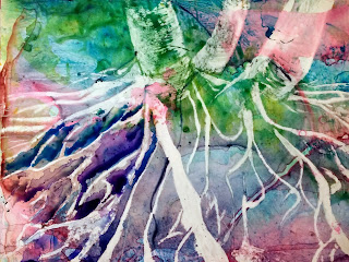
When you have all the darks in, you can go back over some of the mid tones, change colors, or soften some edges or add textures.
SOME STUDENT BEFORE AND AFTER PICS:
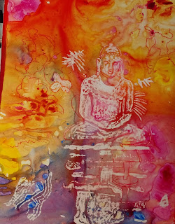
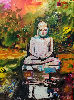
Buddha, before and after (I took this photo at Marie Selby orchid gardens in Sarasota)
Some pics with just whites removed:
B
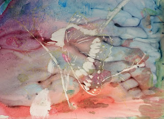
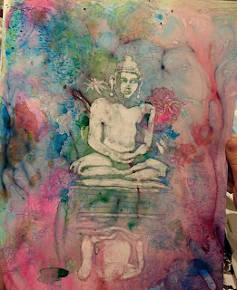
(Butterfly pic taken by Glenn at Oxbow)
Whites removed and beginning to paint in darks:
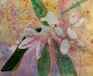 (plumeria photo taken in St. Augustine)
Finished paintings:
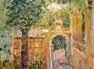
(pic taken by student )
Student used watercolor pencil to sharpen some areas.
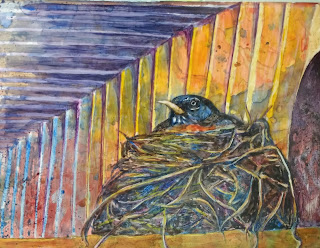
(Photo ref. taken by student)

Sketch your picture onto the dried fluid acrylic pour. You may need colored saral (graphite paper) or colored watercolor pencil in order for it to show up. On the tree roots I used white; on the Buddha I used blue.
Now get ready to remove your whites and light values with alcohol. You can use several tools for removing the fluid acrylic: cotton swabs, stiff brushes, bamboo stick for thin lines, toothpick, etc. Here is the fig tree picture with whites and lights removed.

Begin to fill in the darkest darks with watercolor. The paper will be slick and resist, so you have to use more saturated paints. If you can't get the effect you want, you can use fluid acrylic or watercolor pencils. You just won't be able to remove the acrylic as easily if you don't like it. Here you can see that I've begun to darken the roots on the left.

When you have all the darks in, you can go back over some of the mid tones, change colors, or soften some edges or add textures.
SOME STUDENT BEFORE AND AFTER PICS:


Buddha, before and after (I took this photo at Marie Selby orchid gardens in Sarasota)
Some pics with just whites removed:
B


(Butterfly pic taken by Glenn at Oxbow)
Whites removed and beginning to paint in darks:
 (plumeria photo taken in St. Augustine)
Finished paintings:

(pic taken by student )
Student used watercolor pencil to sharpen some areas.

(Photo ref. taken by student)
Tuesday, May 22, 2018
Yupo Part I
WORKING WITH YUPO
Yupo is a compelling and unique alternative to traditional
art papers. It's a syntheticpaper, machine-made in
the USA of 100% polypropylene. It is waterproof, stain-resistant, and extremely
strong and durable.
There are a number of plusses in working with yupo. The paint stays on the surface of the plastic, so it doesn't lose it's richness because it is not soaking into the fibers. If you don't like what you painted, you can remove it with water or alcohol. (Even though some colors will leave a "ghost" because they are more staining.) You can easily make changes to part or all of your painting.
The downside is that it picks up oils and dust from your fingers and the air. So before you paint with watercolor, you need to clean it with soap and water or alcohol to remove oils spots.
Here is what you will need for painting with FLUID ACRYLIC and watercolor:
fluid acrylics
brushes (don't use your watercolor brushes)
alcohol
spray bottle
cottons swabs
stiff small brushes to remove paint
sharp wooden tool (bamboo stick, toothpick, etc.) to remove small edges.
Pictured here are the yupo paper, two bottles of fluid acrylic, and a doggie training pad, used to absorb the paint and protect your table.
In this picture, I lightly sprayed the yupo paper before putting on any paint, only because I was working in the heat with a fan over me. I used manganese blue, magenta, quin burnt orange, and yellow in the mix. You are striving for an overall medium tone. You want texture and smooth blends of color, without too many hard edges.
Let it dry completely overnight before going to the next step.
In class I handed out a very small piece of yupo that had already been painted with fluid acrylic. We used a turtle pattern to practice the next steps. We
STEP ONE: Remove everything that will be white or a light value with alcohol on a stiff brush, cotton swab, or other tool.
STEP TWO: Paint in the darkest darks with watercolors. You can also use watercolor pencils or fluid acrylic if the area stubbornly resists the watercolor paint.
STEP THREE: Refine colors and shapes to make the design you are after.
More on this next time.
Subscribe to:
Posts (Atom)


