Friday, March 23, 2018

LOOSE WATERCOLOR TREES

This watercolor was done as a paint party for our art guild. It was my first experience with liquid watercolor, made by Blicks, which comes in bottles. We only used blue, red, and yellow. It is painted on Winsor Newton 300 pound watercolor paper, which was pretty nice. The size is 11 by 15, a quarter sheet of paper. 

Step one: With masking tape, tape off a broken line for a tree trunk. Make sure the tapes gets smaller at the top.


Step 2: Wet the entire painting with a large brush, until the painting looks shiny, but not puddled. Using free strokes, brush on some yellow here and there, then some red, and finally some blue. Allow the colors to run together. Try not to let the three colors touch --they will turn brown. 

Step 3: While the paint is shiny, you can use some salt to create texture. SOME salt: don't go hog wild and pig crazy. 

Step 4: While it is a little shiny, you can scratch some twigs in with a credit card or palette knife. These will have dark shapes to them.

Step 5: After the paint has lost it's shine, you can scrape out some distant trees with a palette knife or rounded edge of the credit card. 

Also: at this point drop little droplets of water into the drying paint. This will create some interesting back-runs. (see the large yellow shapes one the left)


Step 6: Dry the painting completely and remove the masking tape on your main tree. 


Step 7: To do the main tree you will need your credit card or knife. With a small brush, about 2 inches at a time, paint a line along the left side of the tree trunk. Drag the wider side of the credit card from the paint into the other side of the trunk, left to right, to create the bark lines and shadow at the same time. 


Step 8: If you want to make your other trees a little more pronounced, use white acrylic or guouche paint to lighten the trunks and some of the branches. You can also use paint to darken some of the branches. Don't over do this part. 


You can also spatter some over the finished tree. 

PAINTING ROCKS IN WATERCOLOR


ROCK BLOG

In this I’ll be using the following photo for my reference. It isn’t the most artistic photo, but it has some qualities I like: strong shadows, a diagonal thrust, a variety of shapes, and uncomplicated. 


 REFERENCE PHOTO (Taken by me at Ludlow Hill Park, Lawreneburg, IN) (I try to include where I got the photo so no one can be accused of copyright infringement if it turns out to be a winner..I wish)

First I sketched (or traced, no crime if you need to trace) outlines of the rocks. Try to compose your picture as you sketch. Decide if you want to leave out some rocks (as I did) or add some other elements.(I eliminated two rocks on the right upper side because the shape was boring)
Apologize in advance for the lightness of the drawing.

PICTURE OF SKETCH

Next, make a small value study. There are several ways to do this. One is to trace your photo (small or large, but small is quicker) on tracing paper, and using a dark pencil or black ink pen, color in the darkest darks in your picture. The second way is to make a copy of the pattern (outlines), and shade in on the copy. NOT ON YOUR WATERCOLOR PAPER.


PICTURE OF DARK VALUES

This step should only take a few minutes. This value study helps you see if you have a good pattern of light and dark right at the beginning, before you lay paint to paper. If you don’t like the pattern, make the changes on your value study.  If you take a picture with your cell phone and look at it small, you should see a pattern that you are happy with. If no, change it.

So, what are you looking for? One, do you like the pattern? Two, are all the darks the same size or shape? (you do not want that) Three, When you squint, can you see anything awkward? Does the pattern of light and dark move you through the picture? Some people judge by this: If all you saw across the room was this pattern, would you walk across the room to get a closer look?

Then shade in your mid values with a pencil until you like what you see. These steps don’t take a lot of time, but can save you a lot of trouble when you start to paint. We are going to use this value study as a MAP to our painting. 

This mapping can be done with ANY kind of painting that you do, which is one reason why I am using it with this painting. 

Now, using your value study as a map, PAINT in the darkest darks. They will begin to look very rocklike.


PAINTED IN DARKEST VALUES

Choose from a few of the following methods to create some texture on your rocks:
spattering; dropping water into wet paint to create backruns; scratching into the paint with fingernails or palette knife; using granulating paints, such as lunar earth; saran wrap; wax paper; salting.

I chose to use saran wrap first. I wet the rock area, then applied washes of permanent rose, quin coral, cobalt, and raw sienna. While it was wet (shiny, but not puddley) I lay crinkled saran wrap over the washes and allowed it to dry. (The dryer it is, the more definite edges you get. You can take the wrap off before it is completely dry, but the colors will not remain as hard edged.)

Expect some of your darks to be softened and bleed into the rocks. I like the look of this so far.


C
SARAN WRAP APPLIED TO WET WASH

To finish: I went back to my "map" to re-darken some of the darkest areas. This time, I put the paint in the darkest area, then softened it up into the rock behind it, creating a medium tone on the rocks. Thisdoes two things at once: refines the hard edges that make it read as rock, and creating the mid tone on the part that is softened. 


FINISHED ROCK PAINTING

Two last details: the highlights and the background. 
For highlights I taped around the edges of the rock area I wanted to lighten to create a harder edge as I lifted paint with a magic eraser. (Mr. Clean or generic will do). 
For background, I turned my paper upside down and wet the area behind the rocks. Holding my paper upside down over a sink, keeping a spray bottle handy, I put in dark green and cobalt blue around the edges using a 3/4 inch flat brush. The spray bottle came in handy if I didn't like the direction the paint was going. I wiped off the excess and let it drain off. (You can use a paper towel to soak up extra paint off the edges so it doesn't back run) I let it dry upside down on a slant. 


Saturday, March 17, 2018

The Climbing Tree

Here is a simple painting of the catalpa tree in our back yard that has been my kids' and grandkids' climbing tree for 35 years. It is really huge--I can't get my arms around the trunk at all, and that first limb is 5 feet off the ground.

I include this because we never got to talk about painting the sky in your tree. I didn't miskit out anything, but wet the sky area only first and painted it in. I like the dark shadows that show the twisting and turning of the branches. Shadows tell you whether that branch is coming toward you or away from you. I used the palette knife techique on some of the smaller branches. 

TREES, TREES, TREES

NOT MUCH can ruin an otherwise beautiful painting more than a hokey looking tree. People (and I include myself in that category) sometimes have problems creating believable trees. Sometimes trees look like they are floating rather than anchored on the ground. Sometimes they look like they are growing out of someone's head or the roof of a building. Some look really cartoonish or the limbs look too thick at the top. Some foliage appears too solid and blocky, with no room "for the birds to fly through." How do you make distant trees? How can you make bark on a close-up?

I sent everyone some pictures of five views of the same tree. The first is front lit, and you can see how flattened the tree appears. The view gradually becomes more side lit, and the trunk appears more rounded because of the shadows on the trunk and branches. Finally you see a completely back-lit view, again completely flattening the tree. I prefer to paint some with strong shadows, but when doing a sunset, remember those trees are flattened.

Front-lit


Completely back-lit


The first thing we did was decide on a green that would work for the styles I wanted to demonstrate. Below is a picture of a "sample" page I made with different yellows and blues blended together. Phalo or cerulean and hansa yellow produced the most bright greens; cobalt and french ultramarine with yellows produced more subtle natural  greens, and adding red or orange neutralized the color even further.


The first tree we tried was using a yellow and a blue with a hogs hair brush. You can read more about this technique in Gordon MacKenzie's Complete Watercolor Essential Notebook. This book was recommended by Steve Mitchell on his youtube channel, The Mind of Watercolor, and I've found it really useful. 

The hogs hair brush is a stiff bristle, often called "chinese" brush, and used for oil painting. If used for watercolor, it holds a good amount of paint. In this method, apply yellow, following the foliage pattern of the tree, and while wet, putting blue beneath the yellow and allowing the paint to move up into the yellow. This creates the shadows of the tree. Be sure to leave spaces of sky. Continue to add darks in the shadow areas. If it is a pine tree, take a DRY hogs hair and drag the tips of the bristles over the ends to create the effect of pine needles. 

Practice different types of trees, deciduous and evergreen. Use reference pictures (or observe trees) to see where the shadow areas of the leaves will go.

When dry, add the trunks of trees and a few carefully placed branches, being sure that the branches get smaller at the top. 

Deciduous, applied with hogs hair brush

Evergreen, using hogs hair bristles for pine needles


The next method we tried was using sponging for the foliage. This can be effective or it can look contrived. Gordon Mackenzie TEARS a cellulose sponge into small pieces. Then he soaks up paint with the sponge, squeezes it out, then soaks it up again. He applies the yellow for the sunlit top side, then the blue for the shadowed side. I liked the look, but it felt like it used a lot of paint into the sponge. 


Here is another sponging technique for a lot of trees in a scene. 
You might recognize the picture below. In this one, the entire tree line was sponged in yellows and oranges added while wet. Once it dried I sponged in some greens and blues for the darker trees, and added some negative painting for more tree trunks. 


Next we practiced using a PALETTE KNIFE or CREDIT CARD to paint limbs and small branches. 
There is a bit of a trick to this. The consistency of the paint should be like ink: thick enough to stick to the palette knife, but runny enough to flow off the knife smoothly. At first I thought it had to be a metal knife, but the plastic ones work also, especially those with a wide blade shaped like a trapezoid. Load the flat part of the palette knife with paint. Hold the blade almost vertically, and pull it across the paper quickly to create small branches. They will look very branch-like, with jagged edges. It takes a bit of practice, but it's not a big learning curve. 

Now try this with a credit card. I cut mine at a diagonal so that I have one sharp point, one rounded part, and all edges are a different length. Drag the card through the puddle of paint so that some sticks to one flat side. Use the point to make some branches. Drag it through the puddle again, and now try using one of the flat sides to make a trunk. You hold the side of the credit card onto the paper and pull horizontally to make a trunk that looks like a birch tree. 


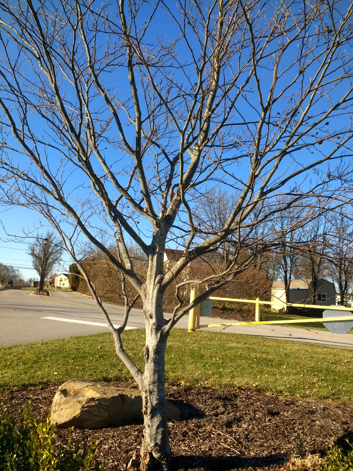
Finally we put it all together with this picture of a tree a took at a local park. It has a lot in it to practice: distant trees, aerial perspective, shadowing, texture on the bark, and anchoring the base of the tree to the ground.

For the background trees, wet the area from the horizon line to about an inch above where you want to put the top of the trees. Working wet into wet, add some pale neutral purple or blue at the top, then some neutral greens until the area is covered. While the paint is still shiny, you can use the point of the credit card to pull out some thing trees. (It creates a dent in the paper that paint gravitates too, making it darker than the area around it.) You can add green with a flat brush held vertically to suggest fir trees. When the paint loses its sheen, but is still damp, use the round part of the credit card or a tip of a palette knife to scrape out white trees and branches. And when it is dry, practice pulling out some branches with some negative painting. 


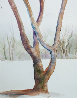
For the trunk you can mix any two complimentary colors to get a brown you like. On this tree I began with burnt sienna on one side and French ultramarine on the left side.(shadowed side), and let them blend together on the paper. I liked the strong shadow in this picture and tried to reinforce it. I wanted it to appear to have some moss on the trunk bottom, so I introduced some deep green (mixed from French and gamboge), and sponged it on the edges. 

There are three things that help anchor a tree to it's surroundings: keeping the value similar where the trunk and ground meet; shadows that connect the trunk to the ground; and soft edges. You can see that I softened the edge where the trunk and ground meet. The shadow on the left side of the tree melts into the shadow on the gorund. And the values are very similar. 

This was a practice picture, not meant to be a final product, but do show ways you can achieve a natural looking tree. 

WHEW! We covered a lot, and there is so much more we could have tried. Trees can add a lot to your picture. They don't have to be photorealistic to be believable. They do have to match the style of your painting, though, and I hope these tips are useful to you!

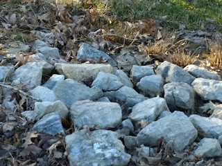
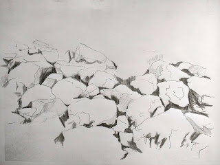
Next time: adding ROCKS to your painting.