Sunday, December 3, 2017

EASY CHRISTMAS TREES ON YUPO


CHRISTMAS TREES ON YUPO - EASY


You will need: yupo paper cut into 5 x 7 or so, 2 pieces; a brayer (roller); tube paints in colors you like; a pieces of plexiglas or wax paper; tar gel, if desired

On one sheet of yupo paper start dotting some small bits of paint
straight from the tube in the shape of a tree. (or any other shape you want).
Lay the other sheet of yupo directly over your painted shape. Cover with wax paper or plexiglas to protect your surface and brayer from paint.
With a brayer, roll firmly in a top to bottom motion. (This creates those
tree-like swirls) Gently pull apart your yupo pieces. You should now
have two prints.

If the paint is too thick, blot it with a paper towel. If it is too dry, mist it lightly.
If you don't like your results, wash it off and start over again.

To finish the tree:
When it is completely dry, use a small damp brush to shape it. From outside of the tree,
gently brush inward to create the branches, then blot with paper towel or tissue. To remove larger
areas of paint, use a larger brush. IF THE BRUSH IS TOO WET IT WILL MOVE THE PAINT TOO MUCH. You just want it damp.

You can remove small round areas in the tree with a damp round brush and blot to make
colored ornaments or lights.

If you want extra pizzazz, drizzle some clear tar gel over the picture in swirlls and let that dry overnight. Finish off your tree by spraying with acrylic sealer. If you do not, any amount of
water on the finished project will ruin it. 


FINISHING THE PUPPY

TO PAINT THE EYES:


Make sure you have drawn the eyes the same size and the iris is very round. Paint the entire iris with quin gold and dry. Dampen the eye area, and, starting at the top of the eye, paint with burnt orange and gradually add some french ultramarine blue to make it more brown. (Painting from the top down allows some of the quin gold to show at the bottom and makes the eye rounder as it moves from dark to light) When the eye is dry, darken the pupil. Pick out a small hilight with the point of a razor.

THE NOSE:

The nose is sort of a plum color made from cobalt violet and some quin burnt orange (or burnt sienna). The nostrils are darker at the tops, and there is a little highlight on the tip. It is darker on the right side and on the bottom.

BACKGROUND:


I wanted the fur to have a golden-red hue, and the background to bring it out. But a pretty blue, the complement of orange, would be competing. So I used cerulean mixed with German Greenish Raw Umber (raw umber with dull green) to make a more subdued and granulated background. I have some work to do yet, but I'm happy with the overall effect.

FINISHING:


I needed to continue to paint in some of the curls in the fur. When I got it the way I wanted, I began lifting hilights. Starting with the ears I lifted some of the areas to soften. Soften the areas that may have hard edges from the miskit.

Use a razor blade to get back some of the fine hairs that may have been lost in the fur. Also pick out hilight in the eyes if that has been lost and the whiskers if you want them to show.


Thursday, October 26, 2017

HOW TO MOUNT A WATERCOLOR PAINTING ON CRADLE BOARD

If you're wondering if you can mount your watercolors without frame and glass, the answer is YES!
Here are two web sites that you can use. There are only two mediums you will need, acrylic gel and clear, archival varnish.

I only have a few comments that may not be clear in the web sites. #1: These are mounted on boards that have been gessoed ahead of time. There needs to be a barrier between the painting, which is acid free, and the wood board. If the board is not pre-treated (with gesso or other primer) it can damage your painting.

#2: When I use a brayer, I put wax paper between my painting and my brayer so I don't accidetally get gel on the painting.

#3 I use WEIGHTS to hold down the paper while it is drying. I turn mine upside down on a clean board (covered with wax or butcher paper) and add weight to the back of the cradle board to insure a flat, air free seal.

I did this stargazer lily about a year ago, and I'm still happy with the results. It is on a 12 x 12inch,
1 1/2 inch cradle board. I had to seal the wood myself with a sealant first. I used GAC-100 from Golden to seal the wood first. I glued the painting to the wood with gel.  I used Krylon Kamar Varnish (acid free, non yellowing) in two coats as a final finish.


As this first web site points out, you can mount blank paper on a board and paint it afterward. It can also be mounted on canvas, but I like the board best.

https://paintingdemos.com/mounting-a-watercolor-painting-on-a-cradled-panel-board-a-step-by-step-tutorial/
Step by step instructions


https://www.youtube.com/watch?v=rMAJnDhTpDc
Annie Strack's video

There are a number of web sites that demonstrate this process.

There's a lot to like about this process. It is light weight. There is no glass. And you don't have to pay for glass and frame. I paid about $12 for the cradle board on sale.

PETS & FUR PART I


We just started 2 weeks of learning a bit about painting furry friends. This is Jasper, a dog portrait I am doing studies for. After transferring the sketch onto Arches 140 lb paper, I decided to try an experiment. Before painting, I covered the entire background with gum arabic straight from the bottle, to see if it would enhance the softness of the fur around the edges while masking out the background. I also put a bit on the hilight of the nose, hoping to get a nice hilight without having to soften edges when I'm finished.


The gum arabic dries quickly with a sheen, so it's not hard to see where I put it on. I also put miskit on some fine hairs on the ears, whiskers, and fur.


I am using only four colors for this painting: Quin gold, quin burnt orange, a dab of coral, and French ultramarine. The first painting step was to wet the entire dog and put in a basecoat of quin gold. While that was still wet, I added quin burnt orange in areas that will be darker: under the chin, shadows of the face and eyese, under the ears. I let that dry. Then I put in a second coat, starting with quin burnt orange with a little coral. I added a bit of French ultramarine mixed with quin burnt orange to the darker areas, deepening the shadows. 

OK, he looks like a zombie puppy right now, but I am pretty satisfied with the results so far.

If you are doing a dark animal, begin with a wash of blues with some pinks added. With subsequent coats, it will become very dark without becoming dull. 

Next week we will put in the eyes and tighten up some of the shapes in the fur and face.

Thursday, October 19, 2017

Student Show Off Time

Today in class we had a free-paint. Everyone could bring anything they wanted to work on.
Here are a few results. Wish I took a few more pictures. So pleased with their work!


Sunday, October 15, 2017

RUSHING WATER PART 2

A STREAM WITH RUSHING WATER - BACKGROUND AND FINISHING WATER

Before proceeding with the background, I strengthened my rock  shapes until they were the way I waned them.

The last thing I did from the previous post was to put in a warm wash for a background, indicating vertical trees. The next step is to find the shapes I wanted for the background. Laying a sheet of CANSON tracing paper over the painting, I shaded in the places where I wanted my tree shapes to be. This way I was not damaging my paper with excess pencil marks while I played around with shapes. You can use charcoal or crayon or marker on the tracing paper to more quickly make the shapes.

Another way to do this is to tear strips of colored paper into general shapes and arrange them over your paper. You can move these around until you know how you want your background to look.

I used a sponging technique on the trees. When doing trees, TRY TO LEAVE PLACES THAT BIRDS CAN FLY THROUGH.  I dampened a small natural sponge, blotting out a lot of the moisture with a paper towel. Since my background had a lot of yellow, I didn't need to sponge yellow in. So I sponged a pale yellow green over anything that would have any shade of green in it. Dry that layer. Add some blue or darker green to the light green mix until you have a medium green, and sponge it over all greens that are a medium shade or darker. Dry that.


Now you THINK I'm going to tell you to go to the darkest green...but NOT YET. I am setting this up by values, and my oranges and reds are a lighter value than the dark greens. So I sponge in anything that will be orange or red. Dry. Sponge in a few reds...don't overdo those. NOW go back with a dark green and sponge in those darkest greens. 


You can see I saved a little space for my fisherman in the distance. 
I covered up my water and spattered a little over the trees. (some blues and reds). 


Now it's time to put your negative painting to work. Negative paint around the tree branches and trunks. Put some high in the distant trees and lower in the close trees. Keep it lighter in the distance. Paint in some grasses, some fir branches, or some shadows in places that need attention. Paint the waders and hat on the fisherman.


I am generally happy with the results. I have the blurred area on the right to resolve, and I want to put a few more waves in the river, but overall, I like the way it is turning out. It's quite bright, but that's how I think about fall.


Sunday, October 8, 2017

APPLYING MASKING FLUID

More about masking fluid.

On most masking fluids, you want to pour a small amount into the lid (for Pebeo) or a small container. You don't want to dip your brush directly into the bottle, because you need to put the lid back on right away to prevent it from drying out.

There are several good ways to apply masking fluid to retain the white of the paper.

1. Use an old brush. Put soap on the hairs of the brush to keep the miskit from clumping up on it. From time to time, rewet the brush with soapy water.

THROW AWAY RINSE WATER WHEN YOU ARE DONE. You don't want to paint with rinse water that has soap residue and latex from the miskit.

You will never use these brushes for anything else but masking. Use several size brushes depending on the job.

2. Use "color shapers" that are used by pastelists and sometimes for clay. These have silicon ends, and you don't need to soap them. Just pull the dried masking fluid right off the silicon. These are good for large areas.

3. Use a drafting pen, especially for fine lines.

4. Use a metal pallette knife. Artist Joy Moon recommends using these for masking.

5. SPATTER miskit on using a toothbrush. This creates a pretty fine spatter.


You can always remove some of the miskit with your rubber cement eraser before you paint to create holes and texture in the masking fluid for extra texture.

Don't try to blow dry masking fluid, except on very low setting, if at all. And try not to keep the miskit on the painting for very long or in a hot or very cold room/vehicle.  It can become impossible to remove.

Painting Rushing Water

A Stream with Rapids


A photographer friend, Dana Smith challenged me to paint his beautiful photo of a stream in Oklahoma. There are several challenges this presents, so I may end up doing this several times before I get it right.

First I sketched a general drawing of the rocks and stream. I was tempted to mask out a lot, but decided on a different approach. I spattered some miskit into the background, and only put miskit on the hard whitesof the white water.

I painted the rocks first, using warm colors and scratching out some highlights with a credit card edge (you can also use a palette knife.) I also painted in some of the rocks all along the edge of the stream, which helped me find my way through the painting.

I put in a wash using French ultramarine blue and adding permanent rose to the water. In some of the darkest areas I added indanthrone. While waiting for it to dry, I put in a wash for the background, using new gamboge, quin gold, quin burnt orange, and some cerulean. I had my board tilted upside
down so that the paint could run vertically. I lightly salted to get some texture for the trees.


This looks pretty pale so far. I then removed the miskit from the water. I worked on darkening the shadows of the rocks. 

For the water I tried to observe the direction of some of the waves, and began to layer in some of them using French ultramarine in some, pthalo in others. For some of the darkest water at the edges, I added some burnt umber to the ultramarine and some indanthrone.  It's nearly impossible to paint in every wave, but do enough to show the direction the water is flowing. The waves farther up the river will be smaller, closer together, until they disappear. 

The final step for the waveswas to lift and soften some of them if the miskit created too many hard edges. 


I started a little on the background, laying in some vague distant bushes and trees, and finding where I want my middle ground to be. I painted in a little more of the shore on the right side.  More about the background later. 


Saturday, September 23, 2017

FINISHED FLOWERS ON GESSO BOARD


So here is how I finished the roses on the gessoed 300 pound Arches. 
I used pthalo blue and deep sea green on the leaves with a touch of quin gold. I deepened the shadows of the white flower with purple and added a few pale washes of pink. I had the center of the white rose yellow, but I decided it needed to be a dark center, so it is purple with some lunar black to make it look textured. 

FINISHING THE YELLOW CANOE


To finish the reflections on the canoe, first I taped off the water line and imitated the reflections to make the trees. The purpose of the tape was to keep me from losing the shore of the lake.

One by one, I began defining my background trees and accompanying reflections. I started with the tree trunks to the right of the boat, using negative painting. Then I painted their reflections, keeping the reflection a little softer, a little darker than the object.  I painted in the little evergreen to the right of that, then painted in the reflection. Little by little I worked my way across the shore of the lake, defining some trees, bushes, and weeds. After each one, I painted its reflection so I didn't lose track of what should be reflected in the water.

Friday, September 22, 2017

MEDIUM OF THE WEEK: DANIELSMITH MASKING FLUID

MASKING MEDIUMS

I just got some Daniel Smith masking fluid with 5 tips for applying it in narrow lines. I really liked it for making tiny lines, letters, etc. You have to clean the tip out right away, though, or it will clog or make bubbles instead of a nice line. You can remove the lid and paint it on the paper too.

I liked this a lot. I wish it were a color though, because I like to see where I've put the masking fluid without hunting for it. I also wish it came with suggestions as to how to clean the tips!  I think it's a good value for the money, though. I can think of lots of uses: lettering in a painting; fur; waves on water; hair hilights; small details in portraits.

I also checked out the Susan Scheewe crayons. These are colorless wax for keeping a permanent white on the paper. I can see lots of uses, (sparkle of water, blocking out paint after a wash) but you have to carefully PLAN your whites. Once you apply this wax, you can't put color on it or soften the edges. I want to see if using parafin will do the same thing. A package of 4 cost about $5.

PAINTING RIPPLES IN WATER

RIPPLES

Remember when we were kids, and used to  make paper fans by folding a piece of paper back and forth? Ripples in water are a lot like this. You can take a piece of foil, fold it back and forth, and look for how it affects the reflection of an object.

When you have a ripple, one side of it reflects the object; the other side reflects the sky to your eyes. That is what makes it appear to be a "broken" reflection. Ripples can make a reflection appear to be much longer than what it is reflecting.

So try this: Paint a pole in the water. Close to the object,  the reflection just wiggles a little. As the ripples get closer to you, the reflection gets broken up. So paint pieces of the pole as the water gets closer to you (or the bottom of the paper). The closer to the viewer, the farther apart and larger the pieces will appear. (perspective)

BEGINNING TO PAINT RIPPLED REFLECTIONS

After painting your beginning wash, you can begin to paint ripples. Pay attention to the direction your ripples are going. They follow the rules of perspective:

   *  Even if they look like they are at an angle close to the viewer (bottom of page) they will       gradually become more horizontal as they reach the horizon line, and may disappear all together in the distance.
    *They will become narrower, closer together, and less distinct in the distance.

You might want to draw some light guidle lines to help you with perspective.

Dampen the area of the water where you want to make ripples. You can do this a little at a time, so you don't have to wet the entire area. Make a light stroke in the direction you want to go, touching down lightly, adding a little pressure as the ripple thickens, then letting up lightly as the ripple gets smaller again. Practice on a scrap piece of paper. Do not let the edges get hard edges. Wipe your brush dry and soften edges that look like they want to get hard. You want the wave to look distinct, but not hard edged. Look carefully at your reference.Sometimes the ripples are long, sometimes short and choppy.

I started this in the last blog. I miskit off the white ripples in the reflection, then used contac paper to cover the boat while I made a wash for the water. (see last blog) I really liked the foggy effect.


In the above picture, I used ultramarine turquoise with some French ultramarine to paint the main color of the boat. I used burnt umber wet-into-wet in the bottom to create the dark area at the bottom. Forthe reflection, I just added some ultramarine turquoise (or whatever color used in the boat) to the water color, making it lighter as I got to the bottom of the page. there is a bit of burnt umber where the reflection touches the dark bottom of the boat. I also darkened the left side of the boat and the left part of the reflection.

 I started to put in pale washes of boat color inside the boat area. 


I started to create some ripples. I concentrated on the ripples around the boat, not trying to do them all. I used the water color in a slightly darker concentration, adding a few waves of burnt sienna to
warm the water a little bit.Notice the waves get smaller and closer together in the distance. Be careful NOT TO MAKE THE RIPPLES TOO UNIFORM or too patterned. They will look contrived.

For the inside of the boat, I finished with a first wash of blue-green except for the railings and 
metal rim. I put in cobalt shadows on the dark areas, adding a little burnt umber in the floor area.

The rails are French ultramarine with alizarin crimson. It's important to leave whites on the metal rim and rails of the boat to give it some sparkle. 
The metal rim is cobalt blue with a little burnt umber to gray it down. The rope is also French with some burnt umber with white hilights. There are some tiny burnt umber spots to indiate where there would be screws.

In this painting, the color of the boat is dark at the bottom of the boat, and looks like a duller version of the boat color in the body of the boat. The ripples cause the sides of the boat to appear wavy. They really break up and become distorted toward the bottom of the reflection.

If you have painted and still want some more ripple to appear, you can lift some in horizontal strokes to break up waves or reflections.

Friday, September 15, 2017

REFLECTIONS IN WATER

EXPERIMENTING WITH REFLECTIONS--STILL WATER

Water has some amazing properties, and painting it can be a challenge. Water reflects light, absorbs light, can let you see objects beneath it. Understanding a few of these properties, along with your own observations, can help make your paintings believable. So, be patient with my little experiments. They really do help simplify things.


First use a mirror and a marker or clothespin. Observe the reflection of the object in several positions: upright, leaning to the left or right; leaning forward, leaning backward. Notice that the length of the reflection changes as you lean it back or forward, and that the angle of reflection is the exact angle of the object in reverse. It may seem obvious, but also notice that the top of the object appears as the bottom of the reflection. 
Also, in this picture my line of vision is quite close. Try moving closer and farther from the mirror to see how much the reflection changes.

Take the marker off the mirror and move it onto the table a small distance away from the mirror. How much of the marker is reflected? 

Often, we think it is reflecting exactly what we see. But think about lying face up und
erneath the water. What you see from there may be the underneath side of a pier, not the top. 


This experiment shows color and value of reflections.

Water color is influenced by several factors: The actual color of the water; the color of the sky; minerals that might be in the water; and the bottom of the stream or lake, depending on the depth of the water; and pollution and other particles. So the color of your reflections are influenced by all of these.
I tried to imitate a green color of water with the bowl. The reflection of the white cup is darker and greener than the cup itself. But we also discovered that the reflection of something black is LIGHTER than the object. Try other colors of objects and see what happens.
COLOR of the reflection depends on color of water/sky/etc. VALUE of the reflection depends on the cleanliness of the water and the value of the object. Also, distance comes into play. If an object is close to you, and you are looking down at it, the reflection is probably darker than if the object was farther away and you were looking at it at a different angle. Dirty water tends to reflect lighter than the object in general. 


So here is a little exercise. Top Left is three poles in the water at different angles. Reflections are darker. To the right of that is three poles, same angles, only in dirty water. Reflections are lighter. On the bottom left are three poles facing away from you. Their reflections will be shorter, if they are there at all. Check your mirror experiment. Right of that is three poles foreshortened and facing toward you. The reflections look longer. They are reflecting the underneath side of those poles that your eye doesn't see.

On the far right, I was demonstrating making a wash for my first layer of water. Painting upside down, with my board at a slight tilt, I wet the body of water to the horizon line, and made a wash from dark to light. (I used french ultramarine, cobalt, and a  little burnt umber to make it darker.) WATER IS GENERALLY OPPOSITE OF SKY. Sky is darker at the top, lighter toward the horizon. Water is darker at the bottom (toward you) and lighter toward the horizon. This has to do with aerial perspective and how the sky is reflected in the water. 


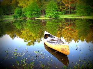
So this is the reference that I got from Pixabay.com. It's a very good example of very still water and nearly perfect reflections.  Notice a few things that I've already mentioned. #1: The reflection of the canoe is much darker than the canoe itself. It is a combination of the yellow canoe and the color of the water. You only see the underside of the canoe. It is darker near the canoe, because that is in shadow, which would be darker. It is also darker because it is close to the viewer. Also, the canoe reflection is pretty hard edged because there are no ripples in the water. 
The reflections of the trees are precise, but not as hard edged. 
One more thing to notice.  there is a stand of tree trunks on our right. They are set back off the shore. The trees that come to the shore edge are completely reflected. But the trees set back a little have only part of their trunks reflected. 


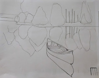
To start the painting, I used contact paper to white out the canoe. (to use contact paper, see the turtle demo) Then, holding the paper upside down at a tilt, I painted in the calm water. (French Ultramarine, cobalt, and a bit of burnt umber in the darkest part) I made a gradual wash, ending with almost pure white paper at the edge of the lake.

I painted the shadow of the canoe using raw sienna and some of the water color. (Yellow of canoe + blue of water would make a greenish color) If the canoe were red, I would have made the reflection red  + some blue of the water + some color to dull the red a bit.)

You can start your painting with either painting the reflections first or the trees first. I chose to do the reflections first. I wanted to keep them soft edged, so I wet the sections I wanted to paint first, painting wet into wet, and softening the edges as I painted. This is as far as I've gone, but I wanted to at least get this much posted, since we are working more on this next week.

STARTING TO PAINT RIPPLED WATER

I chose this reference for a reason. First, the water is not a pure clean color. Second, the reflection is distorted slightly because of the ripples in the water. This also came from Pixabay. Remember, when using a photo that you did not take, even if it's from a copyright free site, this is just for your practice. If it is not my photo, I don't enter it into shows or put it up for sale without written permission to use it.


This water is started the same as the other, upside down and tilted for a wash that blends better, but there is no horizon line. I used contact paper to white out the boat first, and some miskit on the rope and on the white wiggles in the reflection. The difference is that I wanted the water to look darker and greener, so in addition to the blues, I have added some raw umber and burnt umber. 


MORE ON RIPPLE NEXT POST.


MEDIUM OF THE WEEK: IRIDESCENT MEDIUM

Iridescent medium adds a glitter and shine to the paint. You can either add it to the paint itself to make it like the iridescent paint you can buy. Or you can paint it over a dry painting. If you are making prints of your painting, I would not recommend putting it directly on your painting, but adding it to the print.
For example, if I made a painting of a poinsettia for a Christmas card, and wanted to make prints to mail to friends, I would print first and then paint the iridescent on top of the printed card.

What happens is the iridescence distorts the light on a print. The printer doesn't know how to read it.
On the top picture I've added iridescence to the moon and cloud. In person it looks shiny, but it's not really noticeable on the copy.

In this poppy I've added iridescence to the bottom right petals. It looks lighter than the other petals, but in person it looks shiny. The camera just doesn't know how to read it.


If you plan to enter your painting in a purist show, I don't think they'd accept the iridescent medium. Other water media shows would be fine. 

Friday, September 8, 2017

More example of gesso board

One thing I forgot to mention is that if you use gesso a lot, you will wear out your brushes faster.
Acrylic and oil artists, who use rougher surfaces and more heavy bodied paints, wear their brushes out much faster than most water color artists.

Here are a few of the student paintings, each one unique. Great results for first time! (some requested I not post, even though I thought they were good!)


ONE MORE MASA PAPER FISH

ALMOST FINISHED PAINTINGS ON GESSO BOARD


Painting on Gesso BOARD


The beauty of painting on gesso is also its downfall. You have more control over it than yupo, as it's not affected much by fingerprints and oils. You can easily erase imperfections, even start over again, if you choose. However, you cannot glaze over things or make corrections without disturbing a considerable amount of paint.


Sketch and reference photo from Pixabay, a copyright free website.


Some people used the modeling paste to create mountains, trees, or ocean waves. I used the mountain for a demo. I had first formed mountain shapes from the modeling paste, with a little bit of sand added to the foremost mountain. First I used cerulean and cobalt blue to paint over the sky and tops of mountains. For my mountains I added in some burnt sienna to blues leaving some white at the base for snow. I left a white space to later put in some trees and flowers. On the bottom I used some greens and burnt siennas where I wanted some rocks. I painted in some pinks and greens where I was going to add some detail in the flowers and grasses. I let it dry.

Next I lifted the paint off the sky where I was going to add clouds. I lightened a few areas in the mountains and lifted a little more where the snow field at the mountain base would be.

For rocks, I lifted the high lights on the tops and darkened the shadows on the rocks. I used a green made from Pthalo Turquoise and a red and purple to make the dark green fir trees. I stippled some green foliage in between the reds to make it appear that they were red stalks of flowers.


To finish the painting I added some greens to the mountains. I put in a few more rocks in the foreground. I defined the flowers more by stippling in green foliage between flowers. Then I added some purple to the clouds.


There's a lot of push and pull with this type of painting. You remove some paint, you add some paint, and sometimes you have to start over again on an area. It forces you to paint loosely, and it can be a bit difficult for us glazers to get used to, but can also be very relaxing, as you can just play around with it.


MEDIUM OF THE WEEK: WATERCOLOR GROUND

WATERCOLOR GROUND


I was first introduced to the Daniel Smith brand of watercolor ground about seven years ago.
The purpose of ground is to create a surface that will accept watercolor in a way that imitates sized paper. You can apply it to almost any surface, but smooth surfaces, such as tiles, glass, ceramics, etc. need to be roughed up a little with sand paper to make it accept the ground more easily.

Ground is usually white, but you can buy it in black or you can add some paint to tint it. To apply it, smooth an even coat over your surface. Directions recommend drying each layer and using three layers, then allowing it to dry 48-72 hours before using watercolor paint on it. 

In this picture I have taken an old film canister and put ground on the lid. I have begun to paint a little flower on the ground. I can glaze a little and lift some also. It isn't as slick as gesso.

Another great use of watercolor ground is as a correction for mistakes on your painting. You can cover entire areas with the ground to cover a mistake and paint over it. However, it will not have the exact same response to the paint as the original paper would.

I have used ground to cover old canvas, cover hard board and wrapped canvas, tiles, and some papers that do not accept watercolor. I will always prefer the feel of the paper, but this is a fun alternative.

PAINTING WATERCOLOR ON GESSO

Last week's blog discussed how to prepare a board or sheet of paper to paint watercolor on gesso.

Here is one project done on 300 pound paper that has a layer of gesso on it.
I used Karlyn Holman's idea of applying background color: choose 4 or 5 colors that go well together, and go around the paper applying the paint in the same order several times, in this case quin gold, hansa yellow, cerulean blue, permanent rose, repeated three times. (Described in her book Watercolor--the Spirit of Spontaneity) You can plan whites or lift them out with a paper towel before it dries.


After dried, I drew a pattern on the dry gesso. This is  a modified version from Wendy Tait's book that has some flower pattern's in it. (Ready to Paint: Watercolor Flowers)


This is a "subtractive method" of painting, meaning that you first remove some of the paint to make your objects appear. Using a stiff brush, I removed paint on the petals where I either wanted white or needed to paint another color over it. Where you see the gray is where staining colors left a "ghost" color and did not completely remove.


When I'd removed all I needed (paint removes easily without scrubbing on gesso, but staining colors can leave a "ghost" color, which is all right), I began to paint in the areas that needed a darker value.
I will add more details to finish the painting.