Thursday, October 31, 2019

THREE THINGS TO TRY WITH SUNSETS

SUNRISE, SUNSET
They should be simple, right? 
But then, someone goes and puts clouds into the mix. And maybe some body of water.

I want to talk about three things that might make it simpler. But first, I'm going to show Sterling Edwards method of painting a sunset. Below is a link to his 13 minute video on painting sunsets.


The main idea is that, when painting a sunset, you need a "buffer zone" to keep the blues and yellows or oranges from creating greens or muddy colors. He makes "puddles" of his colors: yellow, orange, red, violet, and blue. With clean water he wets the paper. Then, starting with the yellow at the horizon line, he paints a strip of yellow. Just above that, a strip of orange, and lets the two colors merge a bit. Then comes the buffer color: red. He paints that red in, then violet, then blue over the violet. All the colors merge, like a sunset, but they don't become muddy. 

Here are a few other things you can do. If you have clouds in the picture that take on a dark cast, you can underpaint those clouds with a bit of neutral tint, davy's gray, or violet. Let them dry.


Then you can paint over that with yellows and oranges to make a very orange sky with darker clouds, like the picture on the top left here. The sun in that picture is pulled out while the paint is wet, using a thirsty round brush. 

On the picture on the right, I first used Gum Arabic to temporarily mask out the sun and some clouds. Gum Arabic can be purchased at Michaels, Hobby Lobby, or art supply stores. It is the binder in most traditional watercolor paints, so it is water soluble. You simply paint it on where you want a white, using a regular brush, dry completely, then paint over it. When the painting is dry, you go over that area with a wet brush, and the gum Arabic lifts off, leaving a soft edged white area.

The bottom sunset uses permanent masking fluid to mask out the sun. Use an old brush to apply it. Dry completely, Then paint in your sunset. You do not remove this masking fluid. It leaves a softer shape than regular masking fluid that you remove.


Below I wanted to show how to create a sunset just before it gets really dark outside.
I started with a regular Sterling Edwards method, lifting out the sun with a thirsty brush. To  create clouds, I dropped clean water into paint that was not quite dry, but not shiny wet. It creates some backruns. Then I let it dry.


After drying, I introduced some indanthrene to darken the sky. 


I added a little red and yellow in the reflection and dried it. Then I added some indanthrene in the water. Darkened the horizon line and added some "buildings." The main object was to create a clean underglow of reds and yellows, but make the sky look dark.


IRIS IN GRISAILLES (Ooh, that sounds French!)


As promised, here is the version of Iris portrait done in grisailles, or more accurately, brunailles, since the underpainting is burnt sienna.

I chose to do this on hot press paper because I thought it might hold onto the underpainting better. (meaning that the under-paint would not dissolve too much when I put a wet glaze over it.)

I did an underpainting of the values similar to previous grisailles. In areas that would have a pure color, such as the iris of the eye, the lips, and the pinker, fresher skin tones, I did no underpainting. The finished underpainting looked very similar to the monochrome version, with no color added to those areas I mentioned.

Next, I glazed over the face with skin tone base made from raw sienna and magenta (or permanent rose). I wet the entire face and hair areas first, including the lips, then glazed the skin tones. While it was still wet, I added more rose in the cheeks, nose tip, and side of the face.

I was pretty pleased with the results. This is the first time I've tried a watercolor portrait with this method.


Friday, October 18, 2019

OK, IT LOOKS UGLY.

We started working on making a color version of our portraits.

We needed to determine a basic skin tone for our picture. Below shows a  chart I made once in a workshop. Each block has a mix of two basic colors (such as raw sienna and permanent rose), then shows what it would look like with a third color (sometimes a fourth) charged in. Sorry these really don't show up well.

For example, the first square is raw sienna and permanent rose with Janets Violet charged in. Second in top row is naples yellow + permanent rose with Janets Violelt. Third is coral + green gold. Last in the top row is quin burnt orange and green gold. So experiment with colors - usually one from the yellow family+one from the orange/red family+a surprise, like veridian, hookers green, Janet's Violet, or verditer.

Think of it like this. If you are baking, you can take four ingredients: flour, sugar, salt, and baking powder, for example. From this BASE you can make a number of things--muffins, bread, cookies, cake, donuts--OK I'm making myself hungry. But you get it. We simply add more or less of one of the ingredients and sometimes other ingredients to make what we want. But the base is pretty much the same.

So make a BASE color that seems close to the skin tones. Then add more of the red family for rosy areas, the addition of a cool for shadowed areas.


For my BASE I chose new gamboge and coral. For other colors I chose quin burnt orange and cerulean blue. Just experimenting. 

Some are doing darker skin tones. A golden dark skin tone can be achieved using quin burnt orange or quin burnt sienna with raw sienna and cobalt violet to darken. Less golden could use a base of quin burnt scarlet with burnt umber, shadowed with carbazole violet or even turquoise.. You have to experiment and WRITE DOWN the color choices so you don't have to wonder what you did later. 

This is using Fabriana Artistico 140 pound paper. I wet the entire face and hair area and applied the base color to all skin plus a little in the hair line. While wet, I put some blue in the shadowed part of the hair and some on the shadowed side of her face. I did more than I really wanted to, but it's OK. It really will turn out just fine, even though it looks a little weird right now.


After I had skin tone on everything, I could work on the eye. For details in painting the eye, please see the following blog dates: May 2017 and Aug 2018. 

Also, for a good youtube on DRAWING the eye, see: 


It is pretty long, but very realistic. 

OH, and the name of the portrait book I showed in class is Painting Watercolor Portraits that Glow by Jan Kunz.

I am still finishing up the hot press version that I am doing grisailles method. Hope to post that soon.


Sunday, October 13, 2019

GLASS PEN


So this is the GLASS PEN that my daughter and her husband surprised me with. I was pretty fascinated with it. It's a LongXin glass pen gold ink set.

The nib of the pen is spiraled glass. When you write with it, the ink is very consistent. I experimented to see if I could make it work with watercolor. I thought it would make a great way to sign a painting. I had to make the watercolor the right consistency, but it does work.

Anyway, playing with it got me in trouble doing hair on the last portrait. I got carried away having fun. Oh well. It was worth it.

MONOCHROME PORTRAIT

We worked some more on refining the sketches and monochrome portrait. It's useful to work from your value sketch when painting.

I used burnst sienna on cold press for the original portrait. Burnt sienna lifts, so you can correct mistakes pretty easily on cold press. To darken values with burnt sienna, just add French ultramarine blue, burnt umber, or another dark color to the burnst sienna.

For a second attempt at this portrait, I tried hot press. It is not as forgiving, nor is it easy to lift paint from hot press. However, I wanted to try GLAZING COLOR over it later to see how it turns out. (like we did for the grisailles paintings) Hopefully it will  be ready to show next post.

One of the things I wanted to discuss is hair. I hate hair. I am not very good at it. But, with help, I've learned a few tips about painting hair. If you've been following the blog, you'll see I've changed the hair on the final painting for several reasons. The first is that she has pretty long hair, and I wanted to show it. The second is I didn't like something about the shoulder area and I wanted to cover it.

Below is the finished painting. You can learn from my mistakes here. After I was done, I "played" with a new toy, a glass pen, thinking I could soften any lines. And I inked in a few lines in her hair, only to discover they would not blend like I thought they would.


One thing I ALWAYS do when painting hair is to PAINT THE SKIN COLOR clear into the scalp. Otherwise you run the risk of the hair looking like a painted on wig. 

Then I wet the hair area all over and decide where the highlights are going. I'll paint light values, thinking of it as areas of light, medium, or darker values. I paint in some of the darker values, also while wet, and, with a thirsty brush, keep pulling out those lighter areas. Try to paint shapes and not individual hairs at this point.

The areas of fine hair close to the facial skin need to look like they are truly growing out of the skin, so you have to keep them light and soft where they connect to the skin. At this point, it's done by using a thirsty brush to keep it soft. 

Let this first pass dry. Then you can go back and darken other areas that need to be darker. IF DOING A CHILD especially, be aware of the pattern of light that often shows up on shiny, blonde or dark hair, particularly if it is straight. It will almost be like a halo across the brow. There are patterns of light on the part area also. 


HERE IS A TIP FOR PAINTING FINE LINES IN PAINT, INK, OR MISKIT

If you want to make the line look smooth and not have a definite "point" on the beginning where you first set the brush or pen down, you can do this. Set a scrap piece of paper next to the area you are painting a line. Start the line on the scrap paper and continue it where you want to place it. That definite point will not be there.

This is particularly helpful if you are using miskit on fine hairs, whiskers, etc. It saves softening after the miskit is removed.


Thursday, October 3, 2019

A Monochromatic Portrait of Iris

Iris, as in my granddaughter, Iris.

I have other blog pages on doing a portrait, individual features, and skin color. This time I wanted to focus on the values and shapes in the face, making gentle transitions in tone to create roundness, and I felt it would be helpful to do it in a monochrome. That way, I can work out many of my problems in drawing and shading first, and not have to also worry about what color to use at the same time.

In order to model a face, it is important to know how to place the features. Even if you are tracing from a photograph, you can make mistakes in the drawing. For example, you might think you are tracing the line of the nose, when you are actually tracing the shadow. Even though you think you have the features correct, once you start painting, you can easily paint the feature to large or too big.

A SUGGESTION IF YOU ARE GOING TO TRACE:

If tracing, I would print a copy on regular paper. Then, using an ultra fine black sharpie, go over the basic shapes on the printed copy. These dark lines will show up much better if using a light box. Also, don't put in too much detail. Suggest places where there is a curve or change in light. But too many lines, especially in  a child's face, can make a picture look over worked and older.

Reference Photo


Rough sketches.

Here are just a few of the sketches I used to get to know the subject. Top left is using a boxed in method to find the placement of features. This view is not only 3/4 view, but I am looking at her from above. So I wanted to be able to picture the PLANES of the face and angles.

Top right I used the Loomis method. She looks like she has a mustache because I was trying to locate the "muzzle" around the mouth. This helps with how it should be shaded.

Bottom left uses the oval method, locating eyes at center. Bottom right also uses the Loomis method.


The purpose of making some rough sketches is to get to know the face better. Just tracing doesn't give you enough information. Also, knowing how a "normal" face is proportioned helps you find the idiosychrosies of the face you are drawing. So when you draw, you look for what is out of the norm. Is the nose longer? Are the eyes more wide set? Is the chin pointed or angled? Things like that.

Normal division of oval method vs. Loomis method. On the left you see the normal way a face that is not angled would be divided up. You make the oval, divide it in half top to bottom and sideways. Pupils of the eyes are right above the center horizontal line. Find the browline.

Then you divide the face into thirds: top third is hairline to brow line; middle third is brow line to bottom of nose; bottom third is bottom of nose to chin. More thirds: in the brow to nose area, the top third is the glabella (keystone shaped bone); middle third is ridge; bottom third is the "ball" of the nose composed of cartiledge.

Bottom third is divided into thirds: First third is the center of the mouth; bottom of second third is top of chin.

The face is divided in other ways. We usually talk about how many "eyes" long something is. The entire front view of a face at the eyes is five eyes wide. There is one eye space between the eyes. The width of the nose is usually one eye, and you can draw a line straight down from the inner eye to the width. Draw a line down from the pupil to the corner of the mouth.

LOOMIS METHOD: I am attaching links to Proko.com videos on this method of drawing the head. It begins with a circle, has elipses drawn to the side, then you draw the chin down from the points where the elipses meet. The videos do a better job than I can.

There are several other methods, but these two are most commonly used.


One thing you have to remember when drawing using the oval method, is that as soon as the angle changes, you have to take the egg shape into account. The line for the eyes is no longer a straight line, but a curve that indicates that there is more than one plane. You can see this curve in the four head sketches I did above.

A SUGGESTION FROM JAN KUNZ:  When sketching the head, she uses tracing paper. She'll do the basic oval and placement lines and features. Then she'll put a piece of tracing paper over that and only use the features, and continue working on that. That means less erasing and less confusion from lines she no longer needs.

So here is the sketch I finally came up with. I think the eye on my left is a little too large. In a 3/4 view, that eye is usually smaller because of foreshortening.


I took my drawing and, using pencil, started shading in the features. This is where I really got to know more about the face. I discovered I originally had the left part of her forehead too high and the right eyebrow too thin. It will be a lot easier to paint once I know what values I want these areas to be. Also, I am delaying doing anything with the hair in case I decide to paint it long.


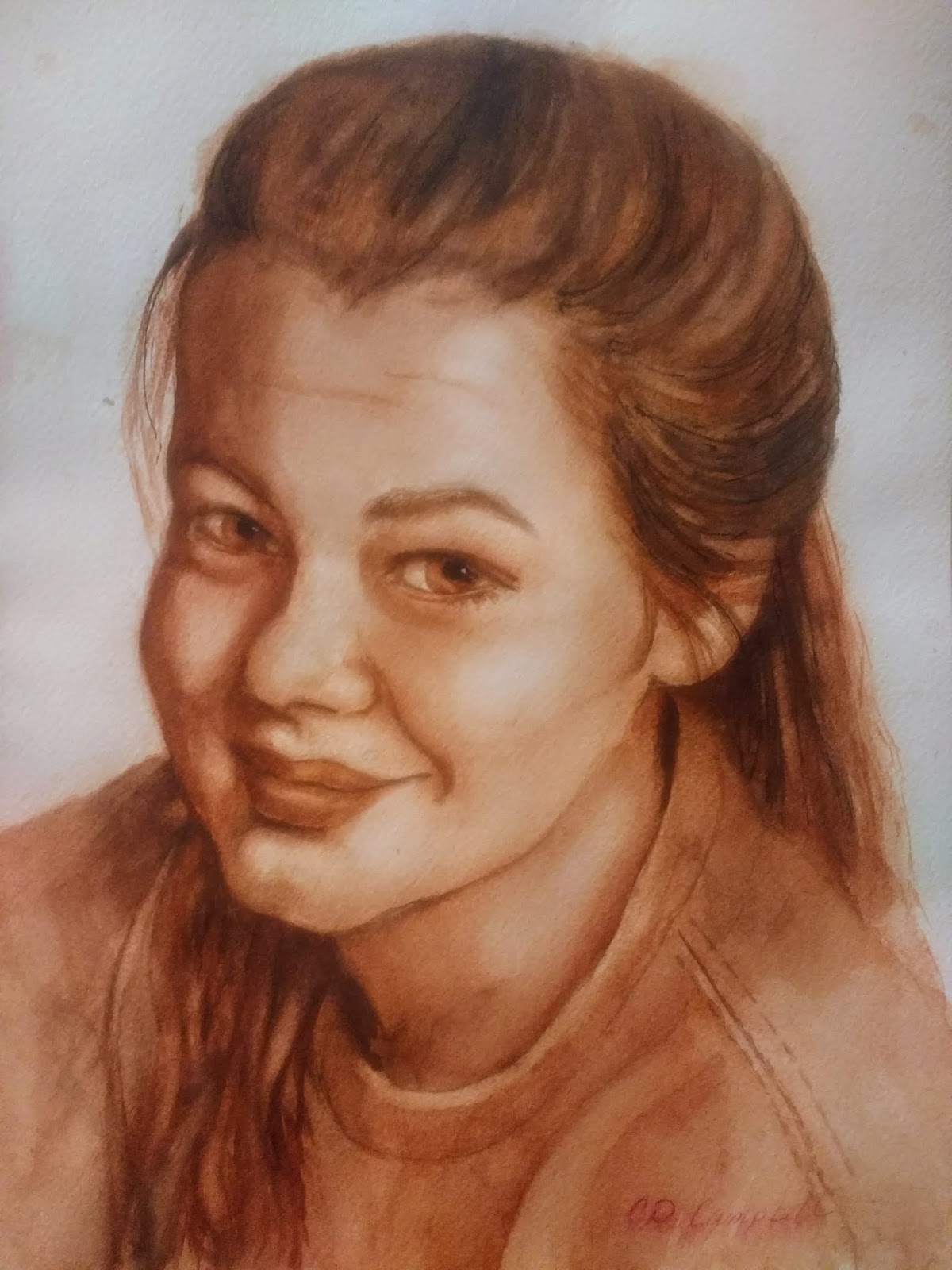
I transfered my sketch onto cold press arches. I decided to use burnt sienna with burnt umber or french ultramarine added to it to create darkest tones. On the first wash, I just wet the entire skin and hair area. (I paint skin tone right into the scalp area to prevent it looking like a wig) Also painted right over the eyes.  I painted in burnt sienna darker on the left side of the face and other darker areas. I dried it, then shaded in more. This is what it looked like after the second wash. 


I kept working in glazes until I was able to get the value changes I wanted. I still have at least one more pass to round out the neck, and that left eye is too large. See how the iris is the same as the one on my right? Too big. 


So here are some references for Stan Prokopenko's videos of the Loomis method of drawing a face from any angle (most are only 5 minutes or so):

https://www.youtube.com/watch?v=1EPNYWeEf1U

https://www.youtube.com/watch?v=z4ZLkyTuX_w

https://www.youtube.com/watch?v=yS6R2l8t8wo

There are several books I really like that are helpful in portraits. One is Painting Watercolor Portraits that Glow by Jan Kunz.
Lee Hammond has a book, Lifelike Portraits from Photographs, that teaches using the graph method for transfering a face from a photo.