I hesitated to post this, because it looks kind of boring. But if you want to know a little more about elements and principles of art, there are a few youtubes I found helpful. Confusing at times, but helpful.
Here are a few youtubes you might try to learn a little more about the elements and principles of art and design. If you look at enough stuff, you'll notice that not all educators agree on the exact principles and even elements. Often it depends on the audience, whether it is for design classes, fashion, engineering, architecture, etc. ALL element lists, however, have line, shape, (some include form with shape, some make them separate), texture, value, space, and color. Some add point, size, or direction.
Principle lists vary more. Most include emphasis, movement, unity, balance, pattern (or repetition), contrast. They may add proportion, harmony, rhythm, or other properties.
Elements of Art and Principles of Design
This is nearly an hour long, but a simple but thorough exploration
https://www.youtube.com/-R18bjGoU2k
Below is a 31-minute power point. You will notice that they include "point" as an element of design,
which is not true of most lists of elementss of design. However, this is a power point with engineering students in mind.
https://youtu.be/Wxq4Hnw0Ukw
Similar but 7 minutes: principles of design
https://youtu.be/HJXoUHisICM
a great 2-minute synopsis
https://youtu.be/ZK86XQ1iFVs
The one below breaks it down into only 5 principles , but includes some of the others usually included (such as repetition, gradation, contrast, radiation) as sub-principles of rhythm. It includes unity as part of harmony. It's only about 7 minutes long.
https://youtu.be/ZDcd5PdrttQ
Thursday, April 25, 2019
A LITTLE ABOUT COMPOSITION
Below is a link to Tim Packer's video about Composition. There are three in all, if you care to see them, but this first one is my favorite. I like his comparison of art to music: singing in the shower or singing for an audience. I also like his comparison of composition to a "dance" that we provide to keep the audience interested.
He emphasizes that composition isn't a bunch of RULES that a group of artists made up. They are, instead, OBSERVATIONS of what actions create predictable responses, that our brains are hardwired to respond to certain things.
https://www.youtube.com/watch?v=pvJmqVh2vwk
It's only about 11-12 minutes long.
ELEMENTS OF DESIGN: LINE
DEFINITION OF A LINE:
In art, we define a line differently than in mathematics. Math tells us that a line is the distance between two points, and it has only length, no width. In art, however, it not only has width, but several other properties as well. Some people define it as a point that makes a journey. And indeed, we can use line to help us journey through a work of art.
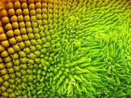
Pictured below, with art's definition, lines can be thin or thick; curved or calligraphic (having both thick and thin areas); it can be zig zag or spiral; it can be blurry or even "implied,"smooth or rough.

LINE AND EMOTION
Line can show how you feel about your subject. Very vertical lines appear static or at rest. They imply stability and are used to show dignity, poise, or formality. The vertical lines below remind me of the columns in a government building; trees in a forest; tall buildings in a city; fence posts.

Horizontal lines, shown below, are also a bit static, not much movement going on. Maybe because it feels like you are standing on solid ground, you get a feeling of permanence, quiet, rest, peace, even solidarity. I think of sunsets, calm bodies of water, days at the beach, a southern Texas field of flowers.

DIAGONAL LINES begin to show more energy. In fact, they can feel a bit unstable, and are used to create tension (not a bad thing), or an exciting mood. I think of waterfalls, mountain slopes, falling, going up or downhill.

Diagonal lines feel more stable when they meet. When lines cross in your picture, that intersection is sure to be an attention getter. You still get a feeling of action, excitement, but perhaps more controlled.

Curving lines show movement, like ocean waves, and move your eye through the paintng.
They change direction and express activity. Gentle, horizontal curves are peaceful. If you painted vertical curves, it might look like seaweed being gently swayed by the movement of the water.

Zigzag lines seem to feel most unstable, creating a feeling of confusion. They evoke feelings of excitement, nervousness.
Spirals can feel hypnotic. They draw the eye to the center, and often create a feeling of luxury.

If you put a zigzag on a horizontal line, as below, it feels more stable. Think rooftops in a town, picket fence post tops.

PLAYING THE "LINE & EMOTION" GAME
You need 3 x 5 cards and a list of situations that evoke different emotions, such as:
a day at the beach
riding a horse
motorcycle ride
fishing
walk in the woods
waterfall
skiing
skydiving
waiting in line at the store
holding a sleeping baby
splashing in the pool
receiving sad news
mountains
crowded city with tall buildings
falling
kissing/hugging
watching a sunset
riding in an airplane
Pull one of these at random. Then draw, using only line, how you FEEL about that emotional situation. (not shapes, so don't close in any lines). Some people can have totally different emotions about an activity. One person may LOVE skiing; another might find it terrifying. Then compare notes to see how others represented their response.
For example, if I had chosen "a day at the beach" my lines might be curved, horizontal lines to suggest rolling waves and a peaceful feeling. Someone else, who finds it more exciting, might draw a spiral for the sun, and some diagonals for windsurfing that they enjoy. Expect these to look cartoonish, because they should only take 30 seconds to do.
HOW DOES LINE APPLY TO USING DESIGN PRINCIPLES?
On the left you can see line used to show gradation and change of direction. The yellow lines go from thick to thin as they gradually change direction. The pink lines, all the sirectame size, continue the feeling of changing direction.
On the right, you see line used to create "value," (another ELEMENT) as you would when shading a drawing with tight, close lilnes.

Two ways line shows value: Tightly spaced lines, and cross hatched lines.

Below I've used line at different angles and different sizes to show perspective, as a road with posts on the side, converging in the distance. PERSPECTIVE and DIRECTION are the principles.
Also, line can be used to direct attention to a focal area, or EMPHASIS, another principle of design.
In the picture below, I would probably put the emphasis in the area where the lines nearly converge.

Below, line is showing PATTERN, RHYTHM, and VARIETY. A pattern of different sized lines, creating a rhythm, but a variety of sizes and placement. This pattern tends to give the picture UNITY also, another principle of design.

Tuesday, April 23, 2019
Transition and Gradation
TRANSITION:
Is how you make the eye move through the picture, how you lead the viewer from point to point.
One of the ways you do that is through GRADATION, which is a gradual change either in shape, value, size, or color, line, direction, the elements of composition. It is a step by step series of gradual changes and the opposite of contrast. It adds interest and movement to the painting.
Gradation in color is like a sunset or rainbow, where one color gradually blends into another.

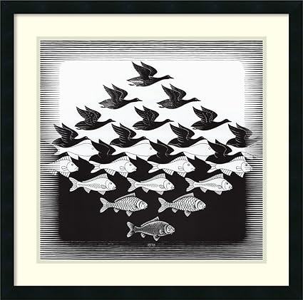
Gradation in shape is where the shape gradually changes. Think of M.C. Escher's tessellations.


a brief explanation:
Is how you make the eye move through the picture, how you lead the viewer from point to point.
One of the ways you do that is through GRADATION, which is a gradual change either in shape, value, size, or color, line, direction, the elements of composition. It is a step by step series of gradual changes and the opposite of contrast. It adds interest and movement to the painting.
Gradation in color is like a sunset or rainbow, where one color gradually blends into another.
Mr. Mahi
gradation of color
Gradation in shape is where the shape gradually changes. Think of M.C. Escher's tessellations.

M.C. Escher
gradation of shape, value, and texture
Gradation in size is taking similar shapes and gradually changing the size to lead the eye in one direction or another.

gradation of size and value
In line, gradation is seen in perspective drawings. You can even have gradation in texture, in which the texture gradually changes in the picture.
Thursday, April 11, 2019
PAINTING CHALLENGE - AGAIN
HERE IS THE CHALLENGE:
Find a photo reference you don't mind doing more than once.
Choose one of the ELEMENTS of art (line, shape, value, color, space, size, texture) to create your area of EMPHASIS (Sometimes called domination) in your painting. Choose one type of composition (such as cruciform,bridge, spiral, radial, S or Z shaped, cantilevered, horizontal, vertical, etc.) compose a painting with those two things in mind.
For example: You might choose texture as to be dominant in your painting of a building and choose a vertical composition.
You might choose a Z shape composition to paint a country path landscape and choose strong values as your element to emphasize.
(good paintings have several design elements, but the one you choose should be dominant above the others.)
Then on the next week, choose a different element to emphasize and a different composition, USING THE SAME REFERENCE PHOTO. You can focus in on a part of the reference or change as little or as much as you choose. Be creative.
Today I issued a challenge, one I took about eleven years ago. In fact, I'm going to refer you to the original blog I did. Look at Feb. 2008. There are six posts named Painting Challenge, Painting Challenge #1, etc. You can check those out to see my original reference of an alstromeria plant and five of my attempts. Then look at August of 2008 for #7. It seems I never posted #6, which you will see below. In this one I used a "checkerboard" composition (overall plan), and the design element I chose for this one was color again, using a blue/orange complementary color scheme.

This was either four or five, can't remember. I wanted to try an S shaped composition. I think the focus was on repeated shapes, like the small white shapes to direct the eye into an S shape.

Below is my 2nd challenge painting, only completed and matted. I was probably most happy with this one. If you look back at the blog you'll see that I chose a radial composition.

In the original challenge, we only had two hours to paint each one, after the initial planning and drawing. Since I am not a quick painter, that was a bit challenging for me too, but it was helpful in deciding at an early stage whether or not I was going to like the painting.
This might sound like work, but it is a great tool to help get away from just "copying" a photo reference and making it uniquely your own. It forces you to look at how strong your composition is, as well as to ask yourself the best way to present what you love about that picture. And I think it's fun. Hope you do too!
Thursday, April 4, 2019
Still Life Using Grisailles
STILL LIFE: COPPER POT
In grisaille, you can use burnt umber (BRUNaille), Green (VERDaille) or gray (GRISaille). It depends on the final outcome you want, whether a warm tone, cool tone, etc.
In this picture (from my photo), I used the burnt umber. Please see the notes on what paints and paper to use in the previous blog.
In grisaille, you do most of the work in monochrome, forming the values and molding the shapes as you would if you were shading a picture.
My reference photo taken 3/29/2019. First step was to turn it into a black and white so all I could see was value, not color.

First I sketched onto Arches cold press. It really holds the underpainting. You don't want a paint (or paper) that will lift for underpainting. I taped the BLACK AND WHITE version of my photo next to my painting as I work.
Mask off any highlights you want to preserve.
I constantly compare values as I go. A good way to do that is, if you are not using grays, take photos on your cell phone and change them to black and white (side by side, like this), and compare the two.
You can also compare by taking two very white cards and poking a hole in each. Use it as a viewer, holding one over the area on the photo, and the other over your painting. Compare to see how close your values are.

In the above photo, I could see that my values were not as strong on the copper pot as they should be to create the feeling of shine and roundness. So, in the photo below, I strengthened the darks. Then I worked on the two glass vases. When I got to the middle one (yellow with specks), I used a sponge to create small flecks on the glass. This part of the process took me about 2 hours...I'm a slow poke.
Also, you can see on the far left vase that I am terrible with straight lines. I had to go in with some masking tape to help me straighten up the right side of that vase.

When I was satisfied with my values, I began glazing over the underpainting. I began with green and pthalo blue over the center of the copper pitcher. While that was drying I used quin gold to glaze over the yellow vase. The red vase is rose madder and perm red. (You can see I still have miskit on the vases. I should have used more miskit on the pitcher) I feel like I lost some sparkle.

To finish up the pitcher, I used quin burnt orange, quin gold, and perm red. I used quin gold over most of it, avoiding the pure whites, then put burnt orange and perm red in the deeper tones. When dry, I removed all miskit, and made some small adjustments. Also added a bit more green tones in the center area of the copper.

I like the overall look and feel of this. However, I have two regrets. One is that I did not mask off enough of the whites on the pitcher, and had to go back and lift. The other is that I would like to have the glass look more transparent than it does. Other than that, I like it. Not something to use with every painting, but definitely a tool in your tool kit.
For more information about painting grisaille, see these two youtube videos:
The Frugal Crafter: Step by step - about 1 hr
about 7 minutes explanation
This is the one by Hajra Meeks. She has several good videos on grisaille, both with and without a color glaze.
When I finish the gray tone painting, I'll post it and tell you what I did differently on my second attempt.
Subscribe to:
Posts (Atom)