Thursday, January 30, 2020

Demo on Complementary Colors

Here is a VERY quick demo done to show how much variety you can get with just one set of complementary colors.

Below is a quick sketch of a wooden barn, a bucket, and some leaves.


I used French Ultramarine and burnt sienna. The orange in the burnt sienna makes it a complement of the French Ultramarine. First I "neutralized" the blue with just a touch of burnt sienna and painted in a sky around the barn.  Next, for the gray of the barn wood, I mixed a gray from the French ultramarine and burnt sienna and applied it to the barn wood. As it was drying, I spattered some water on it to make the wood look weathered. Looks pretty sloppy right now.


After all that dried, I put an underlayer of yellow on the leaves. After they dried, I mixed
a green with yellow and French and glazed it over the leaves.
For the bucket, I covered the entired bucket with burnst sienna and then, starting on the right side, 
I added French ultramarine for shadow. The sediment in the two colors combine nicely to create rust.
I painted the rusty nail the same way, and darkened the inside of the bucket with blue also.

To make the lines in the wood, I made a dark mix, again of FUM and burnt sienna, and painted it onto the edge of a credit card, then pressed the credit card down where I wanted a line and pulled it down.
This is a great way to make straight lines.
There's a bit of shadow using French ultramarine.
I used a total of three colors, and got quite a variety from blues to greens to grays, browns, and oranges. 


This is not meant to be a work of art, but a quick demo on using complements.

A note on French Ultramarine: I recently discovered that French ultramarine and ultramarine are not the exact same. French has a red bias and granulates more; ultramarine has more of a green bias with less granulating properties. And they make a fine grained ultramarine with no granulation at all. (I think it's Schminke)
To read more about the history of this color, read this:


Wednesday, January 29, 2020

USING COMPLEMENTARY COLORS


It is extremely useful to get familiar with the color wheel, especially your complementary colors.

The word "complement" (with an E) means "that which completes or perfects; the amount needed to complete." In color, it is the color it needs to contain all the primary colors in the color wheel. 

I think of it this way: To find the complement of red, I think, "What two colors are left on the color wheel?" Yellow and blue. Combined they make green. So green is the complement of red.

How do you make purple? With red and blue. What primary is missing? Yellow. The complement of purple is yellow. If you have a color wheel, the complement is directly across from the color you choose.

I made the following chart using three colors: cad red deep; Azo yellow; and cerulean blue.
I mixed the secondary colors (orange, violet, and green) using those three primaries.

On the left of each row is the primary; on the far right is its complement. Next to the primary is that color "neutralized" with a bit of the complement. Third in each row is a brown made that is heavier on the primary. Middle is a gray made from the complements. Fifth is a brown heavier on the secondary color. Sixth is the complement "neutralized" a bit with the primary color.


So you can see there is quite a variety of colors you can make using complements. 
So try doing this with the colors in your palette. Use whatever blue, red, and yellow you have. The colors you choose will make a slightly different color wheel than mine. But you need to know what YOUR colors will do for you.

REASONS TO KNOW AND USE COMPLEMENTS

1. To neutralize (calm down, gray) an intense color
2. To create interesting browns and grays
3. To create color harmony in a painting using only a few colors
4. To emphasize an area using coplements next to each other (example: a bit of red in a largely green painting)
5. To shade
6. To prevent unwanted "mud"
7. to create "mood"


Thursday, January 23, 2020

ARTIST I WATCH

Here's a short post with a few of the artists on youtube that I'd follow.

#1 (yes, #1 for a reason) Steve Mitchell's Mind of Watercolor.
     He has about four or five years of doing this. Most of his are 20-25 minutes long on a
     huge number of subjects. He doesn't just expect you to watch him work. His explanations
     are very clear and helpful. Steve is a commercial artist with a lot of knowledge about a lot of         media, but focus is watercolor on this channel.
     Plus he is a nerd and funny to watch. Say hello to Reese for me!

#2 Angela Fehr

     Angela does a lot of loose work, largely landscapes. She also gives very clear explanations.

#3  Lindsay Weirich(?) The Frugal Crafter

     A lot of her stuff is craftsy, but she has great tips on watercolor painting.

#4  Watercolor Misfit

     A pretty young gal who has taught herself and picked up some pretty good ideas on the way.
     I don't always agree with her choices of paper, but she has a unique style. Tends to say
     "that being said" a lot.

Most of these don't take up a lot of time, but give great information .... things you might think seem so simple, so how did I not know that?


GLAZING & CREATING SHADOWS

Below are some of Steve Mitchell's youtubes on glazing, blending, and creating shadows.
All are really helpful.

Mind of Watercolor: creating shadows on intense colors

https://www.youtube.com/watch?v=_9u61TJ3ems

Mind of Watercolor: fundamentals of glazing

https://www.youtube.com/watch?v=_58Eyyhv0gs&t=10s

How to blend colors wet onto dry

https://www.youtube.com/watch?v=Qy_8px43Esc


MORE THAN ONE WAY TO MIX COLOR

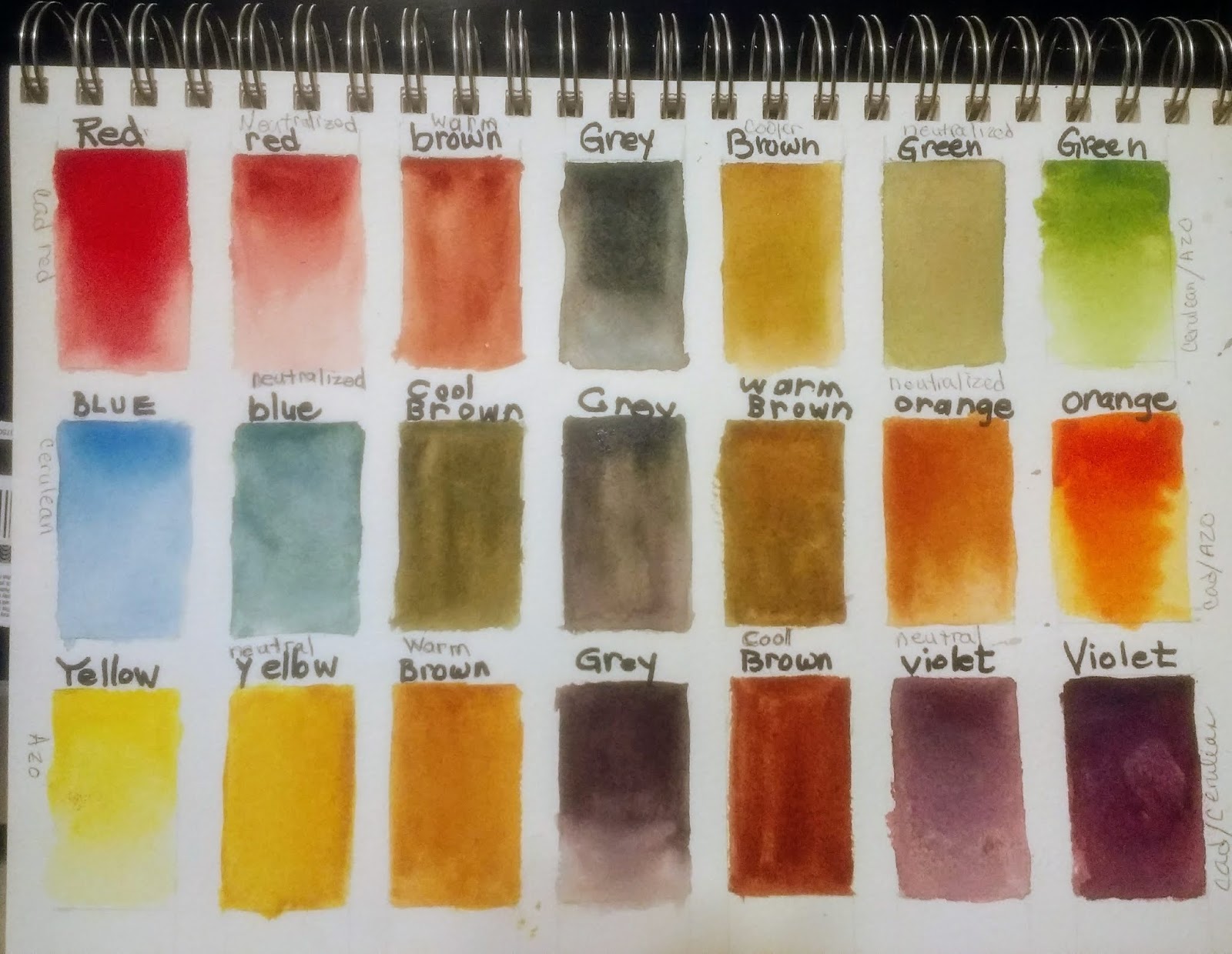
The picture below shows 3 ways to achieve color on your paintng. Top row uses permanent yellow and cerulean in each circle. Bottom row uses alizarin crimson and French Ultramarine blue.On the left is wet-in-wet. Middle shows color mixed on a palette. Circles on the right show glazing.
The left side of top circle has yellow first, cerulean glazed over yellow. The right side has cerulean first, then yellow glazed over that.


TEN REASONS TO GLAZE

On my list, the first 5 are reasons given in the Mind of Watercolor Video. The last 5 other reasons I have used glazing.

1. Control of values (deepening and adjusting values and gradual shading)
2. Subtle color changes
3. "visual mixing" of color
4. Dulling or neutralizing with complementary colors
5. Keeping luminosity
6. Separating planes
7. unifying an object
8. pushing an area into the background
9. underpainting, such as for grisailles
10. Brighten a dull color (either warm up or cool off)

GLAZING EXERCISE

First make some shapes on your paper, any shapes. Make some of them overlap. 
Go ahead and put a light to medium coat of flat wash over each shape.
Dry completely.


Now try to use that list of 10 reasons to alter color on each shape. 

Top left: #1-- I started with alizarin crimson. I added a deeper shade of red on the front to darken the value of the red. The side of the block shows reason # 10--brightening with quinacridone gold.

On the right I underpainted leaves with yellow. This gave it a bright undertone. I made gradual changes in the greens by adding some greens to the leaves to make gradual changes.

Next row, the overlapping circles show VISUAL MIXING. Think of visual mixing as taking two sheets of colored tissue, a yellow and a red. When you overlap them, your eye sees orange. That is what is happening when you glaze one color over another. 

The teal flower petals were painted teal then shaded with pthalo blue. (Shading)

The blue rectangle is #2, subtle color changes. 

The orange triangle also demonstrates shading. 
the green cross of rectangles shows separating of planes. Think of two green stems, identical in color, but you need to separate the planes (or stems) with a darker color on one so you can see them. I also used a yellow glaze over one of the rectangles to demonstrate #10, warming up a color, which also
helps to separate the planes.

The red ball was painted with Allizarin, then glazed over with green to dull it down.
I have several posts on grisailles, which you can refer for #9.


The most important thing to remember in glazing is that the underpainting must be DRY before you glaze. Steve Mitchell also points out that you don't want to use a mop brush, which holds a lot of water, when glazing. You don't want to disturb the underpainting, and too much water will do that. 

SHADING

I used a styrofoam try to make this dot chart of color that follows the color wheel. (mostly...I made a mistake with a red)  Looking at your paints in their most intense form will allow you to see just how strong (or weak) a value that paint can go to. Also, it lets you see which colors are closest in the family. 

So how does this help you in shading? Steve does a great job of explaining this. When you are shading a color that is already able to achieve a very dark value (French ultramarine for example), or a neutral such as Paynes gray, you can start out light and just use stronger versions of the same color to shade.

BUT
what about your bright intense colors, such as yellow (which gets green if you put in blues and orange if you add reds)? Or reds, which can get muddy if you add a neutral?

For yellow, look on the color chart on the left side and find a yellow (or sienna) that can achieve a value higher than that yellow. I chose quin gold, but other colors can work too. And you can use more than one, building layers.

For reds, instead of going straight to a blue, go to a more intense red or red violet first for your shading.

You can use neutral tint, but tends to make it dull. Especially on flower petals.


So below I made a few shapes that I could shade. Top row shows dark colors that can have a variety of values. Left to right: carbozole, shadow violet, neutral tint, paynes gray, French. Then blue shaded with neutral tint, and red shaded with neutral tint.

Second row: Permanent yellow with quin gold and Burnt orange; Cerulean blue with French; sap green with pthalo blue; alizarin with quin violet. Third row, same yellows, magenta with quin violet, jadite green with itself and pthalo; perm. red with violet. You just have to play to see what works.


Thursday, January 16, 2020

BOKEH - PART 2


#1 Draw the details on the flowers.


#2 Gently lift stems if needed


Cut a piece of masking tape in half, slightly curved to resemble a stem.


Set one piecee of masking tape on each side of the stem.


Using a magic eraser, GENTLY lift some of the stem. When dry remove the masking tape.
If you rub too hard, you will remove the sizing of the paper, making it hard to paint over.


#3 Begin by lifting some circle shapes from the background.


Use a circle stencil and a magic eraser to gently remove paint from circles in areas you want to
be out of focus. You may want to draw them on so you can create a pleasing pattern. If you lack a stencil, you can make one from plastic or just freehand them. 


Here you can see a pattern of circles- the "specular" effect of bokeh.


#4 Begin painting your tulips. I wet each one and put a base of yellow and coral, allowing the colors to run together. I also painted stems using lemon yellow and French ultramarine.


I added a base of alizarin crimson on the middle tulip.


OOPS! I discovered how off balance that middle tulip is. So I used magic eraser to remove
paint to move the stem. BUT It took off some sizing, and wouldn't take more paint. So now what?
I used something called "watercolor ground," which allows you to repair the paper, but you have to let it dry overnight.

Meantime, I separated the tulip petals. I wet the line along the side of a petal, added darker paint, then blended it out onto the next petal. 


You can see three things in this picture below. First, I deepened the color on each tulip, and each time I did, I continued to separate petals. You can see on the right tulip that I scored some lines on the petals to indicate veins. This was done by wetting the petal, adding paint, and then, carefully following the form of the tulip, using the sharp point of a cut credit card to score some dark veins.

The third thing you see here is that I've added a few more circles, this time with gouache, and a few of them with Watercolor ground. I used a round sponge on a stick called a spouncer to apply it.
This wasn't in the original plan--I have just been using gouache--but I needed to repair the paper on the stem, so decided to try the ground as a replacement for the gouache. If you have some, it works pretty well. But it isn't as transparent as I'd like.


I wasn't happy with the red tulip. I used a little cobalt blue to separate the petals and darken the bottom.  I did a little lifting on the tulips to bring some hightlights into the painting. I also began dropping color into some of the circles. 
On the left, you can see where I've negative painted cobalt blue around some of the circles to bring them out a little more. 


I added some opera rose to make the red rose pinker. Then, usuing a bit of gouache, I added some white highlights to the tulips. I softened some of the edges of the circles.You can add more color to the circles, if you choose, adding as many or as few circles as you like. 


RECAP OF SOME OF THE THINGS LEARNED FROM THIS:

1. You can create bokeh with stencils, by removing paint, by painting gouache with a round "spouncer" sponge, or by using watercolor ground. You can also use certain white inks used by stampers. (but that's not a product I have on hand)

2. How to separate the petals of a flower by blending.
3. How to make smooth, natural looking flower petals wet into wet.
4. How to use a credit card to create small veins in petals.
5. How to remove paint using a magic eraser and either tape or stencils.


Thursday, January 9, 2020

CREATING A BOKEH, PART ONE

CREATING A BACKGROUND FOR YOUR BOKEH

A bokeh, often seen in photography, is the effect of an out of focus part of a picture, often seen with bright circles of light. Right before Christmas, a friend offered the challenge of trying to produce this effect in watercolor. I'd seen and done it in acrylic before, but not with watercolor. Below are two examples of what a bokeh can look like, using lifting and gouache.


I wanted to start this project in a fun, loose way, using some texture processes. And since I needed an area in focus (with hard edges), I masked off some flowers using contact paper.

DIRECTIONS FOR USING CONTACT PAPER: Cut shapes out of contact paper and adhere them to the watercolor paper. Use the edge of a credit card or your fingers to burnish the edges of the shape so that the contact paper will not leak paint into the masked off area. This leaves you free to paint and play without having to paint around your white area.


Choose a few of the texture methods below. These are wet in wet methods: Row 1:
scratching into damp paint with a credit card; salting with popcorn or table salt; salting with pretzel or kosher salt; 2nd row: dripping alcohol into moist paint; scratching into moist paint with a comb; spattering drops of water into damp paint. 3rd row: plastic wrap over moist paint; crinklet wax paper; cut wax paper shapes onto moist paint; 4th row: impressed objects, such as hair, thread, leaves; granulating paint (lunar earth and sicklerite genuine); spattering paint on either dry or moist paper.


STEPS TO BACKGROUND:

1. Choose the methods you want to use and have materials ready
2. Choose 3 colors and make a puddle of each one on palette
(prepare your paint colors)
3. With a large brush, wet the entire page until shiny, not puddly
4. loosely apply your paint until you like the pattern. You should have all soft edges. You can spray the painting to make the paint run if it looks too heavy or blotchy.
5. Apply your texture method to the wet (moist) paint.
6. Allow to dry until it has reacted as much as you want it to.
7. If you dry with a hair dryer, be sure it is a cool dryer so that the adhesive on the contac paper doesn't glue to your paper.
8. When dry, remove from the contact paper.


A FEW BEGINNER TIPS

The more I paint, the more I discover simple things that I somehow didn't know when I started out. With this lesson, I wanted to point out a few of those tips. I passed out my "Ten Commandments of Watercolor," and I'll elaborate just a little.

Before I do, though, the one thing people should remember is that you should treat watercolor the way you treat your kids. They all have different personalities, and you don't try to make one child behave exactly like another child, because they have different talents and interests.
SO...
Don't expect watercolor to behave like acrylic or oil. It has its own unique personality that shines when you let it do what it does best instead of trying to force it to be something else.

TIP # 1
"WAKE UP" YOUR PAINTS

Just use a spray bottle and spray your paints a few minutes before you want to paint. They will go one much more smoothly, and you won't be struggling to get the consistency you want.

TIP #2
CHOOSE YOUR COLORS IN ADVANCE, AND HAVE THEM WET AND READY

TIP #3 - 
LEARN THE STAGES OF WET/DRY

Watercolor paint has 4 stages of wetness. The first is DRIPPY WET. It may puddle or drip. This stage has its uses when you are making a large wash.
Stage 2 is MOIST. It is the perfect stage for wet in wet techniques. It is wet and shiny, but not puddly or drippy. You have some control over where the paint goes, and it gives lovely soft edges. Think soft kitty fur, fluffy clouds, hair, soft skin tones.
Stage 3 is DAMP. Damp is dangerous. It is not dry enough nor wet enough to paint on, and if you try you will get blossoms (which you sometimes want) or muddy looking color. There are a few texture techniques done at this stage, such as scratching with a knife or credit card, but in general, avoid painting into or next to an area that is DAMP. You judge damp by touching your fingers to the paint, then touching a very dry part of the painting. If it feels cool, it is still damp, not dry.
Stage 4 is DRY. It is always safe to paint on perfectly dry paper. This is where you have the most control over shapes and hard edges.

You will read things that talk about "wet" paper, and it usually means the moist stage, not drippy wet.

TIP #4
WATER TRAVELS FROM AREAS OF MORE MOISTURE TO LESS

Think of this as a sponge. If you have a damp, squeezed out sponge, it is easy to soak up a puddle of water. Dry areas totally resist water. This is important to remember when adding paint to an area that you've just painted.  If there is more water on your brush than on the moist/damp paper, that wetness will push into your already painted area and cause blossoms.  If you are trying to get an area darker, or introduce another color, and it is still wet, there needs to be more paint/less water on your brush than there is on the paper.
So you don't need to clean out your brush unless you are changing colors. Don't dip it into the water constantly if you are using the same color. You will have trouble getting darker colors and run a greater risk of backwashes (blossoms)