Monday, November 30, 2020

PLAYING AROUND


One of the things I've been working on personally is practicing "strokes" such as those used in toll painting and Chinese painting. Loose floral painters often rely on these strokes in their paintings.
So I turned to youtube to help with those, especially learning the roses. Here are two fun youtubes that I used to play with these cute little birds and roses. Check them out.

deWinton Paper Co.
5 tips on roses: focuses on "C" curve stroke
10 minutes


deWinton Paper Co. - cute robins - 12 min


deWinton Paper Co. --winter foliage (pine, holly, etc) 24 minutes


Bet you'll be speaking with an English accent before you're done!!!!


Sunday, November 22, 2020

CHRISTMAS SNOWGLOBES


Lately I've been fascinated with painting snow globes. I wanted to see what I could create. So I started with putting a picture of my house in it. The first one I did I put a black background on. The second one, I didn't. On the third, with the kitten, I wanted to paint something for my youngest granddaughter, who is obsessed with kitties, but can't have one bc of her mom's allergies.

The black background was easily done with black wc ground.


Messing with the base for the globe.


Made the base look like Santa's body just for fun. 


My house.


Just start by tracing over a round lid. Size of lid depends on size of paper. I used a cottage cheese lid on a 7 x 10 piece of paper; a smaller one for a 5 x 7 card. Then draw a base. You don't even need to draw a base if you want it to look like a glass globe ball on a tree.


Here are some fun youtubes to give you some instruction on painting them.

cute little bear in a globe


a winter tree scene


The only supply that was not my normal watercolors was white gouache to sprinkle on the snow at the end. I also used black ground on one of them, but you can use black watercolor, gouache, or acrylic for a dense, flat look. 


CREATING A DISTANT LOOKING BACKGROUND

FROM THIS: 


TO THIS:


The first photo is one taken by artist Bonnie Sitter, from Paint My Photo. The challenge was to create a distant background that still reflects all the beautiful fall colors.

I have to admit that I drew this picture loosely and quickly. Not sure if you can see the sketch that well, but I placed the barn first where I wanted it; then I sketched the large shapes of foreground and background--the hill in front of the barn; the grassy area in front of the hill; the valley line; the tree line of the closer trees behind the barn; and then some areas of the distance.


To do the distant background, you need to follow the rules of aerial perspective.
Objects in the distance are:

1. cooler in color  2. more muted or neutralized in color 3. have less detail 4. are not as hard edged

First I wet the background, damp but not puddly. I chose sap green, lemon yellow; burnt orange; and violet to mute the yellows.  I first put in the yellows, then dropped some oranges in. When I was happy with the yellows, I dropped in greens that had been  muted with some violet. Even the yellows have a tiny bit of violet to mute the color just a tad.

You want the paper to be wet enough to keep the paint flowing, but dry enough that it isl more controlled.


I let all that dry before taking the next step. I wet the entire midground that is just behind the barn. I did the same procedure as before, but my paint is more concentrated and has no blue or purple added. I again began with yellows, then oranges, getting those patterns in first. Then I began to drop in greens. The green is a combination of Hookers and apatite genuine. Dry it.


Next I painted the valley behind the barn. It's a pretty flat neutral color, so I used a combination of yellow ochre and green.

I painted in the hill in front of the barn with stronger yellow ochre and some greens. Then I painted the barn itself. I just used neutral tint. I applied it under the eaves and used a stiff flat brush to pull it down, dry brush method, to make the boards appear. In areas that got too wet, I scratched in verticle lines with a credit card.
 I painted in the door and some small barn details. Then I worked on the trees around the barn and some foreground trees on the hill.


 I was completely unhappy with the mushy mess in the foreground. So I brushed in some grasses and put more detail in the trees in the foreground. I spattered some darks in foreground trees and barn. Then I carefully spattered some white gouache mixed with ochre over the grasses, using a toothbrush for finer spatter. 


I felt like I lost some of the yellows in the background, so I added some on the right and behind the barn roof. I added a little dark shadow underneath the windows and behind the little tree on the right of the barn to make it stand out a bit. 


Looking at it again, I may have to add more dark greens in the background, but I'm pretty happy with it as is.  And my main intent was to create a muted background that still looked like colorful trees, so I think I accomplished that.


Thursday, November 19, 2020

Loose Pussywillows

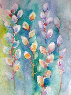
 I found a picture of pussywillows in Jean Haines' book, Atmospheric Flowers in Watercolor, page 49.

There were no instructions how to do it, but I remembered a class I took from Sandy Maudlin years ago, so here is how I would paint this picture. 

First, using a large brush, wet the paper and make a wash with several colors. I did mine vertical, but it doesn't have to be. I used ultramarine, pthalo blue,  quin gold, magenta, and lemon yellow. TIP: try to use non-staining colors for your first try. (don't use pthalo or carbazole violet). You will be able to lift out white much more easily.


WHILE THE WASH IS DAMP, I pulled out some oval shapes with a thirsty brush. (wipe off a shape with a brush, wipe off the brush, rinse and repeat) You can use tissue also. This leaves a lot of very soft edged areas. If paint runs back into the shape, you can later put a little water on the brush, and refine the oval shape a bit.


Choose just a few colors for the insides and shadows. I should have kept to blue, magenta, and yellow, but I got carried away experimenting to see which colors I liked best. You are not trying to fill in these shapes from edge to edge--you want that outer edge left soft. You are just putting some color near the bottom of the oval shape, keeping that soft also.


Next, I used quin burnt scarlet (you can use burnt sienna or other color) to attach the ovals to a stem. I just dropped a bit of color at the bottom, pulled down a stem, then softened where the base meets the oval. The hard edges are the stem and some of the outer bottom of the brown.

 
Watercolor always dries lighter, so I was now ready to strengthen some of the 
background behind the pussywillows. I wet an area I wanted to darken, added some turquoise around the left side of this stem, and dropped in some ultramarine. Now the pussywillows really show up. I'm careful to keep the edges of the ovals soft. 


On mine, to create some continuity in the background, I started each area with some turquuoise, but varied the color I dropped in so it didn'g get boring: yellows on the left, blues and violets toward the right. 


Last step was to lift out and soften a few of the buds that got too hard-edged. I even lifted out a few more buds that were not originally there. Now that I'm looking at it, I think I want to strengthen some of the stems just a bit. But done for now. 


In Jean Haines' version, there are more dark vertical streaks of green and burnt scarlet at the bottom. 

OK, couldn't resist...added some stems and dark green at bottom. Did I mess it up?


Thursday, November 5, 2020

MAKING YOUR OWN PAINT


Years ago an art teacher friend visited Roussilon, France, which is known for its ochres. The entire village is painted only in ochre shades. She returned home with some ochre pigments from Roussilon, and together we figured out how to turn them into watercolor paints.

Your watercolor paints are generally made of 3 things: a pigment; a binder (traditionally gum arabic, but QoR has its own); and something to make paint flow, such as ox gall. Other possible additives are honey and glycerin. 

There are no set recipes, but in general the ratio of binder to pigment is 2 to 1; some say 1 to 1. You may have to experiment.

Pictured above are the simple supplies needed: Left to right are: ox gall, gum arabic, glass muller, pigment, half-pans (or other containers to put paint in), palette knife, and glass dish. I used premixed gum arabic, but there is a video linked below that explains how to mix your own from the powder. (much cheaper)

To make a small amount of paint, pour a T. of gum arabic, a drop of oxgall, and a drop of honey, if you want it, onto a glass plate. Mix well with your palette knife. Add a T. of powder pigment and mix together. If it seems too thin, add more pigment, a bit at a time. 

When it seems to be the right consistency, use the glass muller to grind and blend the mixture until you don't see any more granules.

Scoop off the plate with a palette knife and into small containers. Allow to dry for a few days. 

The glass plate should be of sturdy quality, such as the glass in a microwave. I don't have a muller (because of cost and because I don't do this often), but I use a glass that is perfectly flat on the bottom.

Below are short videos describing the process.

From Owens art--about 11 minutes. Simplest explanation with simple tools.

https://www.youtube.com/watch?v=OdP2xSWHvRw


Arleebean explains how to make your own binder (using ground powdered gum arabic)

https://www.youtube.com/watch?v=x_779MFFtF0


Oto Kano describes paint making process with more professional supplies

https://www.youtube.com/watch?v=WIdVblDIRWM

Below are the 4 shades of ochres I was able to make from my pigments.


FINISHING TOUCHES ON STARFISH

 MORE BUBBLES?

I was so fascinated with the idea of using bubbles to create sea foam, that I added some more. First I tried Jean Haines way, applying soapy bubbles with a spoon onto an area and dabbing wc paint on top of them gently. Then I tried a bubble paint recipe using white paint, about a teaspoon of liquid dish soap, and a cup of water. I blew through a straw to make it bubble a lot. Then I scooped out the white/paint bubbles on top of dark areas. I really loved the effect.

You really need to be patient with this. There is no rushing, and it needs to dry naturally to be effective.

Below are  some close ups of the bubbles after they are dried.  


Then I thought, What else could I do to make the edge of the water look like sea foam?"
Spatter? Sponge some white paint? Both would make cool textures. But I'd been playing with making some Christmas cards and had used some pearlescent watercolor ground. What about that? 

So the next pictures show the watercolor ground sponged onto the sea edge to make foam. Then I spattered it with a toothbrush afterward. I really like it now. Lacking ground, you can still spatter or sponge on Titanium white or white gouache. 


Now I just had to finish the starfish. 


First, finish the dot patterns on each arm, darkening a few. Try to keep some of those whites formed by the salt to create light ridges in the starfish. 

Then work around the edges. Using a small brush, I started along the bottom of one edge with quin burnt scarlet. Instead of using a smooth brush stroke, I sort of jabbed the paint in in short, uneven strokes to create the feeling of the starfish texture, softening the edges over the sand. I dropped in some purple where I wanted it darker.  (Hard edge on starfish/soft edge toward sand)
Be careful not to make it looked outlined. There are some places where you might want to make the starfish appear as if it is partially buried in the sand. In those places, you won't darken the edge so much. 
Also, the light is coming from the left, so most of the shadows are going to be on the bottom right edges.

Just for fun, I opened up my buff titanium ground. Using the edge of a credit card, I popped some of it where I wanted a little rough texture on the starfish.