Friday, August 30, 2024

Elephant on Masa Paper

I love working on masa paper. It is inexpensive (about $2 a sheet of 20x30) and it practically paints itself. 
I love how you can get beautiful blends and textures almost effortlessly. 


In this more realistic version of the elephant, I used masa paper. After marking an X on the BACK side (shiny side) of the paper, I wrinkled it and soaked it  for a few seconds. I then spread the paper on an absorbant surface (I use doggie pads) and applied washes of color. This dries much lighter than it seems when you first put it on because both the paper and color contain a lot of moisture.


I traced my sketch using a lightbox. If you are drawing with permanent ink, as this version is, you can actually draw the picture on BEFORE you wrinkle it and paint the wash. If drawing with pencil, be sure it is dark enough for you to see well.


I worked on the sides of the elephant first. I want to be sure the face and trunk stand out from the rest of the body, so I be sure to use darks around those areas. The paints I used for this are burnt sienna, magenta, some transparent Pyrrol Orange, and French ultramarine. 


I emphasized the warms for the face and trunk so they would stand out a little more.

I always try to paint as much as possible BEFORE gluing the masa paper to another surface. I usually choose to glue it to a cheaper water color paper that is acid free. Occasionally I paste to a prepared gallery board.

When I've painted as much as I think I can, I paste it to another white surface. It has to be completely dried. Then I can work on details, because gluing it down makes the paper smoother to work on.

What glue do I use?

In the past, I have used YES paste to glue this down because I was told it is archival. And very strong. I still like it, but it is expensive and not as archival as I was told. If you don't want to spend $ on a good glue, you CAN use modge podge, Aleene's glue, or matte Medium. I used heavy gel medium because it is archival and is good to glue down even heavier paper. If all you have is Elmer's glue, try to NOT use the "school glue." What happens is it can separate the masa paper from the support if it gets wet. So if all I have is that, I try not to paint on it any more. Using bits of ink is fine.

If you want more info on this process, here are some of my other blogs on masa paper:


Friday, August 23, 2024

Painting on Yupo


Beginning Yupo


 This next painting will be done once on yupo and once on masa paper.

Yupo is made from polypropylene. It is very white and non porous, and has many uses. Before being discovered for the fine art market, it had many commercial uses, such as signs, wrist bracelets for hospitals, etc. It is fun to use with fluid acrylics, alcohol inks, Brush-O, and even printing. You can paint on both sides. Because yupo is nonporous, the paint sits on the top of the surface instead of sinking into the paper. It makes the colors appear more vibrant. It also takes some time to dry.

There are many techniques for painting yupo in watercolor. In this demo we'll use it for positive shapes and also removing paint to create shapes, using only a few basic techniques.

Before using a sheet of yupo, it is recommended that you clean it thoroughly either with warm soap and water or with wiping it down with alchohol. This removes grease and any marks from your hands when handling it. If the oils are not removed you will have a hard time getting the paint to adhere to the surface.

When tracing or drawing your picture, you can use a water color pencil. Regular pencil will not erase well, but if you don't mind the pencil showing, you can use pencil. If you want a pen and wash effect, you could also draw with a permanent marker.


Some   videos with painting tips for yupo:

Sunflower: a good 25 min video for just learning. I don't agree with some of the things she says (like using an eraser to lighten pencil marks), but overall a fun demo to try. 

https://www.youtube.com/watch?v=hWNiybDBlOo

Mary Schumaker - 1 1/2 hours  But so worth watching! She shows dozens of ways to create textures with yupo. The first half is showing how to make textures. The second half is a demo. A little overwhelming at first, but super interesting if you want to pursue it. 

https://www.youtube.com/watch?v=59Oxl8XjCSE

This is my reference photo. It is an AI created photo from Unsplash.


I did two paintings of this elephant. The first is drawn with watercolor pencils, which dissolve as you apply paint and water, then direct painted, elephant first, then background. The second is drawn with permanent marker, like Sharpie, then paint the background first, then the elephant. 

I used French ultramarine blue, purple, and magenta to paint in the elephant ears first. I was not trying to do any details yet. I added darks where I saw darker values, especially around the face. Then I did the body. I let that dry, then painted in the face with lighter values. Looks pretty messy. I dried it all, then painted in some ochre in the background. I left mine lose looking, but you can use a sponge roller to smooth it out.

When all was dry, I used a small damp brush to lift or remove paint from the wrinkles in the trunk and ears. Then I used the small brush dipped in dark color to emphasize the lines in the wrinkles. You can also use a watercolor pencil for these fine details. 

Tip for drying: the more it air dries, the more effects will happen. You can use a hair dryer to speed up the process, but you may lose some textural happenings.

I used a credit card dipped in paint to create grasses. I used a dark watercolor pencil for the dark eyes.

Below left is the process of removing paint; on the left is after I added darks for creases in skin.


In the one drawn in ink, I did the background first. I used several blues with some ochre painted all over, then used the sponge roller to smooth it out. I used a damp paper towel to remove some of the paint from the elephant. With yupo you cannot glaze one color over another....the paint will either mix with the new color or just lift off. 

When the background was dry, I started painting the elephant, using burnt sienna, French ultramarine and some ochre. I tried to paint in the darker areas, but I know I will use water to

 lift out highlights, so I didn't have to be overly careful. 


When that was dry, I lifted out the wrinkles in ears and trunk with a small brush dipped in water. Then used watercolor pencil and a fine brush and dark paint to darken the creases. I put in the eye. Haven't done any ground yet.

Lifting out whites: 


Painting in darks:


Friday, August 16, 2024

Paper compare...hot press vs cold press


Comparing hot press and cold press papers


 Steve Mitchell does a concise summary of the differences of hot press, cold press, and rough papers.

https://www.youtube.com/watch?v=D_AnLl0PMlo

Hot press is rolled between hot drums, so it is very smooth. Think of pressing clothes with an iron to remove wrinkles. Cold press is formed with cold drums. Rough is pressed between drums wrapped in felt to give it rougher texture. 

Even among top professional papers that are cotton, there are differences in texture or weave, softness, and sizing. Sizing is a product  (usually a gelatin) added to the pulp to allow the paint to sit on top of the paper and not be completely absorbed by the paper. It is what gives you control over the paint. Internal sizing is added to the pulp before it is pressed; external is added afterward. Too much sizing makes lifting easy, but makes glazing difficult. 

Paper also comes in a variety of weights. The most used are 140 pound and 300 pound. Paper weight refers to the weight of a ream of paper, which is 500 sheets of paper cut to a standard sizeIt can be measured in either pounds (lb) or grams per square meter (gsm). In the United States, paper weight is usually measured in pounds, while outside of the US, it's usually measured in gsm.

 Be careful when buying...you may mistake 140 lbs for 300 because 140 pounds is 

the same as 300 gsm

You can also purchase 90 pound paper, which is about like card stock. It does buckle 

but it can fit through most printers.


The work horse is usually 100 per cent cotton cold press because it allows you to use a variety of techniques. (masking fluid, taping, scoring, etc.) 


To compare, I painted the cold press on the left exactly the same as the hot on the right. (Same size, colors, etc.) 


First I painted a wash of pale colors to create the background. From this I was able to compare the drying time of the papers and how well the colors blend. You can see that wash behind this painting. Do this to both hot and cold press to compare.


Observe: Drying time of papers.

Hot press dried more quickly, sometimes before I could get the paint on. I had to add more water initially and work a bit faster to get an even wash.  You might notice little flecks until the paint dries, and then it leaves a smooth surface.

Blending

Even though the paper is wet, the hot press does not  blend or bleed into other colors as much.

Then I painted some teardrop shaped buds, only the centers. While waiting for them to dry I painted in some stems and played with leaves. (I used a flat brush for the stems and experimented with a dagger brush on the leaves) When dry, I GLAZED over the buds on each side to see how well each glazed.

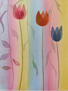
Below is the tear drop centers of flower:


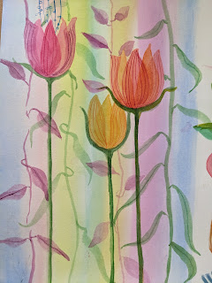
When center is dry, the sides are glazed over them. (Glazing is simply one color
painted over another after the first is dry)


Here are the glazed flowers with some leaves and stems added in background


Observe Glazing...does one type of paper seem better than another?

you should notice that the petals appear transparent on both types of paper. 

Stems and leaves

Use the chisel tip of a flat brush to create stems. Practice using round brushes to make different types of leaves. I even used my dagger brush for long ones. Make them overlap stems for a transparent effect.

How well does it lift?

Choose some places to try lifting with a medium soft brush. Which is easier, hot or cold? 

Try some fine lines with a small brush . (see on petals)

Try some pen and ink. The pen should glide over hot press, but get a little resistance from cold press.


Another test you might try is painting with granulating paints. Do you get more granulation with hot press or cold press? Below is French ultramarine and burnt sienna, both granulating colors, on hot.


Try this: wet a square on each, hot and cold press. Then paint a form inside each wet square.
On the cold press, the paint spreads a lot. On the hot press, it keeps its shape, but has soft edges.
This picture shows what it looks like on hot press.


Hot press is often used in flowers because the petals appear so smooth, and you can get tiny details. Some think the colors are more vibrant since they stay on the surface instead of being absorbed.

Here is a video that shows 5 tips for painting successfully on hot press.

Rachel's Studio tips on painting on hot press

https://www.youtube.com/watch?v=1At1F2pBXKg

GLAZING TIPS:

Sometimes, in order to unify a painting, it helps to glaze over an object with a color. My three favorites are:

Cobalt blue--for pushing something into the distance

Nickel azo yellow

Transparent Pyrrol Orange - for unifying reds