Thursday, June 20, 2019

Chrome/Silver/Gold

PAINTING METALLICS

I thought a lesson on metallics would be a good follow up to glass. While glass has both reflection and transparency plus distortion, metallics have mostly reflection with distortion.

OBSERVE:

Look at yourself in a spoon. If you hold it upright looking inside it, you'll see your own image elongated and distorted. If you look sideways into it, you'll see yourself  wider. You'll also see yourself upside down. 

Look at the backside of the spoon. Here you'll see your reflection very large in the center and becoming tiny further along the edges.

For this "simple" lesson, I used indigo, quin gold, burnt umber, and French ultramarine. Instead of indigo, you can use neutral tint or a gray mixture of your own. If you don't have quin gold, use a warm yellow with a bit of burnt sienna in it (or quin sienna). 

Here is the reference. After studying it, I realized that part of what was being reflected was me taking the picture with my cell phone! No wonder it looks concave instead of convex. The colors green and blue appear at the bottom edge of the spoon. These are reflections of the trees and sky on the opposite side of the spoon. 
Notice the handle of the spoon does not reflect any of these colors. It is made of a "buffed" metallic that reduces glare, so no reflections.


Line drawing. Don't go by my line drawing though. Going by your own observation will be a lot more effective.


First, I used indigo to paint the background. When it dried, I painted in the shadows. This is being a little more careful than I normally am, so that the shadow in between the fork tines is right. 

The important things in painting metallics are these: 1. Leave whites for sparkle; and 2. very darks against very lights create feeling of shine.

Then I painted in the pure color of any reflections, in this case, blues and greens on the bottom of the spoon. Those reflected colors should look clean, not dulled.  This particular spoon handle is not shiny and reflective. I just gave it a wash of indigo. I used a little blue on the shiny parts of the spoon. 


To finish the spoon, I worked in several glazes of indigo, adding a little French ultramarine. The main thing is to observe where your high lights are. Put your darkest darks next to a highlight. (Look for where the spoon is picking up the light source. If it is at the bottom of the bowl of the spoon, the top will be a little darker; if the tip of the spoon is picking up the light, the bowl will be darkest).


For the gold fork, do the following:
1. Lay in a pale wash of quin gold, leaving bits of white. Dry.
2. Apply a heavier concentration of quin gold on the tines, and drop in a bit of burnt umber along the edges of the tines. Paint the handle, a section at a tme, with heavier quin gold, then, while wet, use a thin brush to paint the curve line on the handle. Do that with each section, so that one edge will be hard edged and the other will blend softly. 3. When dry, paint the dark shadows of the fork with burnt umber.

(A substitute for burnt umber would be a dark mix of French ultramarine with burnt sienna or burnt orange)
4. I ran a small brush of burnt umber along the edges of the tines and side of fork to create the edge of the fork.

You may need to lift some highlights if you've lost your whites, or you may want to retrieve some pure whites with gel pen on some of the tinier spots.

Thursday, June 6, 2019

PAINTING EFFECTS OF LIGHT ON GLASS

SET UP YOUR OWN EXPERIMENT

This experiment is for you to observe for yourself the interesting distortions of light caused by glass and water. It will help you understand any reference you may be using for glass, chrome, or any other shiny surface. 

Pick one color for the ground and one for background. Here I have dark blue for background, white for the ground. Set up a glass object, and look at it from different angles. Notice how light traveling through the glass bends and distorts the color slightly. It also reflects objects around it. (In this picture, taken outdoors, reflects the trees in the yard on the upper third of the vase)
Also look for shadow below and behind the glass. 

NOTE: IF YOU ARE GOING TO PHOTOGRAPH YOUR OBJECTS, TRY NOT TO USE A FLASH.


Same vase, slightly higher angle.


Now add water to the glass. Again look at it from different angles, and note where the ground color and background color appear. 
Now add a stem or straw. You'll see how the water distorts and refracts light even more on the stem. It seems to disappear just below the water line, go off at an angle, then angle again and seem wider. Often the stem appears totally disconnected.Probably because of the convex curve of the glass. (Like our glasses make things appear larger)


Here I've changed the ground to blue to see what happens.


And now a black ground. Black and gray appear in such unexpected places. And there's still a lot of white.


Now try using just white for background and ground. The color in the water isn't nearly as dramatic, but the distortion is still there.  However, the shadows are very dramatic. They have the colors of the rainbow, as if split by a prism, and are very soft. And through the shadow you can see slices of light passing through the glass. (This was actually more apparent in life than in the photo)


Below is the photo I chose to use as a reference. (My photo from a series taken to demonstrate effects of light). I wanted a dramatic change in the colors, so chose a dark background against a white ground for shadow. (The dramatic change helps me to see the shapes I want to paint to indicate glass)


PAINTING THE VASE..MAKING A MAP

Why make a map? It takes about 5 minutes and saves you a world of pain later. This particular painting is not so complex, but is a good demonstration of how to do it. It keeps you from getting confused in a more complicated painting, especially one that has distortions in it.

Before I painted, I made a print of my sketch, about 5 x 7.


On that sketch, I made a "Map" to guide me through this painting. First I colored yellow pencil where I wanted the miskit to be. Then I colored green the spaces that will be pale tones with soft edges. 


So here is the final "map". The red indicates the darkest tones, mostly hard edged on one side, soft edged on the other. The gray are mid values. I didn't map the stems because I know they are pretty hard edged. 


First I miskit off the stems above the vase only . I put miskit on the areas that need a crisp, sharp white to show glass reflections.  (Yellow on my map) You can tape over areas with stems instead of miskit, if you'd rather. 


After the miskit is dry, paint the dark background. I want mine to suggest folds of fabric. I used cerulean, pthalo, and a little indigo for the darkest folds. It is painted wet into wet. So remember, if you paint it wet into wet, it will dry quite a bit lighter, so make sure you use enough paint. Dry it, then, if you want it darker, paint again. 

To suggest folds, paint the blues, then add darker color along a fold edge while it is wet. Then drag a dry brush along where there would be a highlight on the fold. Try not to make it look like a "stripe," but a wedge shape.

REASON FOR PAINTING BACKGROUND FIRST: You've established your darkest colors and your base color that will appear through the glass. It gives you a reference to work from so you don't get too dark or light as you paint the glass. 

COLORS USED: Pthalo blue, cerulean, Winsor blue, and violet or indigo. 


You don't have to wait for the top to dry before painting the shadow around the vase. Make a gray and have some other colors (green, pink, blues) handy to drop into it. Wet the shadow area and a little beyond it. Swirl in some color on the sides of the shadow, keeping some white spaces in there to indicate light passing through. Use the gray a little darker near the vase. Feel free to add some colors for interest. 


Dry the painting and remove only the miskit from the stems. 

COLORS FOR STEMS: Hansa light (or any lemony yellow) and cerulean, with French ultramarine added for darker areas.

Paint the green stems. This picture doesn't really show how green they are. Just observe how the colors and shapes of the stem change as they travel through the vase. The upper parts of the leaves are pretty medium. then they blur and become llighter as they go through the very top portion of the glass. Then they get darker and bluer until they reach the point where they enter the surface of the water. Then they get blurry, nearly disappearing, and are light colored again as you see them through the bottom of the vase. 

COLORS FOR GRAYS: a mix of whatever blue and yellow you've used, with some magenta or red.
Or just gray, if you prefer to use a tube gray.

Mix another gray, with a little more green in it. Then wet the area (you have marked off these areas in green on your map--pale soft edged color). Paint these soft edged areas a light gray with some green in it. (green is reflected in the water from the stems). 

COLORS FOR DARK VALUES: SAME as for background and greens.

When you have done those pale tones, you can work on your darkest values.(red on the map) Most of these darkest values are slightly lighter than the background behind it. Use the same colors as in the background.  I tend to work wet into wet to keep the edges soft. Then add your medium tones. (gray on the map)You will end up making adjustments as you discover more nuances in the glass that you didn't notice before. 


When you are satisfied, remove all the miskit. Soften some of the hard miskit edges, like the highlight on the middle left. I also soften the ring of the surface of the water a little.  I also went around the edges of the vase on the inside and cleaned up some edges. I darkened the stems on the outer part of the vase. 


GOOD POINTS BROUGHT OUT BY CLASS:

1. Don't like the pencil lines. Solution: before you paint, erase pencil lines in the area you are about to paint if it will be pale and pencil lines will show through. Leave just enough to be a guideline. 
2. What if I lose my whites? Solution: You can use gouache in small amounts to get back a crisp white edge. You can use a razor blade for a very thin white edge. 

Thursday, May 30, 2019

ONE LAYER PAINTING


ONE LAYER PAINTING

Here is the photo reference. This was taken by my son-in-law on one of his motorcycle trips, I think through Virginia. I was attracted by the cloud shapes and the feeling of mountains receding in the distance.

So you don't have to scroll through for the web sites, I will go ahead and put them here. They are 2 youtubes by Angela Fehr, a loose watercolor painter. Each one is about 30 minutes, but have a lot of information and are entertaining to watch. 


I didn't draw much, just indicated generally where the hills were and parts of the clouds and the horizon line.

Before painting, I spattered some miskit along the foreground for the white flowers. Dry.

Then I started painting the clouds. I got the top 1/3 of the paper wet and started applying my sky/cloud colors. I used cobalt blue, some Janet's Violet, and a bit of Ultramarine Turquoise. When painting wet into wet, you have to remember this will dry much lighter. Since I was trying to do as much as possible in one layer, I applied it pretty dark, and this is how light it dried.
After I had the very top the way I wanted it, I wet the lower half of the clouds, and began painting them in. As long as the paper is wet, I will not get hard lines, and I can play with the clouds a long time.

While waiting for the sky to dry, I painted the layer of hills that is mid blue.(shown behind the green hill) I skipped the green hill while that dried, and did the dark green hill nearest the foreground.
I used green apatite genuine with ultramarine turquoise, pretty dark, leaving the bottom wet.

USING A HOG BRISTLE BRUSH (the cheap kind you get in packages from Walmart), I lightly brushed the dark paint into the white on the bottom to create grass in that next layer.
After that was dry, I painted in the blue green hill behind the dark one.


I finished working in the rows of hills behind the blue ones. Each successive row gets small, cooler,
grayer, and less distinct. My color choices were:

Dark green hill: ultramrine turquoise and green apatite genuine
Middle green/blue hill: Ultramarine turquoise with less green and some cobalt blue
Blue hill: mostly cobalt with a hint of turquoise
Next layer: cobalt with a bit of violet
Last layer: mostly violet


FOREGROUND: I used some quin gold underneath, and added some green apatite genuine and turquoise. Then I removed the miskit.


When I got home I only added a few touches. I put in a tree on the right and some tall grasses. I added some red/violet to some of the whites for a pop of color. 

Below is the first time I tried this painting. It turned out paler, but I still liked it. What I changed were some of the colors I used, because the violet and blue I used first in the sky turned out to be granulating. I also wanted to raise the foreground a little in the picture. 


A side by side comparison.


Thursday, May 16, 2019

BEGINNING A VERY WET ON WET LOOSE PAINTING


The following reference is one found on Pinterest by someone else. I wish I could give credits to the artist, but I don't know who it is. 
So the request was to do some kind of very loose painting, similar to this. I felt the best way to start was very wet.

So items needed: paper and paint (I have a gift for the obvious)
A piece of glass, or plexiglas, or cookies sheet or gator board, something non-porous a little larger than your paper;
a towel or something to catch dripping paint
large brush (good opportunity to use you mop or quill)


PART I

Step One: spatter some miskit and let it dry
Step Two: Wet (Soak) both sides of the paper, either by spraying or running under water
Set it on your plexiglas or board. It will stick all by itself. 
(the purpose of the board is to support the wet paper while you are working on it)

Step Three: Mix three paint colors for your base. I used Turners Indigo, Indian Yellow, and Coral. 
I sort of wish I'd used a blue and a yellow that made prettier green, but this is what I used on this one. 

Step Four: With a large brush, start at the top and add color. I started with blue, added some yellows, then some reds, and a few spots of purple on the bottom. I had the board on a slight SLANT to allow the paint to move downward. I picked up the board and moved it sideways to make the paint move a different way. This part is probably the most fun, just allowing the colors to run and blend. You can also use a pipette to drizzle some more color. If color looks too blobby (I'm sure that's a technical term) use your spray bottle to move the paint.

The towel (Or I use a "doggie diaper") is there to soak up any drips in this first phase.

When you are happy with the blend of colors, set the painting flat to dry.  Because the paper is soaking wet, it will take a lot of time to dry. 

If you want to speed up the drying process, lift the paper off the board and hair dry BOTH SIDES of the paper. 

PART II

When the paper is completely dry, think about how you want to compose you painting. The first time I did this, as in the sample painting, I was sort of copying the general idea, keeping the horizon high, as if you are looking up a hill. In this one, I wanted to change thing a little with a lower horizon line.

I rewet the the top of my paper where I want to put some distant tree (or other objects, like hills,etc.).
So to keep something distant you use 4 ways. Things in the distance are COOLER, LESS DETAILED, SOFTER EDGED, and LESS SATURATED IN COLOR (grayed down).
So I added some trees in the distance with some purples and blues. I actually worked upside down so that the "trees" would run down the page a bit. (The purple I used was cobalt violet). Then that has to dry. 


Below is my first try with this picture. You can see I kept it looking as if you are looking up a hill. Those purple trees in the background were the first things I added after the initial wash had dried.

I will show the finishing process next week, but will just give a basic summary here.
I paid attention to those subtle lines that criss cross down the hill, gradually getting farther apart, giving you a feeling that there is a trail getting more distant as it goes up the hill. I lightly penciled in those lines, or trails if you will.

After painting in the purple background, I wet the area at the top of the hill about 3 inches up, and applied pthalo blues and yellows to creat some greens, some blues. Notice they are more hard edged now, especially where they meet the ground, and a a bit softer on top, but not as soft as the background purple trees.


One at a time I wet the crisscrossing lines and dropped in color to create the feeling of rolling hills. I was still using pthalo and yellow for greens, adding some magenta here and there. When all that was dry, I brushed in some grassy stems with a small brush and did some spattering of magenta an purple.
On the one above I did not save any whites with miskit, which I regretted later. 

TO GRID OR NOT TO GRID....

GRIDDING A DRAWING

Before going into the WHY of gridding, I'm just going to walk through how I do it.
Gridding is a way of copying, enlarging, or shrinking an image, usually a photograph. I am inherently lazy, so it cost me some time to figure out how to save myself time. I created grids of different sizes (you can download patterns from different web sites, but I created mine on Xcel.) I printed them on overhead projector transparencies. (These can only be printed on one side, and most only on an inkjet printer. Can even print in color)

These transparencies make it so I don't have to hand draw new grids every single time I need one. I can place the small grid over the image I want to enlarge or examine. 


Then I tape TRACING PAPER over the larger grid and draw directly on the tracing paper.
After I have finished the drawing, making whatever changes I want, I will then transfer it to my watercolor paper, either with saral, or, more likely, with my light box.


OTHER WAYS TO USE IT

You CAN grid a still life or something you are drawing from life.  I tape the grid to a piece of plexiglas and prop it in front of me so I can see the object. Trying to photograph the transparency/plexiglas/flower was a bit much for my camera, so it's blurry. 


Below you can see my grid on the plexiglas, then the vase behind it. This helps me get proportions and placement of petals more correct. 


In addition to making transprencies, you can also just print out grids and draw straight on them, any size you want. If you want to, you can take your photograph, make a copy, then run it through the printer again, printing a grid on top of it. (if you are not trying to preserve that photo)
Lots of ways to make it easier for yourself.

TO BE HONEST: I mostly save gridding for two things: portraits that have to be totally accurate; and checking my own work for correct angles, comparing sizes and shapes on my drawing to my reference, or getting correct perspective when drawing from life. (Ex: in class we checked the head of a bird by laying a grid over it and noticed it wasn't the correct shape.) Also if the pattern is super complex, and it has to be accurate.

There is something about looking at your picture through squares that helps you see better. Or is that just my brain?


WHY GRID INSTEAD OF JUST ENLARGING YOUR PHOTO?

Most of the time, especially if I'm in a hurry and accuracy is not necessary, I do that. No shame in that, especially if it is my photo and I've made my own adjustments to the composition. However, gridding forces you to really look at the details and nuances in a picture. If you trace, you are likely to trace the shadow of something rather than the object. On a tree, no big deal. On someone's face, it is. Also, in tracing, you are more likely to trace everything, important or not. Gridding makes you make decisions about what you really want in that composition.  

It is also making you DRAW. It will make you better at seeing, comparing, and drawing. So I don't promote one or the other, but if your goal is to draw better, gridding is a good way to start.


Thursday, May 2, 2019

BEE PAPER REVIEW

LOOKING FOR A LESS EXPENSIVE PAPER ALTERNATIVE FOR "PRACTICE"

I've spent some time looking at different reviews of different papers, hoping to find SOMETHING that students can use "just for practice" or "just for color testing." I am hooked on using the best, and get frustrated when using other papers. But I understand the cost of good cotton rag paper can be daunting. So I continue to look for a paper that will give a good watercolor experience without breaking the bank. I've been reading about Bee paper, and decided to give it a try.

Below are some of the results of my trials.


This Bee paper is 140 pound, 100% cotton rag, and is archival, so that was a promising start. I ordered a pack of 50  6" by 9" sheets from Amazon Prime for $13.99, the same price as a 12-sheet pad of Arches 9 x 12. (So you get about double the amount of paper). It does come in 22 x 30 sheets, but I have not tried that yet, for reasons I'll get into.

I tested for eight different qualities that I ask for in a paper:

1. How smoothly does the paint flow onto the paper?
2. Can I do wet-into-wet techniques?
3. Does it lift well, without tearing or pilling?
4. Can I use glazing techniques?
5. Can I do large, smooth washes?
6. Will it take masking fluid or tape?
7. Does the color blend cleanly on the paper?
8. How much does it warp or buckle? 

POSITIVES:

I did like how the brush felt on the paper, and I could do some wet-into-wet IF it was not over a large area. Flowers worked nicely. I had no problem glazing - although I only tried three layers. I think the colors looked clean and vibrant on the paper. I like the SMOOTH texture of the paper. It also is a very SOFT paper. 

NEGATIVES:

I didn't get smooth washes over a LARGE area. (which is why I didn't get a larger size to try). 
When I tried lifting, the paper tends to "pill" up, even though I use a very soft lifting brush. It was better when I used lifting prep on the paper. It won't take a lot of punishment . I tried blue painters tape, and it came off fine without tearing, but it did not like masking fluid. Maybe it was the brand. Also, you can only paint on ONE SIDE. The other, smoother side is streaky and doesn't absorb the paint as well. It is advertised as 140 pound, but it doesn't feel as substantial as, say Arches, Frabriano Artistico, or Heritage. It seems to absorb the paint a little faster, so it's hard to soften an edge. 

WOULD I RECOMMEND BEE?

Actually, I'd say yes to that if it suits the way you paint. I think it's fine for making cards (I still haven't tested it in a printer) and small paintings that don't take a lot of punishment. You have pretty good control over the paint. You could also use it with water color pencil or pen and ink, since the paper is smoother than many. It would be a handy size for making sample pages of paint or practicing strokes, since the paper feels and reacts to the brush like the good paint. It's a good way to keep your brushes wet without a huge paper expense. 

But would I start a painting that I plan to put in a show? Probably not. 

If you like using sketchbooks, Bee makes one that is 100% cotton rag--but again, you can only use one side of the paper. Not a problem for a lot of people


ELEMENTS OF ART: SHAPE

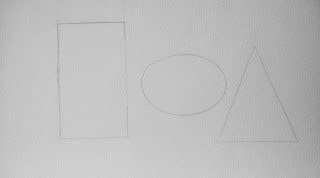
The definition of SHAPE is a line closed in on itself. It can be geometric (measurable), like squares, circles, triangles, etc. Or it can be ORGANIC, or free-form.

The area between, around, below your shapes is SPACE. Sometimes we think of it as the NEGATIVE of the shape.

SO, the question is: Does the artist see MORE shape than other people, or LESS? Or does the artist just know how to SIMPLIFY and DIRECT THE EYE with shape?

Sometimes you are stuck with shapes that are not themselves very interesting by themselves. Here are a few ways to make your shapes a little more interesting and unified.

Think of your picture as a good story. Would you give away the ending at the very beginning? No, you want the mystery to unfold and keep you interested. So you can do the same thing with the shapes in your picture. The human brain WANTS to have to work to enjoy the picture. You make it work when you DON'T spell out every little detail.

Take three basic shapes.


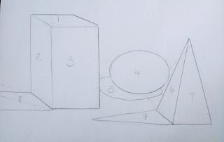
Give them some dimension, then a shadow, and now you have 9 individual shapes.
I've spelled it all out for you. Kind of boring.


Below I've taken the 3 basic shapes and shown 3 ways to make them more interesting. From left to right are: wet into wet charging color; gradual transition of color (shading); and texture on the triangle. Much better than flat color.


So in the one below, I've MERGED the shadow shapes, so that instead of 9 shapes, I have only 7. MERGING SHAPES is a great way to simplify and make shapes more interesting. PLUS, bonus points for making the human brain do some of the work.


In this one, I've taken MERGING a step further, merging the shadow of the egg shape with the triangle shadow. Now I have only 6 shapes. (The shadow on the left of the rectangular prism plus the side of it; the yellow top of the prism; the front of the prism; the egg shape; its shadow merged with the shadow of the pyramid; the front of the pyramid)


Below are a few more ways to add interest to your shapes. 
Top left: make the NEGATIVE space around your shape interesting.
Bottom left: Have a variety of EDGES: 
Edges can be SHARP, FIRM, SOFT, OR LOST. In the shaded oval, you see all of these. Sharp (razor sharp between object and background) and hard (firm--definite) lines give definite edge to a shape. Soft edges (think a kitten's fur) indicate form and gradual change. And lost edges blend into the surrounding space. You can see a white lost edge at the right tip of the oval and in the dark undershadow where you can't see where the egg ends and the shadow begins. (also causing a MERGED shape)


On the right you can see how overlapping another shape over the rectangle (the tree and the bush) can make the shape appear more interesting...or at least less boring. And I've used repeated shapes in the walk up to the house, making them go from large to small, to guide the eye toward the front of the house. 

EVALUATING THE SHAPES IN MY OWN PAINTING

When self-critiquing (is that a real word?) here are some questions to ask yourself about your shapes:

1. Are there opportunities to connect (merge) shapes and simplify?
2. Are my negative shapes interesting?
3. Do the shapes direct to the focal point....or are they drawing the eye away toward the edges?
4. Is there interest within some of the shapes?
5. Is there variation? 
6. Is there balance in my shapes?
7. Do they feel unified, or does it feel random?
8. Do I have a boring shape too close to the edge of the picture?

Here are some short little youtubes. I was happy to see Stan Prokopenko making a 12-minute video on the subject. Have to say, he's my favorite drawing instructor.


And these to 10-minute videos are pretty good too!