ROCK BLOG
In this I’ll be using the following photo for my reference.
It isn’t the most artistic photo, but it has some qualities I like: strong
shadows, a diagonal thrust, a variety of shapes, and uncomplicated.
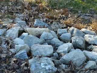
REFERENCE PHOTO (Taken by me at Ludlow Hill Park, Lawreneburg, IN)
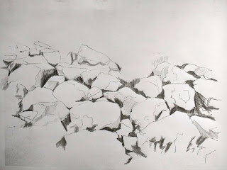
First I sketched (or traced, no crime if you need to trace)
outlines of the rocks. Try to compose your picture as you sketch. Decide if you
want to leave out some rocks (as I did) or add some other elements.(I eliminated two rocks on the right upper side because the shape was boring)
Apologize in advance for the lightness of the drawing.

PICTURE OF SKETCH
Next, make a small value study. There are several ways to do
this. One is to trace your photo (small or large, but small is quicker) on tracing paper, and using a
dark pencil or black ink pen, color in the darkest darks in your picture. The
second way is to make a copy of the pattern (outlines), and shade in on the
copy. NOT ON YOUR WATERCOLOR PAPER.
PICTURE OF DARK VALUES
This step should only take a few minutes. This value study
helps you see if you have a good pattern of light and dark right at the
beginning, before you lay paint to paper. If you don’t like the pattern, make
the changes on your value study. If you
take a picture with your cell phone and look at it small, you should see a
pattern that you are happy with. If no, change it.
So, what are you looking for? One, do you like the pattern? Two, are all the darks the same size or shape? (you do not want that) Three, When you squint, can you see anything awkward? Does the pattern of light and dark move you through the picture? Some people judge by this: If all you saw across the room was this pattern, would you walk across the room to get a closer look?
Then shade in your mid values with a pencil until you like
what you see. These steps don’t take a lot of time, but can save you a lot of
trouble when you start to paint. We are going to use this value study as a MAP
to our painting.
This mapping can be done with ANY kind of painting that you do, which is one reason why I am using it with this painting.
Now, using your value study as a map, PAINT in the darkest darks. They will begin to look very rocklike.
Now, using your value study as a map, PAINT in the darkest darks. They will begin to look very rocklike.

PAINTED IN DARKEST VALUES
Choose from a few of the following methods to create some texture on your rocks:
spattering; dropping water into wet paint to create backruns; scratching into the paint with fingernails or palette knife; using granulating paints, such as lunar earth; saran wrap; wax paper; salting.
I chose to use saran wrap first. I wet the rock area, then applied washes of permanent rose, quin coral, cobalt, and raw sienna. While it was wet (shiny, but not puddley) I lay crinkled saran wrap over the washes and allowed it to dry. (The dryer it is, the more definite edges you get. You can take the wrap off before it is completely dry, but the colors will not remain as hard edged.)
Expect some of your darks to be softened and bleed into the rocks. I like the look of this so far.
 C
C
SARAN WRAP APPLIED TO WET WASH
To finish: I went back to my "map" to re-darken some of the darkest areas. This time, I put the paint in the darkest area, then softened it up into the rock behind it, creating a medium tone on the rocks. Thisdoes two things at once: refines the hard edges that make it read as rock, and creating the mid tone on the part that is softened.

FINISHED ROCK PAINTING
Two last details: the highlights and the background.
For highlights I taped around the edges of the rock area I wanted to lighten to create a harder edge as I lifted paint with a magic eraser. (Mr. Clean or generic will do).
For background, I turned my paper upside down and wet the area behind the rocks. Holding my paper upside down over a sink, keeping a spray bottle handy, I put in dark green and cobalt blue around the edges using a 3/4 inch flat brush. The spray bottle came in handy if I didn't like the direction the paint was going. I wiped off the excess and let it drain off. (You can use a paper towel to soak up extra paint off the edges so it doesn't back run) I let it dry upside down on a slant.
No comments:
Post a Comment