
There are so many reasons to do a value study before a final color painting.
1. It's an easy and gradual process
2. You are getting used to the painting process--brush strokes against the type of paper you are using, etc. -- (instead of penciling in)
3. You are getting familiar with the subject
4. You can make your composition changes ahead of time, making many of your decisions before you add color.
5. If you choose a looser style, you understand which details can be left out, and which shapes are most important.
6. You can practice techniques you are less familiar with.
7. You are only worried about one thing at a time: value. You paint with one color only.
7. It's fun.
I am using a photo reference by Jack Ninno, Jr. found on unsplash.

You can use your Notanizer to find values, or print it in black and white.
I experimented a little with the composition, and decided I wanted a portrait layout, and I cropped off the left side to put the focus on the 3 women.

The first one I did using only Payne's Gray. I wanted to see how it would look with warmer tones, so I used burnt umber in this demo. You can choose any color you want, as long as it can cover a wide range of values. I don't usually choose black, although I might add black as a final value. Another reason for using burnt umber is that I like to be able to lift, and Payne's Gray is hard to lift. (if you made your color from burnt sienna and French ultramarine, it would be gray or brown, but you can lift it more than Payne's Gray.)
Below you can see my "palette." It's a tiny Altoids box that hold 5 half-pans. One is burnt umber. I used the lid to mix my paint with water. For the very pale first layer, I made a light, watery version, and tested it on scrap paper to be sure it was pale enough.

Starting at the top, I wet the sky area. I saturated my round brush with watery burnt umber, and painted in what will be blue sky, leaving the clouds the white of the paper.

Then,using the same pale consistency, I painted everything that will not be white of the paper. This is so easy, because you just paint from one object to another, connecting them all, not worrying about any details. So I started with the basket and painted straight down the body of each woman, then into the shadows. I want the top of the road to be much lighter than the very bottom, so avoided painting that. You can see some small whites I left. (no masking) I am also adding some directional strokes at the bottom to indicate the direction of the hill. This is not in the original photograph, but I think it will add to the feeling I want to express--the uphill struggle of their daily lives.

This dries pretty quickly, so it's usually ready for the next layer of value. I just added more burnt umber to my puddle, and tested it next to the first value to be sure it was the right shade.
Then I painted this next value over everything except what I want to leave white or light. (I left the sky, some of the road, parts of the clothing, highlights on the baskets, etc.) I darkened some of the bottom road, using strokes that indicate the direction of the hill. (be careful to follow the general rules of perspective here so your road is believable.)

I added some more burnt umber to my puddle, and tested it next to the other two values on a scrap of paper to be sure there was enough value change. Then I painted everything that I wanted darker, and left everything that was white, pale, or the last value. You can see their skin, folds in clothing, and legs are getting more definition. I now have 4 values: white, pale, medium pale, and medium dark. There are still 2 more values to go, but it is already shaping up.

Here is the scrap of paper I used to determine how dark to make each value.

Deepen the values on some areas....this further separates details, like the shadow under legs, clothing folds, etc.
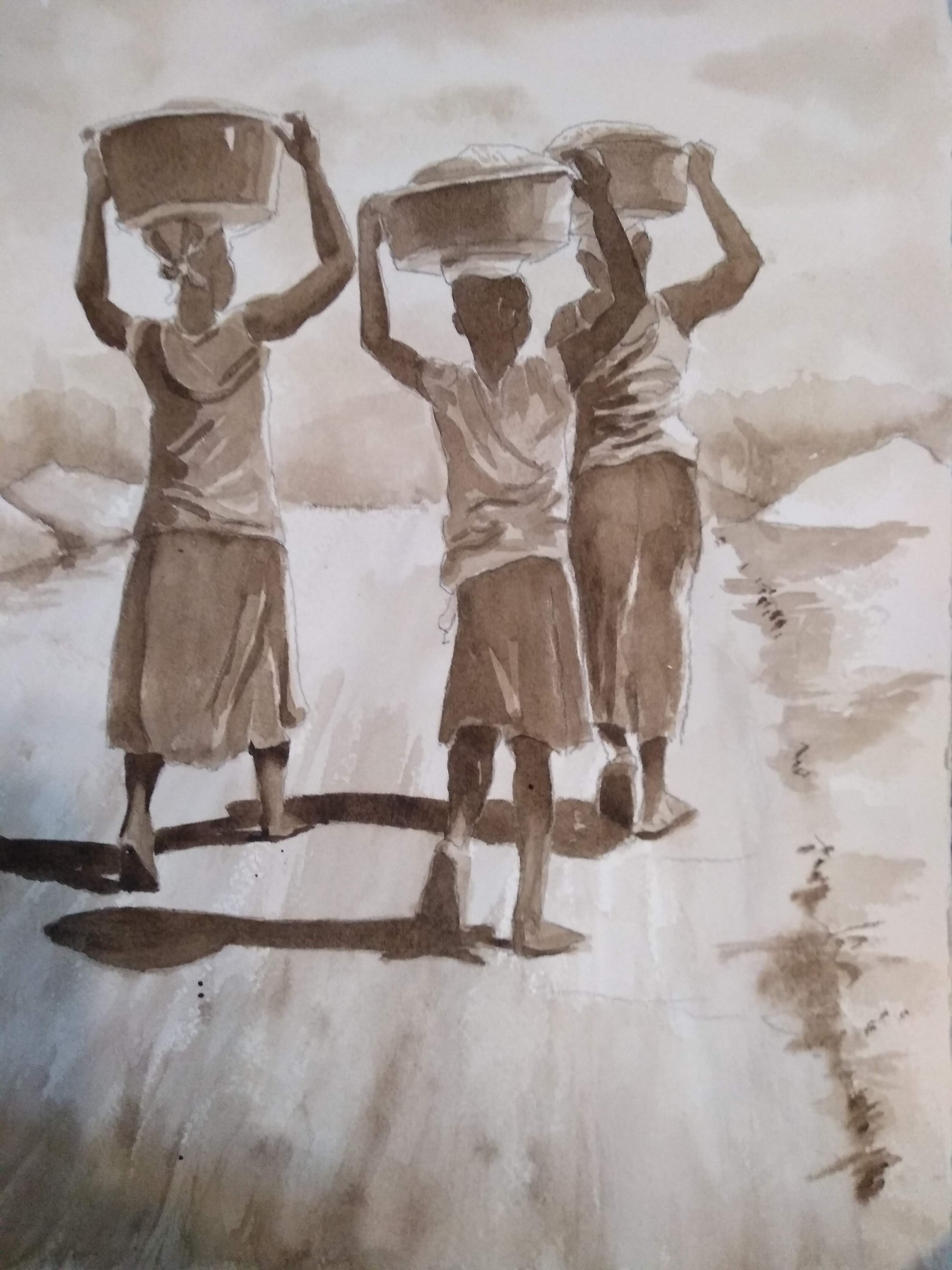
To get the values deep enough for the final one, I added a dark green, which made
a nice warm black/brown. I added a few details on the skirts, deepened the shadows,

Because I used a liftable color, I lifted a little on the skirt on the right; I spattered some on the road. If you want something lighter, add a little white gouache.


No comments:
Post a Comment