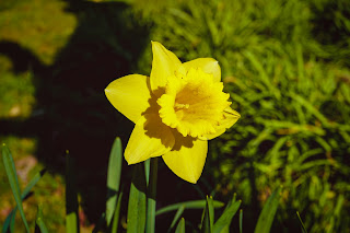
Daffodils: Two versions
Here are the sketches for the daffodils, one from my photo reference, and a more simplified version: fewer frilly ruffles, more simple petals. Kier Insight Archives from Unsplash is where this reference is from. For reference for yellow colors I used Catrin Ellis photo from Unsplash.
Simplified Sketch
More complex sketch
I had those who were doing the very dark background mask off the frilly edges with masking fluid, only because it is easier to keep the crisp edges after going over it with three or four layers of paint later.
(These have already been painted a bit so you can see better where I've put the masking fluid)
You can also put the masking over the edges AFTER you have painted in the yellows and dried them.
Put if you are not doing a background, no real need to mask.
The first order thing after masking is to underpaint the shadows in the flowers. Last week I tried different colors for this shadow, and chose raw sienna. I could also have used violet (very pale), ochre, or yellow mixed with a bit of violet.
I used cobalt blue for the shadows in the white flower and some of the shadows on the leaves and stems.
When those had dried I flooded the page with yellows, hansa light and new gamboge.
(If no background, just wet the flowers and lightly brush on yellow colors)
NOTE: Do this with a light touch. If you brush hard or over and over again, your underpainting may get lost.)
I also added in blues and greens in the leaf area, trying to get a variety of shades, because I am going to negative paint over those. Those who want no background or light background will put the leaves in with positive painting.
I built up the bottom part until I was happy with the color and texture. Then dried the entire painting.
I began negative painting to make the leaves stand out. I began with a dark green, but will build it up with other color later until I have a very dark background.
Here is an effective way to build up blacks in a picture. You will see it at the top of this chart.
I used dark versions of every secondary color: orange, violet, and green. You can see I started with orange; dried that, then did a layer of green; dried that, then did a layer of violet; dried that. For the final layer I tried different darks: first sepia, then sodalite, then indigo, then Paynes gray, then pthalo. I lifted a line through the entire thing so you can see what colors will appear if you lift anywhere.
The bottom left shows two layers of different blacks. To the right of those is that black painted over different colors. Your underpainting determines the temperature and appearance of the black.
This chart is one you can make at home. The left side is under-painted with yellow, then glazed with violet. To the right of that square is yellow and violet mixed on the palette, with more emphasis on the yellow. Below that is an under-painting of violet, glazed over with yellow. The right of that is violet and yellow mixed on the palette, with more emphasis on the violet. They are labeled so that the first color in the label is the underpainting, and the second color is the glaze. I hope you can see the difference in effect of using a glaze.
You get a VISUAL or Optical mixing.
Here I'm using a very dark green to negative paint around the leaf and petL shapes. Negative painting is simply painting what is not the object.
This green was french ultramarine with hansa
Later I'll continue painting layers of negative painting until I achieve a dark I like. More next time .


No comments:
Post a Comment