It is extremely useful to get familiar with the color wheel, especially your complementary colors.
The word "complement" (with an E) means "that which completes or perfects; the amount needed to complete." In color, it is the color it needs to contain all the primary colors in the color wheel.
I think of it this way: To find the complement of red, I think, "What two colors are left on the color wheel?" Yellow and blue. Combined they make green. So green is the complement of red.
How do you make purple? With red and blue. What primary is missing? Yellow. The complement of purple is yellow. If you have a color wheel, the complement is directly across from the color you choose.
I made the following chart using three colors: cad red deep; Azo yellow; and cerulean blue.
I mixed the secondary colors (orange, violet, and green) using those three primaries.
On the left of each row is the primary; on the far right is its complement. Next to the primary is that color "neutralized" with a bit of the complement. Third in each row is a brown made that is heavier on the primary. Middle is a gray made from the complements. Fifth is a brown heavier on the secondary color. Sixth is the complement "neutralized" a bit with the primary color.
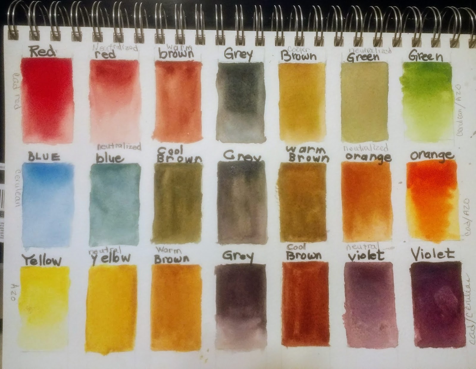
So you can see there is quite a variety of colors you can make using complements.
So try doing this with the colors in your palette. Use whatever blue, red, and yellow you have. The colors you choose will make a slightly different color wheel than mine. But you need to know what YOUR colors will do for you.
REASONS TO KNOW AND USE COMPLEMENTS
1. To neutralize (calm down, gray) an intense color
2. To create interesting browns and grays
3. To create color harmony in a painting using only a few colors
4. To emphasize an area using coplements next to each other (example: a bit of red in a largely green painting)
5. To shade
6. To prevent unwanted "mud"
7. to create "mood"
No comments:
Post a Comment