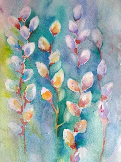
I found a picture of pussywillows in Jean Haines' book, Atmospheric Flowers in Watercolor, page 49.
There were no instructions how to do it, but I remembered a class I took from Sandy Maudlin years ago, so here is how I would paint this picture.
First, using a large brush, wet the paper and make a wash with several colors. I did mine vertical, but it doesn't have to be. I used ultramarine, pthalo blue, quin gold, magenta, and lemon yellow. TIP: try to use non-staining colors for your first try. (don't use pthalo or carbazole violet). You will be able to lift out white much more easily.
WHILE THE WASH IS DAMP, I pulled out some oval shapes with a thirsty brush. (wipe off a shape with a brush, wipe off the brush, rinse and repeat) You can use tissue also. This leaves a lot of very soft edged areas. If paint runs back into the shape, you can later put a little water on the brush, and refine the oval shape a bit.
Choose just a few colors for the insides and shadows. I should have kept to blue, magenta, and yellow, but I got carried away experimenting to see which colors I liked best. You are not trying to fill in these shapes from edge to edge--you want that outer edge left soft. You are just putting some color near the bottom of the oval shape, keeping that soft also.
Next, I used quin burnt scarlet (you can use burnt sienna or other color) to attach the ovals to a stem. I just dropped a bit of color at the bottom, pulled down a stem, then softened where the base meets the oval. The hard edges are the stem and some of the outer bottom of the brown.
Watercolor always dries lighter, so I was now ready to strengthen some of the
background behind the pussywillows. I wet an area I wanted to darken, added some turquoise around the left side of this stem, and dropped in some ultramarine. Now the pussywillows really show up. I'm careful to keep the edges of the ovals soft.
On mine, to create some continuity in the background, I started each area with some turquuoise, but varied the color I dropped in so it didn'g get boring: yellows on the left, blues and violets toward the right.
Last step was to lift out and soften a few of the buds that got too hard-edged. I even lifted out a few more buds that were not originally there. Now that I'm looking at it, I think I want to strengthen some of the stems just a bit. But done for now.

.
In Jean Haines' version, there are more dark vertical streaks of green and burnt scarlet at the bottom.
OK, couldn't resist...added some stems and dark green at bottom. Did I mess it up?
 .
. 


No comments:
Post a Comment